Styled-components와 Emotion: CSS-in-JS의 비교 및 장단점
1. 서론
최근 웹 개발 트렌드 중 하나는 CSS-in-JS이다. 이 기술은 JavaScript 내에서 CSS를 작성할 수 있게 해주는데, 그 중에서도 Styled-components와 Emotion이 가장 주목받고 있다. 두 라이브러리의 차이점은 뭘까
2. CSS-in-JS의 등장 배경
전통적인 CSS는 스타일 관리의 어려움, 전역 범위 등의 문제점을 안고 있다. CSS-in-JS는 이 문제들을 해결하기 위해 나왔다. 컴포넌트 단위의 스타일링이나 동적 스타일링이 훨씬 간단해졌다.
3. Styled-components
const Button = styled.button`
  background: ${props => props.primary ? 'blue' : 'white'};
`;- 주요 특징 및 장점: 자동화된 고유 클래스명, 동적 스타일링 지원, 서버 사이드 렌더링과의 호환성 등
- Styled-components의 단점: 런타임에 스타일을 생성하기 때문에 성능 이슈가 발생할 수 있다.
4. Emotion
const buttonStyles = css`
  background: hotpink;
`;- 주요 특징 및 장점: 빠른 런타임 성능, 객체 스타일 문법 지원, SourceMap 지원
- Emotion의 단점: 설정이 복잡할 수 있으며, 초기 학습 곡선이 다소 높을 수 있다
5. 제공하는 기능 비교
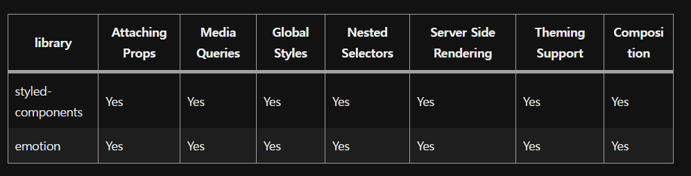
- 전반적인 스타일 기능은 똑같다.
- 둘다 sass문법을 사용하기에 스타일 문법에도 차이가 없다.
6. Emotion 차별점 : css prop
- css prop의 기본 사용법:
Emotion을 사용하여 React 컴포넌트를 스타일링할 때, css prop을 직접 컴포넌트에 전달할 수 있다
/** @jsxImportSource @emotion/react */
import { css } from '@emotion/react';

function App() {
  return (
    <div
      css={css`
        background-color: palevioletred;
        color: white;
      `}
    >
      안녕하세요, Emotion!
    </div>
  )
}- css prop와 동적 스타일링:
css prop은 동적으로 스타일을 적용하는 데도 아주 유용하다
/** @jsxImportSource @emotion/react */
import { css } from '@emotion/react';

function Button({ primary }) {
  return (
    <button
      css={css`
        background-color: ${primary ? 'palevioletred' : 'white'};
        color: ${primary ? 'white' : 'palevioletred'};
      `}
    >
      버튼
    </button>
  )
}- css prop을 여러 스타일과 결합하기:
또한, css prop은 여러 스타일을 쉽게 결합할 수 있게 해준다.
/** @jsxImportSource @emotion/react */
import { css } from '@emotion/react';

interface ButtonProps {
  children: React.ReactNode;
  theme?: 'primary' | 'secondary';
  onClick?: () => void;
}
const Button = ({ children, theme = 'primary', onClick }: ButtonProps) => {
  return (
    <button css={[style, themes[theme]]} onClick={onClick}>
      {children}
    </button>
  );
};

const style = css`
  padding: 10px 20px;
  border: none;
  border-radius: 4px;
  font-size: 16px;
  cursor: pointer;
  outline: none;
  transition: background-color 0.3s;
`;

const themes = {
  primary: css`
    background-color: palevioletred;
    color: white;

    &:hover {
      background-color: darkviolet;
    }
  `,
  secondary: css`
    background-color: white;
    color: palevioletred;
    border: 1px solid palevioletred;

    &:hover {
      background-color: palevioletred;
      color: white;
    }
  `,
};

export default Button;
이처럼, Emotion의 css prop 기능은 스타일링을 더 직관적이고 유연하게 만들어줍니다. 이는 특히 동적 스타일링이나 여러 스타일의 조합이 필요할 때 큰 장점으로 작용한다.
7. 결론
CSS-in-JS는 웹 개발에서 중요한 트렌드로 떠오르고 있으며, Styled-components와 Emotion은 이 분야에서 주목받는 라이브러리다. Styled-components는 사용자 친화적인 API와 커뮤니티의 강력한 지원을, Emotion은 비교적 조금더 빠른 성능과 유연한 css prop 기능을 제공한다. 프로젝트의 필요에 따라 두 라이브러리 중 적합한 것을 선택하여 효과적인 웹 개발을 추구하면 좋을듯 하다
REFERENCE

풀스택 개발자