[Android] JetPack Compose Codelab 2 : BasicLayoutsCodelab
오늘은 지난번(BasicCodelab)에 이어서 BasicLayoutsCodelab의 내용을 둘러보고자 한다.
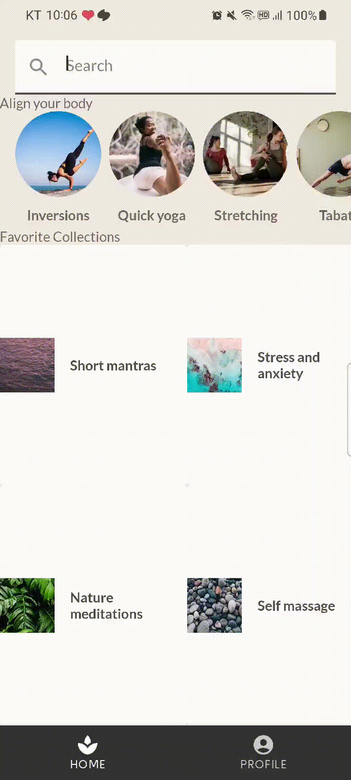
상단의 검색창, 중앙에 리스트 두개, 그리고 바텀내비게이션 바가 있는 앱이다.
- MySootheApp > SootheBottomNavigation, HomeScreen
@Composable
fun MySootheApp() {
    MySootheTheme {
        Scaffold(
            bottomBar = { SootheBottomNavigation() },
        ) { padding ->
            HomeScreen(Modifier.padding(padding))
        }
    }
}
Scaffold를 사용하여, 바텀 내비를 설정했고, 하위 화면은 HomeScreen으로 설정했다.
- SootheBottomNavigation
@Composable
private fun SootheBottomNavigation(modifier: Modifier = Modifier) {
    BottomNavigation(modifier) {
        BottomNavigationItem(
            icon = {
                Icon(
                    imageVector = Icons.Default.Spa,
                    contentDescription = null,
                )
            },
            label = {
                Text(stringResource(R.string.bottom_navigation_home))
            },
            selected = true,
            onClick = {},
        )
        BottomNavigationItem(
            icon = {
                Icon(
                    imageVector = Icons.Default.AccountCircle,
                    contentDescription = null,
                )
            },
            label = {
                Text(stringResource(R.string.bottom_navigation_profile))
            },
            selected = false,
            onClick = {},
        )
    }
}
네비게이션을 통해 바텀 내비의 화면전환을 하고자 한 것으로 확인되고, 아이콘과 아이콘 하단의 텍스트만 설정되어 있다. 하지만 라우팅이 작용하고 있지는 않은 상태로, 자세한 사항은 이곳에서 확인해보도록 하자.
- HomeScreen > SearchBar, HomeSection(AlignYourBodyRow), HomeSection(FavoriteCollectionsGrid)
@Composable
fun HomeScreen(modifier: Modifier = Modifier) {
    Column(modifier) {
        Spacer(Modifier.height(16.dp))
        SearchBar(Modifier.padding(horizontal = 16.dp))
        HomeSection(title = R.string.align_your_body) {
            AlignYourBodyRow()
        }
        HomeSection(title = R.string.favorite_collections) {
            FavoriteCollectionsGrid()
        }
        Spacer(Modifier.height(16.dp))
    }
}

@Composable
fun HomeSection(
    @StringRes title: Int,
    modifier: Modifier = Modifier,
    content: @Composable () -> Unit,
) {
    Column(modifier) {
        Text(stringResource(title))
        content()
    }
}
Spacer로 상하단의 간격을 제시하고, 검색창, 첫번째 리스트, 두번째 리스트가 Column을 사용하여 구현했다. HomeSection은 리스트의 타이틀을 달아주기 위한 또 한꺼풀의 껍질이다.
- SearchBar
@Composable
fun SearchBar(
    modifier: Modifier = Modifier,
) {
    TextField(
        value = "",
        onValueChange = {},
        leadingIcon = {
            Icon(
                imageVector = Icons.Default.Search,
                contentDescription = null,
            )
        },
        colors = TextFieldDefaults.textFieldColors(
            backgroundColor = MaterialTheme.colors.surface,
        ),
        placeholder = {
            Text(stringResource(R.string.placeholder_search))
        },
        modifier = modifier
            .fillMaxWidth()
            .heightIn(min = 56.dp),
    )
}
TextField로 검색창을 구현했고, 아이콘(leadingIcon으로 앞단에 배치)과 색, 힌트 문구, 규격을 제시한다.
- AlignYourBodyRow > AlignYourBodyElement
@Composable
fun AlignYourBodyRow(
    modifier: Modifier = Modifier,
) {
    LazyRow(
        horizontalArrangement = Arrangement.spacedBy(8.dp),
        contentPadding = PaddingValues(horizontal = 16.dp),
        modifier = modifier,
    ) {
        items(alignYourBodyData) { item ->
            AlignYourBodyElement(item.drawable, item.text)
        }
    }
}

@Composable
fun AlignYourBodyElement(
    @DrawableRes drawable: Int,
    @StringRes text: Int,
    modifier: Modifier = Modifier,
) {
    Column(
        modifier = modifier,
        horizontalAlignment = Alignment.CenterHorizontally,
    ) {
        Image(
            painter = painterResource(drawable),
            contentDescription = null,
            contentScale = ContentScale.Crop,
            modifier = Modifier
                .size(88.dp)
                .clip(CircleShape),
        )
        Text(
            text = stringResource(text),
            style = MaterialTheme.typography.h3,
            modifier = Modifier.paddingFromBaseline(
                top = 24.dp,
                bottom = 8.dp,
            ),
        )
    }
}
첫 번째 리스트이다. LazyRow를 통해 구현됐으며, AlignYourBodyElement를 아이템 뷰의 형태를 받고 있다. 이렇다 할 특징은 없지만, 리스트를 구현하는 방식이다. Lazy하게 그리며, 리사이클러뷰와 비슷한 기능을 compose 구현한 것이다.
- AlignYourBodyRow > AlignYourBodyElement
@Composable
fun FavoriteCollectionsGrid(
    modifier: Modifier = Modifier,
) {
    LazyHorizontalGrid(
        rows = GridCells.Fixed(2),
        modifier = modifier,
    ) {
        items(favoriteCollectionsData) { item ->
            FavoriteCollectionCard(item.drawable, item.text)
        }
    }
}

@Composable
fun FavoriteCollectionCard(
    @DrawableRes drawable: Int,
    @StringRes text: Int,
    modifier: Modifier = Modifier,
) {
    Surface(
        shape = MaterialTheme.shapes.small,
        modifier = modifier,
    ) {
        Row(
            verticalAlignment = Alignment.CenterVertically,
            modifier = Modifier.width(192.dp),
        ) {
            Image(
                painter = painterResource(drawable),
                contentDescription = null,
                contentScale = ContentScale.Crop,
                modifier = Modifier.size(56.dp),
            )
            Text(
                text = stringResource(text),
                style = MaterialTheme.typography.h3,
                modifier = Modifier.padding(horizontal = 16.dp),
            )
        }
    }
}
두 번째 리스트이다. LazyHorizontalGrid를 통해 구현됐으며, FavoriteCollectionCard를 아이템 뷰의 형태를 받고 있다. Lazy하게 그리며, GridListView와 비슷한 기능을 compose 구현한 것이다.
다음 포스팅은 Basic State codelab 이다.
출처 :
