🥰 계속 추가/ 수정 중입니다!
FLEXBOX
1.0 Life Before Flexbox
-
block 은 element 이고 옆에 어떤 element 도 올 수 없다
각 box 는 옆으로 모두 margin을 가지고 있다
기본값: display: block; -
inline 은 너비와 높이를 설정할 수 없다
display: inline-block 을 하면 box의 block 속성을 유지하면서 inline 으로 나란히 위치시킬 수 있다
⭐ 하지만! block 과 inline, inline-box 를 사용해서 box 들 사이의 간격이나 배치를 조절하기 위해서는 px 를 자잘하게 조절해야 하고 이건 매우 비효율적
- 그래서 flex-box 가 나왔다
1.1 First Rule of Flexbox
- flexbox 를 만들 때는 children 을 움직이는 것이 아님!
box가 3개 있을 경우에 3개의 박스를 감싸는 container을 만들어주고 container의 display 속성을 flex로 설정
(flex container)
box 자체에 뭔가를 설정하는 것이 절대 아님 - 직속 부모만 직속 자식의 display 에 영향을 줄 수 있다
1.2 Main Axis and Cross Axis
- display: flex 의 기본값은 row
position 의 justify-content 속성을 이용
justify-content는 수평축에 있는 flex childeren의 위치를 변경
기본 방향이 row 이면 main axis 는 가로 - cross axis 는 main axis 의 다른 축
cross axis 에서 item 을 움직일 때는 align-items 사용
⭐ align-items 를 사용해서 예를 들어 center 속성을 줬는데 center 가 안될 때 확인해야 할 것?
father container의 크기를 확인해라
⭐ 정리!! justify-content: main axis/ align-items: cross axis
1.3 Column and Row
- flex-direction 을 column 으로 하면 main-axis 가 vertical, cross-axis 가 horizontal
1.4 align-self and order
- align-self 는 자식 요소의 위치 속성을 바꾸는 몇 안되는 프로퍼티 중 하나
- align-self 는 align-items 처럼 cross-axis 에서 작용하는데 대신 부모요소가 아니라 자식요소에 작용한다.
- 자식요소에 적용할 수 있는 또 다른 프로퍼티 중 하나는 order
- order 는 html 을 수정할 수 없을 때 유용하다.
1.5 wrap, nowrap, reverse, align-content
flexbox 는 item 들의 넓이가 변하더라도 모두 같은 줄에 있도록 한다
flex-wrap: nowrap 이 기본값, wrap: 박스의 크기를 유지
align-content: modify the line (which is in cross axis)
flex-flow 는 flex-direction 과 flex-wrap 을 한번에 지정할 수 있는 단축 속성
.container {
	flex-flow: row wrap;
	/* 아래의 두 줄을 줄여 쓴 것 */
	/* flex-direction: row; */
	/* flex-wrap: wrap; */
}
1.6 flex-grow, flex-shrink
flex-shrink 는 child 에 적용되는 속성이며 기본값은 flex-shrink: 1;
-> 화면을 줄였을 때 shrink 되지 않게 하려면 flex-shrink: 0; 으로 설정한다
만약 flex-shrink: 2; 를 3개의 박스 중 1번째 박스에 적용하면 1번째 박스는 2, 3번째 박스보다 2배씩 줄어든다
flex-grow의 기본값은 flex-grow: 0; flex-grow 를 설정하면 '모든' 가용공간내에서 크기가 커진다
공간이 없다면 더 이상 커지지 않음
반응형 디자인을 할 때 유용!!
이제 px 를 잘 안쓰게 될 것임 구리구리
1.7 flex-basis
child 에 적용되는 property
flex-basis: giving element the initial size (before it shrinks or grows)
seems same with width but not
therefore, the size of the box might change! (not guranteed)
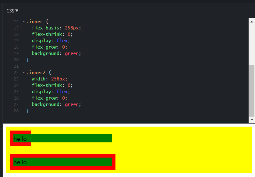
- flex-basis: 100px; 를 하면 원래 너비가 100 이상인 B 의 너비는 유지가 되고 너비가 100 보다 작았던 A 와 C 의 너비는 100px 이 된다.

- width: 100px; 를 하면 모든 아이템의 너비가 100px 로 고정된다.
- flex-basis: 100px; width: 100px; 둘 다 해주면 아래와 같다.
flex-basis 는 main axis 위에서 작동하기 때문에 flex-direction 에 따라 작동방향이 달라짐
flex-direction 이 column 일 때 flex-basis 는 height 가 된다는 뜻
-> 고로 flex-basis 는 width 와 같지 않다
// if you want to disable shrinking, do like this:
div {
    width: 100px;
    flex-shrink: 0;
}

// or like this:
div {
    flex-basis: 100px;
    flex-shrink: 0;
}

// or do like this as recommended by the spec:
.item {
	flex: 1;
	/* flex-grow: 1; flex-shrink: 1; flex-basis: 0%; */
	flex: 1 1 auto;
	/* flex-grow: 1; flex-shrink: 1; flex-basis: auto; */
	flex: 1 500px;
	/* flex-grow: 1; flex-shrink: 1; flex-basis: 500px; */
}- 바로 위의 코드처럼 여백의 비가 아닌, 영역 자체를 원하는 비율로 분할하기 원한다면 flex-basis 를 0 으로 처리하면 된다.
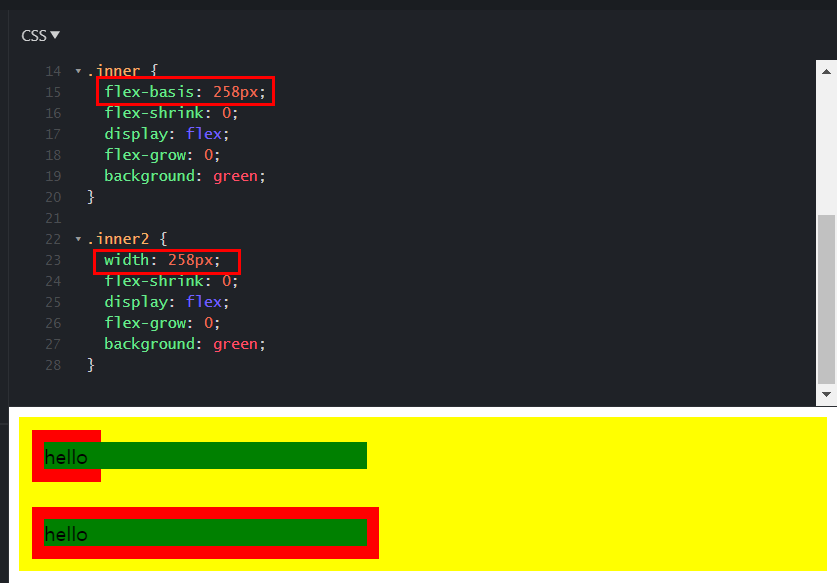
- flex-basis 와 width 의 차이 (아래 내용 이외에도 더 있다)
: width - 부모가 자식의 사이즈를 고려하여 같이 늘어나지만, flex-basis - 부모가 자식의 사이즈를 무시한다. 아래 예를 보자. go to see source code
z-index
z축 정렬을 할 수 있다.
숫자가 클수록 위로 올라온다.
(position 에서의 z-index와 같다)
.item:nth-child(2) {
	z-index: 1;
	transform: scale(2);
}
/* z-index를 설정 안하면 0이므로, 1만 설정해도 나머지 아이템을 보다 위로 올라온다 */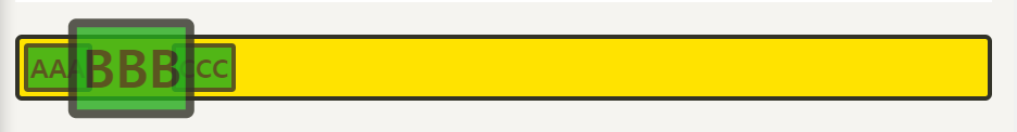
GRID
2.1 Life Before Grid
grid = 격자무늬
flex-box 는 박스들을 옮기기는 쉬운데 grid 를 짜는 것이 어렵다
설정을 잘 못하면 계속 박스들이 원치 않는 위치로 움직임
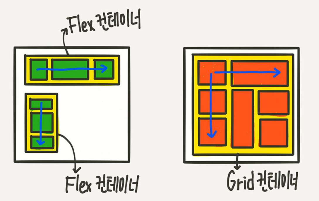
flex 는 column 만 가지고 있어서 1차원 레이아웃인데
grid 는 column 과 row 가 있어서 2차원 레이아웃이다
2.2 CSS Grid Basic Concepts
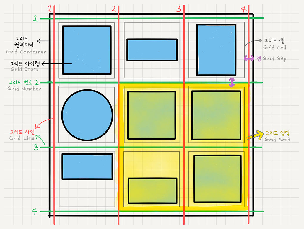
display: grid; <- grid 만드는 법
그리드도 플랙스와 마찬가지로 대부분 father 에 적용한다
그리드는 줄점으로 표시가 된다
grid-template-columns: 20px 10px 348px 45px; 이런 식으로 원하는 개수, 치수의 열을 만들 수 있다
column-gap: 10px; 열 사이에 공간 주기 row gap 도 있고 그냥 gap 쓰면 가로 세로 다 됨
그리드 크기는 안에 있는 컨텐츠(폰트 등)의 사이즈가 디폴트 값인데
column 과 마찬가지로 row의 크기도 grid-template-rows 로 조절 가능
grid-template-columns 의 값을 auto 로 주면 공간을 다 사용하게끔 만듦
2.3 Grid Template Areas
sexy function = repeat(횟수, 크기)
grid-template-columns: repeat(4, 200px);
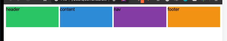
grid-template-areas = "visually design the layout"
grid-template-areas:
"header header header header"
"content content content nav"
"content content content nav"
"footer footer footer footer";

/*
grid-template-areas:
"header header header header"
"content content . nav"
"content content . nav"
"footer footer footer footer";
*/
// 비우려면 . 또는 none 을 사용
grid-template-areas 는 뭐가 header 고 뭐가 content 인지 등을 모르기 때문에
해당 아이템 요소에 .header { grid-area: header; } 이렇게 이름을 설정해줘야 한다(이름값에 따옴표가 없는 것 주의)
여기서 설정하는 이름은 html 의 class name 과 상관 없다
class name 과 같아도 되고 달라도 된다
2.4 Rows and Columns
grid-template-areas 를 안 쓰고 다른 방법으로도 grid layout 을 짤 수 있는데
grid-column-start
grid-column-end
grid-row-start
grid-row-end
여기서 값은 줄의 인덱스를 말한다! stretch 한다고 생각하면 됨
start 를 1로, end 를 3으로 하면 1번 줄부터 3번 줄까지니까 1, 2번 박스가 header 가 되는 것
.header {
grid-column-start: 1;
grid-column-end: 3;
grid-row-start: 1;
grid-row-end: 4;
2.5 Shortcuts
⭐ start 와 end 를 따로 적어주기 귀찮다
grid-column: 1 / 4;
-> / 를 이용해서 시작과 끝 line 을 적어주면 됨
⭐ 끝 line 이 몇인지 모르고 세기도 귀찮다
grid-column: 1 / -1;
-> 뒤에서부터 세면 -1 이 끝 line 이기 때문에 위와 같이 적어주면 첫 라인부터 끝 라인까지라는 뜻이 됨
⭐ 라인 수 세기도 귀찮다
grid-column: span 4;
-> span replaces start point and finishing point
-> span 은 몇 개의 cell 이 포함되어 있는지 나타낸다
-> span 과 /숫자 를 섞어 써도 됨
2.6 Line Naming
- 라인에 이름을 붙일 수도 있다.
/*
grid-template-columns: repeat(4, 100px);
grid-template-rows: repeat(4, 100px);
*/

grid-template-columns: [first-line] 100px [second-line] 100px [third-line] 100px [fourth-line] 100px [fifth-line];
grid-template-rows: repeat(4, 100px [sexy-line]);
위의 grid-template-rows 의 [sexy-line] 은 1번째 줄은 없다
repeat 을 사용했기 때문에 아래랑 같다고 생각하면 됨
grid-template-rows: 100px [sexy-line] 100px [sexy-line] 100px [sexy-line] 100px [sexy-line]
/*
grid-column: 1 / -2;
grid-row: span 2;
*/
grid-column: first-line / fourth-line;
grid-row: sexy-line 1 / sexy-line 3;
2.7 Grid Template
fr = fraction = space available = '그리드 컨테이너 내의' 사용 가능한 공간의 비율
px 를 사용하지 않아도 되며 유연한 레이아웃을 짤 수 있다
(기기마다 화면 크기가 다 다르므로)(%도 마찬가지로 유연)
.grid {
  display: grid;
  gap: 10px;
  // height: 50vh;
  grid-template-columns: repeat(4, 1fr);
  grid-template-rows: repeat(4, 1fr);
}
위의 코드를 입력하면 갑자기 박스가 없어질 것!
왜냐면 화면 가로로는 크기의 한계가 있지만 세로로는 크기의 한계가 없기 때문에
그리드의 높이를 지정하지 않을 경우 row 의 1fr 은 0으로 간주된다.
따라서 꼭! grid 의 height 를 정해줘야 한다. (height: 50vh 처럼)
🤟 그치만 개쿨킹왕짱 shortcut 이 있는데 바로 grid-template
grid-template:
    [header-start] "header header header header" 1fr [header-end]
    [content-start] "content content content nav" 2fr [content-end]
    [footer-start] "footer footer footer footer" 1fr [footer-end]/ 1fr 1fr 1fr 1fr;
row 에 이름을 붙여줄 수 있고 (naming 은 굳이 붙이지 않음)
row 의 높이를 설정할 수 있고
가장 끝 / 뒤에 column 의 너비를 설정할 수 있다
-> 화면 크기가 변해도 비율이 똑같다 fr 때문에!!
2.8 Place Items
justify-items align-items
grid 의 justify-items 기본값은 stretch
grid 는 grid children(item) 을 가지고 있고 grid children(item) 을 늘려서(stretch) 각각의 cell을 채우려고 하는 것
그러니까 기본적으로 item 들은 가로, 세로로 늘려져 있는데!
// 예를 들어 아래와 같이 코딩하면
// text 의 길이만큼 너비가 생기고 cell 의 시작부터 자리를 차지한다.
justify-items: start;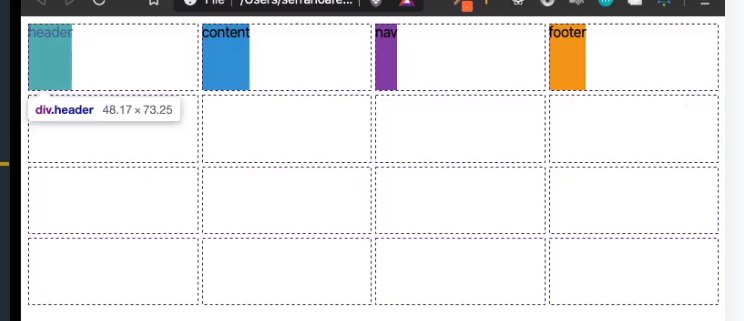
justify-item 와 align-items 로 cell 안 아이템의 배치를 바꿀 수 있다.
⭐ shortcut! place items: (vertical) (horizontal)
place items: stretch center -> 아이템이 세로로는 stretch 가로로는 가운데 정렬된다
⭐ grid 는 그대로고 content(item) 의 배치를 바꾸는 것!
2.9 Place Content
justify content align content
item 은 cell 의 하나 하나를 의미
content 는 전체 그리드를 의미
justify-content 는 그리드를 움직이는 것 (main axis 에서) 기본값: start;
align-content 도 그리드를 움직이는 것 (cross axis 에서) 기본값: start;
place-content: end center; -> 그리드를 vertically end, horizontally center 로 움직이는 것
place-items 는 사각형 하나하나를 움직이는 것/ place-content 는 모든 사각형 다같이 함께
2.10 Auto Columns and Rows
align-self 와 justify-self 는 각각의 element 에만 영향을 주는 것
place-self 는 이의 shortcut!
ex) place-self: (vertical) (horizontal) -> place-self: end center;
grid-auto-rows (contents 의 개수가 row 보다 많아지면 기본값은 row 가 계속 생기는 것 column 이 아니라)
우리가 정한 row 의 개수보다 content 의 양이 많을 때 grid-auto-rows 를 설정해서 자동으로 content 의 grid 를 생성해준다 ex) grid-auto-rows: 100px;
grid-auto-flow 는 자동으로 생성되는 grid 의 방향을 바꿔준다 flex-direction 과 비슷
grid-auto-flow: row 혹은 grid-auto-flow: column 이렇게 바꿔준다
이후에 grid-auto-columns 를 설정해주면 끝
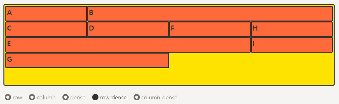
grid-auto-flow 값을 dense 로 하면 아래처럼 된다
2.11 minmax
content 크기의 최소, 최대값을 설정하고 싶을 때 사용
ex) grid-template-columns: repeat(5, minmax(100px, 1fr));
2.12 auto-fit auto-fill
really important in responsive design
아이템의 개수를 모를 때 유용하다
auto-fill 은 빈공간에 우리가 설정한 값(너비) 만큼 최대한 많은 column 을 생성하는 것
auto-fill fills the column as many as it can even if it's empty
auto-fit stretches the element and make the row fits (don't create empty spaces)
auto-fit: 유동적인 사이즈 / auto-fill: 정확한 사이즈
repeat 안에서만 쓴다
.grid: first-child {
grid-template-columns: repeat(auto-fill, 100px);
}
.grid: last-child {
grid-template-columns: repeat(auto-fit, 100px);
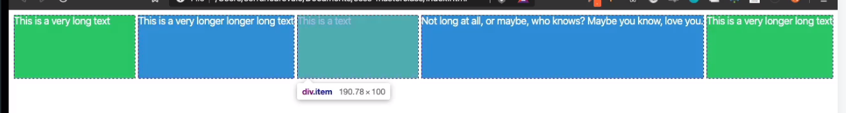
}2.13 min-content max-content
min-content 와 max-content 로 content 의 크기를 디자인 할 수 있다
예를 들어 min-content 를 설정하게 되면 content 가 작아질 수 있는 만큼 작아진다는 뜻
grid-template-columns: max-content min-content로 설정하고 box 안에 '내 이름은 오승하' 라고 적으면
1열의 너비는 '내 이름은 오승하' 만큼의 너비가 되고
2열의 너비는 아래와 같이 보일 것
내 이
름은
오승하
이런 식으로 content 를 나타낼 수 있는 최소한의 너비로 보여준다
max-content 는 content 가 필요한 만큼 box 가 커지는 것
min-content 는 content 가 작아질 수 있는 만큼 box 가 작아지는 것
개쿨한 거: 우리가 배운 거 결합하면 개쿨해짐
grid-template-columns: repeat(5, minmax(min-content, 1fr);
auto-fill, auto-fit 이랑 결합해도 쿨해짐
SCSS
3.0 CSS Preprocessors and Set Up
SCSS = CSS preprocessor
sexy 한 css 를 compile 해서 일반 css 처럼 보이게 하는 것
scss 가 sass 를 위한 공식적인 syntax 로 릴리즈 된 것
stylus 나 less 도 preprocessor
css preprocessor 가 업계 표준이 되고 있고 굉장히 소수만 순수 css 를 이용하고 있다
gulp 는 compile 하거나 transform 해주는 nodeJS package
3.1 Variables and Nesting
variables 만드는 건 쉽다
scss 폴더 안에 (variables name).scss 를 만들어주면 됨
를 붙이는 이유는 _ 가 붙은 파일은 css 로 변환하고 싶지 않기 때문 (don't want to translate or compile)
variable 파일에서 $(variable name): (value); 적으면 끝
그리고 난 뒤에 scss 파일에서 @import "_variables"; 이렇게 해주면 끝
scss 를 이용하면 nesting 도 가능한데 -> 코드의 가독성과 정확성을 높여주기 때문에 꼭 사용해라
3.2 Mixins
_mixin.scss 파일을 src / scss 폴더 내에 만들어준다
@mixin (mixin name)($color) {
text-decoration: none;
display: block;
color: $color;
}
이렇게 mixin 을 만들고
scss 에서 @import "_mixins" 해준다 (임포트)
예를 들어 h1 tag 에 mixin 적용한다하면
@include (mixin name)(); 하면 됨
