7.0 Introduction
Frame Motion을 써서 아름다운 애니메이션을 만드는 법을 배워보자
💡 Frame Motion : React.js용 라이브러리
Production-Ready Animation Library for React | Framer Motion
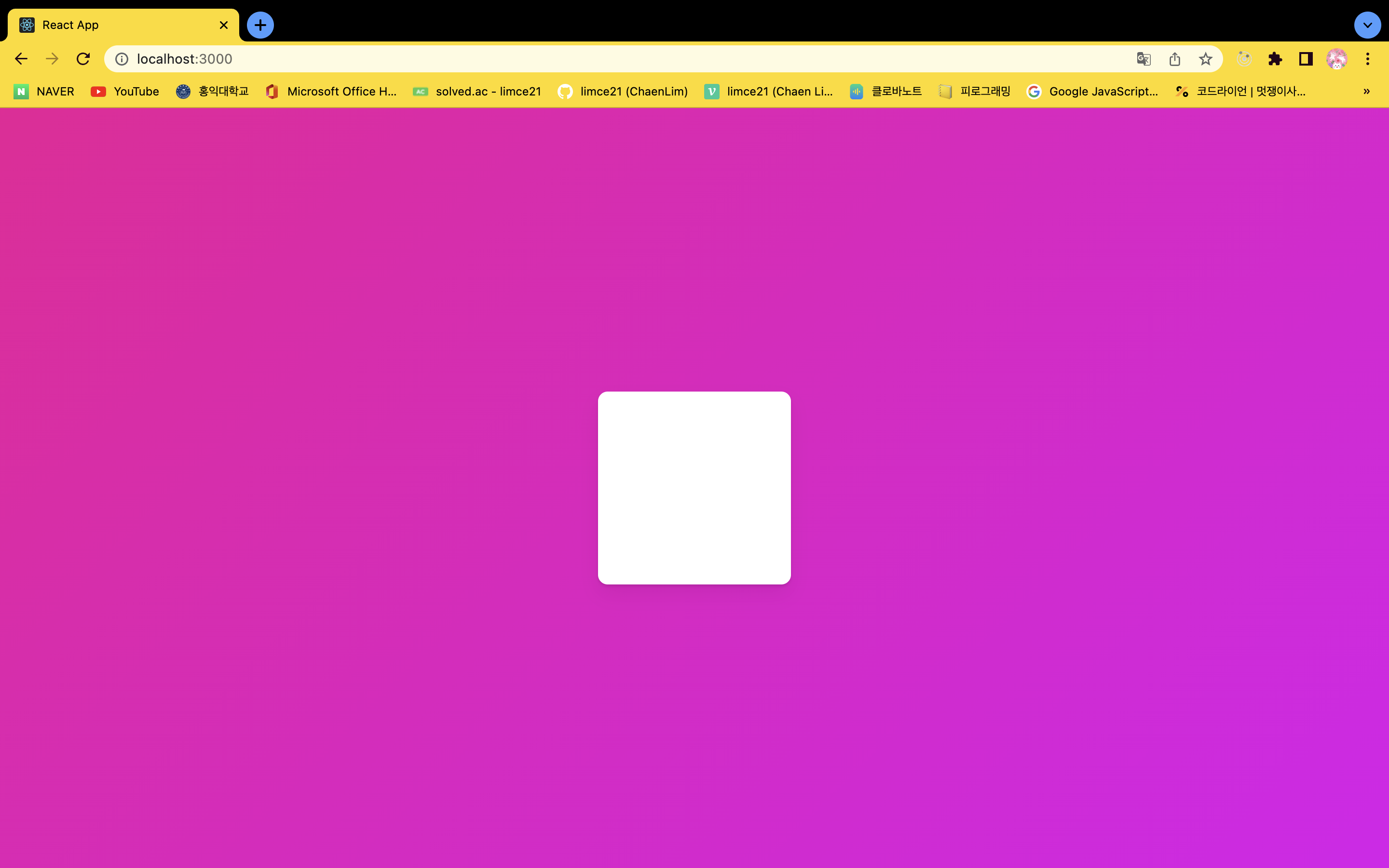
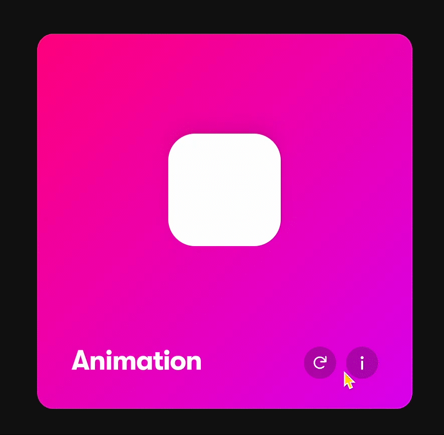
세팅하자
1. App.tsx
```tsx
import styled from 'styled-components';

const Wrapper = styled.div`
	height: 100vh;
	width: 100vw;
	max-width: 680px;
	display: flex;
	justify-content: center;
	align-items: center;
`;

const Box = styled.div`
	width: 200px;
	height: 200px;
	background-color: white;
	border-radius: 10px;
	box-shadow: 0 2px 3px rgba(0, 0, 0, 0.1), 0 10px 20px rgba(0, 0, 0, 0.06);
`;

function App() {
	return (
		<Wrapper>
			<Box />
		</Wrapper>
	);
}
export default App;
```
2. Index.tsx
```tsx
import React from 'react';
import ReactDOM from 'react-dom';
import App from './App';
import { RecoilRoot } from 'recoil';
import { createGlobalStyle, ThemeProvider } from 'styled-components';
import { darkTheme } from './theme';

const GlobalStyle = createGlobalStyle`
	@import url('https://fonts.googleapis.com/css2?family=Source+Sans+Pro:wght@300;400&display=swap');

	*[hidden] {
		display: none;
	}

	html, body, div, span, applet, object, iframe,
	h1, h2, h3, h4, h5, h6, p, blockquote, pre,
	a, abbr, acronym, address, big, cite, code,
	del, dfn, em, img, ins, kbd, q, s, samp,
	small, strike, strong, sub, sup, tt, var,
	b, u, i, center,
	dl, dt, dd, menu, ol, ul, li,
	fieldset, form, label, legend,
	table, caption, tbody, tfoot, thead, tr, th, td,
	article, aside, canvas, details, embed,
	figure, figcaption, footer, header, hgroup,
	main, menu, nav, output, ruby, section, summary,
	time, mark, audio, video {
		margin: 0;
		padding: 0;
		border: 0;
		font-size: 100%;
		font: inherit;
		vertical-align: baseline;
	}

	body {
	line-height: 1;
	}
	menu, ol, ul {
	list-style: none;
	}
	blockquote, q {
	quotes: none;
	}
	blockquote:before, blockquote:after,
	q:before, q:after {
	content: '';
	content: none;
	}
	table {
	border-collapse: collapse;
	border-spacing: 0;
	}

	*{
		boxsizing: border-box;
	}

	body{
		font-weight: 300;
		font-family: 'Source Sans Pro', sans-serif;
		color: black;
		line-height: 1.2;
		background:linear-gradient(135deg,#e09,#d0e);
	}

	a{
		text-decoration: none;
		color: inherit;
	}
`;

ReactDOM.render(
	<React.StrictMode>
		<RecoilRoot>
			<ThemeProvider theme={darkTheme}>
				<GlobalStyle />
				<App />
			</ThemeProvider>
		</RecoilRoot>
	</React.StrictMode>,
	document.getElementById('root')
);
```
3. styled.d.ts
```tsx
import 'styled-components';

declare module 'styled-components' {
	export interface DefaultTheme {}
}
```
4. theme.ts
```tsx
import { DefaultTheme } from 'styled-components';

export const darkTheme: DefaultTheme = {};
```
세팅 완료!
7.1 Installation
Motion을 설치해보고 Motion으로 애니메이션을 만들어보자
1. Framer Motion을 설치해보자
⇒ npm install framer-motion
2. Framer Motion을 import 해보자
import { motion } from 'framer-motion';💡 Framer Motion은 HTML 태그 앞에 motion. 을 붙여야 한다!
⇒ 그냥 div 사용 불가능!
⇒ <motion.div></motion.div> 로 사용해야 한다.
7.2 Basic Animations
❓ 스타일 컴포넌트를 어떻게 애니메이트 시킬 수 있을까?애니메이션을 만들어보며 애니메이트 된 스타일 컴포넌트를 어떻게 가지는 지를 배워보자
⇒ 컴포넌트 생성 시에 div라면 styled.div가 아니라 styled(motion.div)로 생성
const Box = styled(motion.div)`
	width: 200px;
	height: 200px;
	background-color: white;
	border-radius: 10px;
	box-shadow: 0 2px 3px rgba(0, 0, 0, 0.1), 0 10px 20px rgba(0, 0, 0, 0.06);
`;
1. animate Prop을 써보자
 function App() {
 	return (
 		<Wrapper>
 			<Box animate={{ borderRadius: '100px' }} />
 			<motion.div></motion.div>
 		</Wrapper>
 	);
} 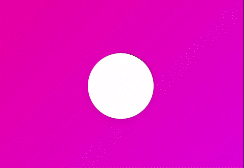
⇒ 새로 고침 시 사각형에서 원으로 바뀐다.2. transition Prop도 함께 써보자
 function App() {
 	return (
 		<Wrapper>
 			<Box transition={{ duration: 3 }} animate={{ borderRadius: '100px' }} />
 			<motion.div></motion.div>
 		</Wrapper>
 	);
} 
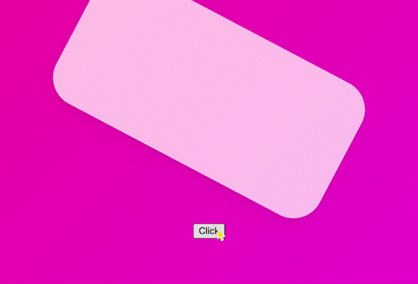
아래 애니메이션을 만들어보자!
function App() {
	return (
		<Wrapper>
			<Box initial={{ scale: 0 }} animate={{ scale: 1, rotateZ: 360 }} />
			<motion.div></motion.div>
		</Wrapper>
	);
}
initial: Element의 초기 상태

💡 애니메이션이 약간 튕기는 현상?
: 모든 애니메이션에 spring이 기본적으로 달려 있기 때문이다.
⇒ transition의 기본타입이 spring
⇒ 없애보자!
function App() {
	return (
		<Wrapper>
			<Box transition={{ type: 'tween' }} initial={{ scale: 0 }} animate={{ scale: 1, rotateZ: 360 }} />
			<motion.div></motion.div>
		</Wrapper>
	);
}
spring의 여러 효과들
stiffness: 경직성damping: 반동력elasticity: 탄력성mass: 물체의 질량
완성!
8.3 Variants part One
Variants를 배워보자
💡 Variants
- 코드를 깔끔하게 해준다.
- 많은 애니메이션들을 하나로 연결시켜준다.
1. Variants를 만들어보자
  const myVars = {
  	start: { scale: 0 },
  	end: { scale: 1, rotateZ: 360, transition: { type: 'spring', delay: 0.5 } }
  };
2. variants Prop을 사용하자
function App() {
return (
<Wrapper>
<Box variants={myVars} initial='start' animate='end' />
<motion.div></motion.div>
</Wrapper>
);
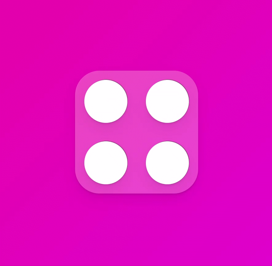
}7.4 Variants part Two
아래 애니메이션을 만들어보자

1. Box 스타일 변경
  const Box = styled(motion.div)`
  	width: 200px;
  	height: 200px;
  	display: grid;
  	grid-template-columns: repeat(2, 1fr);
  	background-color: rgba(255, 255, 255, 0.2);
  	border-radius: 40px;
  	box-shadow: 0 2px 3px rgba(0, 0, 0, 0.1), 0 10px 20px rgba(0, 0, 0, 0.06);
  `;
2. Circle 컴포넌트 생성
   const Circle = styled(motion.div)`
   	background-color: white;
   	height: 70px;
   	width: 70px;
   	border-radius: 35px;
   	place-self: center;
   	box-shadow: 0 2px 3px rgba(0, 0, 0, 0.1), 0 10px 20px rgba(0, 0, 0, 0.06);
   `;
3. Variants를 사용하자
    const boxVariants = {
    	start: {
    		opacity: 0,
    		scale: 0.5
    	},
    	end: {
    		opacity: 1,
    		scale: 1,
    		transition: {
    			type: 'spring',
    			duration: 0.5,
    			bounce: 0.5
    		}
    	}
    };

    function App() {
    	return (
    		<Wrapper>
    			<Box variants={boxVariants} initial='start' animate='end'>
    				<Circle />
    				<Circle />
    				<Circle />
    				<Circle />
    			</Box>
    		</Wrapper>
    	);
    }
4. circleVariants를 만들어 사용하자
💡 자식 Variants는 부모 Variants의 initial과 animate 값을 상속한다.
const circleVariants = {
  start: {
    opacity: 0,
    y: 10
  },
  end: {
    opacity: 1,
    y: 0
  }
    };
function App() {
  return (
    <Wrapper>
      <Box variants={boxVariants} initial='start' animate='end'>
        <Circle variants={circleVariants} />
        <Circle variants={circleVariants} />
        <Circle variants={circleVariants} />
        <Circle variants={circleVariants} />
      </Box>
    </Wrapper>
  );
}
5. 원마다 딜레이를 다르게 줘보자
💡 부모 variants에서 적용
- delayChildren : 자식에게 딜레이를 동일하게 적용
- staggerChildren : 딜레이를 자식마다 다르게 적용
 const boxVariants = {
 	start: {
 		opacity: 0,
 		scale: 0.5
 	},
 	end: {
 		opacity: 1,
 		scale: 1,
 		transition: {
 			type: 'spring',
 			duration: 0.5,
 			bounce: 0.5,
 			delayChildren: 0.5,
 			staggerChildren: 0.2
 		}
 	}
 };
완성!
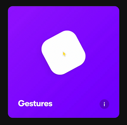
7.5 Gestures part One
마우스의 상태에 따른 몇몇 이벤트를 listening 하는 방법을 배워보자
아래 애니메이션을 만들어보자 - 1
1. while prop을 사용해보자
 function App() {
 	return (
 		<Wrapper>
 			<Box whileHover={{ scale: 1.5, rotateZ: 90 }} whileTap={{ scale: 1, borderRadius: '100px' }} />
 		</Wrapper>
 	);
 }
2. Variants로 변경하자
 const boxVariants = {
 	hover: { scale: 1.5, rotateZ: 90 },
 	click: { scale: 1, borderRadius: '100px' }
 };

 function App() {
 	return (
 		<Wrapper>
 			<Box variants={boxVariants} whileHover='hover' whileTap='click' />
 		</Wrapper>
 	);
 }
완성
아래 애니메이션을 만들어보자 - 2
1. 제한 없는 드래깅을 먼저 만들어보자
  function App() {
  	return (
  		<Wrapper>
  			<Box drag variants={boxVariants} whileHover='hover' whileTap='click' />
  		</Wrapper>
  	);
  }
2. 드래깅 시에 색 변화 추가
💡 색은 rgb 값으로 해야 애니메이트 된다!
 const boxVariants = {
 	hover: { scale: 1.5, rotateZ: 90 },
 	click: { scale: 1, borderRadius: '100px' },
 	drag: { backgroundColor: 'rgb(46, 204, 113)', transition: { duration: 1 } }
 };

 function App() {
 	return (
 		<Wrapper>
 			<Box drag variants={boxVariants} whileHover='hover' whileTap='click' whileDrag='drag' />
 		</Wrapper>
 	);
 }
완성!
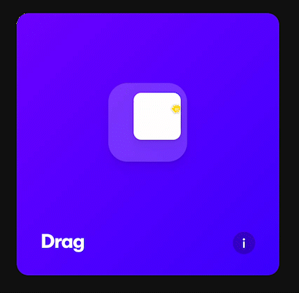
7.6 Gestures part Two
드래그에
제약을 주자
1. 제약을 추가하자
💡 dragConstraints : 드래깅 허용 영역을 설정
2. 제한 영역 박스 컴포넌트를 추가하자
 const BiggerBox = styled.div`
 	width: 600px;
 	height: 600px;
 	background-color: rgba(255, 255, 255, 0.4);
 	border-radius: 40px;
 	display: flex;
 	justify-content: center;
 	align-items: center;
 `;

 function App() {
 	return (
 		<Wrapper>
 			<BiggerBox>
 				<Box drag dragConstraints={{}} variants={boxVariants} whileHover='hover' whileTap='click' />
 			</BiggerBox>
 		</Wrapper>
 	);
 }
3. 제한 영역에서만 드래그 되게 설정하자
a. 직접 수치를 계산
        function App() {
        	return (
        		<Wrapper>
        			<BiggerBox>
        				<Box drag dragConstraints={{ top: -200, bottom: 200, left: -200, right: 200 }} variants={boxVariants} whileHover='hover' whileTap='click' />
        			</BiggerBox>
        		</Wrapper>
        	);
        }
b. ref를 설정
        import { useRef } from 'react';

        function App() {
        	const biggerBoxRef = useRef<HTMLDivElement>(null);

        	return (
        		<Wrapper>
        			<BiggerBox ref={biggerBoxRef}>
        				<Box drag dragConstraints={biggerBoxRef} variants={boxVariants} whileHover='hover' whileTap='click' />
        			</BiggerBox>
        		</Wrapper>
        	);
        }
완성!
4. Box를 중앙으로 되돌려보자
a. dragSnapToOrigin 사용
💡 dragSnapToOrigin : 원래 위치로 돌아가게 함
b. dragElastic 사용
💡 dragElastic (0과 1 사이의 값)
- 0 : 박스 영역 안에서만 움직일 수 있음
- 1 : 사용자 맘대로 움직임
완성!
7.7 MotionValues part One
MotionValue를 배워보자
💡 MotionValue : 사용자의 element 드래그 값을 계속 추적해줌
- MotionValue는 상태로 저장되지 않는다! 리렌더링 X.
- 보는 법 :
useEffect()
import { motion, useMotionValue } from 'framer-motion';

function App() {
	const x = useMotionValue(0);

	return (
		<Wrapper>
			<Box style={{ x }} drag='x' dragSnapToOrigin />
		</Wrapper>
	);
}
7.8 MotionValues part Two
useTransform을 사용해 사각형을 드래그 시 크기가 커지거나 작게 해보자
💡 useTransform(특정 입력값, 특정 입력값의 범위 배열, 특정 값의 범위에 따른 결과 값 배열)
- input과 output은 반드시 같은 배열 크기를 가져야 한다.
1. useTransform() 변수를 만든다.
const scale = useTransform(x, [-800, 0, 800], [2, 1, 0.1]);2. 변수를 style과 연결하자
 return (
 		<Wrapper>
 			<Box style={{ x, scale: scale }} drag='x' dragSnapToOrigin />
 		</Wrapper>
 	);
완성!

7.9 MotionValues part Three
색깔을
transform해보자
1. scale 대신 rotate를 추가해주자
 function App() {
 	const x = useMotionValue(0);
 	const rotateZ = useTransform(x, [-800, 800], [-360, 360]);

 	return (
 		<Wrapper>
 			<Box style={{ x, rotateZ }} drag='x' dragSnapToOrigin />
 		</Wrapper>
 	);
 }
2. Wrapper를 애니메이트 할 수 있게 변경하자
 const Wrapper = styled(motion.div)`
 	height: 100vh;
 	width: 100vw;
 	display: flex;
 	justify-content: center;
 	align-items: center;
 `;
3. gradient
 function App() {
 	const x = useMotionValue(0);
 	const rotateZ = useTransform(x, [-800, 800], [-360, 360]);
 	const gradient = useTransform(x, [-800, 800], ['linear-gradient(135deg,rgb(0,210,238),rgb(0,83,238))', 'linear-gradient(135deg,rgb(0,238, 155),rgb(238,178,0))']);

 	return (
 		<Wrapper style={{ background: gradient }}>
 			<Box style={{ x, rotateZ }} drag='x' dragSnapToOrigin />
 		</Wrapper>
 	);
 }
스크롤이 될 때 애니메이션을 추가하자
💡 useViewportScroll
- scrollYProgress : Y축 진행도 (0~100)
const { scrollYProgress } = useViewportScroll();
const scale = useTransform(scrollYProgress, [0, 1], [1, 5]);
return (
		<Wrapper style={{ background: gradient }}>
			<Box style={{ x, rotateZ, scale }} drag='x' dragSnapToOrigin />
		</Wrapper>
);
완성!
7.10 SVG Animation
아래 svg 애니메이션을 만들어보자
1. svg를 가져오자
 function App() {
 	return (
 		<Wrapper>
 			<svg focusable='false' xmlns='http://www.w3.org/2000/svg' viewBox='0 0 448 512'>
 				<path d='M224 373.12c-25.24-31.67-40.08-59.43-45-83.18-22.55-88 112.61-88 90.06 0-5.45 24.25-20.29 52-45 83.18zm138.15 73.23c-42.06 18.31-83.67-10.88-119.3-50.47 103.9-130.07 46.11-200-18.85-200-54.92 0-85.16 46.51-73.28 100.5 6.93 29.19 25.23 62.39 54.43 99.5-32.53 36.05-60.55 52.69-85.15 54.92-50 7.43-89.11-41.06-71.3-91.09 15.1-39.16 111.72-231.18 115.87-241.56 15.75-30.07 25.56-57.4 59.38-57.4 32.34 0 43.4 25.94 60.37 59.87 36 70.62 89.35 177.48 114.84 239.09 13.17 33.07-1.37 71.29-37.01 86.64zm47-136.12C280.27 35.93 273.13 32 224 32c-45.52 0-64.87 31.67-84.66 72.79C33.18 317.1 22.89 347.19 22 349.81-3.22 419.14 48.74 480 111.63 480c21.71 0 60.61-6.06 112.37-62.4 58.68 63.78 101.26 62.4 112.37 62.4 62.89.05 114.85-60.86 89.61-130.19.02-3.89-16.82-38.9-16.82-39.58z' />
 			</svg>
 		</Wrapper>
 	);
 }
2. Svg 컴포넌트를 만들어준다
 const Svg = styled.svg`
 	width: 300px;
 	height: 300px;
 `;

 function App() {
 	return (
 		<Wrapper>
 			<Svg focusable='false' xmlns='http://www.w3.org/2000/svg' viewBox='0 0 448 512'>
 				<path
 					stroke='white'
 					strokeWidth='2'
 					fill='transparent'
 					d='M224 373.12c-25.24-31.67-40.08-59.43-45-83.18-22.55-88 112.61-88 90.06 0-5.45 24.25-20.29 52-45 83.18zm138.15 73.23c-42.06 18.31-83.67-10.88-119.3-50.47 103.9-130.07 46.11-200-18.85-200-54.92 0-85.16 46.51-73.28 100.5 6.93 29.19 25.23 62.39 54.43 99.5-32.53 36.05-60.55 52.69-85.15 54.92-50 7.43-89.11-41.06-71.3-91.09 15.1-39.16 111.72-231.18 115.87-241.56 15.75-30.07 25.56-57.4 59.38-57.4 32.34 0 43.4 25.94 60.37 59.87 36 70.62 89.35 177.48 114.84 239.09 13.17 33.07-1.37 71.29-37.01 86.64zm47-136.12C280.27 35.93 273.13 32 224 32c-45.52 0-64.87 31.67-84.66 72.79C33.18 317.1 22.89 347.19 22 349.81-3.22 419.14 48.74 480 111.63 480c21.71 0 60.61-6.06 112.37-62.4 58.68 63.78 101.26 62.4 112.37 62.4 62.89.05 114.85-60.86 89.61-130.19.02-3.89-16.82-38.9-16.82-39.58z'
 				/>
 			</Svg>
 		</Wrapper>
 	);
 }
3. 애니메이션을 추가하자
 function App() {
 	return (
 		<Wrapper>
 			<Svg focusable='false' xmlns='http://www.w3.org/2000/svg' viewBox='0 0 448 512'>
 				<motion.path
 					initial={{
 						pathLength: 0,
 						fill: 'rgba(255,255,255,0)'
 					}}
 					animate={{
 						pathLength: 1,
 						fill: 'rgba(255,255,255,1)'
 					}}
 					transition={{
 						duration: 5
 					}}
 					stroke='white'
 					strokeWidth='2'
 					d='M224 373.12c-25.24-31.67-40.08-59.43-45-83.18-22.55-88 112.61-88 90.06 0-5.45 24.25-20.29 52-45 83.18zm138.15 73.23c-42.06 18.31-83.67-10.88-119.3-50.47 103.9-130.07 46.11-200-18.85-200-54.92 0-85.16 46.51-73.28 100.5 6.93 29.19 25.23 62.39 54.43 99.5-32.53 36.05-60.55 52.69-85.15 54.92-50 7.43-89.11-41.06-71.3-91.09 15.1-39.16 111.72-231.18 115.87-241.56 15.75-30.07 25.56-57.4 59.38-57.4 32.34 0 43.4 25.94 60.37 59.87 36 70.62 89.35 177.48 114.84 239.09 13.17 33.07-1.37 71.29-37.01 86.64zm47-136.12C280.27 35.93 273.13 32 224 32c-45.52 0-64.87 31.67-84.66 72.79C33.18 317.1 22.89 347.19 22 349.81-3.22 419.14 48.74 480 111.63 480c21.71 0 60.61-6.06 112.37-62.4 58.68 63.78 101.26 62.4 112.37 62.4 62.89.05 114.85-60.86 89.61-130.19.02-3.89-16.82-38.9-16.82-39.58z'
 				/>
 			</Svg>
 		</Wrapper>
 	);
 }
4. 애니메이션을 variant로 빼주자
 const Svg = styled.svg`
 	width: 300px;
 	height: 300px;
 	path {
 		stroke: white;
 		stroke-width: 2;
 	}
 `;

 const svg = {
 	start: { pathLength: 0, fill: 'rgba(255,255,255,0)' },
 	end: {
 		fill: 'rgba(255,255,255,1)',
 		pathLength: 1,
 		transition: {
 			duration: 5
 		}
 	}
 };

 function App() {
 	return (
 		<Wrapper>
 			<Svg focusable='false' xmlns='http://www.w3.org/2000/svg' viewBox='0 0 448 512'>
 				<motion.path
 					variants={svg}
 					initial='start'
 					animate='end'
 					d='M224 373.12c-25.24-31.67-40.08-59.43-45-83.18-22.55-88 112.61-88 90.06 0-5.45 24.25-20.29 52-45 83.18zm138.15 73.23c-42.06 18.31-83.67-10.88-119.3-50.47 103.9-130.07 46.11-200-18.85-200-54.92 0-85.16 46.51-73.28 100.5 6.93 29.19 25.23 62.39 54.43 99.5-32.53 36.05-60.55 52.69-85.15 54.92-50 7.43-89.11-41.06-71.3-91.09 15.1-39.16 111.72-231.18 115.87-241.56 15.75-30.07 25.56-57.4 59.38-57.4 32.34 0 43.4 25.94 60.37 59.87 36 70.62 89.35 177.48 114.84 239.09 13.17 33.07-1.37 71.29-37.01 86.64zm47-136.12C280.27 35.93 273.13 32 224 32c-45.52 0-64.87 31.67-84.66 72.79C33.18 317.1 22.89 347.19 22 349.81-3.22 419.14 48.74 480 111.63 480c21.71 0 60.61-6.06 112.37-62.4 58.68 63.78 101.26 62.4 112.37 62.4 62.89.05 114.85-60.86 89.61-130.19.02-3.89-16.82-38.9-16.82-39.58z'
 				/>
 			</Svg>
 		</Wrapper>
 	);
 }
5. fill 애니메이션만 duration을 1초로 변경해보자 ⇒ 각각 다르게 하려면 prop으로 넘겨줘야함!
 const svg = {
 	start: { pathLength: 0, fill: 'rgba(255,255,255,0)' },
 	end: {
 		fill: 'rgba(255,255,255,1)',
 		pathLength: 1
 	}
 };

 function App() {
 	return (
 		<Wrapper>
 			<Svg focusable='false' xmlns='http://www.w3.org/2000/svg' viewBox='0 0 448 512'>
 				<motion.path
 					variants={svg}
 					initial='start'
 					animate='end'
 					transition={{
 						default: { duration: 5 },
 						fill: { duration: 1, delay: 3 }
 					}}
 					d='M224 373.12c-25.24-31.67-40.08-59.43-45-83.18-22.55-88 112.61-88 90.06 0-5.45 24.25-20.29 52-45 83.18zm138.15 73.23c-42.06 18.31-83.67-10.88-119.3-50.47 103.9-130.07 46.11-200-18.85-200-54.92 0-85.16 46.51-73.28 100.5 6.93 29.19 25.23 62.39 54.43 99.5-32.53 36.05-60.55 52.69-85.15 54.92-50 7.43-89.11-41.06-71.3-91.09 15.1-39.16 111.72-231.18 115.87-241.56 15.75-30.07 25.56-57.4 59.38-57.4 32.34 0 43.4 25.94 60.37 59.87 36 70.62 89.35 177.48 114.84 239.09 13.17 33.07-1.37 71.29-37.01 86.64zm47-136.12C280.27 35.93 273.13 32 224 32c-45.52 0-64.87 31.67-84.66 72.79C33.18 317.1 22.89 347.19 22 349.81-3.22 419.14 48.74 480 111.63 480c21.71 0 60.61-6.06 112.37-62.4 58.68 63.78 101.26 62.4 112.37 62.4 62.89.05 114.85-60.86 89.61-130.19.02-3.89-16.82-38.9-16.82-39.58z'
 				/>
 			</Svg>
 		</Wrapper>
 	);
 }
완성!
7.11 AnimatePresence
AnimatePresence를 배워보자
💡 AnimatePresence: React js App에서 사라지는 component를 애니메이트한다.
1. App.tsx 사전 세팅
 import styled from 'styled-components';
 import { motion, useMotionValue, useTransform, useViewportScroll } from 'framer-motion';

 const Wrapper = styled(motion.div)`
 	height: 100vh;
 	width: 100vw;
 	display: flex;
 	justify-content: center;
 	align-items: center;
 `;

 const Box = styled(motion.div)`
 	width: 400px;
 	height: 200px;
 	background-color: rgba(255, 255, 255, 1);
 	border-radius: 40px;
 	position: absolute;
 	top: 100px;
 	box-shadow: 0 2px 3px rgba(0, 0, 0, 0.1), 0 10px 20px rgba(0, 0, 0, 0.06);
 `;

 function App() {
 	return (
 		<Wrapper>
 			<button>Click</button>
 			<Box />
 		</Wrapper>
 	);
 }
export default App; 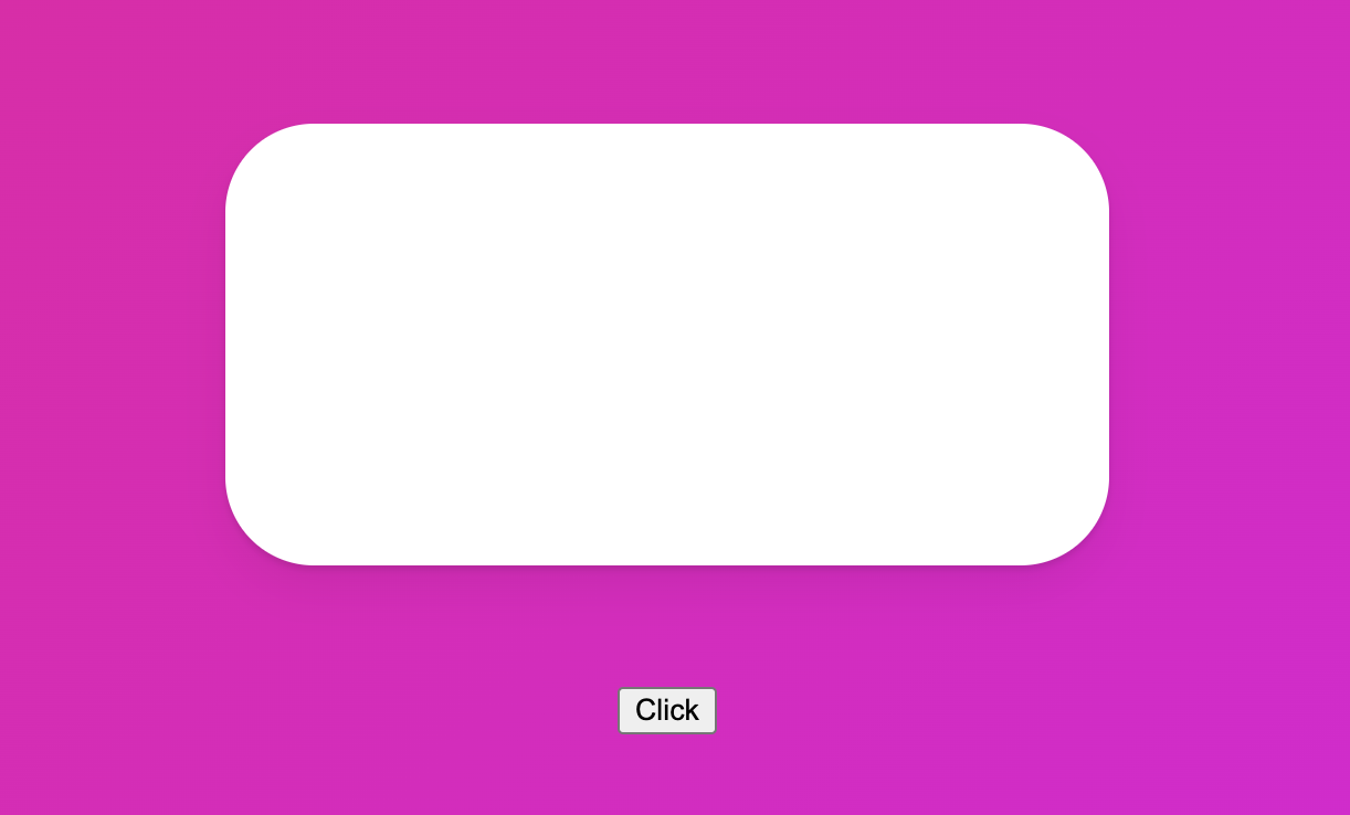
2. 토글 버튼을 만들어주자
 function App() {
 	const [showing, setShowing] = useState(false);
 	const toggleShowing = () => setShowing((prev) => !prev);
 	return (
 		<Wrapper>
 			<button onClick={toggleShowing}>Click</button>
 			{showing ? <Box /> : null}
 		</Wrapper>
 	);
 }
3. AnimatePresence를 사용해 토글할 때 애니메이션을 주자
💡 AnimatePresence의 규칙
- visible 상태여야 한다.
- 내부에 condition(조건문)이 있어야한다.
    import { motion, AnimatePresence } from 'framer-motion';

    function App() {
    	const [showing, setShowing] = useState(false);
    	const toggleShowing = () => setShowing((prev) => !prev);
    	return (
    		<Wrapper>
    			<button onClick={toggleShowing}>Click</button>
    			<AnimatePresence>{showing ? <Box  /> : null}</AnimatePresence>
    		</Wrapper>
    	);
    }
4. Box에 애니메이션을 주자
💡 exit prop : element가 사라질 때 어떤 애니메이션을 발생시킬 지를 정해주는 prop
 const boxVariants = {
 	initial: {
 		opacity: 0,
 		scale: 0
 	},
 	visible: {
 		opacity: 1,
 		scale: 1,
 		rotateZ: 360
 	},
 	leaving: {
 		opacity: 0,
 		y: 20
 	}
 };

 function App() {
 	const [showing, setShowing] = useState(false);
 	const toggleShowing = () => setShowing((prev) => !prev);
 	return (
 		<Wrapper>
 			<button onClick={toggleShowing}>Click</button>
 			<AnimatePresence>{showing ? <Box variants={boxVariants} initial='initial' animate='visible' exit='leaving' /> : null}</AnimatePresence>
 		</Wrapper>
 	);
 }
완성!
7.12 Slider part One
AnimatePresence를 사용해 슬라이드를 만들어보자
1. 세팅하자
 import styled from 'styled-components';
 import { motion, AnimatePresence } from 'framer-motion';
 import { useState } from 'react';

 const Wrapper = styled(motion.div)`
 	height: 100vh;
 	width: 100vw;
 	display: flex;
 	justify-content: center;
 	align-items: center;
 	flex-direction: column;
 `;

 const Box = styled(motion.div)`
 	width: 400px;
 	height: 200px;
 	background-color: rgba(255, 255, 255, 1);
 	border-radius: 40px;
 	position: absolute;
 	top: 100px;
 	box-shadow: 0 2px 3px rgba(0, 0, 0, 0.1), 0 10px 20px rgba(0, 0, 0, 0.06);
 	display: flex;
 	justify-content: center;
 	align-items: center;
 `;

 function App() {
 	return (
 		<Wrapper>
 			<AnimatePresence>
 				{[1, 2, 3, 4, 5, 6, 7, 8, 9, 10].map((i) => (
 					<Box key={i}>{i}</Box>
 				))}
 			</AnimatePresence>
 		</Wrapper>
 	);
 }
 export default App;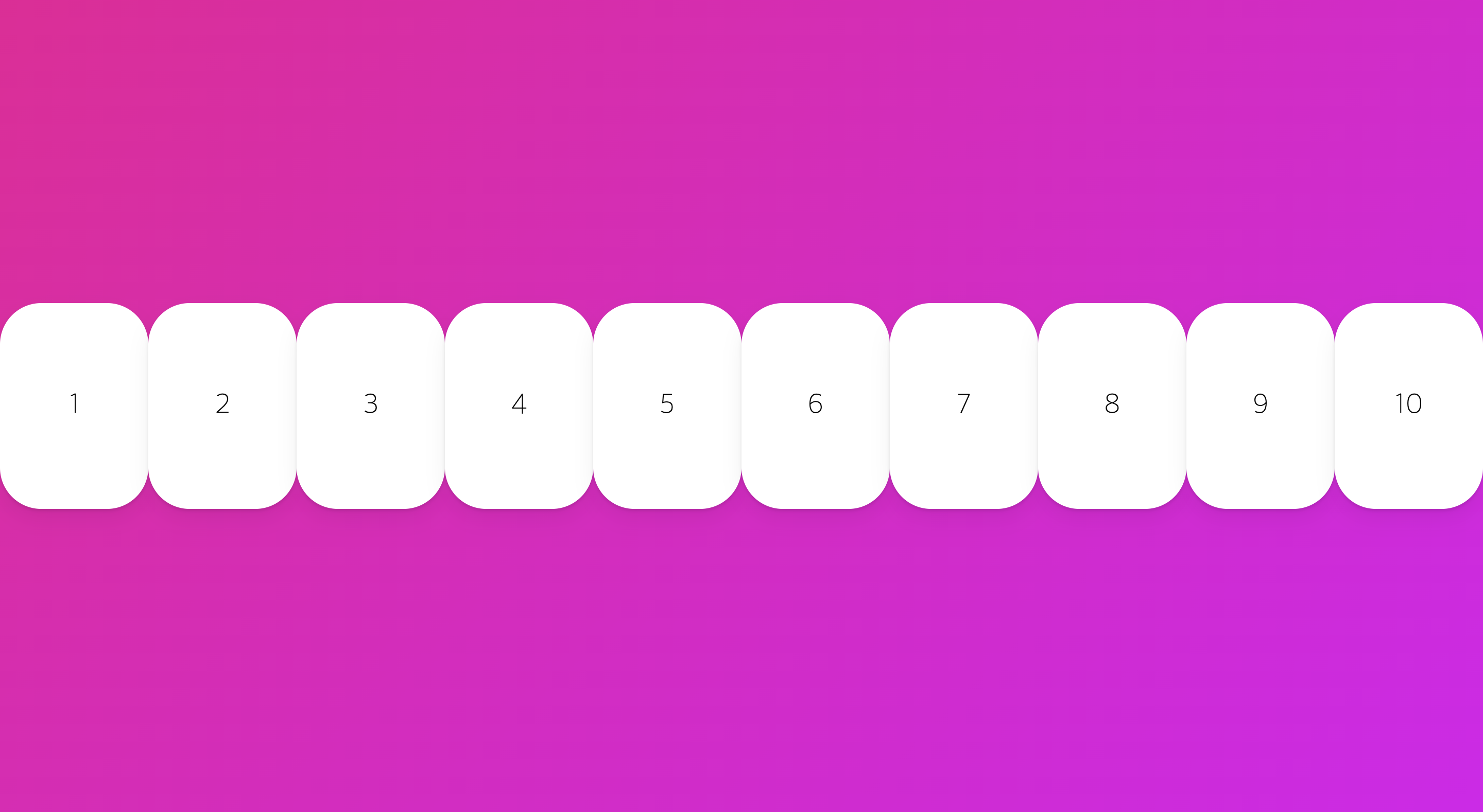
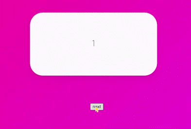
2. 한 번에 한개의 Box만 보여주게 해보자
 const Box = styled(motion.div)`
 	width: 400px;
 	height: 200px;
 	background-color: rgba(255, 255, 255, 1);
 	border-radius: 40px;
 	display: flex;
 	justify-content: center;
 	align-items: center;
 	font-size: 28px;
 	box-shadow: 0 2px 3px rgba(0, 0, 0, 0.1), 0 10px 20px rgba(0, 0, 0, 0.06);
 	position: absolute;
 	top: 100px;
 `;

 const box = {
 	invisible: {
 		x: 500,
 		opacity: 0,
 		scale: 0
 	},
 	visible: {
 		x: 0,
 		opacity: 1,
 		scale: 1,
 		transition: {
 			duration: 1
 		}
 	},
 	exit: { x: -500, opacity: 0, rotateX: 180, scale: 0, transition: { duration: 1 } }
 };

 function App() {
 	const [visible, setVisible] = useState(1);
 	const nextPlease = () => setVisible((prev) => (prev === 10 ? 10 : prev + 1));
 	return (
 		<Wrapper>
 			<AnimatePresence>
 				{[1, 2, 3, 4, 5, 6, 7, 8, 9, 10].map((i) =>
 					i === visible ? (
 						<Box variants={box} initial='invisible' animate='visible' exit='exit' key={i}>
 							{i}
 						</Box>
 					) : null
 				)}
 			</AnimatePresence>
 			<button onClick={nextPlease}>next</button>
 		</Wrapper>
 	);
 }
완성!
7.13 Slider part Two
코드를 개선시키고, 슬라이더의 방향을 활성화 시켜보자
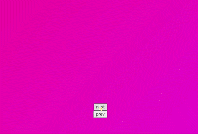
1. 세팅 → prev 버튼 추가
 function App() {
 	const [visible, setVisible] = useState(1);
 	const nextPlease = () => setVisible((prev) => (prev === 10 ? 10 : prev + 1));
 	const prevPlease = () => setVisible((prev) => (prev === 1 ? 1 : prev - 1));

 	return (
 		<Wrapper>
 			<AnimatePresence>
 				{[1, 2, 3, 4, 5, 6, 7, 8, 9, 10].map((i) =>
 					i === visible ? (
 						<Box variants={box} initial='invisible' animate='visible' exit='exit' key={i}>
 							{i}
 						</Box>
 					) : null
 				)}
 			</AnimatePresence>
 			<button onClick={nextPlease}>next</button>
 			<button onClick={prevPlease}>prev</button>
 		</Wrapper>
 	);
 }
2. 코드를 축소하자
 function App() {
 	const [visible, setVisible] = useState(1);
 	const nextPlease = () => setVisible((prev) => (prev === 10 ? 10 : prev + 1));
 	const prevPlease = () => setVisible((prev) => (prev === 1 ? 1 : prev - 1));

 	return (
 		<Wrapper>
 			<AnimatePresence>
 				<Box variants={box} initial='invisible' animate='visible' exit='exit' key={visible}>
 					{visible}
 				</Box>
 			</AnimatePresence>
 			<button onClick={nextPlease}>next</button>
 			<button onClick={prevPlease}>prev</button>
 		</Wrapper>
 	);
 }
💡 React.js가 이전 component를 삭제하고 새 것을 보여주는 곳에는 initial, animate, exit 세가지 애니메이션이 모두 실행된다.
3. 방향을 추가하자
💡 custom : variants에 데이터를 보낼 수 있게 해주는 property
- AnimatePresence에도 custom을 부여해야함!
    const box = {
    	entry: (isBack: boolean) => ({
    		x: isBack ? -500 : 500,
    		opacity: 0,
    		scale: 0
    	}),
    	center: {
    		x: 0,
    		opacity: 1,
    		scale: 1,
    		transition: {
    			duration: 1
    		}
    	},
    	exit: (isBack: boolean) => ({
    		x: isBack ? 500 : -500,
    		opacity: 0,
    		rotateX: 180,
    		scale: 0,
    		transition: { duration: 1 }
    	})
    };

    function App() {
    	const [visible, setVisible] = useState(1);
    	const [back, setBack] = useState(false);
    	const nextPlease = () => {
    		setBack(false);
    		setVisible((prev) => (prev === 10 ? 10 : prev + 1));
    	};
    	const prevPlease = () => {
    		setBack(true);
    		setVisible((prev) => (prev === 1 ? 1 : prev - 1));
    	};
    	return (
    		<Wrapper>
    			<AnimatePresence custom={back}>
    				<Box variants={box} custom={back} initial='entry' animate='center' exit='exit' key={visible}>
    					{visible}
    				</Box>
    			</AnimatePresence>
    			<button onClick={nextPlease}>next</button>
    			<button onClick={prevPlease}>prev</button>
    		</Wrapper>
    	);
    }
    export default App;
4. exitBeforeEnter prop를 사용해보자
💡 exitBeforeEnter : exit을 실행시키고 exit이 끝나면 다른 element를 오게 한다.
- 없다면 거의 동시에 시작됨!
    return (
    	<Wrapper>
    		<AnimatePresence exitBeforeEnter custom={back}>
    			<Box variants={box} custom={back} initial='entry' animate='center' exit='exit' key={visible}>
    				{visible}
    			</Box>
    		</AnimatePresence>
    		<button onClick={nextPlease}>next</button>
    		<button onClick={prevPlease}>prev</button>
    	</Wrapper>
    );
완성!
7.14 You Need to Watch This
layout animation에 대해 배워보자
1. 세팅하자
 import styled from 'styled-components';
 import { motion, AnimatePresence } from 'framer-motion';
 import { useState } from 'react';

 const Wrapper = styled(motion.div)`
 	height: 100vh;
 	width: 100vw;
 	display: flex;
 	justify-content: space-around;
 	align-items: center;
 `;

 const Box = styled(motion.div)`
 	width: 400px;
 	height: 400px;
 	background-color: rgba(255, 255, 255, 1);
 	border-radius: 40px;
 	display: flex;
 	justify-content: center;
 	align-items: center;
 	font-size: 28px;
 	box-shadow: 0 2px 3px rgba(0, 0, 0, 0.1), 0 10px 20px rgba(0, 0, 0, 0.06);
 `;

 const Circle = styled(motion.div)`
 	background-color: #00a5ff;
 	height: 100px;
 	width: 100px;
 	border-radius: 50px;
 	box-shadow: 0 2px 3px rgba(0, 0, 0, 0.1), 0 10px 20px rgba(0, 0, 0, 0.06);
 `;

 function App() {
 	return (
 		<Wrapper>
 			<Box>
 				<Circle />
 			</Box>
 		</Wrapper>
 	);
 }
 export default App;
2. 클릭하면 원이 중앙 정렬되도록 구현해보자
 function App() {
 	const [clicked, setClicked] = useState(false);
 	const toggleClicked = () => setClicked((prev) => !prev);
 	return (
 		<Wrapper onClick={toggleClicked}>
 			<Box style={{ justifyContent: clicked ? 'center' : 'flex-start', alignItems: clicked ? 'center' : 'flex-start' }}>
 				<Circle />
 			</Box>
 		</Wrapper>
 	);
 }
3. layout prop을 사용해보자
💡 layout : element의 layout이 바뀔 때 알아서 animate가 되는 prop
  function App() {
  	const [clicked, setClicked] = useState(false);
  	const toggleClicked = () => setClicked((prev) => !prev);
  	return (
  		<Wrapper onClick={toggleClicked}>
  			<Box style={{ justifyContent: clicked ? 'center' : 'flex-start', alignItems: clicked ? 'center' : 'flex-start' }}>
  				<Circle layout />
  			</Box>
  		</Wrapper>
  	);
} 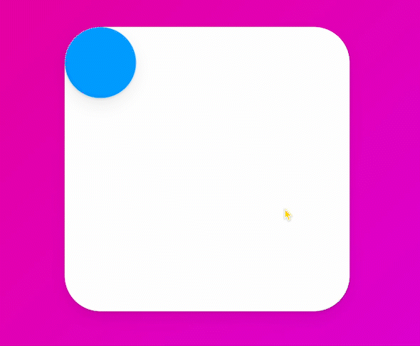
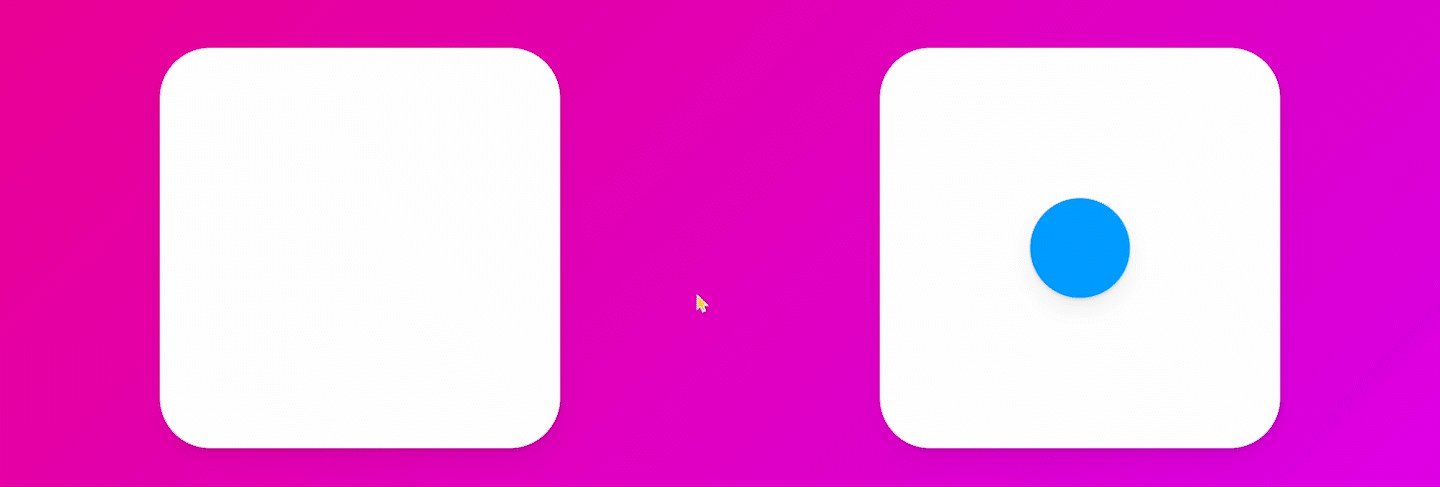
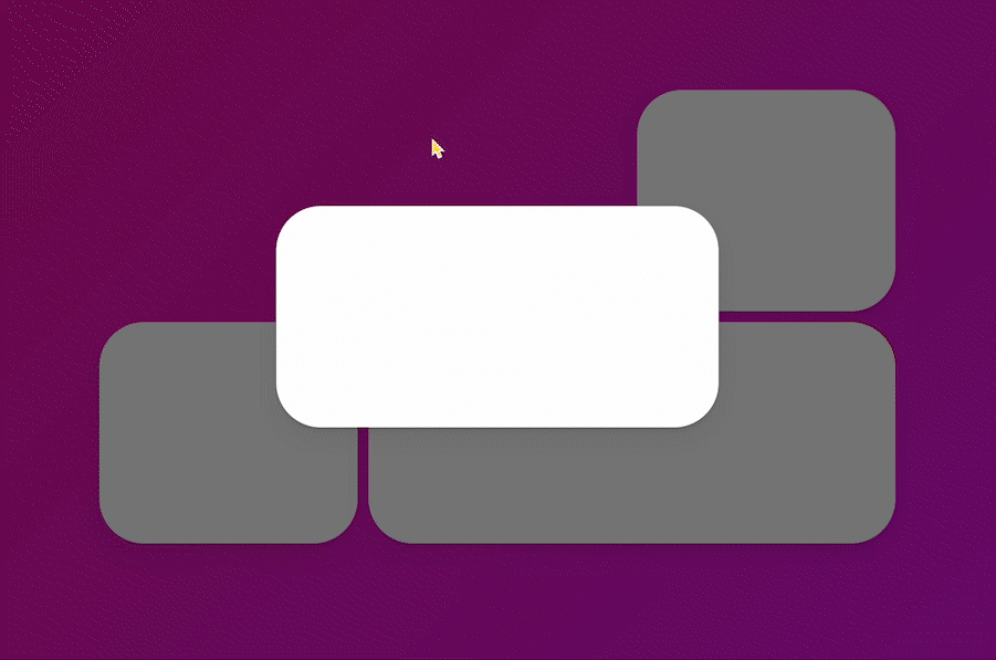
4. shared layout animation을 사용해보자
💡 layoutId : Framer에게 컴포넌트가 같다는 걸 알려주는 prop
 function App() {
 	const [clicked, setClicked] = useState(false);
 	const toggleClicked = () => setClicked((prev) => !prev);
 	return (
 		<Wrapper onClick={toggleClicked}>
 			<Box>{!clicked ? <Circle layoutId='circle' /> : null}</Box>
 			<Box>{!clicked ? null : <Circle layoutId='circle' />}</Box>
 		</Wrapper>
 	);
 }
완성!
7.15 Final Project part One
아래 애니메이션을 구현해보자

1. 세팅하자
 const Grid = styled.div`
 	display: grid;
 	grid-template-columns: repeat(3, 1fr);
 	width: 50vw;
 	gap: 10px;
 	div:first-child,
 	div:last-child {
 		grid-column: span 2;
 	}
 `;

 const Box = styled(motion.div)`
 	height: 200px;
 	background-color: rgba(255, 255, 255, 1);
 	border-radius: 40px;
 	box-shadow: 0 2px 3px rgba(0, 0, 0, 0.1), 0 10px 20px rgba(0, 0, 0, 0.06);
 `;

 function App() {
 	return (
 		<Wrapper>
 			<Grid>
 				<Box />
 				<Box />
 				<Box />
 				<Box />
 			</Grid>
 		</Wrapper>
 	);
 }
 export default App;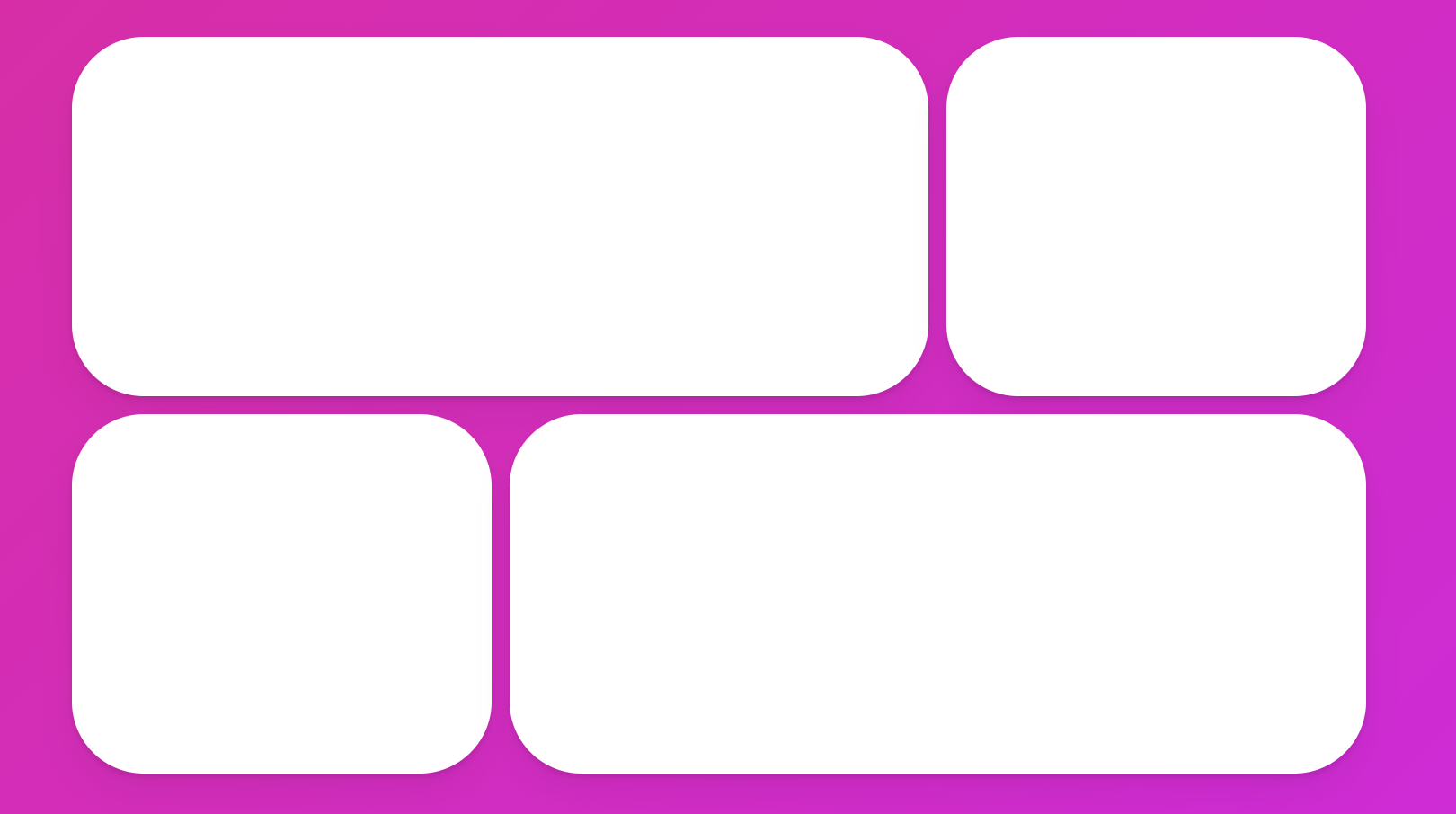
2. Overlay 컴포넌트를 만들어주자
 const Overlay = styled.div`
 	width: 100%;
 	height: 100%;
 	background-color: rgba(0, 0, 0, 0.5);
 	position: absolute;
 `;

 function App() {
 	return (
 		<Wrapper>
 			<Grid>
 				<Box />
 				<Box />
 				<Box />
 				<Box />
 			</Grid>
 			<Overlay></Overlay>
 		</Wrapper>
 	);
 }
3. 클릭했을 때 Overlay를 보여주는 애니메이션을 만들자
 const Overlay = styled(motion.div)`
 	width: 100%;
 	height: 100%;
 	background-color: rgba(0, 0, 0, 0.7);
 	position: absolute;
 `;

 function App() {
 	const [clicked, setClicked] = useState(false);
 	const toggle = () => setClicked((prev) => !prev);
 	return (
 		<Wrapper onClick={toggle}>
 			<Grid>
 				<Box />
 				<Box />
 				<Box />
 				<Box />
 			</Grid>
 			<AnimatePresence>{clicked ? <Overlay initial={{ opacity: 0 }} animate={{ opacity: 1 }} exit={{ opacity: 0 }}></Overlay> : null}</AnimatePresence>
 		</Wrapper>
 	);
 }
4. 클릭 시 박스가 확대되게 구현해보자
 function App() {
 	const [clicked, setClicked] = useState(false);
 	const toggle = () => setClicked((prev) => !prev);
 	return (
 		<Wrapper onClick={toggle}>
 			<Grid>
 				<Box layoutId='hello' />
 				<Box />
 				<Box />
 				<Box />
 			</Grid>
 			<AnimatePresence>
 				{clicked ? (
 					<Overlay initial={{ backgroundColor: 'rgba(0, 0, 0, 0)' }} animate={{ opacity: 1 }} exit={{ opacity: 0 }}>
 						<Box layoutId='hello' style={{ width: 400, height: 200 }} />
 					</Overlay>
 				) : null}
 			</AnimatePresence>
 		</Wrapper>
 	);
 }
완성!
7.16 Final Project part Two
어느 element를 클릭해도 동작하게 구현해보자
1. map을 사용해 Box 컴포넌트를 만들어주자
 function App() {
 	return (
 		<Wrapper>
 			<Grid>
 				{['1', '2', '3', '4'].map((n) => (
 					<Box key={n} layoutId={n} />
 				))}
 			</Grid>
 			<AnimatePresence>
 				{clicked ? (
 					<Overlay initial={{ backgroundColor: 'rgba(0, 0, 0, 0)' }} animate={{ opacity: 1 }} exit={{ opacity: 0 }}>
 						<Box layoutId='hello' style={{ width: 400, height: 200 }} />
 					</Overlay>
 				) : null}
 			</AnimatePresence>
 		</Wrapper>
 	);
 }
2. Box 클릭 시 박스가 나타나게 구현하자
 function App() {
 	const [id, setId] = useState<null | string>(null);
 	return (
 		<Wrapper>
 			<Grid>
 				{['1', '2', '3', '4'].map((n) => (
 					<Box onClick={() => setId(n)} key={n} layoutId={n} />
 				))}
 			</Grid>
 			<AnimatePresence>
 				{id ? (
 					<Overlay initial={{ backgroundColor: 'rgba(0, 0, 0, 0)' }} animate={{ opacity: 1 }} exit={{ opacity: 0 }}>
 						<Box layoutId='hello' style={{ width: 400, height: 200 }} />
 					</Overlay>
 				) : null}
 			</AnimatePresence>
 		</Wrapper>
 	);
 }
 export default App;
3. Overlay 클릭 시 박스가 사라지게 구현하자
 function App() {
 	const [id, setId] = useState<null | string>(null);
 	return (
 		<Wrapper>
 			<Grid>
 				{['1', '2', '3', '4'].map((n) => (
 					<Box onClick={() => setId(n)} key={n} layoutId={n} />
 				))}
 			</Grid>
 			<AnimatePresence>
 				{id ? (
 					<Overlay onClick={() => setId(null)} initial={{ backgroundColor: 'rgba(0, 0, 0, 0)' }} animate={{ opacity: 1 }} exit={{ opacity: 0 }}>
 						<Box layoutId='hello' style={{ width: 400, height: 200 }} />
 					</Overlay>
 				) : null}
 			</AnimatePresence>
 		</Wrapper>
 	);
 }
 export default App;
4. Overlay의 Box와 Grid의 Box를 연결시켜주자
 function App() {
 	const [id, setId] = useState<null | string>(null);
 	return (
 		<Wrapper>
 			<Grid>
 				{['1', '2', '3', '4'].map((n) => (
 					<Box onClick={() => setId(n)} key={n} layoutId={n} />
 				))}
 			</Grid>
 			<AnimatePresence>
 				{id ? (
 					<Overlay onClick={() => setId(null)} initial={{ backgroundColor: 'rgba(0, 0, 0, 0)' }} animate={{ opacity: 1 }} exit={{ opacity: 0 }}>
 						<Box layoutId={id} style={{ width: 400, height: 200 }} />
 					</Overlay>
 				) : null}
 			</AnimatePresence>
 		</Wrapper>
 	);
 }
완성!