생활코딩 Parallax수업을 듣고 정리한 내용입니다.
수업 링크
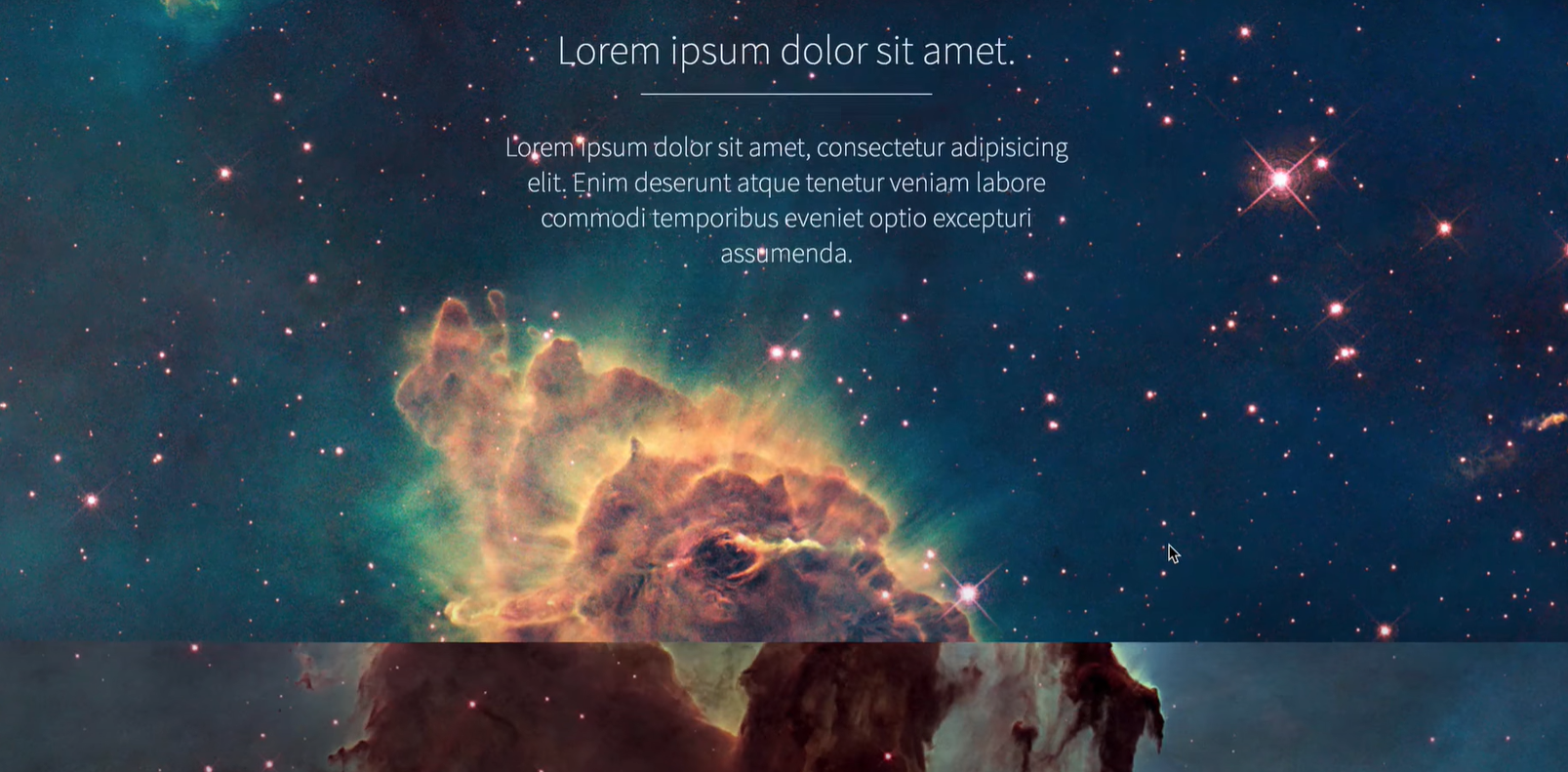
뒤에 있는 배경은 멀리 있고 앞에있는 텍스트는 가까이있게 하는 것 처럼 보이게 할 수 있다.
여러 방법이 있지만 가장 간단한 방법을 배울 것
가장 간단한 방법 .
background-attachment: fixed;
하면 된다.
배경은 고정되어 있고 텍스트는 변경하게 하는 것
나는 html과 css모두 익숙하지 않기 때문에 처음부터 모든 과정을 따라해가며 익히려 한다.
- 장면 하나하나 를 Sceen으로 부른다. == section
- 거기에 있는 아이템 하나하나를 컨텐츠로 부른다. == header
<html>
    <head>
        <style>

        </style>
    </head>

    <body>
        <section class="scene">
            <header>
                <h1>Lorem ipsum dolor sit amet.</h1>
                Lorem ipsum dolor sit, amet consectetur adipisicing elit. Sapiente quibusdam perspiciatis at distinctio, aperiam atque.
            </header>
        </section>
    </body>
</html>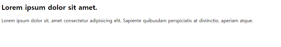
여기서 배울 점
작업을 할 때 구조를 생각하고 html코드 먼저 작성을 한다.
1. 하나의 장면
2. 장면안에 이미지와 글자
3. 글자중에 헤더 값과 본문 값
- 배경 이미지 넣기
<style>
	.scene {
    	    background-image: url(../images/arrow.jpg);
	}
</style>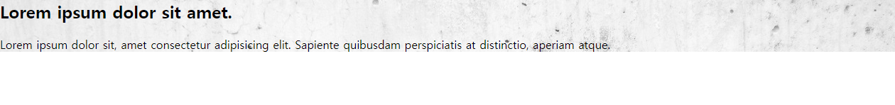
정확히 해당 태그의 영역에만 배경이미지가 저장되었다.
scene을 한 화면을 차지하게 하고 싶다.
<style>
	.scene {
    	    background-image: url(../images/arrow.jpg);
            height: 100vh;
	}
</style>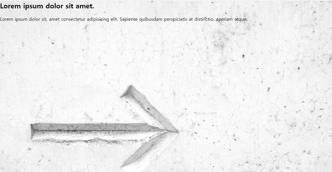
기본 body의 margine값을 0으로 한다(기본값은 8이 주어져 있다.)
body {
	margin: 0;
}
reset css
html모든 탴그의 기본 css값을 지워주는 코드를 제공한다.
/* http://meyerweb.com/eric/tools/css/reset/
   v2.0 | 20110126
   License: none (public domain)
*/

html, body, div, span, applet, object, iframe,
h1, h2, h3, h4, h5, h6, p, blockquote, pre,
a, abbr, acronym, address, big, cite, code,
del, dfn, em, img, ins, kbd, q, s, samp,
small, strike, strong, sub, sup, tt, var,
b, u, i, center,
dl, dt, dd, ol, ul, li,
fieldset, form, label, legend,
table, caption, tbody, tfoot, thead, tr, th, td,
article, aside, canvas, details, embed,
figure, figcaption, footer, header, hgroup,
menu, nav, output, ruby, section, summary,
time, mark, audio, video {
	margin: 0;
	padding: 0;
	border: 0;
	font-size: 100%;
	font: inherit;
	vertical-align: baseline;
}
/* HTML5 display-role reset for older browsers */
article, aside, details, figcaption, figure,
footer, header, hgroup, menu, nav, section {
	display: block;
}
body {
	line-height: 1;
}
ol, ul {
	list-style: none;
}
blockquote, q {
	quotes: none;
}
blockquote:before, blockquote:after,
q:before, q:after {
	content: '';
	content: none;
}
table {
	border-collapse: collapse;
	border-spacing: 0;
}- header 컨텐츠 꾸미기
화면의 글자를 크기 좀 작게 하기
화면 가운데로 위치시키기
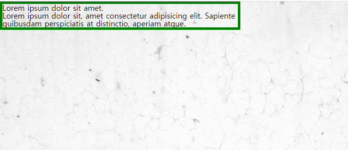
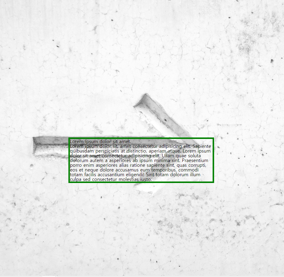
이것을 하기 위해선 먼저 header의 위치 값을 확인해야한다.
그런 방법으로 border값을 지정하여 태그의 기본 범위 및 위치를 인식할 수 있게 한다.
.scene header {
	max-width: 80%;
	border: 5px solid green;
} 
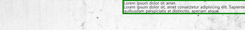
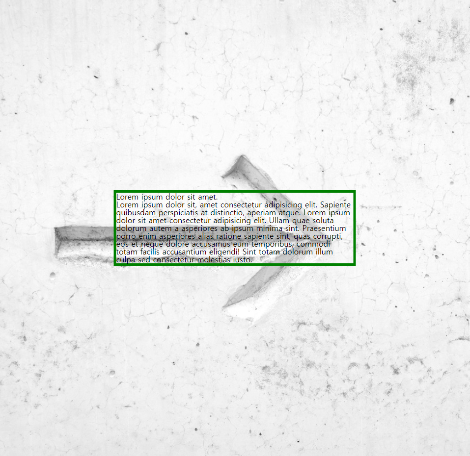
이때 헤더값을 scene에 폭에 반으로 위치시킨다.
헤더의 position값을 relative로 하고
left값을 10px했을 때 먹힌다.
왼쪽에서 10px떨어진 지점을 할 수 잇다.
단순히 왼쪽으로 이동만한다면
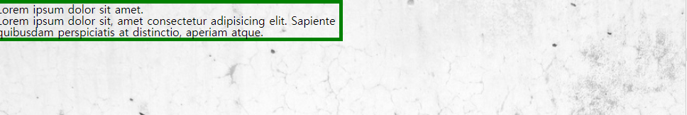
left: 50%;
자신의 크기의 반만큼 왼쪽으로? 하는 기능이 필요한데 여기서 css3의 transform을 이용할 수 잇다.
변형이란 뜻인데
translateX()가 있는데
폭을 X축으로 이동할 수 있게 한다.
transform: translateX(-100%)
폭에ㅔ 100%만큼 왼쪽으로 이동
마찬가지로 높이에서도 가운데로 하고 싶으면
top: 50%;
을 하고
자신의 높이에서 50%만큼만 위로 올려주면 된다.
transform: translateX(-50%) translateY(-50%);
- 위치 외의 기본 css 적용(font-size, margin, text-align, color)
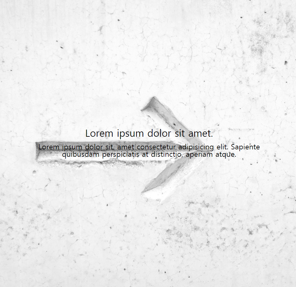
현 상태
<style>
body {
	margin: 0;
}
.scene {
	background-image: url(../images/arrow.jpg);
	height: 100vh;
	overflow: hidden;
	background-repeat: no-repeat;
	background-size: cover;
}
.scene header {
	/* color: white; */
	max-width: 80%;
	position: relative;
	left: 50%;
	transform: translateX(-50%) translateY(-50%);
	top: 50%;
	font-size: 1.5rem;
	text-align: center;
}
.scene header h1 {
	font-size: 2rem;
	margin-bottom: 1rem;
}
</style>- parallex추가하기
추가하기 위해 scene을 늘리고 class를 달리한다.
<section class="scene one">
	<header>
            <h1>Lorem ipsum dolor sit amet.</h1>
            Lorem ipsum dolor sit, amet consectetur adipisicing elit. Sapiente quibusdam perspiciatis at distinctio, aperiam atque.
        </header>
	</section>
        <section class="scene two">
	<header>
		<h1>Lorem ipsum dolor sit amet.</h1>
		Lorem ipsum dolor sit, amet consectetur adipisicing elit. Sapiente quibusdam perspiciatis at distinctio, aperiam atque.
	</header>
	</section>
	<section class="scene three">
	<header>
		<h1>Lorem ipsum dolor sit amet.</h1>
		Lorem ipsum dolor sit, amet consectetur adipisicing elit. Sapiente quibusdam perspiciatis at distinctio, aperiam atque.
	</header>
</section>
그리고 css로는 각각에 background-image를 달리하고 상위div에 background-attachment: fixed로 한다.
.scene {
	height: 100vh;
	overflow: hidden;
	background-repeat: no-repeat;
	background-size: cover;
	background-attachment: fixed;
}
가상 선택자
.scene header h1:after {...}
내용 정리
.scene header h1::after {
	content: "";
	border-bottom: 1px solid white;
	width: 10rem;
	display: block;
	margin: 0 auto;
}
먼저 content를 해서 밑 줄을 그을 수 있는 최소한의 방법을 제공하고
border-bottom을 통헤 밑줄을 생성한다.
width값 조정을 통해 밑줄의 길이를 조정하고
display를 통해 아래 층으로 내려가게 한다.
margin을 통해 위아래 좌우 값을 조정한다.
전체 코드
<html>
    <head>
        <link rel="stylesheet" href="reset.css">
        <link rel="preconnect" href="https://fonts.gstatic.com">
        <link href="https://fonts.googleapis.com/css2?family=Source+Sans+Pro:wght@200;300&display=swap" rel="stylesheet">
        <style>
            body {
                margin: 0;
            }
            .scene {
                height: 100vh;
                overflow: hidden;
                background-repeat: no-repeat;
                background-size: cover;
                background-attachment: fixed;
                font-family: 'Source Sans Pro', sans-serif;
                font-weight: 200;
            }
            .scene.one {
                background-image: url(../images/arrow.jpg);
            }
            .scene.two {
                background-image: url(../images/word.jpg);
            }
            .scene.three {
                background-image: url(../images/moon.jpg);
                color: white;
            }
            .scene header {
                /* color: white; */
                max-width: 80%;
                position: relative;
                left: 50%;
                transform: translateX(-50%) translateY(-50%);
                top: 50%;
                font-size: 1.5rem;
                text-align: center;
            }
            .scene header h1 {
                font-size: 2rem;
                margin-bottom: 1rem;
                font-weight: 300;
            }
            .scene header h1::after {
                content: "";
                border-bottom: 1px solid white;
                width: 8rem;
                display: block;
                margin: 0 auto;
                margin-top: 1rem;
            }
        </style>
    </head>

    <body>
        <section class="scene one">
            <header>
                <h1>Lorem ipsum dolor sit amet.</h1>
                Lorem ipsum dolor sit, amet consectetur adipisicing elit. Sapiente quibusdam perspiciatis at distinctio, aperiam atque.
            </header>
        </section>
        <section class="scene two">
            <header>
                <h1>Lorem ipsum dolor sit amet.</h1>
                Lorem ipsum dolor sit, amet consectetur adipisicing elit. Sapiente quibusdam perspiciatis at distinctio, aperiam atque.
            </header>
        </section>
        <section class="scene three">
            <header>
                <h1>Lorem ipsum dolor sit amet.</h1>
                Lorem ipsum dolor sit, amet consectetur adipisicing elit. Sapiente quibusdam perspiciatis at distinctio, aperiam atque.
            </header>
        </section>
    </body>
</html>
정리
여기서 사용한 총 html 태그
section, header사용한 총 css 값들
margin: 0;
height: 100vh;
overflow: hidden;
background-repeat: no-repeat; # 그림 반복 x
background-size: cover;  # 그림에 대한 화면 전체 차지 결정? cover, contain 등
background-attachment: fixed;  # 배경은 멈추게 할 수 있는 핵심 코드
font-family: 'Source Sans Pro', sans-serif;
font-weight: 200;  # font 두께

background-image: url();
color: white;  # 글씨 하얀 색

max-width: 80%;  # 글자의 크기를 화면에 80%로 한다.
position: relative;  # 이것을 했을 때 화면에서 움직일 수 있었다.
left: 50%  	         # 왼쪽에서 50%만큼 떨어진다.
transform: translateX(-50%) translateY(-50%); # 자신의 길이에서 50%정도 오른쪽으로, 자신의 높이에서 50% 위로
top: 50%;      # 위에서 50%만큼 아래에서 위치
font-size: 1.5rem;
text-align: center;

content: "";
width: 8rem;
display: block;  # 태그 속성의 값을 block형태로 바꾸어 준다.