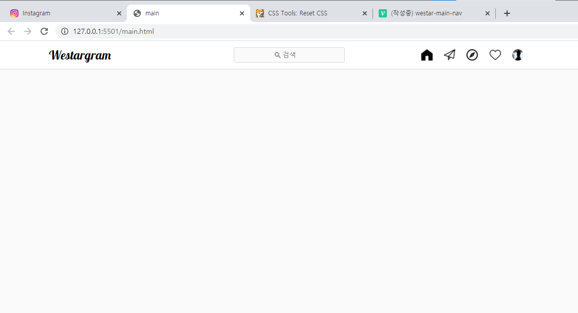
결과물
목표
- 최소한의 html과 css를 사용하고 싶다.
- 디자인 시안만 봐도 85%의 페이지를 완성하기 위해서!!
1. reset.css
/* http://meyerweb.com/eric/tools/css/reset/
   v2.0 | 20110126
   License: none (public domain)
*/

html, body, div, span, applet, object, iframe,
h1, h2, h3, h4, h5, h6, p, blockquote, pre,
a, abbr, acronym, address, big, cite, code,
del, dfn, em, img, ins, kbd, q, s, samp,
small, strike, strong, sub, sup, tt, var,
b, u, i, center,
dl, dt, dd, ol, ul, li,
fieldset, form, label, legend,
table, caption, tbody, tfoot, thead, tr, th, td,
article, aside, canvas, details, embed,
figure, figcaption, footer, header, hgroup,
menu, nav, output, ruby, section, summary,
time, mark, audio, video {
	margin: 0;
	padding: 0;
	border: 0;
	font-size: 100%;
	font: inherit;
	vertical-align: baseline;
}
/* HTML5 display-role reset for older browsers */
article, aside, details, figcaption, figure,
footer, header, hgroup, menu, nav, section {
	display: block;
}
body {
	line-height: 1;
}
ol, ul {
	list-style: none;
}
blockquote, q {
	quotes: none;
}
blockquote:before, blockquote:after,
q:before, q:after {
	content: '';
	content: none;
}
table {
	border-collapse: collapse;
	border-spacing: 0;
}
일부러 적용 안하고 했더니, body의 기본 값,
나중에 협업시 유지 보수 문제등을 고려해 항상 넣는것을 기본으로 하기로 햇다.
자꾸 nav가 display속성이 되었다.
main.css에서 아무리 nav의 display를 바꿔도 적용이 안되었다.
오래동안 고민하다 nav class를 주어서 변경할까하다가
생각해보니 html에서 reset.css를 마지막에 줬던 것이 생각났다.
위로 옮기니 바로 flex로 적용이 되었다.
reset.css 결론
- reset.css항상 모든 css파일 최상위에 넣어놓자.
html
<div class="container">

  <div class="nav-container">
    <nav class="nav">

      <h1>Westargram</h1>

      <div class="nav-search-box">
        <img class="nav-search-icon" src="./images/loupe.png" alt="찾기">
        <input class="nav-search-input" type="text" placeholder="검색">
      </div>

      <div class="nav-content-box">
        <div class="nav-content-list">
          <img class="nav-content-icon" src="./images/home.png" alt="">
          <img class="nav-content-icon" src="./images/paper-plane.png" alt="">
          <img class="nav-content-icon" src="./images/compass.png" alt="">
          <img class="nav-content-icon" src="./images/heart.png" alt="">
          <img class="nav-content-icon nav-user-icon" src="./images/jongho.png" alt="">
        </div>

      </div>
    </nav>
  </div>

  <div class="main-container">

  </div>
css
1. container
-
container는 필요한가?
필요하다.
전체 화면에 대해 건드리고 싶을 수 있고 그것을 body로 하면 다른 html에서 영향을 받을 수 있기도 하고(물론 css파일을 공유하지 않으면 되지만)딱 개발자 느낌으로 body를 건드리면 안될 것 같다.
그래서 container를 따로 만들었다.
.container{
   width: 100vw;
   height: 100vh;

   display: flex;
   flex-direction: column;
   align-items: center;

   position: relative;

   background-color: #fafafa;
}
- wid, he를 모니터 크기(vw, vh)만큼 주었다.
- 크게 상단은 nav, 하단은 main을 줘야하기에 flex로 나누었다.
- 좌우 정렬를 하기 위해 ali-item: center를 주었다.
- 후에 nav에 fixed속성을 이용하기 위해 position을 지정해줬다.
- ba-color는 insta에서 가져왔다.
1. container 결론.
- body쓰지 말고 container 새로 만들자!
2. nav-container, nav
nav위에 nav-container를 넣어야 하나?
넣어야 한다.
nav의 요소들을 화면 가운데 놓으면서, 적절한 레이아웃을 구성하기 위해선 개별 요소에 위치를 정해주기 보단, 한번 감싸주는게 좋다.
다만 모바일 화면을 고려하기 위해서, 후에 nav의 wid는 좀더 가변적인 값을 넣어야 겠다.
/* nav */
.nav-container{
    width: 100vw;
    height: 54px;

    position: fixed;
    top: 0;


    display: flex;
    justify-content: center;
    align-items: center;

    background-color: white;
    border-bottom: 1px solid rgb(218, 218, 218);
}

nav{
    width: 935px;
    height: 54px;

    padding: 0px 20px;

    display: flex;
    justify-content: space-between;
    align-items: center;
}- 그외 대충 insta페이지만 보고 완성할 수 있는 코드들이라 더이상 설명은 생략
nav 결론.
- 이정도는 디자인만 봐도 하자!
<h1>Westargram</h1>
<div class="nav-search-box">
  <img class="nav-search-icon" src="./images/loupe.png" alt="찾기">
  <input class="nav-search-input" type="text" placeholder="검색">
</div>
<div class="nav-content-box">
  <div class="nav-content-list">
    <img class="nav-content-icon" src="./images/home.png" alt="">
    <img class="nav-content-icon" src="./images/paper-plane.png" alt="">
    <img class="nav-content-icon" src="./images/compass.png" alt="">
    <img class="nav-content-icon" src="./images/heart.png" alt="">
    <img class="nav-content-icon nav-user-icon" src="./images/jongho.png" alt="">
  </div>
여기서 느낄만한 점은 input태그에 돋보기 모양과 input의 모양 등을 insta와 얼마나 유사하게 할 것이냐 인데,
insta는 focus전에는 span으로만 이루어져 있다가
focus된 이후에 변경되었다.
이부분은 js가 연결하면서 더 수정해줘야 할 듯해서 여기서 다루진 않겠다.
nav-input 결론
- js를 하고 나서 다시 수정할 때도 있다!
  nav > h1 {
    width: 360px;
    font-size: 24px;
    font-family: 'Lobster', cursive;
}- h1태그에 별도로 class를 지정하지 않았다.
- 나중에 보수 관점에선 들어 있는게 좋을거 같긴한데, 인스타 앱 특성상 h1태그가 더 들어가진 않을 것 같다고 생각이 들었다.
- nav요소가 많지도 않아서 수정도 그렇게 복잡해지지도 않을 것 같다.
- class하나 추가하는게 큰 일은 아니지만, 일단은 class도 무조건 추가하고 싶진 않다.
결론
- 특정해 보이는 태그에 class를 지정하냐 문제는, 고수 개발자의 css코드를 보자!
.nav-search-box{
    position: relative;

    width: 215px;
    height: 28px;

    display: flex;

    justify-content: center;
    align-items: center;


    background-color: #fafafa;
    border: 1px solid rgb(218, 218, 218);
    border-radius: 3px;
}

.nav-search-icon{
    width: 11px;
    height: 11px;

    position: absolute;
    left: 79px;
}

.nav-search-input{
    outline: none;
    border: none;
    background-color: #fafafa;
}

.nav-search-input::placeholder{
    text-align: center;
}- 가져온 icon은 vector가 아니라 png라 색상 변경이 안되는 점이 아쉽
- insta에선 돋보기 아이콘은 다른 div에 한번 더 감싸 가운데에서 왼쪽으로 이동했는데
- 일단 이 부분도 js하면서 수정해야 겠다 싶으면 후에 수정할 예정
- 일단은 search-box기준 오른쪽으로 이동하는 것으로 했다.
- 왜 input에 border나 ba-color를 안쓰고, 굳이 search-box에 선언한 이유는, 약간 그게 더 직관적인 것 같았다..
- 좀 더 공부 필요.
.nav-content-box{
    width: 360px;

    display: flex;
}

.nav-content-list{
    width: 222px;

    margin-left: auto;

    display: flex;
    justify-content: space-around;
    align-items: center;
}

.nav-content-icon{
    width: 22px;
    height: 22px;
}

.nav-user-icon{
    border-radius: 50%;
}- user-icon만 따로 class를 하나 더 줘서 스타일을 지정할 수 있다.
<img class="nav-content-icon">다른 아이콘들<img class="nav-content-icon nav-user-icon">유저 아이콘- 짱 신기!
ps
화면을 구상할 때 큰 부분부터 나눠야 한다.
처음에 container
다음 nav와 main
다음 nav에서 아래로, main에서 아래로..
전체 css
/* container */
.container{
    width: 100vw;
    height: 100vh;

    display: flex;
    flex-direction: column;
    align-items: center;

    position: relative;

    background-color: #fafafa;
}

/* nav */
.nav-container{
    width: 100vw;
    height: 54px;

    position: fixed;
    top: 0;


    display: flex;
    justify-content: center;
    align-items: center;

    background-color: white;
    border-bottom: 1px solid rgb(218, 218, 218);
}

nav{
    width: 935px;
    height: 54px;

    padding: 0px 20px;

    display: flex;
    justify-content: space-between;
    align-items: center;
}

nav > h1 {
    width: 360px;
    font-size: 24px;
    font-family: 'Lobster', cursive;
}

.nav-search-box{
    position: relative;

    width: 215px;
    height: 28px;

    display: flex;

    justify-content: center;
    align-items: center;


    background-color: #fafafa;
    border: 1px solid rgb(218, 218, 218);
    border-radius: 3px;
}

.nav-search-icon{
    width: 11px;
    height: 11px;

    position: absolute;
    left: 79px;
}

.nav-search-input{
    outline: none;
    border: none;
    background-color: #fafafa;
}

.nav-search-input::placeholder{
    text-align: center;
}

.nav-content-box{
    width: 360px;

    display: flex;
}

.nav-content-list{
    width: 222px;

    margin-left: auto;

    display: flex;
    justify-content: space-around;
    align-items: center;
}

.nav-content-icon{
    width: 22px;
    height: 22px;
}

.nav-user-icon{
    border-radius: 50%;
}


/* main container */
.main-container{
    width: 935px;

    margin-top: 80px;
}