display란?
-
html 요소 외부 display 유형을 블록과 인라인 중 어떤 방식으로 처리할지 설정 가능
-
자식 요소를 배치할 때 사용할 레이아웃 설정
-
display 프로퍼티를 사용해서 html 요소가 가지고 있는 기본 유형과 상관없이 지정할 수 있음
-
block: 한라인 전체를 차지하고 한줄 띔 -
inline: 요소의 크기만큼 너비를 차지 / 줄바꿈 x
display 유형을 설정하는 값 - 요소의 자식요소 레이아웃 설정
table:<table>태그 처럼 자식 요소를 배치flex: flexbox 모델에 따라 자식 요소를 배치grid: 그리드 레이아웃을 사용해서 자식 요소를 배치
table 레이아웃
    <div class="display-table">
      <div style="display: table-header-group">
        <div style="display: table-row">
          <div style="display: table-cell">A</div>
          <div style="display: table-cell">B</div>
          <div style="display: table-cell">C</div>
        </div>
      </div>
      <div style="display: table-row-group">
        <div style="display: table-row">
          <div style="display: table-cell">A1</div>
          <div style="display: table-cell">B1</div>
          <div style="display: table-cell">C1</div>
        </div>
        <div style="display: table-row">
          <div style="display: table-cell">A2</div>
          <div style="display: table-cell">B2</div>
          <div style="display: table-cell">C2</div>
        </div>
        <div style="display: table-row">
          <div style="display: table-cell">A3</div>
          <div style="display: table-cell">B3</div>
          <div style="display: table-cell">C3</div>
        </div>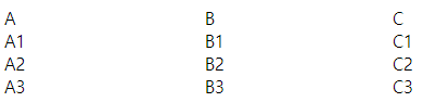
<table>와 비슷하게 보임display-table-><table>display: table-header-group-><thead>table-row-group-><tbody>table-row-><tr>table-cell-><th>,<td>
flexbox 레이아웃
- 웹 화면의 공간 분할과 콘텐츠가 담길 공간의 크기 및 배분, 배치순서를 빠르고 쉽게 정의할 수 있게 해주는 레이아웃 모델
- 주축(main axis)와 교차축(cross axis) ㅡ주축의 수직 축. x축이면 y축ㅡ 기준 레이아웃 정의
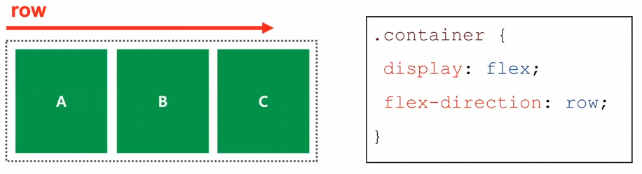
flex-direction -> flex 레이아웃 배치 방향 지정
-
flex-direction: row: 콘텐츠 배치 방향 왼 -> 오
-
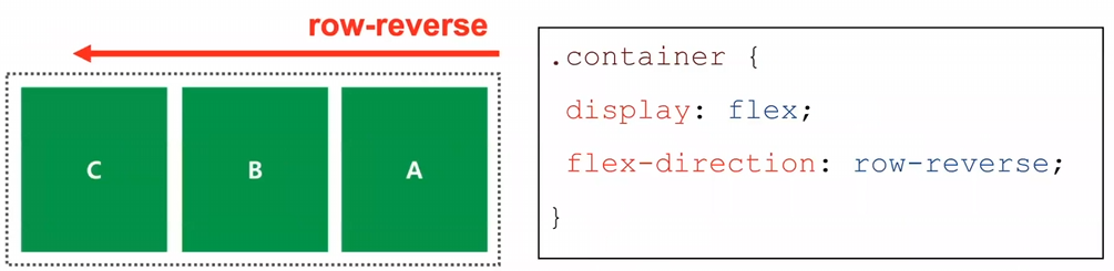
flex-direction: row-reverse: 콘텐츠 배치 방향 오 -> 왼
-
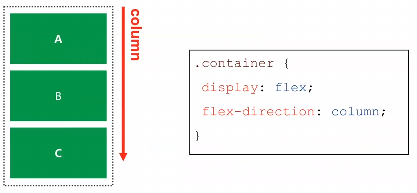
flex-direction: column: 콘텐츠 배치 방향 위 -> 아래
-
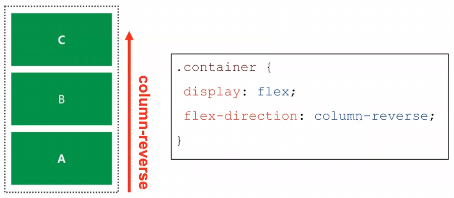
flex-direction: column-reverse: 콘텐츠 배치 방향 아래 -> 위
flex-wrap: wrap -> 지정한 콘텐츠 너비를 적용 가능. 여러개의 콘텐츠 설정시 콘텐츠 너비가 부모 요소보다 클 경우, 지정된 콘텐츠의 너비로 다음 줄로 넘어감
(flex-direction: row는 여러개의 콘텐츠 설정시 지정한 너비를 무시하고 해상도 크기에 맞춰서 레이아웃을 배치)
justify-content -> flex의 정렬 지정
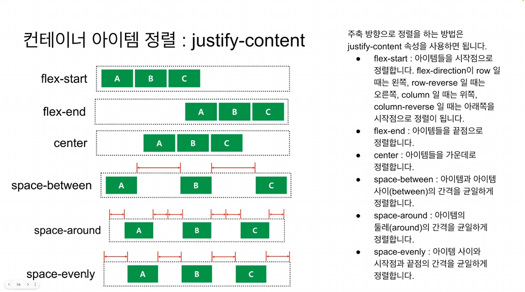
-
justify-content: flex-start: 시작점으로 정렬, row인 경우는 왼쪽, row-revese인 경우는 오른쪽 / column인 경우는 위쪽, column-reverse인 경우는 아래쪽 -
justify-content: flex-end: 끝점으로 정렬, row인 경우는 오른쪽 column인 경우는 아래쪽 -
justify-content: center: 가운데 정렬
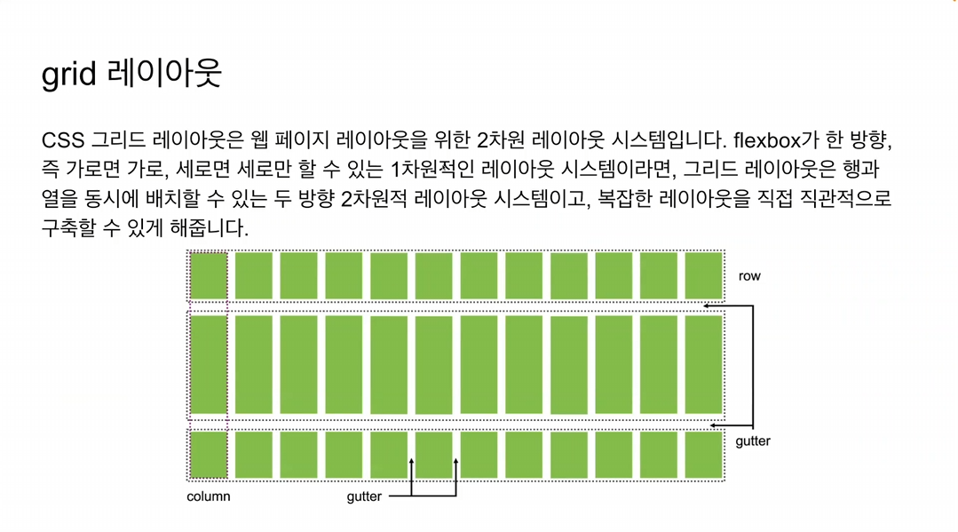
grid 레이아웃

-