2021.06.01 (키즈가오 1편 실습)
학습한 내용
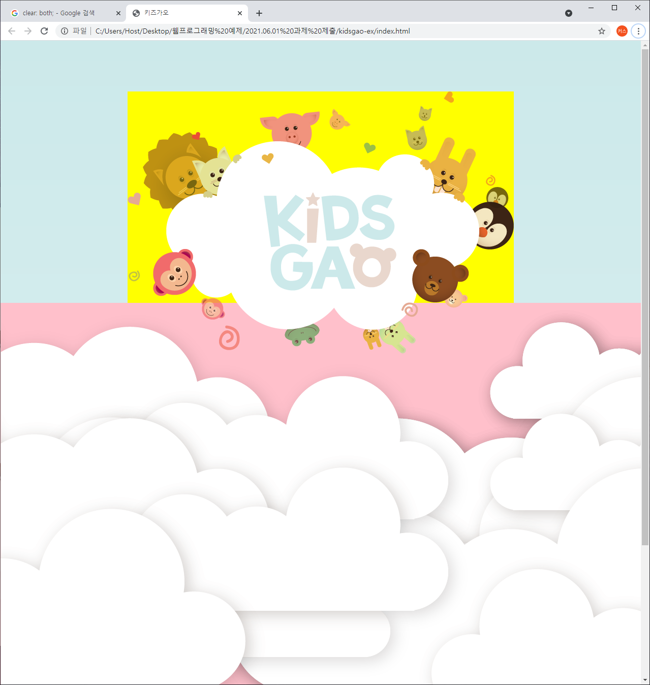
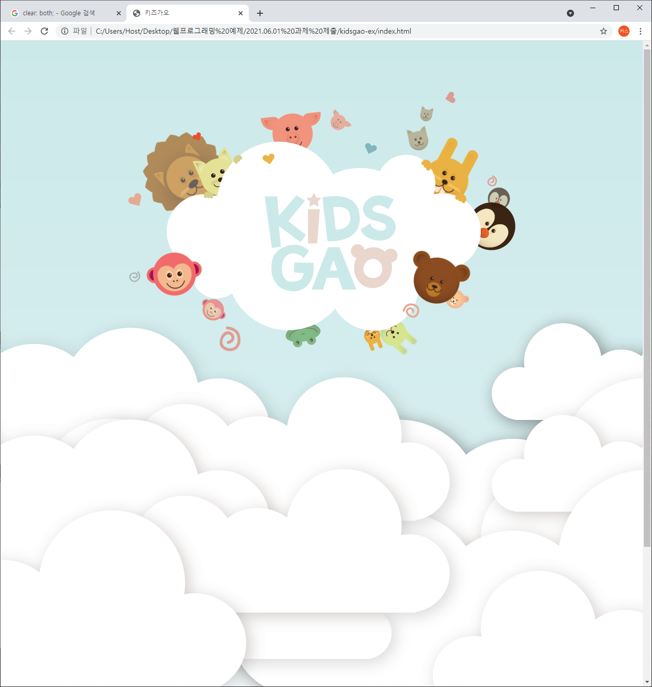
[Intro]
- index.html부분
<head>
<meta charset="utf-8">
<meta name="decription" content="우리쌀 점토로 만든 키즈가오 웹사이트 소개">
<meta name="keywords" content="키즈가오, 점토, 장난감">
<meta name="author" content="키즈가오">
<meta name="viewport" content="width=device-width, initial-scale=1.0">
<!-- Mobile에 맞춰 비율을 조정 -->
<title>키즈가오</title>
<link rel="stylesheet" type="text/css" href="css/style.css">
<link rel="stylesheet" type="text/css" href="css/animation.css">
<link rel="stylesheet" type="text/css" href="css/mobile.css">
</head>
<body>
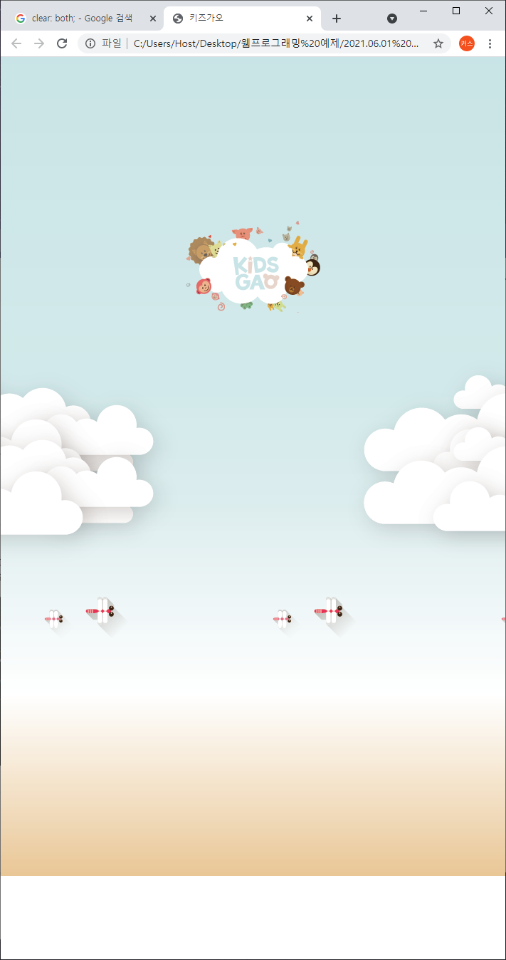
<header id="intro">
<div class="introWrap">
<div class="logo"></div>
<div class=lion></div>
<div class="rabbit"></div>
<div class="bear"></div>
<div class="monkey"></div>
</div>
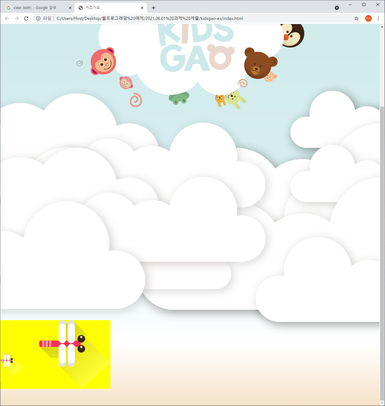
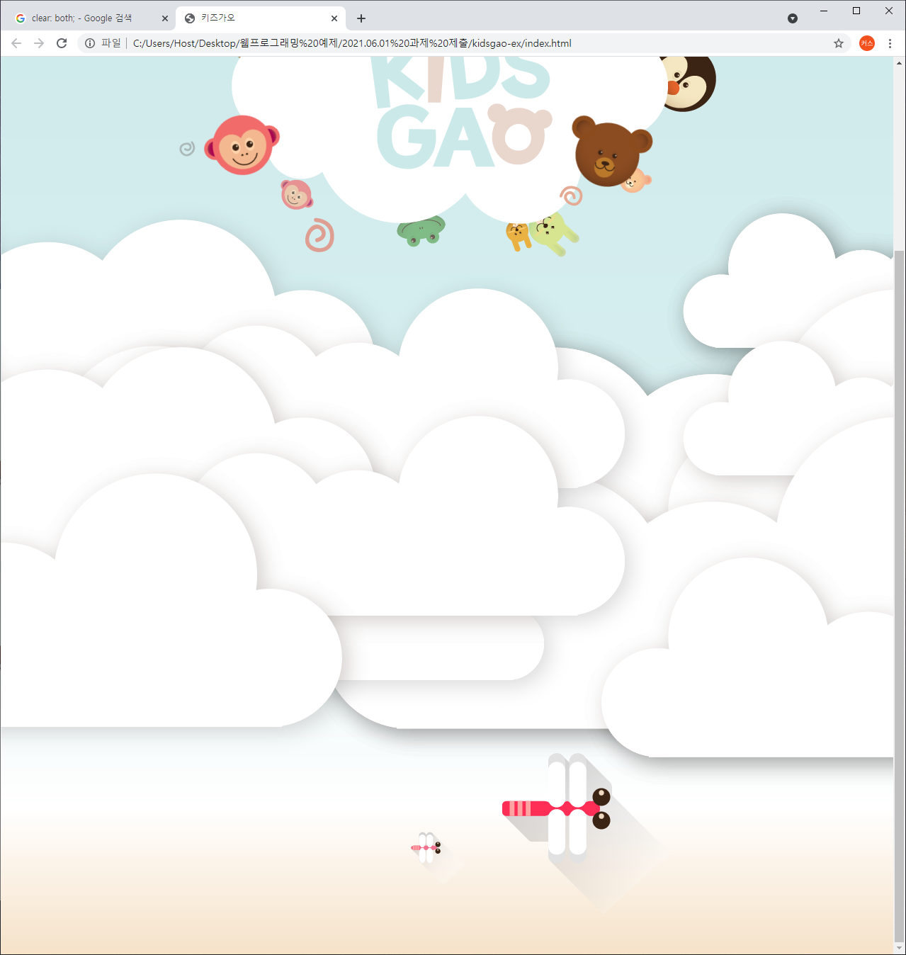
<div class="cloudWrap">
<div class="leftCloud"></div>
<div class="rightCloud"></div>
<div class="dragonfly"></div>
</div>
</header>
</body>- style.css부분
/* Default CSS(초기화 작업) */
html, body {
	margin: 0;
	padding: 0;
}

body {
	overflow-x: hidden; /* x축으로 벗어나는 영역은 숨김처리 */
}

h1, h2, h3, h4, h5, h6, p {
	margin: 0;
	padding: 0;
}

button {
	border: none; /* 태두리를 제거 */
	background-color: transparent; /* 배경값을 투명하게 */
}

.clearfix {
	clear: both; /* float를 사용시 적용시켜야할 속성 */
}
/* Intro부분 레이아웃 작업과 크기조절 */
#intro {
width: 100%;
height: 1600px;
background-image: url(../img/intro/intro_bg.png);
/*padding-top: 100px; 인트로 영역에 패딩값을 줘서 introWrap을 내림(인트로 영역 크기가 늘어나서 전체의 영역이 100px씩 밑으로 내려와서 전체적인 레이아웃틀이 깨짐)*/
}
#intro .introWrap {
position: relative;
/* left를 이용해 중앙정렬을 하기 위해서 사용 */
/* top, left, right, bottom을 위치이동 지점을 부모의 위치에 따라 조정하기 위해서 */
width: 760px;
height: 516px;
/*background-color: yellow;*/
left: 50%;
margin-left: -380px; /* introWrap 영역을 가운데에 위치시키기 위한 설정 */
/*margin-top: 100px;*/
top: 100px; /* 레이아웃이 겹치는 형태로 introWrap이 아래로 내려감(다른 레이아웃의 크기는 고정)
}
#intro .introWrap .logo {
position: absolute;
width: 760px;
height: 516px;
background-image: url(../img/intro/logo.png);
z-index: 100; /* 메인이 되는 로고값으로 기준이되는 z-index 값을 설정 */
}
#intro .introWrap .lion {
position: absolute;
width: 161px;
height: 161px;
background-image: url(../img/intro/lion.png);
/* background-image 사용시 실제 이미지 크기보다 영역의 크기가 크면 반복현상이 발생되기 때문에 크기 지정 */
/* background-repeat: no-repeat 사용시 반복현상은 사라지지만 공간은 차지하고 있음 */
margin: 80px 0 0 30px;
}
#intro .introWrap .rabbit {
position: absolute;
width: 105px;
height: 129px;
background-image: url(../img/intro/rabbit.png);
margin: 90px 0 0 580px;
}
#intro .introWrap .bear {
position: absolute;
width: 112px;
height: 105px;
background-image: url(../img/intro/bear.png);
margin: 310px 0 0 560px;
z-index: 200; /* 로고보다 이미지를 앞으로 보내고 싶을 경우 로고 z-index 보다 크게 설정 */
}
#intro .introWrap .monkey {
position: absolute;
width: 85px;
height: 93px;
background-image: url(../img/intro/monkey.png);
margin: 310px 0 0 50px;
z-index: 200;
}
/* 구름과 잠자리에 해당하는 영역 */
#intro .cloudWrap {
position: relative;
width: 100%;
height: 1050px;
/*background-color: pink;*/
}
#intro .cloudWrap .leftCloud {
position: absolute;
width: 934px;
height: 816px;
background-image: url(../img/intro/cloud1.png);
left: 0;
z-index: 2;
}
#intro .cloudWrap .rightCloud {
position: absolute;
width: 843px;
height: 858px;
background-image: url(../img/intro/cloud2.png);
right: 0;
}
#intro .cloudWrap .dragonfly {
position: absolute;
width: 366px;
height: 228px;
background-image: url(../img/intro/dragonfly.png);
/*background-color: yellow;*/
top: 800px;
}
- animation.css부분
/* Intro 애니메이션 부분*/
#intro .introWrap .lion {
	animation: spinLion 1500ms linear infinite alternate;
    /* linear(일정한속도), infinite(무한), alternate(from에서 to로 이동)
}

@keyframes spinLion {
	from {
		transform: rotate(-10deg);
	}

	to {
		transform: rotate(10deg);
	}
}

#intro .introWrap .rabbit {
	animation: spinRabbit 1000ms linear infinite alternate;
}

@keyframes spinRabbit {
	from {
		transform: rotate(0deg);
	}

	to {
		transform: rotate(5deg);
	}
}

#intro .introWrap .bear {
	animation: spinBear 1000ms linear infinite alternate;
}

@keyframes spinBear {
	from {
		transform: rotate(10deg);
	}

	to {
		transform: rotate(-10deg);
	}
}

#intro .introWrap .monkey {
	animation: spinMonkey 800ms linear infinite alternate;
}

@keyframes spinMonkey {
	from {
		transform: rotate(20deg);
	}

	to {
		transform: rotate(50deg);
	}
}

#intro .cloudWrap .dragonfly {
	animation: flyDragonfly linear 7s infinite;
}

@keyframes flyDragonfly {
	from {
		left: -366px; /* 잠자리영역 크기만큼 왼쪽으로 -366px만큼 이동시켜 첫 화면에서 사라지게 */
	}

	to {
		left: 100%; /* 사라진 지점부터 잠자리영역이 브라우저에서 100% 사려졌을때 까지 */
	}
}
-mobile.css부분
/* 미디어쿼리를 이용한 모바일 화면디자인 */
@media (max-width: 767px) {
	#intro {
		height: 1150px;
		background-image: url(../img/mobile/intro/mobile_intro_bg.png);
	}

	#intro .introWrap {
		width: 189px;
		height: 129px;

		margin-left: -94.5px; /* 변경된 크기에 따라 중앙정렬 하기 위해서 */
		/*background-color: yellow;*/

		top: 230px;
	}

	#intro .introWrap .logo {
		width: 189px;
		height: 129px;
		background-image: url(../img/mobile/intro/mobile_logo.png);
	}

	#intro .introWrap .lion,
	#intro .introWrap .rabbit,
	#intro .introWrap .bear,
	#intro .introWrap .monkey,
	#intro .cloudWrap .dragonfly {
		display: none;
	} /* 기존에 pc버전에서 사용한 이미지들을 감춤 */

	#intro .cloudWrap {
		height: 350px;

		top: 280px;
	}

	#intro .cloudWrap .leftCloud {
		width: 267px;
		height: 314px;
		background-image: url(../img/mobile/intro/mobile_cloud1.png);
	}

	#intro .cloudWrap .rightCloud {
		width: 237px;
		height: 309px;
		background-image: url(../img/mobile/intro/mobile_cloud2.png);
	}
}
[farm1]
- index.html부분
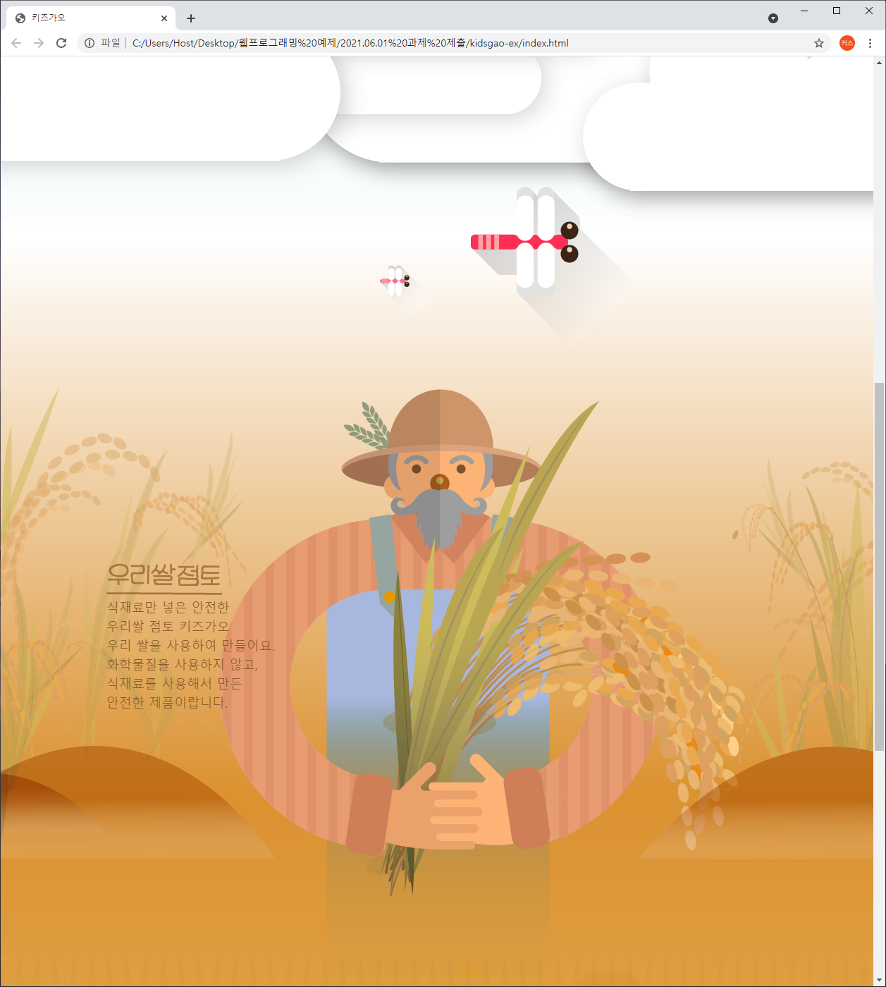
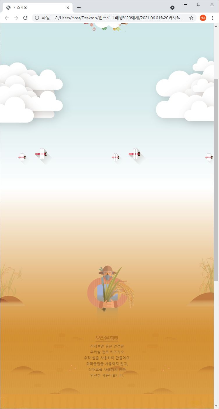
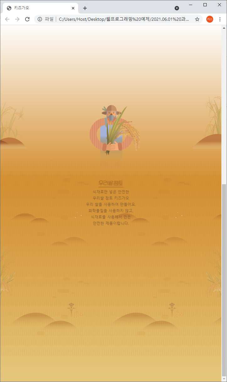
	<div id="farm1">
		<div class="leftRice1"></div>
		<div class="farmer"></div>
		<div class="rightRice1"></div>

		<div class="farmSpeechWrap">
			<img src="img/farm/farm1/farmspeech.png" align="우리쌀 점토">

			<p class="farmSpeech">
				식재료만 넣은 안전한<br>
				우리쌀 점토 키즈가오<br>
				우리 쌀을 사용하여 만들어요.<br>
				화학물질을 사용하지 않고,<br>
				식재료를 사용해서 만든<br>
				안전한 제품이랍니다.
			</p>
		</div>
</div>- style.css부분
/* farm1 */
#farm1 {
	position: relative;

	width: 100%;
	height: 800px;
	background-image: url(../img/farm/farm1/farm1_bg.png);
}

#farm1 .leftRice1 {
	position: absolute;

	width: 390px;
	height: 670px;
	background-image: url(../img/farm/farm1/leftrice.png);

	left: 0;
}

#farm1 .rightRice1 {
	position: absolute;

	width: 335px;
	height: 570px;
	background-image: url(../img/farm/farm1/rightrice.png);

	right: 0;
	top: 100px;
}

#farm1 .farmer {
	position: absolute;

	width: 747px;
	height: 1078px;
	background-image: url(../img/farm/farm1/farmer.png);

	left: 50%;
	margin-left: -310px;
}

#farm1 .farmSpeechWrap {
	position: relative;

	top: 250px;
	left: 150px;
}

#farm1 .farmSpeechWrap .farmSpeech {
	color: #895c2f;
	font-size: 18px;
	line-height: 27px; /* 글자간 위아래 간격 */
}
- mobile.css부분
/* farm1 */
	#farm1 {
		height: 450px;
		background-image: url(../img/mobile/farm/farm1/mobile_farm1_bg.png);
	}

	#farm1 .leftRice1 {
		width: 86px;
		height: 150px;
		background-image: url(../img/mobile/farm/farm1/mobile_leftrice.png);
	}

	#farm1 .rightRice1 {
		width: 95px;
		height: 170px;
		background-image: url(../img/mobile/farm/farm1/mobile_rightrice.png);

		top: -20px;
	}

	#farm1 .farmer {
		width: 160px;
		height: 250px;
		background-image: url(../img/mobile/farm/farm1/mobile_farmer.png);

		margin-left: -69px;
	}

	#farm1 .farmSpeechWrap {
		width: 300px;

		text-align: center; /* 글자나 inline요소에만 영향을 미침 */

		left: 50%;
		margin-left: -150px;
	}

	/* image지만 inline-block요소이기 때문에 text-align:  center; 가 적용됨 */
	#farm1 .farmSpeechWrap img {
		width: 79px;
	}

	#farm1 .farmSpeechWrap .farmSpeech {
		line-height: 20px;
		font-size: 12px;
	}
[farm2]
- index.html부분
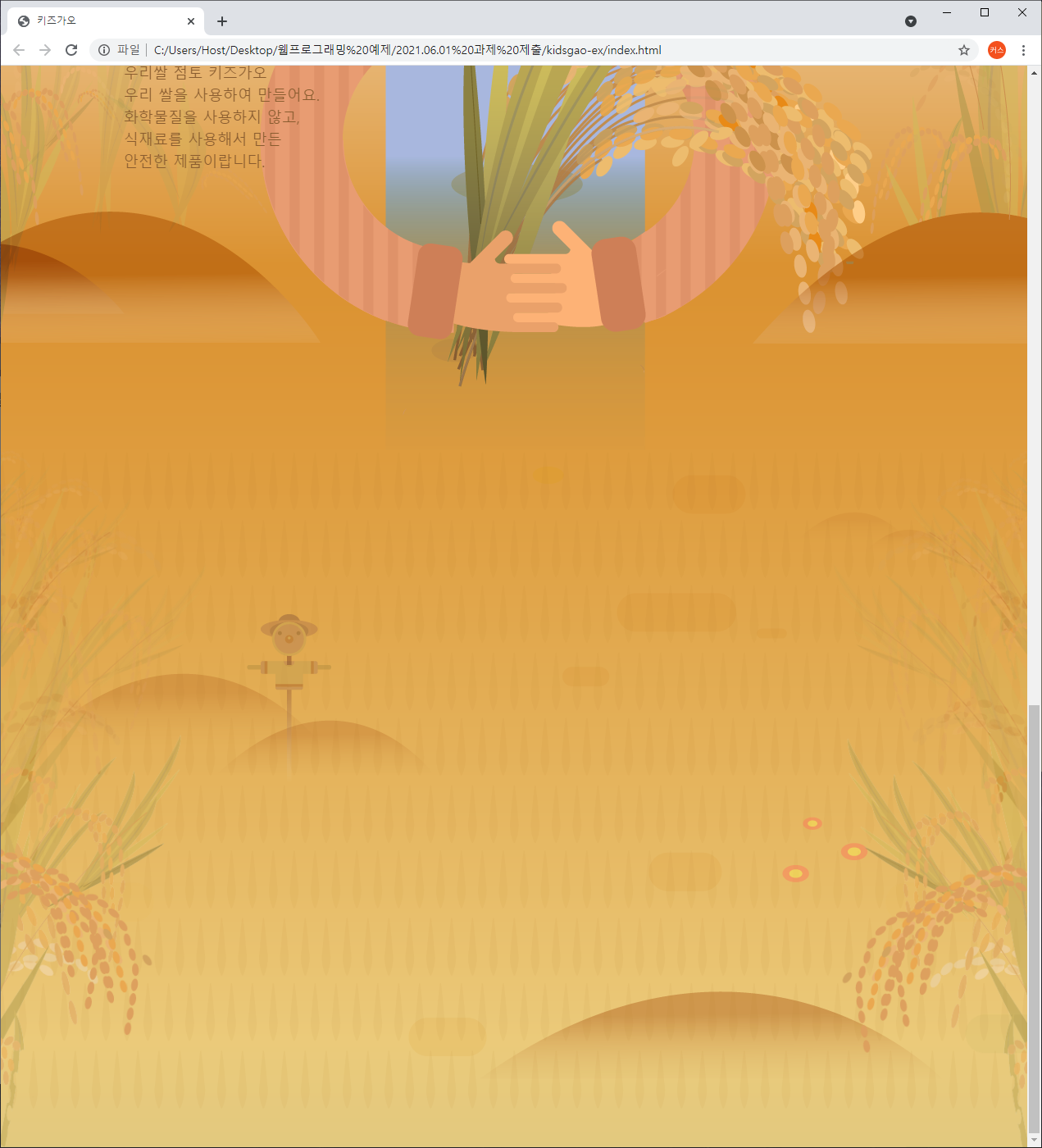
	<div id="farm2">
		<div class="leftRice2"></div>
		<div class="scarecrow"></div>
		<div class="rightRice2"></div>
</div>- style.css부분
/* farm2 */
#farm2 {
	position: relative;

	width: 100%;
	height: 850px;
	background-image: url(../img/farm/farm2/farm2_bg.png);
}

#farm2 .leftRice2 {
	float: left;

	width: 250px;
	height: 850px;
	background-image: url(../img/farm/farm2/leftrice2.png);
}

#farm2 .rightRice2 {
	float: right;

	width: 236px;
	height: 850px;
	background-image: url(../img/farm/farm2/rightrice2.png);
}

#farm2 .scarecrow {
	position: absolute;

	width: 103px;
	height: 206px;
	background-image: url(../img/farm/farm2/scarecrow.png);

	margin: 200px 0 0 300px;
}
- mobile.css부분
	/* farm2 */
	#farm2 {
		height: 440px;
		background-image: url(../img/mobile/farm/farm2/mobile_farm2_bg.png);
	}

	#farm2 .leftRice2 {
		width: 57px;
		height: 201px;
		background-image: url(../img/mobile/farm/farm2/mobile_leftrice2.png);
	}

	#farm2 .rightRice2 {
		width: 54px;
		height: 202px;
		background-image: url(../img/mobile/farm/farm2/mobile_rightrice2.png);
	}

	#farm2 .scarecrow {
		display: none;
	}
[farm3]
- index.html부분
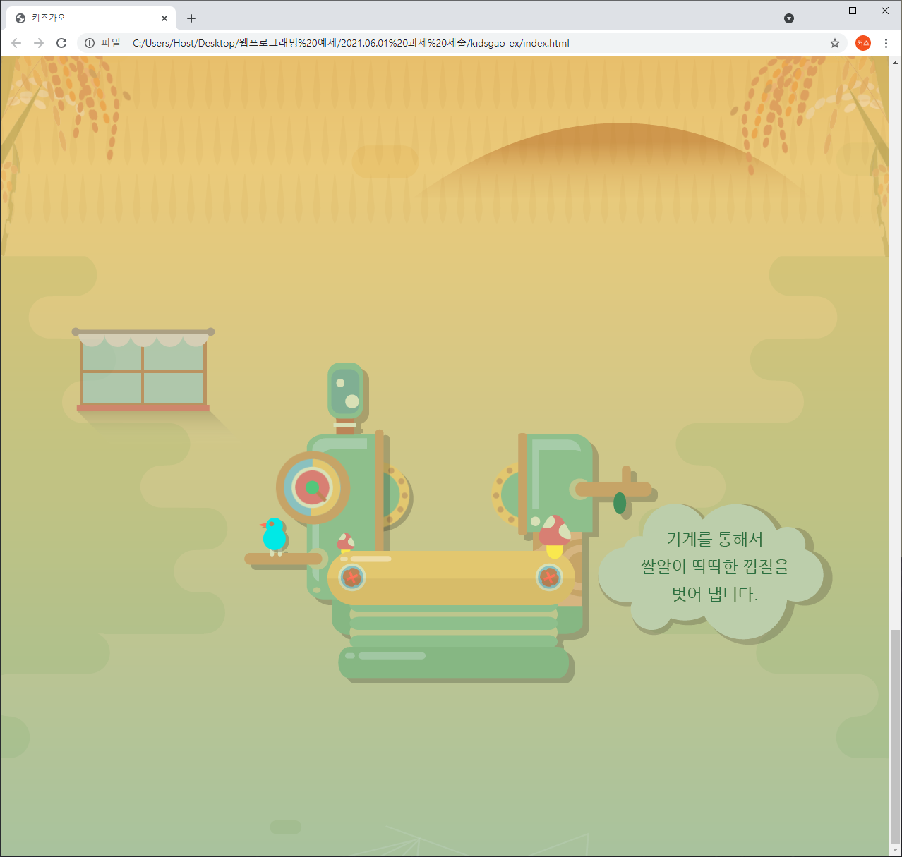
	<div id="farm3">
		<div class="farm3Window"></div>
		<div class="machineWrap">
			<div class="machine1"></div>
			<div class="sawShadow"></div>
			<div class="saw1"></div>
			<div class="saw2"></div>
			<div class="machineBird"></div>
			<div class="timer"></div>
		</div>

		<img class="farm3Bubble" src="img/farm/farm3/farm3bubble.png" alt="기계를 통해서 쌀알이 딱딱한 껍질을 벗어 냅니다.">
	</div>
-style.css부분
/* farm3 */
#farm3 {
	position: relative;

	width: 100%;
	height: 850px;
	background-image: url(../img/farm/farm3/farm3_bg.png);
}

#farm3 .farm3Window {
	position: absolute;

	width: 247px;
	height: 169px;
	background-image: url(../img/farm/farm3/window.png);

	margin: 100px 0 0 100px;
}

#farm3 .machineWrap {
	position: relative;

	width: 600px;
	height: 455px;
	/*background-color: yellow;*/

	left: 50%;
	margin-left: -285px;
	top: 150px;
}

#farm3 .machineWrap .machine1 {
	position: absolute;
	width: 586px;
	height: 455px;
	background-image: url(../img/farm/farm3/machine1.png);

	z-index: 900;
}

#farm3 .machineWrap .sawShadow {
	position: absolute;

	width: 95px;
	height: 95px;
	background-image: url(../img/farm/farm3/sawshadow.png);

	margin: 145px 0 0 145px;
}

#farm3 .machineWrap .saw1,
#farm3 .machineWrap .saw2 {
	position: absolute;

	width: 95px;
	height: 95px;
	background-image: url(../img/farm/farm3/saw.png);
}

#farm3 .machineWrap .saw1 {
	margin: 140px 0 0 140px;
}

#farm3 .machineWrap .saw2 {
	margin: 140px 0 0 350px;
}

#farm3 .machineWrap .timer {
	position: absolute;

	width: 103px;
	height: 104px;
	background-image: url(../img/farm/farm3/second.png);

	margin: 125px 0 0 45px;

	z-index: 999;
}

#farm3 .machineWrap .machineBird {
	position: absolute;

	width: 44px;
	height: 49px;
	background-image: url(../img/farm/farm3/machinebird.png);

	margin: 220px 0 0 20px;

	z-index: 999;
}

#farm3 .farm3Bubble {
	position: absolute;

	top: 350px;
	right: 80px;
}
- animation.css부분
#farm3 .machineWrap .timer {
	animation: rotateTimer 10000ms linear infinite;
}

@keyframes rotateTimer {
	from {
		transform: rotate(0deg);
	}

	to {
		transform: rotate(360deg);
	}
}

#farm3 .machineWrap .saw1 {
	animation: rotateLeftSaw 10000ms linear infinite;
}

@keyframes rotateLeftSaw {
	from {
		transform: rotate(0deg);
	}

	to {
		transform: rotate(360deg);
	}
}

#farm3 .machineWrap .saw2 {
	animation: rotateRightSaw 10000ms linear infinite;
}

@keyframes rotateRightSaw {
	from {
		transform: rotate(360deg);
	}

	to {
		transform: rotate(0deg);
	}
}
- mobile.css
/* farm3 */
	#farm3 {
		height: 500px;
		background-image: url(../img/mobile/farm/farm3/mobile_farm3_bg.png);
	}

	#farm3 .farm3Window {
		width: 82px;
		height: 56px;
		background-image: url(../img/mobile/farm/farm3/mobile_window.png);

		margin: 10px 0 0 10px;
	}

	#farm3 .machineWrap {
		width: 200px;
		height: 150px;

		top: 120px;
		margin-left: -96px;
	}

	#farm3 .machineWrap .machine1 {
		width: 191px;
		height: 149px;
		background-image: url(../img/mobile/farm/farm3/mobile_machine1.png);
	}

	#farm3 .machineWrap .sawShadow,
	#farm3 .machineWrap .timer,
	#farm3 .machineWrap .machineBird {
		display: none;
	}

	#farm3 .machineWrap .saw1,
	#farm3 .machineWrap .saw2 {
		width: 31px;
		height: 31px;
		background-image: url(../img/mobile/farm/farm3/mobile_saw.png);
	}

	#farm3 .machineWrap .saw1 {
		margin: 50px 0 0 50px;
	}

	#farm3 .machineWrap .saw2 {
		margin: 50px 0 0 115px;
	}

	#farm3 .farm3Bubble {
		position: absolute;

		width: 152px;

		left: 50%;
		margin-left: -70px;
	}
학습내용 중 어려웠던 점
어려운 점은 pc->mobile로 바꾸는 상황에서 기존 코드를 덮어쓰거나 숨김처리하는 부분이 살짝 이해가 안갔지만 여러가지를 예제를 통해서 변형해보니 어느정도 이해가 되었습니다.
다양한 상황에 따른 배치작업에 대해서는 아직도 약간 어려운 부분이 있습니다.
해결방법
배치작업에 대한 어려움을 해결하려면 앞으로 남은 다양한 실습을 하면서 배치 작업에 대한 수치와 속성값에 적응해야 할거 같습니다.
학습소감
아직 완벽하진 않지만 자바스크립트가 없는 상태에서 만들수 있는 홈페이지 제작 실습을 하는건 좋지만 기존에 배웠던 내용위주와 주로 비슷한 속성값을 사용하고 정해진 크기를 사용하다보니 강의 속도가 기존보다 빨라서 영상을 멈추는 빈도와 다시 되돌아가서 다시 보는 빈도가 많아 살짝 불편한감이 있습니다.

개발자를 꿈꾸는 이상화입니다.