flex
- 보통은 1줄을 정렬할 때 사용
ex)

홈페이지에 TabBar
display
: flex;
- block 형태의 flex
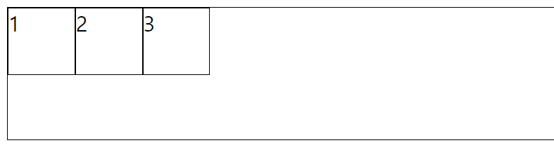
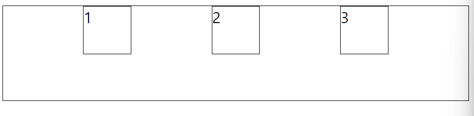
.container{
    border-width: 1px;
    border-color: black;
    border-style: solid;
    display: flex;
    height: 100px;
}

.item1{
    border-width: 1px;
    border-color: black;
    border-style: solid;
    width: 50px;
    height: 50px;
}

.item2{
    border-width: 1px;
    border-color: black;
    border-style: solid;
    width: 50px;
    height: 50px;
}

.item3{
    border-width: 1px;
    border-color: black;
    border-style: solid;
    width: 50px;
    height: 50px;
}
: inline-flex;
- inline 형태의 flex
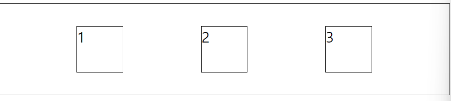
.container{
    border-width: 1px;
    border-color: black;
    border-style: solid;
    display: inline-flex;
    height: 100px;
}
justify - content
- 정렬 방향 기준으로 어떻게 세팅할지 결정
: center;
- 아이템들을 컨테이너의 중앙으로 정렬
.container{
    border-width: 1px;
    border-color: black;
    border-style: solid;
    display: flex;
    justify-content: center;
    height: 100px;
}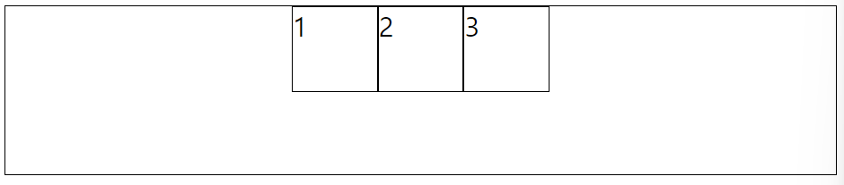
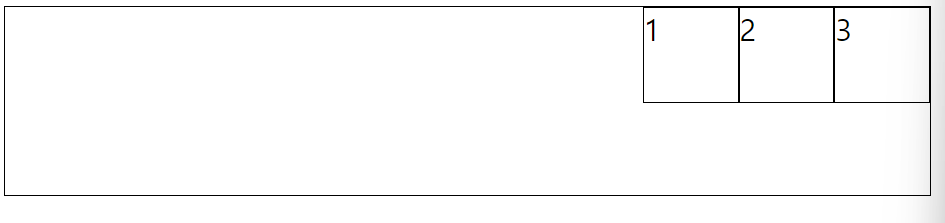
: flex-end;
- 아이템들을 컨테이너의 우측에 정렬
.container{
    border-width: 1px;
    border-color: black;
    border-style: solid;
    display: flex;
    justify-content: flex-end;
    height: 100px;
}
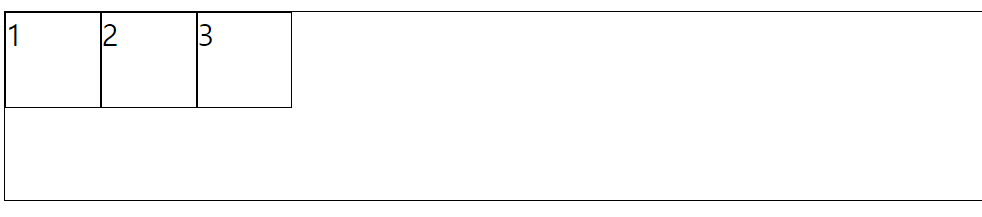
: flex-start;
- 아이템들을 컨테이너의 좌측에 정렬
.container{
    border-width: 1px;
    border-color: black;
    border-style: solid;
    display: flex;
    justify-content: flex-start;
    height: 100px;
}
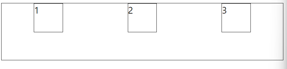
: space-around;
- 아이템들 좌우의 동일한 여백을 가짐
.container{
    border-width: 1px;
    border-color: black;
    border-style: solid;
    display: flex;
    justify-content: space-around;
    height: 100px;
}
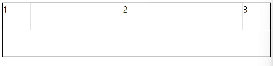
: space-between;
- 아이템들 간의 동일한 여백을 가짐
.container{
    border-width: 1px;
    border-color: black;
    border-style: solid;
    display: flex;
    justify-content: space-between;
    height: 100px;
}
: space-evenly;
- 아이템들 각각의 여백이 동일한 넓이를 가짐
.container{
    border-width: 1px;
    border-color: black;
    border-style: solid;
    display: flex;
    justify-content: space-evenly;
    height: 100px;
}
align-items
- 정렬된 방향의 크로스 된 부분을 어떻게 세팅할지 결정
: center ;
- 아이템들을 컨테이너 크로스 된 부분 가운데로 정렬
.container{
    border-width: 1px;
    border-color: black;
    border-style: solid;
    display: flex;
    justify-content: space-evenly;
    align-items: center;
    height: 100px;
}
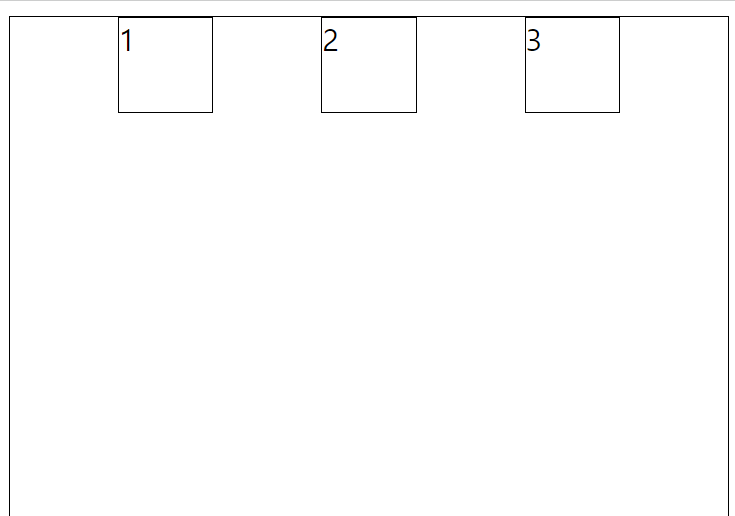
baseline;
- 아이템들을 컨테이너의 시작 위치에 정렬
.container{
    border-width: 1px;
    border-color: black;
    border-style: solid;
    display: flex;
    justify-content: space-evenly;
    align-items: baseline;
    height: 300px;
}
stretch;
- 아이템들을 컨테이너에 맞도록 늘림
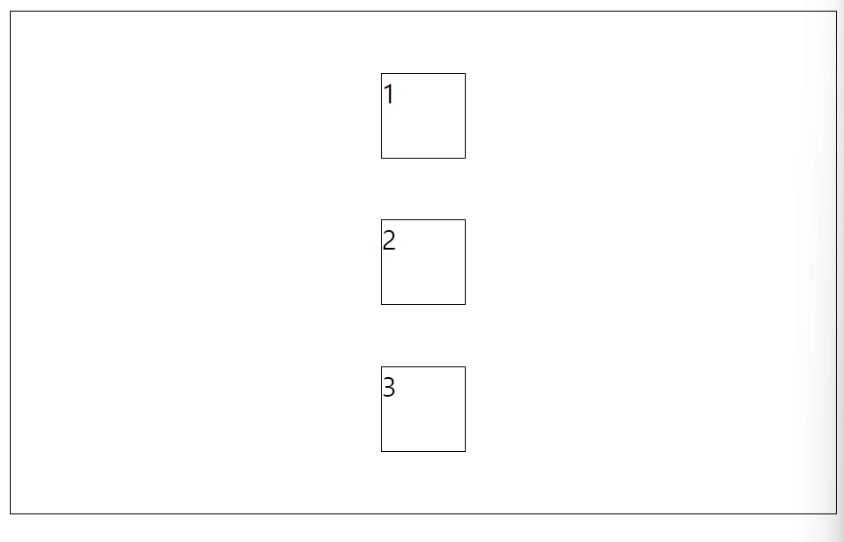
flex-direction
- 아이템들을 위에서 아래로 정렬
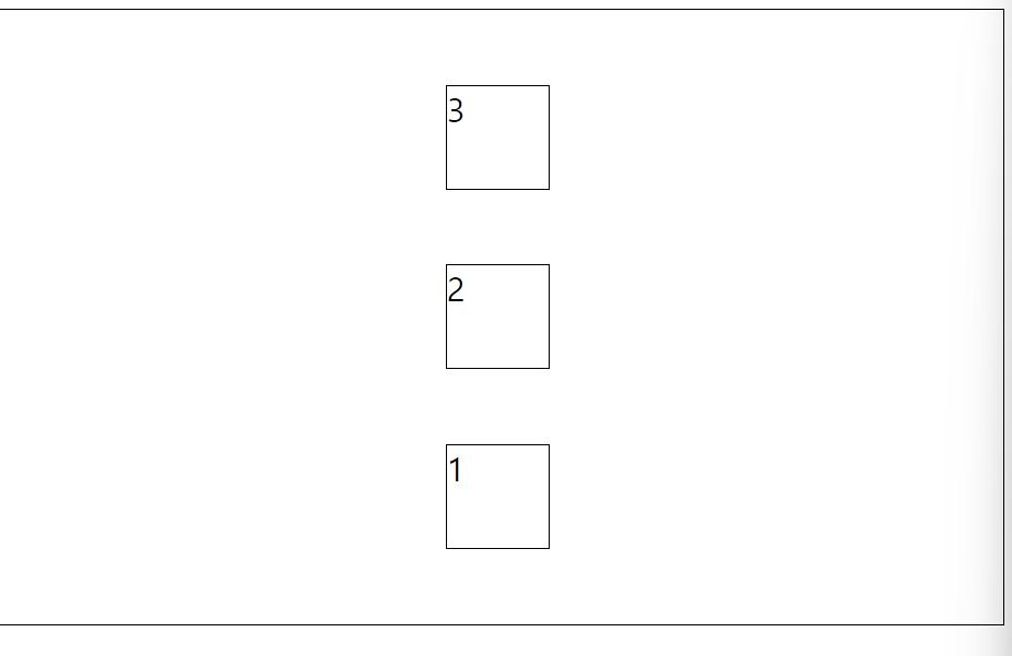
: column;
.container{
    border-width: 1px;
    border-color: black;
    border-style: solid;
    display: flex;
    justify-content: space-evenly;
    align-items: center;
    flex-direction: column;
    height: 300px;
}
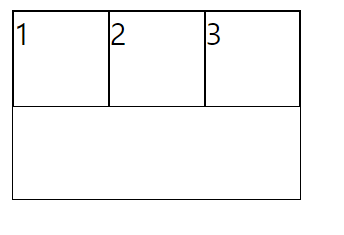
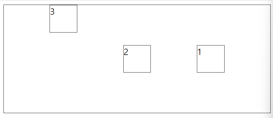
: column-reverse;
- 정렬 방향이 column인데 반대반향으로 정렬
- 아래에서 위를 보는 느낌
.container{
    border-width: 1px;
    border-color: black;
    border-style: solid;
    display: flex;
    justify-content: space-evenly;
    align-items: center;
    flex-direction: column-reverse;
    height: 300px;
}
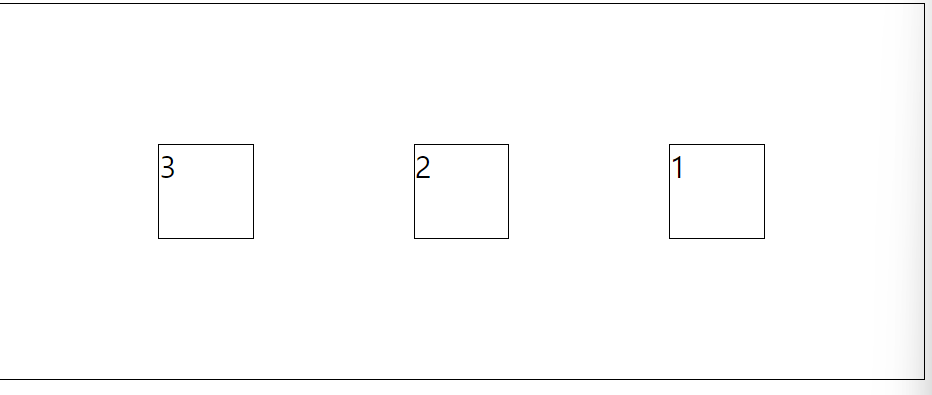
: row-reverse;
- 정렬 방향이 row인데 반대방향으로 정렬
- 아이템들을 텍스트의 반대방향으로 정렬
.container{
    border-width: 1px;
    border-color: black;
    border-style: solid;
    display: flex;
    justify-content: space-evenly;
    align-items: center;
    flex-direction: row-reverse;
    height: 200px;
}
align-self
- 개별 아이템들에 적용할 수 있는 또 다른 속성
- align-items가 사용하는 값들을 인자로 받을 수 있음.
- 인자로 받은 값은 해당 아이템에만 적용
self-start;
- 자기 자신을 맨 위로 보냄
.item3{
    border-width: 1px;
    border-color: black;
    border-style: solid;
    width: 50px;
    height: 50px;
    align-self: self-start;
}
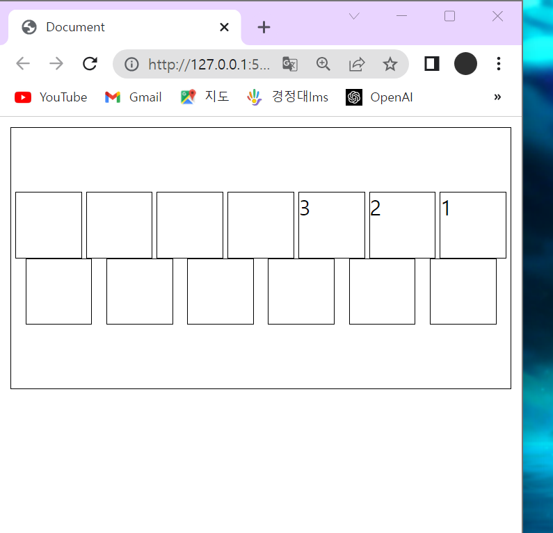
flex-wrap
: nowrap;
- 사이트 창이 작아지면 아이템들이 작아짐
- 모든 아이템들이 한줄에 정렬
.container{
    border-width: 1px;
    border-color: black;
    border-style: solid;
    display: flex;
    justify-content: space-evenly;
    align-items: center;
    flex-direction: row-reverse;
    height: 200px;
    flex-wrap: nowrap;
}
: wrap;
- 사이트 창이 작아지면 아이템이 작아지기 전에 다른 곳으로 이동
- 아이템들이 여러 줄에 걸쳐서 정렬
.container{
    border-width: 1px;
    border-color: black;
    border-style: solid;
    display: flex;
    justify-content: space-evenly;
    align-items: center;
    flex-direction: row-reverse;
    height: 200px;
    flex-wrap: wrap;
}
align-content : center;
- 다른 곳으로 이동한 아이템들을 한곳으로 모아둠
.container{
    border-width: 1px;
    border-color: black;
    border-style: solid;
    display: flex;
    justify-content: space-evenly;
    align-content: center;
    flex-direction: row-reverse;
    height: 200px;
    flex-wrap: wrap;
}
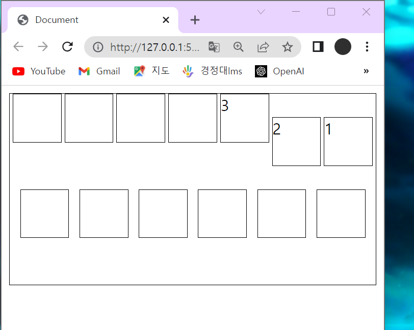
order
- 기본값은 0
- 양수나 음수로 바꿀 수 있음
- 컨테이너 내의 아이템들의 순서를 정할때 사용
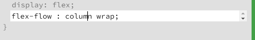
flex-flow
- flex-direction과 flex-wrap가 자주 같이 사용되기 때문에 사용
- flex-flow는 위의 두개를 대신할 수 있음
- 공백문자를 이용해 두 속성의 값들을 인자로 받음
row wrap;
- 아이템들을 가로선 상의 여러줄에 걸쳐 정렬
align-content
-
여러 줄 사이의 간격을 지정
-
align-items와의 차이점
align-items는 컨테이너 안에 어떻게 모든 아이템들이 정렬할지 겨정
: flex-start;
- 여러 줄들을 컨테이너의 꼭대기에 정렬
: flex-end;
- 여러 줄들을 컨테이너의 바닥에 정렬
: center;
- 여러 줄들을 세로선 상의 가운데에 정렬
space-between;
- 여러 줄들 사이에 동일한 간격을 둠
space-around;
- 여러 줄들 주위에 동일한 간격을 둠
stretch
- 여러 줄들을 컨테이너에 맞도록 늘림

^.^