🔖LikeLion_FrontEndSchool_TIL 4월 11일 (월)
이호준 강사님 강의
CSS
-
vertical-align인라인 블록 등을 포함한 모든 인라인 요소의 수직 정렬을 위해 사용되는 속성으로 블록 레벨 요소에는 영향을 미치지 않는다.
.one { vertical-align: top; /* 이미지가 부모요소 안에서 배치 될때 뜨는 것을 해결하기 위함*/ }-
.one없는 경우
-
.one있는 경우
위와 같이 이미지 요소가 배치될 때 공백이 생겨 뜨는 것을 해결하기 위해 사용되기도 한다.
-
-
text-align텍스트를 정렬하는데 사용하는 요소로
left,right,center등의 value를 통해 text를 정렬 가능하다.-
정렬 가능한 요소
- 자식인 inline block 요소
- 자식인 block 요소의 content
- 자식인 inline 요소
- text
-
-
text-indent텍스트 라인에서 텍스트가 시작하기 전의 빈공간을 설정할 수 있다. 음수 값도 가능하다.
<style>
    .a {
        text-indent: 10px;
    }
    .b {
        text-indent: -10px;
        /*음수 값 가능함*/
    }
    </style>
</head>
<body>
    <p class="a">Hello World!</p>
    <p class="b">Hello World!</p>
</body>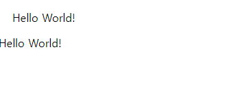
-
positionhtml tag나 id, class 박스 등의 위치를 지정해 주는 속성으로 이를 이용해 페이지의 레이아웃을 결정할 수 있다.
- static
position의 default 값으로 html에 작성한 태그 순으로 위치가 지정된다.position이 static인 요소는 top,left와 같은 값으로 위치를 조정해도 위치가 바뀌지 않는다. - relative
상대적이라는 의미로 원래 자신이 있어야 하는 위치(static)에 상대적인 위치이다. top, left 등의 값들로 위치를 조정하는 것이 가능하다.
- absolute
기본적으로 기준점이 html 요소에 있기 때문에 웹의 좌측 상단을 본래 위치로 인식하고 해당 위치를 기준으로 움직이게 된다. 하지만, 부모요소가
relative,absolute,fixed와 같은position속성을 갖는 다면 가장 가까운 부모 박스의 좌측 상단을 기준으로 위치하게 된다.
<style>
  .container {
    width: 500px;
    height: 500px;
    position: relative;
    margin-left: 100px;
    border: 5px solid black;
    background-color: aqua;
  }

  .one {
    width: 100px;
    height: 100px;
    border: 1px solid black;
    color: white;
  }
  .one:nth-child(1) {
    position: absolute;
    left: 200px;
    top: 200px;
    background-color: red;
  }
  .one:nth-child(2) {
    position: relative;
    /* 원래 자기 위치에서 좌표 조정 가능 */
    top: 10px;
    left: 10px;
    background-color: green;
  }
  .one:nth-child(3) {
    position: static;
    left: 50px;
    /* static 이기 때문에 left 요소의 값을 설정해도 요소가 움직이지 않는다. */
    background-color: blue;
  }
  .two {
    width: 100px;
    height: 100px;
    position: absolute;
    left: 50px;
    top: 50px;
    background-color: blueviolet;
  }
</style>
</head>
<body>
  <div class="container">
    <div class="one">box1</div>
    <div class="one">box2</div>
    <div class="one">box3</div>
  </div>
  <div class="two"></div>
</body>
코드에 따흔 결과 이미지를 확인해 보면 각position속성들의 특징이 나타난 것을 알 수 있다. 빨간색 박스와 보라색 박스는 둘다position이 absolute이지만, 빨간색 박스는position이 relative인.container의 자식 요소이므로.container의 좌측 상단을 기준으로 움직이고 보라색 박스의 경우 position이 지정된 부모요소가 존재하지 않기 때문에 html 요소를 기준으로 움직인 것을 확인할 수 있다.-
fixed
스크롤을 올리거나 내릴 때, 특정 박스가 고정되어야 하는 경우 사용된다. 사용자가 현재 보고있는 뷰포트를 기준으로 화면에 붙은 것 처럼 그 자리를 계속 유지하게 된다.
   <style>
     body {
       margin: 0;
     }
     .nav {
       font-family: "Pacifico", cursive;
       position: fixed;
       position: fixed;
       padding: 10px;
       background-color: brown;
       color: white;
       font-weight: 900;
       font-size: 28px;
       width: 100%;
       height: 45px;
     }
     .container {
       /*margin-top: 0;*/
       padding-top: 120px;
       margin-left: 10px;
     }
   </style>
 </head>
 <body>
   <div class="nav">Hello world</div>
   <div class="container">
     Lorem ipsum dolor sit amet,
     ...
>
> position이 fixed인 요소가 화면을 스크롤해도 위치를 그래도 유지하는 것을 확인할 수 있다.- cf.
position이 fixed인 요소의 형제 요소에게 margin을 주게된다면 아래 사진과 같이 fixed 요소 위에 margin이 생기는 것을 확인할 수 있다.

이 또한, 마진 병합 현상의 하나로 형제 요소의 margin이 fixed 요소와 겹쳐 fixed 요소에 margin이 추가되므로 주의해야한다.
- cf.
-
sticky
fixed와 비슷한 성질을 갖지만 sticky의 경우 sticky 요소나 sticky의 부모요소가 화면 상단과 만나면 그때 부터 fixed의 성질을 갖는 요소이다.
  <style>
    section {
      height: 1000px;
      border: 3px solid black;
    }

    h2 {
      position: -webkit-sticky;
      position: sticky;
      top: 0;
      background: greenyellow;
    }
  </style>
</head>

<body>
  <h1>sticky test</h1>
  <section>
    <h2>오늘의 메뉴</h2>
    <ul>
      <li>
        Lorem ipsum dolor
        ...
- static