📌 대중교통 데이터 분석
✅ 유임 승차 비율이 가장 높은 역은 어디일까
file_path = '/content/drive/MyDrive/전공관련/파이썬/subwayfee.csv'

import csv

f = open(file_path, encoding = 'cp949')

data = csv.reader(f)

next(data)

max = 0    # 유임승차 최대일 때 값 저장 변수
rate = 0   # 유임승차 비율을 구하는 변수
station = ''

for row in data:
  for i in range(4,8):
    row[i] = int(row[i])
   # rate = row[4] / row[6]   ※유임승차 비율 -> 유임승차 / 무임승차  => 이렇게 할 경우 에러!(무임승차자가 0인 경우가 있어서)
  if row[6] != 0 and (row[4]+row[6]) > 100000:
    rate = row[4] / (row[4] + row[6])   # 유임승차 / 전체 승차자(유임 + 무임)

  if rate > max:
    max = rate
    station = row[3] + ' ' + row[1]

print(station, round(max*100, 2))  # 비율이므로 *100, 소수점자리 2번째까지 출력
▶️▶️ 결과!
홍대입구 공항철도 1호선 95.16
(사실 강사님 따라가기 조금 벅차서 혼자 책보고 쳤더니 이게 맞는건지는
잘 모르겠다 ..)
❓ 무임승차자가 가장 많은 역
-> rate 처리 수식만 rate = row[6] / (row[4] + row[6])로 변경 하면 됨
✅ 유무임 승하차 인원이 가장 많은 역
file_path = '/content/drive/MyDrive/전공관련/파이썬/subwayfee.csv'

import csv

f = open(file_path, encoding = 'cp949')

data = csv.reader(f)

next(data)

# 유무임승하차  변수 생성
max = [0] * 4         # max = [0,0,0,0]
station = [''] * 4    # station = ['', '', '', '']
title = ['유임승차', '유임하차', '무임승차', '무임하차']

for row in data:
  for i in range(4,8):
    row[i] = int(row[i])

    if row[i] > max[i-4]:
        max[i-4] = row[i]
        station[i-4] = row[3] + ' ' + row[1]

for i in range(4):
        print(title[i] + ':' + station[i], max[i])
▶️▶️ 결과!
유임승차:강남 2호선 2235658
유임하차:강남 2호선 2193476
무임승차:종로3가 1호선 289163
무임하차:제기동 1호선 279438
✅ 위의 결과 파이그래프로 그리기
plt.pie(row[4:8])
plt.axis("equal")
plt.show()
matplotlib 임포트 후 위의 코드 입력
▶️▶️ 결과

+) 색 변경 및 해상도, 타이틀, 퍼센트 설정
c = ['#14CCC0', '#389993', '#FF1C6A', '#CC14AF']
plt.figure(dpi=300)
plt.title(row[3] + ' ' + row[1])
plt.pie(row[4:8], colors = c, labels = title, autopct="%1.f%%")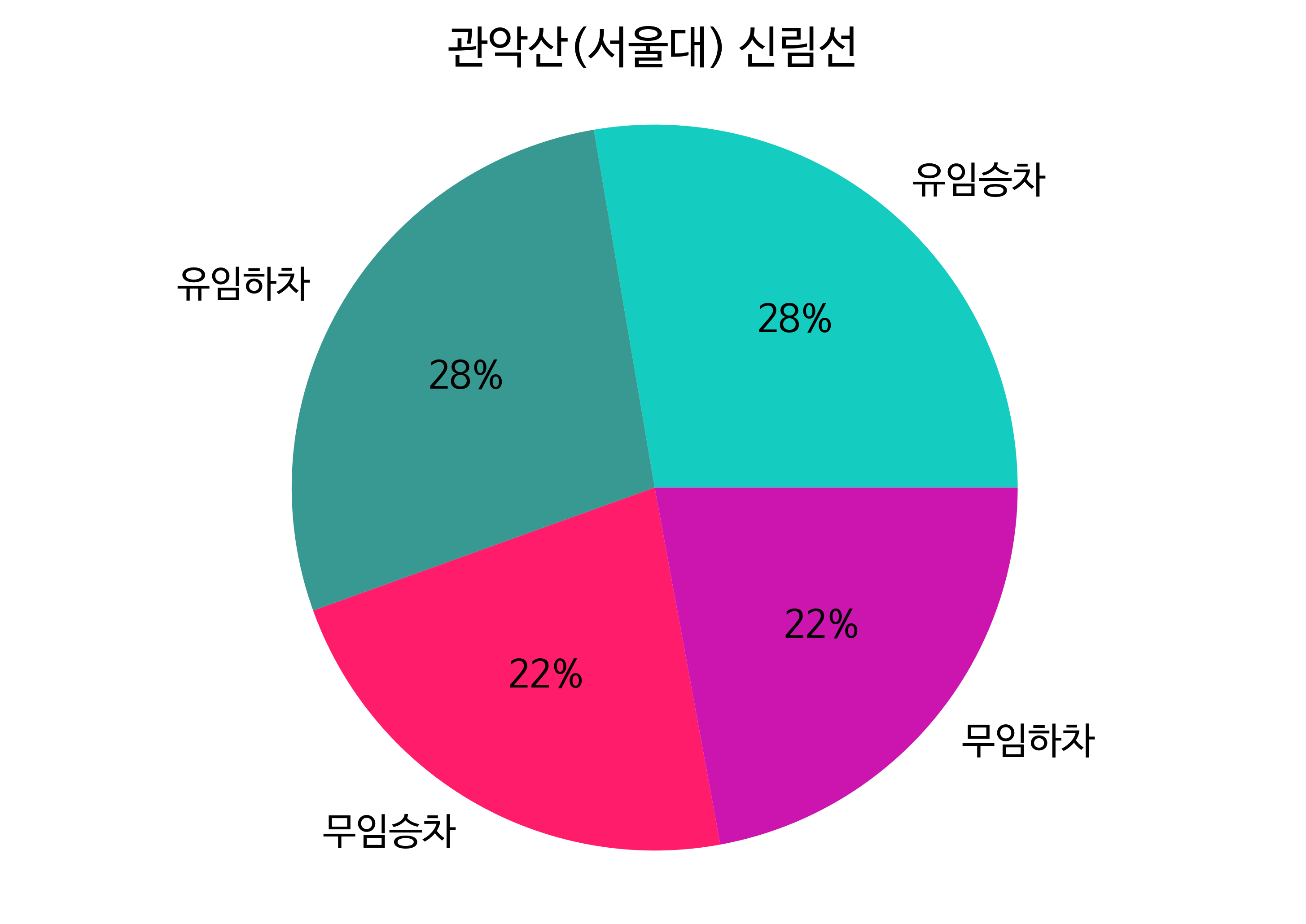
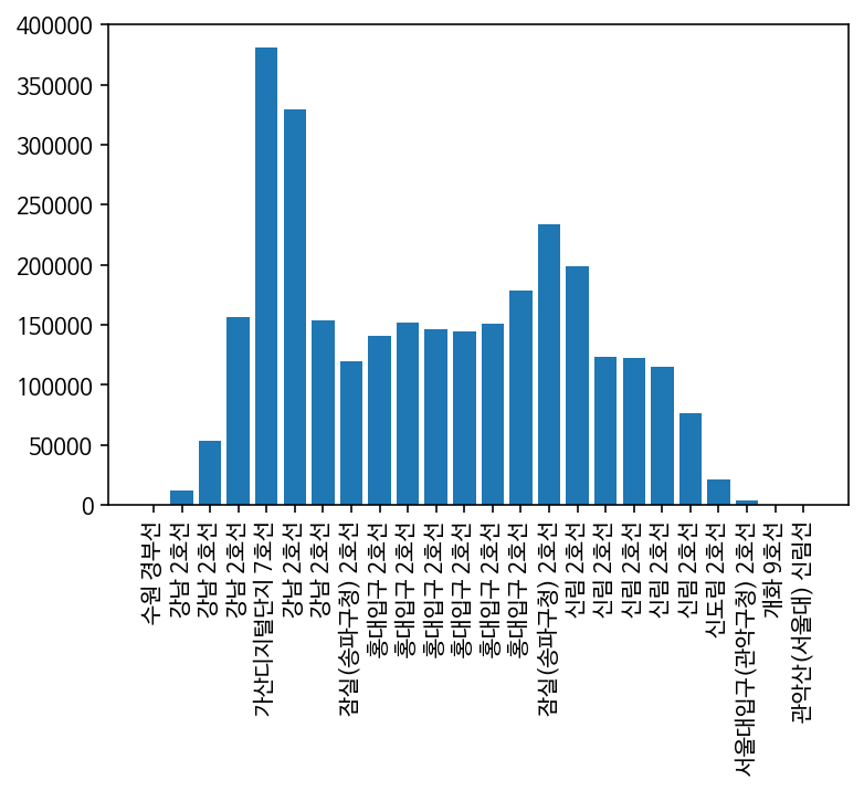
✅ 출근시간 승하차 그래프
- 출근 시간 승하차 인원이 가장 많은 역은?
next(data)  # next 두번
next(data)

# 1) 변수 선언
max = 0
station = ''

# 2) 승하차 인원이 가장 많은 역 출력
for row in data:
  row[4:] = map(int, row[4:])  # map 함수 이용해서 한번에 형변환

  if row[10] > max:
    max = row[10]
    station = row[3] + '(' + row[1] + ')'

print(station, max)
▶️▶️ 결과
신림(2호선) 188831
- 그래프 그리기
# 1) 리스트 저장 변수 생성
result = []

# 2) 역별 승하차 인원 인덱스 출력하여 result 변수에 저장
for row in data:
  row[4:] = map(int, row[4:])
  result.append(sum(row[10:15:2]))

# 3) 막대 그래프 그리기

result.sort()  # sort 이용하여 정렬

plt.figure(figsize=(20,5))
plt.bar(range(len(result)), result)
plt.show()
🔽 결과
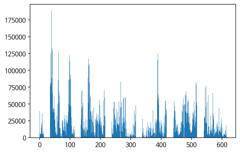
-> sort 하지 않고 그래프를 그렸을 때
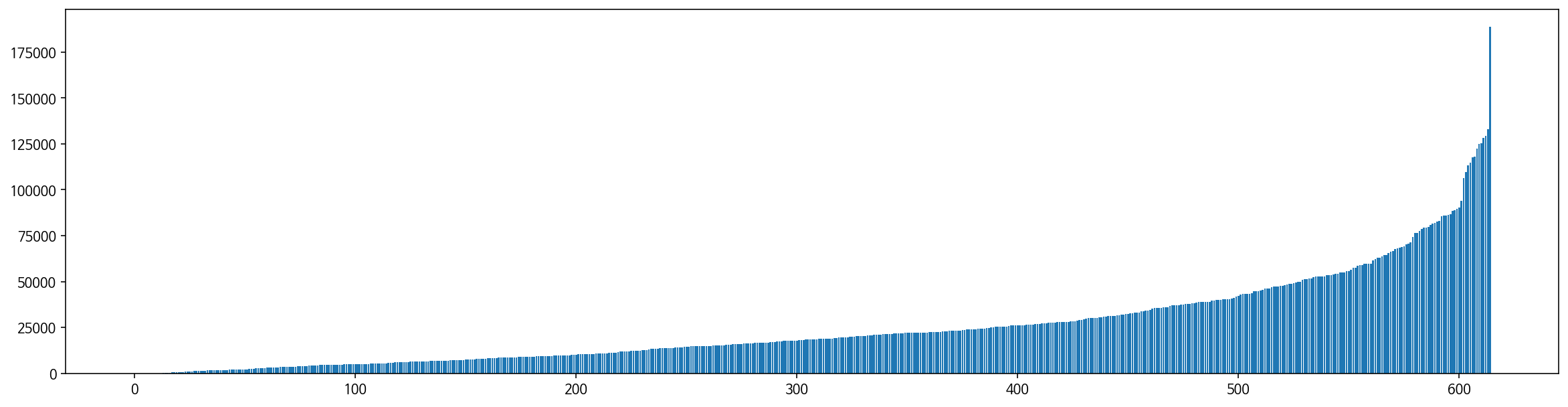
-> sort 한 경우
✅ 사용자가 시간을 입력하여 그래프 그리기
# 1) 시간 저장
time = int(input("몇시: "))
if time < 4: # 24시 이후 새벽은 +24 처리 후 출력할 수 있도록 설정
time = time + 24
idx = 2 * time -4
for row in data:
row[4:] = map(int, row[4:])
if row[idx] > max:
max = row[idx]
station = row[3] + ' ' + row[1]
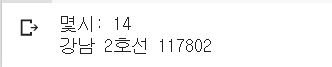
print(station, max)🔽 결과
✅ 시간대별 승하차 그래프
<
# 1) 시간 별 승하차 변수 선언
max_in = [0] * 24
max_out = [0] * 24
station_in = [''] * 24
station_out = [''] * 24

for row in data:
  row[4:] = map(int, row[4:])
  for idx in range(24):
    if row[2*idx+4] >= max_in[idx]:
      max_in[idx] = row[2*idx+4]
      station_in[idx] = row[3] + ' ' + row[1]
    if row[2*idx+5] >= max_out[idx]:
      max_out[idx] = row[2*idx+5]
      station_out[idx] = row[3] + ' ' + row[1]

print(station_in, max_in)
print(station_out, max_out)

for i in range(24):
  print(station_in[i], max_in[i], station_out[i], max_out[i])

# 2) 그래프 그리기
plt.bar(range(24), max)
plt.xticks(range(24), station, rotation=90)  # rotation로 x축 글자 눕히기
plt.show()
🔽 결과