안녕하세요 인티그레이션 프론트엔드 개발자 박정연입니다.
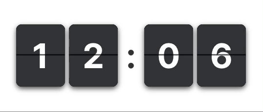
플립 카운터 애니메이션은 메디마켓 공동구매 프로젝트에서 사용자들의 눈을 사로잡는 요소를 넣기 위해 만들게 되었습니다.
플립 카운터 애니메이션의 구현 방법을 리서치 하던 중 흔한 애니메이션임에도 원리가 설명되어 있는 블로그가 별로 없었습니다.
그래서 HTML, CSS, JS 만을 이용하여 구현된 것 중 ‘Adem ilter’ 라는 닉네임의 개발자가 작성한 codepen 코드를 기반으로 Vue.js 코드로 변환하면서 정리하고 원리를 분석해 보았습니다.
원본 코드 링크: https://codepen.io/ademilter/pen/nazxPX
기본 로직 구현하기
template에는 카드에 들어갈 숫자(0~9)까지를 미리 만들어 놓습니다. 그리고 현재 보일 숫자 카드에 front 클래스네임을 붙이고, 그 아래에 보일 이전 숫자에는 back이라는 클래스네임을 붙입니다.
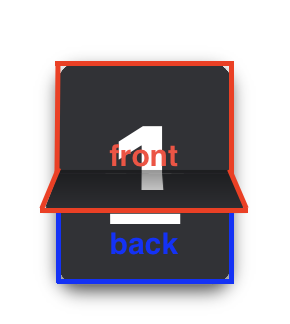
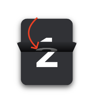
위 이미지에서는 ‘1’ 이 쓰인 카드가 front, ‘2’ 가 쓰인 카드가 back 입니다.
위 예제에서는 플립 애니메이션을 타이머 용도로 사용해서 큰 숫자에서 작은 숫자로 넘어가므로 back 이 front + 1 이 됩니다.
숫자는 0부터 9까지 밖에 올 수 없기 때문에 front = 9인 경우에 front + 1 = 10이지만 back은 다시 0 부터 시작되어야 하므로 back = (front + 1) % 10이 됩니다.
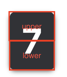
그다음 카드의 중심을 기준으로 회전하는 것처럼 보이게 만들어야 하기 때문에 카드를 upper 와 lower 반으로 나누어 요소를 생성합니다.
여기까지의 template과 script 코드는 아래와 같습니다.
<template>
  <ul>
    <li
      v-for="num in [...Array(10).keys()]"
      :key="num"
      :class="{
        'front': num === counter,
        'back': num === (counter + 1) % 10
      }">
      <div class="upper">
        <div class="num">{{ num }}</div>
      </div>
      <div class="lower">
        <div class="num">{{ num }}</div>
      </div>
    </li>
  </ul>
</template>

<script>
export default {
  props: {
    counter: {
      type: Number,
      default: 0
    }
  }
}
</script>
애니메이션 입히기
카드가 회전하는 애니메이션은 upper가 먼저 회전한 뒤lower가 회전하기 때문에 각각 스타일을 부여해야 합니다.
다음은 front = 1 이고 back = 2 인 경우에 upper와 lower가 회전하는 상황을 각각 살펴보겠습니다.
1. upper 회전
- 카드가 회전하기 위한 중심점
transform-origin: 50% 100%;
- x축 중심 회전 각도
- 0deg → 90deg
- z-index
- back(2번 카드) > front(1번 카드)
- back이 보여야 함
2. lower 회전
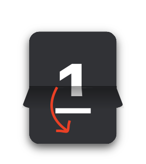
- 카드가 회전하기 위한 중심점
transform-origin: 50% 0%;
- x축 중심 회전 각도
- 90deg → 0deg
- z-index
- front(1번 카드) > back(2번 카드)
- front가 보여야 함
전체 코드
<template>
  <ul>
    <li
      v-for="num in [...Array(10).keys()]"
      :key="num"
      :class="{
        'front': num === counter,
        'back': num === (counter + 1) % 10
      }">
      <div class="upper">
        <div class="num">{{ num }}</div>
      </div>
      <div class="lower">
        <div class="num">{{ num }}</div>
      </div>
    </li>
  </ul>
</template>

<script>
export default {
  props: {
    counter: {
      type: Number,
      default: 0
    }
  }
}
</script>

<style lang="scss" scoped>
ul {
  position: relative;
  width: 25px;
  height: 32px;
  margin: 2px;
  border-radius: 6px;
  box-shadow: 0 2px 5px rgba(0, 0, 0, .7);
  font-size: 20px;
  font-weight: bold;
  list-style: none;

  li {
    position: absolute;
    z-index: 1;
    top: 0;
    left: 0;
    width: 100%;
    height: 100%;

    // 카드 기본 설정

    div {
      position: absolute;
      z-index: 1;
      left: 0;
      overflow: hidden;
      width: 100%;
      height: 50%;

			// 그림자 효과를 넣어줄 가상 요소
      &::before {
        position: absolute;
        z-index: 2;
        width: 100%;
        height: 100%;
        content: "";
      }

      .num {
        position: absolute;
        z-index: 1;
        left: 0;
        display: flex;
        width: 100%;
        height: 200%;
        align-items: center;
        justify-content: center;
        background-color: var(--blue-grey-800);
        border-radius: 6px;
        color: white;
      }

      &.upper {
        top: 0;
        transform-origin: 50% 100%; // transform의 기준을 카드의 중앙으로 설정

        .num {
          top: 0;
        }

        // 카드 가운데 선

        &::after {
          position: absolute;
          z-index: 5;
          bottom: 0;
          left: 0;
          width: 100%;
          height: 1px;
          background-color: rgba(0,0,0,.4);
          content: "";
        }
      }

      &.lower {
        bottom: 0;
        transform-origin: 50% 0%;

        .num {
          bottom: 0;
        }
      }
    }

    &.back {
      z-index: 3;

      .upper {
        z-index: 2;
        animation: top-to-middle .5s linear both;

        &::before {
          animation: show .5s linear both;
          background: linear-gradient(to top, rgba(0, 0, 0, .1) 0%, rgba(0, 0, 0, 1) 100%);
          background: linear-gradient(to bottom, rgba(0, 0, 0, .1) 0%, rgba(0, 0, 0, 1) 100%);
        }
      }

      .lower {

        &::before {
          animation: show .5s linear both;
        }
      }

    }

    &.front {
      z-index: 2;
      animation: increase-zindex .5s .5s linear forwards;

      .upper {

        &::before {
          animation: hide .5s .3s linear both;
        }
      }

      .lower {
        z-index: 2;
        animation: middle-to-bottom .5s .5s linear both;

        &::before {
          animation: hide .5s .3s linear both;
          background: linear-gradient(to top, rgba(0, 0, 0, 1) 0%, rgba(0, 0, 0, .1) 100%);
          background: linear-gradient(to bottom, rgba(0, 0, 0, 1) 0%, rgba(0, 0, 0, .1) 100%);
        }
      }
    }
  }
}

@keyframes increase-zindex {

  0% {
    z-index: 4;
  }

  100% {
    z-index: 4;
  }
}

@keyframes middle-to-bottom {

  0% {
    transform: rotateX(90deg);
  }

  100% {
    transform: rotateX(0deg);
  }
}

@keyframes top-to-middle {

  0% {
    transform: rotateX(0deg);
  }

  100% {
    transform: rotateX(90deg);
  }
}

@keyframes show {

  0% {
    opacity: 0;
  }

  100% {
    opacity: 1;
  }
}

@keyframes hide {

  0% {
    opacity: 1;
  }

  100% {
    opacity: 0;
  }
}
</style>
두자릿수 타이머 만들어보기
마지막으로 앞에서 만들어본 숫자 카드를 FlipCounter라는 컴포넌트로 생성한 후 간단한 두 자릿수 타이머를 구현해 보겠습니다.
99초에서부터 1초씩 줄어드는 간단한 타이머입니다.
<template>
  <div class="timer">
    <flip-counter
      :counter="Math.floor(timer / 10)">
    </flip-counter>
    <flip-counter
      :counter="timer % 10">
    </flip-counter>
  </div>
</template>

<script>

export default {
  data () {
    return {
      timer: 99,
      timerId: null
    }
  },
  mounted () {
    this.timerId = setInterval(() => {
      if (this.timer === 0) {
        clearInterval(this.timerId)
        return
      }
      this.timer = this.timer - 1
    }, 1000)
  }
}
</script>

<style scoped>
.timer {
  display: flex;
  gap: 3px;
}
</style>
메디스트림 서비스에 적용한 사례
읽어주셔서 감사합니다! 플립 카운터 애니메이션 구현 방법을 찾고 계신 분들에게 도움이 되었으면 좋겠습니다.
잘 모르는 부분이 있다면 언제든 질문해주세요!


흥미롭게 읽고 react로 구현해봤어요! 블로그에 쉽게 설명해주셔서 금방 구현했네요