HTML, CSS
display
- inline : 존재하는 콘텐츠의 양에 따라 그 크기가 가변한다
- inline-block : 한줄에 여러개 위치할 수 있다.
- block : 한줄에 하나만 위치할 수 있다.
position
- relative : 원래 있어야하는 자리에서 상대적으로 옮겨간다.
- absolute : 내가 담겨있는 상자 안에서 위치가 변한다.
- fixed : 상자안에서 벗어나서 window에서 움직인다.
- sticky : 원래 있어야하는 자리에 있으면서 스크롤 되어도 유지한다.
시맨틱 태그(의미가 있는 태그)
- i : 시각적으로만 이탤릭체
- em : 강조하는 이탤릭체
- b : 시각적으로만 볼드체
- strong : 정말 중요한 볼드체
- ol : 순서가 중요할 때!
- ul : 순서가 없는 목록 리스트
- dl : 단어에 대한 설명에 대한 목록
- button : 특정한 액션이 발생하는 경우
- a : 어디론가 이동할때 (링크)
- table : (행+열) 데이터!
- css : flex, grid
float를 활용한 레이아웃
- 감싸는 container 박스 만들면 유용함
- float: left => 요소를 붕 띄어서 왼쪽정렬
- clear: both를 사용하면 float 다음에 오는 요소에게 주면 float로 발생하는 이상한 현상 해결 가능
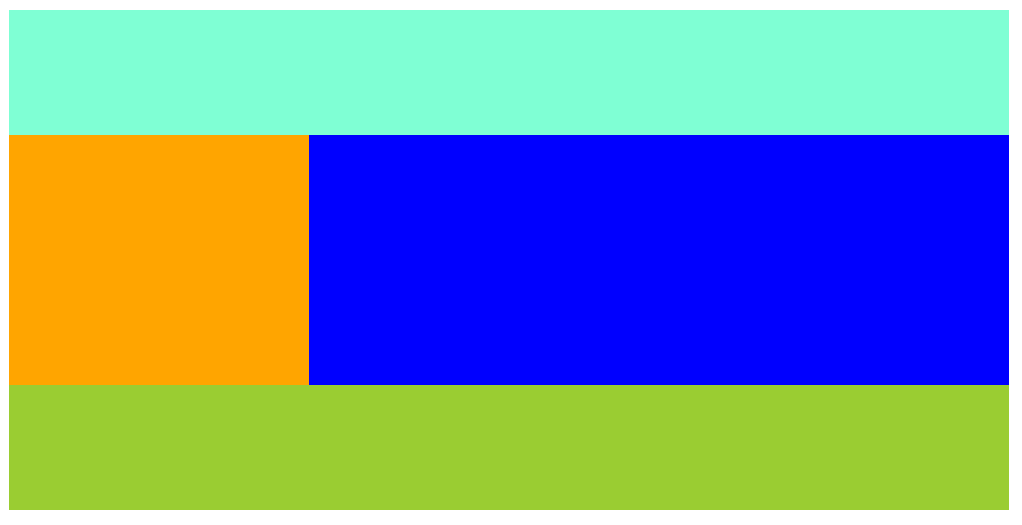
  <body>
    <div class="container">
      <div class="header"></div>
      <div class="left-menu"></div>
      <div class="right-menu"></div>
      <div class="footer"></div>
    </div>
  </body>
.container {
width: 800px;
}
.header {
width: 100%;
height: 100px;
background-color: aquamarine;
}
.left-menu {
width: 30%;
height: 200px;
background-color: orange;
float: left; //요소를 붕 띄어서 왼쪽정렬
}
.right-menu {
width: 70%;
height: 200px;
background-color: blue;
float: left; //요소를 붕 띄어서 왼쪽정렬
}
.footer {
width: 100%;
height: 300px;
background-color: yellowgreen;
clear: both;
}메뉴 상단바 만들기
nav사용, 기능은 div와 같지만 읽기가 쉬움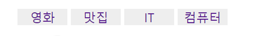
<nav>
   <ul class="navbar">
       <li><a href="https:/www.naver.com">영화</a></li>
       <li><a href="https:/www.naver.com">맛집</a></li>
       <li><a href="https:/www.naver.com">IT</a></li>
       <li><a href="https:/www.naver.com">컴퓨터</a></li>
   </ul>
</nav>

.navbar li {
  display: inline-block;
  width: 80px;
  text-align: center;
  background-color: #eee;
}
.navbar a {
  font-size: 20px;
  text-decoration: none;
}
배경 넣기
- 테두리가 겹침 : margin collapse 현상

  <body>
    <div class="main-background">
      <h4 class="main-title">Buy Our Shoes!</h4>
      <p>할인 전품목 50%</p>
      <button>사러가기</button>
    </div>
  </body>
.main-background {
width: 100%;
height: 500px;
background-image: url("이미지.jpg");
/*여백안남게*/
background-size: cover;
/*가운데부터 채우기*/
background-position: center;
background-repeat: no-repeat;
/*필터조정*/
filter: brightness(100%);
padding: 1px;
text-align: center;
color: black;
font-size: 30px;
}position
- position: static 좌표이동X
- position: relative 현재 위치를 기준으로 이동
- position: fixed 고정
- position: absolute 부모를 기준으로 움직이고 싶을 때
- 내 부모 태그 중에 position : relative 가진 부모 기준
- 가운데 정렬하려면 left:0; right:0; margin:auto; width:150px
<body style="margin: 0px">
  <div class="main-background">
    <h4 class="main-title">Buy Our Shoes!</h4>
    <p>할인 전품목 50%</p>
    <button class="main-botton">사러가기</button>
  </div>
  <div class="intro-box">
    <strong><p>How we design our shoes</p></strong>
    <p>Lorem inpisum doloir dfsflkng nddxz,dmladnmksanflka</p>
  </div>
</body>

.main-background {
  width: 100%;
  height: 500px;
  background-image: url("이미지1.jpg");
  /*여백안남게*/
  background-size: cover;
  /*가운데부터 채우기*/
  background-position: center;
  background-repeat: no-repeat;
  /*필터조정*/
  filter: brightness(100%);
  padding: 1px;
  text-align: center;
  color: white;
  font-size: 30px;
}
.main-background h4 {
  padding-top: 100px;
}
.main-botton {
  padding: 15px;
  font-size: 15px;
  background: white;
  border: none;
  border-radius: 5px;
  /*내원래 위치를 기준으로 이동하기*/
  position: relative;
  top: 20px;
}
.intro-box {
  width: 500px;
  margin: auto;
  padding: 20px;
  background-color: gainsboro;
  position: relative;
  bottom: 50px;
  text-align: center;
  display: block;
  margin-left: auto;
  margin-right: auto;
  border-radius: 10px;
}
.intro-box p {
  padding-top: 5px;
}
z-index
- z-index가 클수록 앞에 온다
반응형 width & box-sizing
- 반응 형 웹을 만들고 싶을때 width를 %단위로 입력한다.
- 최소 폭, 최대 폭 지정 가능하다.(높이도 지정가능)
- width: 80%
- max-width: 600px
- min-width: 300px
- box-sizing : border-box;
- width가 padding, border 포함함
브라우저마다 디자인이 다르게 보일수도 있다.
normalize.css 검색해서 사용하면 호환성 이슈를 해결 할 수 있다.
div {
	box-sizing: border-box;
}
body{
	margin: 0px;
}
form & input
- type도 여러가지가 있음(이메일, 비밀번호 등)
- input value="채워진 값"
- input name ="인풋이름" 서버개발시 필요
<form action="경로" method="방법">
  <input type="text" class="text-input" />
  <input type="email" />
  <input type="password" />
  <button type="submit">전송</button>
  <select>
    <option>사과</option>
    <option>포도</option>
  </select>
</form>


 .text-input[type="text"] {
  padding: 10px;
  font-size: 20px;
  color: blueviolet;
}
form & input 만들기
- div로 박스를 나눠서 생각하자
- float 를 사용할 경우 붕뜨기 때문에 float를 쓰고 난 다음에
<div style="clear: both"></div>를 쓰는 것을 잊지말자 - class 재활용을 잘하자(예 w-50)
<textarea></textarea>를 사용할 경우 최소높이, 최대 높이도 지정이 가능하다 확인해보자!- input태그를 만들면 위아래 폭이 넓은것을 볼 수 있다. 기본적으로 html 설정이 그렇다.
box-sizing : border-box;사용해서 폭을 줄여주자. css파일 맨 위에* { box-sizing: border-box;}설정해도 좋다. - label 태그 유용하게 잘 사용하자!
<input id="sub" type="checkbox" />input의 id와<label for="sub">Subscribe</label>label의 for를 똑같이 지정하면 label 태그의 innertext인 Subscribe 글자를 눌렸을때도 체크가 된다.
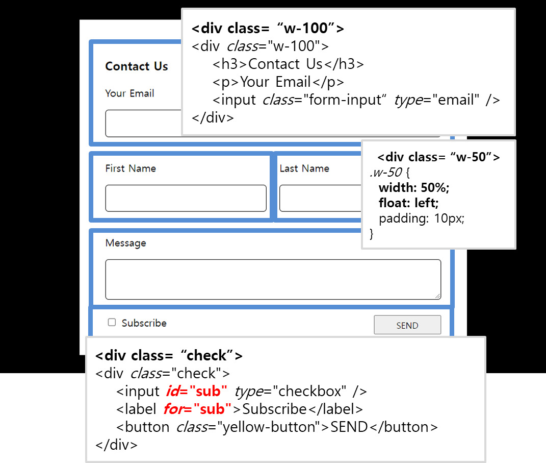
    <form>
      <div class="form-background">
        <div class="form-white">
          <div class="w-100">
            <h3>Contact Us</h3>
            <p>Your Email</p>
            <input class="form-input" type="email" />
          </div>
          <div class="w-50">
            <p>First Name</p>
            <input class="form-input" type="text" />
          </div>
          <div class="w-50">
            <p>Last Name</p>
            <input class="form-input" type="text" />
          </div>
          <div style="clear: both"></div>
          <div class="w-100">
            <p>Message</p>
            <textarea class="form-input form-long"></textarea>
          </div>
          <div class="check">
            <input id="sub" type="checkbox" />
            <label for="sub">Subscribe</label>
            <button class="yellow-button">SEND</button>
          </div>
        </div>
      </div>
    </form>


.form-background {
  background-color: black;
  padding: 30px;
}
.form-white {
  background-color: white;
  padding: 30px;
  width: 80%;
  max-width: 600px;
  margin: auto;
}
.form-input {
  width: 100%;
  padding: 10px;
  font-size: 15px;
  border: 1px solid black;
  border-radius: 5px;
}
.w-50 {
  width: 50%;
  float: left;
  padding: 10px;
}
.w-100 {
  width: 100%;
  padding: 10px;
}
.check {
  width: 100%;
  padding: 10px;
}
.yellow-button {
  width: 20%;
  height: 30px;
  float: right;
}
table 만들기
- div박스 만들고 시작하자
thead는 제목행tbody는 일반행으로 구분하여 사용하자tr은 행td는 열을 의미한다.- 세로 선을 삭제하고 싶으면 border-bottom을 지정하자(예 : 1px solid #c2d3de)
- 셀을 합치고 싶을 때는
colspan='합칠 셀 갯수'를 추가하자
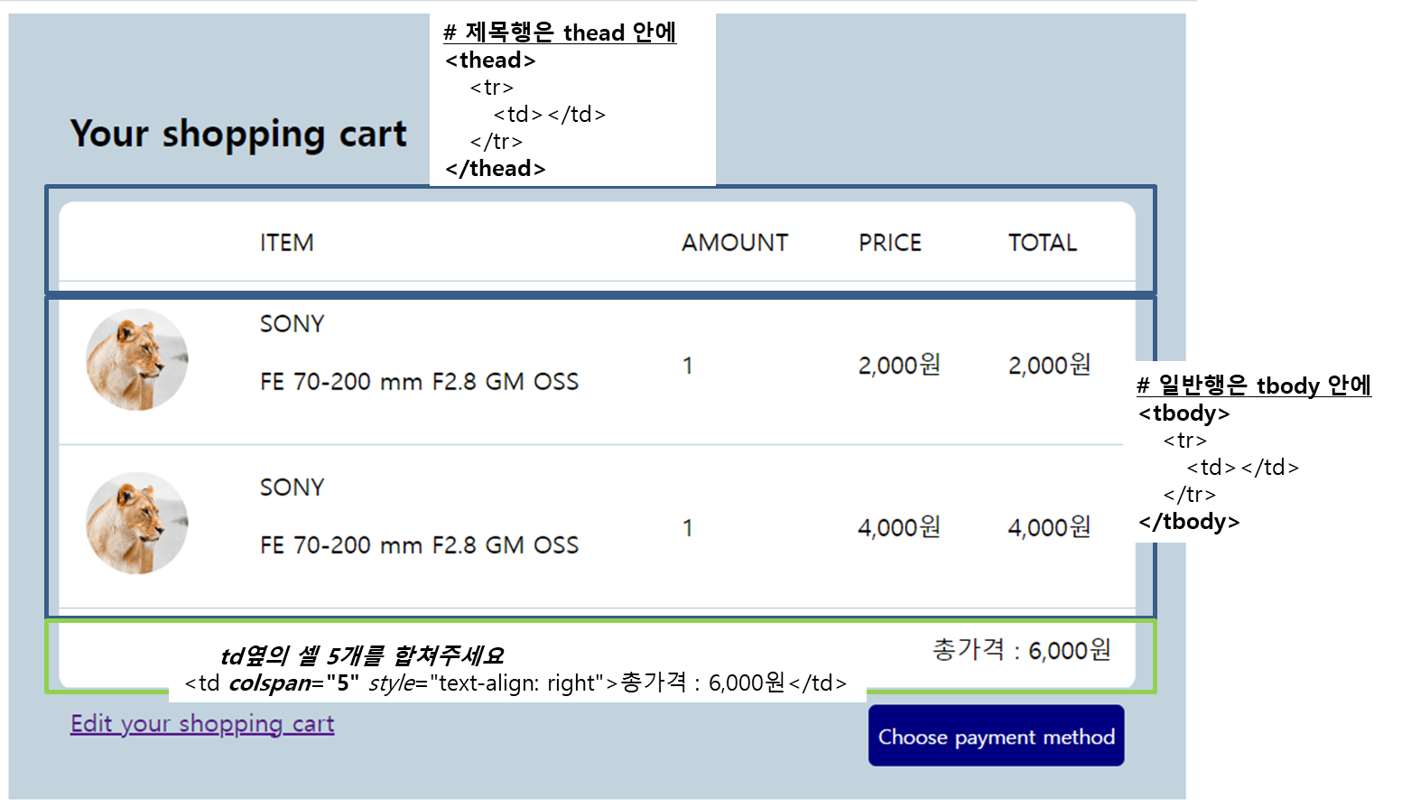
 <body>
    <div class="cart-background">
      <h2 style="margin: 30px 10px">Your shopping cart</h2>
      <table class="cart-table">
        <!--제목행은 thead안에 일반행은 tbody안에 넣으면 좋음-->
        <thead>
          <!--행-->
          <tr>
            <!--열-->
            <td></td>
            <td>ITEM</td>
            <td>AMOUNT</td>
            <td>PRICE</td>
            <td>TOTAL</td>
          </tr>
        </thead>
        <tbody>
          <tr>
            <td><img src="이미지.png" width="70px" /></td>
            <td>
              <div class="prduct-item">
                <span>SONY</span>
                <p>FE 70-200 mm F2.8 GM OSS</p>
              </div>
              <div style="clear: both"></div>
            </td>
            <td>1</td>
            <td>2,000원</td>
            <td>2,000원</td>
          </tr>
          <tr>
            <td><img src="이미지.png" width="70px" /></td>
            <td>
              <div class="prduct-item">
                <span>SONY</span>
                <p>FE 70-200 mm F2.8 GM OSS</p>
              </div>
              <div style="clear: both"></div>
            </td>
            <td>1</td>
            <td>4,000원</td>
            <td>4,000원</td>
          </tr>
          <tr>
            <!--td옆의 셀 5개를 합쳐주세요-->
            <td colspan="5" style="text-align: right">총가격 : 6,000원</td>
          </tr>
        </tbody>
      </table>
      <div class="check-cart">
        <a href="https://www.naver.com">Edit your shopping cart</a>
        <button class="buy-cart-btn">Choose payment method</button>
      </div>
    </div>
  </body>
.cart-background {
width: 100%;
background-color: #c2d3de;
padding: 30px;
}
.cart-table {
width: 100%;
max-width: 700px;
margin: auto;
background-color: white;
border-radius: 10px;
}
.cart-table td,
.cart-table th {
padding: 15px;
border-bottom: 1px solid #c2d3de;
}
/*table은 기본적으로 틈이 존재*/
/*없애려면 border-collapse: collapse 사용*/
table {
border-collapse: collapse;
width: 80%;
margin: auto;
}
.buy-cart-btn {
float: right;
height: 40px;
border: none;
border-radius: 5px;
background-color: navy;
color: white;
}
.check-cart {
margin: 10px;
}pseudo-class
- button, link, input에서 많이 사용
- 마우스가 올라가있는 상태 .buy-cart-btn:hover
- 클릭한 상태 .buy-cart-btn:active
- 커서찍혀있을때 .buy-cart-btn:focus
- 동시에 할 때 순서 중요 (hover -> focus -> active)
- 링크 클릭하기 전 .custom-link:link
- 링크 클릭한 후 색상 지정 .custom-link:visited
** input에서 자주 사용(input 태그 안 눌렸을때 밑테두리가 회색으로변경)
.input-text:focus{border-bottom:2px solid grey}
      <div class="check-cart">
        <a class="custom-link" href="https://www.naver.com"
          >Edit your shopping cart</a
        >
        <button class="buy-cart-btn">Choose payment method</button>
      </div>
.buy-cart-btn {
float: right;
height: 40px;
border: none;
border-radius: 5px;
background-color: navy;
color: white;
cursor: pointer;
}
.check-cart {
margin: 10px;
}
/*마우스가 올라가있는 상태*/
.buy-cart-btn:hover {
background-color: chocolate;
}
/*클릭한 상태*/
.buy-cart-btn:active {
background-color: brown;
}
/*focus 커서찍혀있을때*/
.buy-cart-btn:focus {
background-color: grey;
}
.custom-link {
text-decoration: none;
}
/*방문전 글자색*/
.custom-link:link {
color: violet;
}
/*방문후 글자색*/
.custom-link:visited {
color: black;
}
코드양 줄어드는 class 작명법(OOCSS, BEM)
- OOCSS
- ObjectOriented CSS라고 부르는 작성 관습
- 뼈대용 class, 살점용 class 각각 제작
- BEM(Block-Element-Modifier)
class='덩어리이름__역할--세부특징'
=> OOCSS와 BEM 적절하게 사용<div class="profile"> <img class="profile__imge" /> <h4 class="profile__title"></h4> <p class="profile__content"></p> <button class="profile__button--red">버튼1</button> <button class="profile__button--blue">버튼2</button> </div>
display:flex(가로배치)
- display: flex는 가로 배치가 가능하다.
이렇게 나타낸다면<div style="flex-grow: 1"></div> <div class="flex-item">products</div><div class="flex-item">services</div>div박스가 세로로 쌓일 것이다 . display: flex를 해주면 가로 배치가 되는것을 확인 할 수있다. - 또 하나 유용한 기능은
style="flex-grow: 1"지정하는 것이다. nav 즉, 사단바를 만들고 싶을 때 사용하자 ! flex-grow: 1은 박스의 크기를 조정해준다. 옆으로 길어진 것을 볼 수 있다.
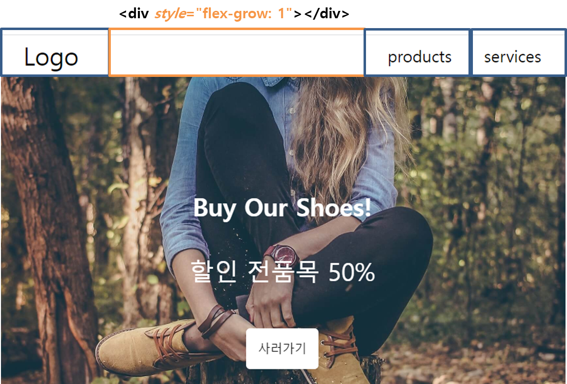
<nav class="flex-container">
  <div class="flex-item" style="font-size: 30px">Logo</div>
  <div style="flex-grow: 1"></div>
  <div class="flex-item">products</div>
  <div class="flex-item">services</div>
</nav>

.flex-container {
  display: flex;
  justify-content: center;
  align-items: center;
  width: 100%;
  margin: none;
  padding: 10px;
  height: 50px;
  align-items: center;
  background-color: white;
  font-size: 20px;
}
.flex-item {
  margin: 10px 20px;
}
단위
- vw(브라우저 폭에 비례)
- vh(브라우저 높이에 비례)
- rem(기본 폰트 사이즈에 비례)
- em(내 폰트사이즈의 x배)
- width : 16px; / 기본 px 단위 /
- width : 1.5rem; / html태그 혹은 기본 폰트사이즈의 1.5배 /
- width : 2em; / 내 폰트사이즈 혹은 상위요소 폰트사이즈의 2배 /
- width : 50vw; / 브라우저(viewport) 화면 폭의 50% /
- width : 50vh; / 브라우저(viewport) 화면 높이의 50% /
반응형 웹 만들기
- max-width은 태블릿 디자인에서는 1200px, 992px, 768px, 모바일 디자인은 576px 단위를 많이 사용함
- 3개 이상 사용하지않기!
<meta name="viewport" content="width=device-width, initial-scale=1.0">
@media screen and (max-width: 1200px) {
  .main-title {
    font-size: 20px;
  }
  .main-intro {
    font-size: 15px;
  }
}