Popover
Popover란 팝업에서 유래한 컴포넌트이다. 팝업창을 PopoverContent라 부르고, 팝업창을 열기위한 버튼은 보통 PopoverTrigger라고 표현한다.
Radix UI 라는 라이브러리에서 각종 컴포넌트를 제공하고 있는데, 이를 직접 구현해보고 싶어서 글을 쓰게 되었다.
기능 분석
PopoverTrigger를 클릭하면,PopoverContent가 아래에 노출된다.PopoverContent는 기본적으로PopoverTrigger의 아래, 오른쪽으로 배치되도록하며, 화면밖으로 튀어나온다면 나오지 않도록 해야한다.PopoverContent가 열렸을 때,PopoverContent외부를 누르거나PopoverContent안에 X 버튼을 누르면 닫혀야한다.
사용법을 아래처럼 선언해서 사용할 수 있어야한다.
<Popover>
  <PopoverTrigger asChild>
    <트리거버튼 />
  </PopoverTrigger>
  <PopoverContent>
     <콘텐트 내용/>
  </PopoverContent>
</Popover>
여기서 PopoverTrigger가 asChild=true일때 트리거버튼이 직접 onClick을 담당하게된다.
asChild===false일때 트리거버튼 위에 <button>컴포넌트가 Wrapping되어 대신 onClick을 담당하게 해준다.
이제 차근차근 이해해보자.
컴포넌트의 구조
Popover
export const Popover = ({ children }: { children: React.ReactNode }) => {
  const [isOpen, setIsOpen] = useState(false);

  const open = () => setIsOpen(true);
  const close = () => setIsOpen(false);

  return (
    <div>
      {React.Children.map(children, (child) => {
        if (!React.isValidElement(child)) return child;

        if (child.type === PopoverTrigger) {
          return React.cloneElement(child as ReactElement, { open });
        }

        if (child.type === PopoverContent) {
          return React.cloneElement(child as ReactElement, { isOpen, close });
        }

        return child;
      })}
    </div>
  );
};Popover에서는 자식으로 PopoverTrigger와 PopoverContent를 받는다.
clonElement를 통해 여러 컴포넌트를 children으로 받아 순서대로 <div>하위에 넣을 수 있다.
children으로 여러 컴포넌트를 넣은 부모컴포넌트 만드는법를 참고할 수도 있다.
또한 PopoverContent의 노출, 미노출을 위해 useState boolean 값을 가져야한다.
PopoverTrigger
export const PopoverTrigger = ({
  open,
  children,
}: {
  open?: () => void;
  children: React.ReactNode;
}) => {
  return <button onClick={open}>{children}</button>;
};PopoverTrigger는 클릭하면 boolean값을 true로 만드는 open 콜백을 프로퍼티로 받는다.
PopoverContent
export const PopoverContent = ({
  isOpen,
  close,
  children,
}: {
  isOpen?: boolean;
  close?: () => void;
  children: React.ReactNode;
}) => {
  if (!isOpen) return null;

  return (
    <div className="absolute border border-gray-300 bg-white p-4">
      {children}
      <button onClick={close} style={{ marginTop: '10px' }}>
        Close
      </button>
    </div>
  );
};PopoverContent는 isOpen의 상태에 따라 그릴지 말지를 결정한다.
close 콜백을 가진 닫기 버튼도 간단하게 추가해보았다.
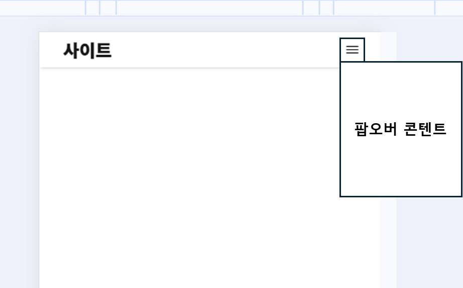
PopoverContent가 화면밖으로 튀어나가지 않게 하기
이렇게만 구현해서 사용하면 이상할 것이다. PopoverContent가 어디에 그려지는지 알 수가 없다.
그래서 PopoverContent의 위치값을 계산할 수 있어야한다.
보통 이런 팝오버나 모달 류의 컴포넌트들은 positoin: abolute CSS 속성을 가지고 직접 이 위치를 계산해야한다.
이렇게 상단바 햄버거버튼을 클릭시 화면밖으로 튀어나가지 않게 어떻게 할 수 있을까?
PopoverContent
type Position = {
  x: number;
  y: number;
};

export const PopoverContent = ({
  isOpen,
  close,
  position,
  contentRef,
  children,
}: {
  isOpen?: boolean;
  close?: () => void;
  position?: Position;
  contentRef?: React.RefObject<HTMLDivElement>;
  children: React.ReactNode;
}) => {
  if (!isOpen) return null;

  return (
    <div
      ref={contentRef}
      className="absolute border border-gray-300 bg-white p-4"
      style={{
        top: 0,
        left: 0,
        transform: `translate(${position?.x}px, ${position?.y}px)`,
      }}
    >
      {children}
      <button onClick={close} style={{ marginTop: '10px' }}>
        Close
      </button>
    </div>
  );
};PopoverContent에 position: abolute 속성을 주고, transform 을 직접 조절하면 된다.
transform 없이 top과 left만으로 위치를 조정한다면, 실시간으로 뷰포트의 크기가 바뀌거나, PopoverTrigger의 위치가 왼쪽이거나 오른쪽이거나 하는 여러 상황에 대해 대응을 할 수 없기 때문이다.
그래서 PopoverContent가 x, y 좌표 어디에 위치할지를 위한 position을 prop으로 뚫는다.
contentRef는 PopoverContent의 크기를 측정하기 위한 prop으로 Popover 파트에서 설명하겠다.
PopoverTrigger
export const PopoverTrigger = ({
  open,
  triggerRef,
  children,
}: {
  open?: () => void;
  triggerRef?: React.RefObject<HTMLButtonElement>;
  children: React.ReactNode;
}) => {
  return (
    <button ref={triggerRef} onClick={open}>
      {children}
    </button>
  );
};
여기에도 아까와 다른점은 triggerRef이다. 이는 PopoverTrigger의 위치를 측정하기 위한 prop으로 Popover 파트에서 설명하겠다.
Popover
export const Popover = ({ children }: { children: React.ReactNode }) => {
  const [isOpen, setIsOpen] = useState(false);
  const [position, setPosition] = useState<Position>({ x: 0, y: 0 });

  const triggerRef = useRef<HTMLButtonElement>(null);
  const contentRef = useRef<HTMLDivElement>(null);

  const open = () => {
    setIsOpen(true);
    calculatePosition();
  };

  const close = () => setIsOpen(false);

   const calculatePosition = () => {
    if (triggerRef.current && contentRef.current) {
      const triggerRect = triggerRef.current.getBoundingClientRect();
      const contentRect = contentRef.current.getBoundingClientRect();
      const viewportWidth = window.innerWidth;
      const viewportHeight = window.innerHeight;

      let x = triggerRect.left;
      let y = triggerRect.bottom;

      if (triggerRect.right + contentRect.width > viewportWidth) {
        x = triggerRect.right - contentRect.width;
      }

      if (triggerRect.bottom + contentRect.height > viewportHeight) {
        y = -contentRect.height;
      }

      setPosition({ x, y });
    }
  };

  useEffect(() => {
    if (isOpen) {
      window.addEventListener('resize', calculatePosition);
    }

    return () => {
      window.removeEventListener('resize', calculatePosition);
    };
  }, [isOpen]);

  return (
    <div>
      {React.Children.map(children, (child) => {
        if (!React.isValidElement(child)) return child;

        if (child.type === PopoverTrigger) {
          return React.cloneElement(child, { open, triggerRef });
        }

        if (child.type === PopoverContent) {
          return React.cloneElement(child, { isOpen, close, position, contentRef });
        }

        return child;
      })}
    </div>
  );
};
뭔가 더 복잡해졌지만, 두려워하지 마라. 추가된것은 triggerRef, contentRef와 calculatePosition 함수밖에 없다.
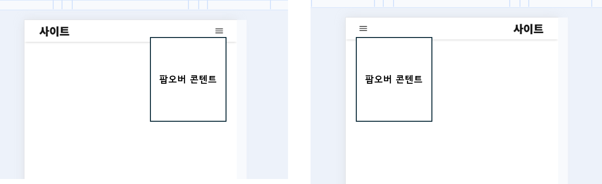
기능 분석 2번째 조건을 보면, PopoverContent가 PopoverTrigger의 아래 왼쪽에 위치하도록 해야하는데, 아래는 맞지만, 왼쪽으로 배치되려면 다음처럼 튀어나오게 된다.
그래서 이 경우에는 아래 오른쪽으로 위치하도록 해야한다.
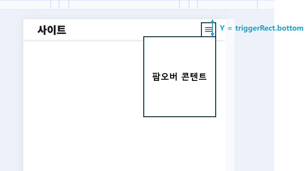
triggerRect.bottom값을 그대로 y 값으로 전달해주면 적절히 배치된다.
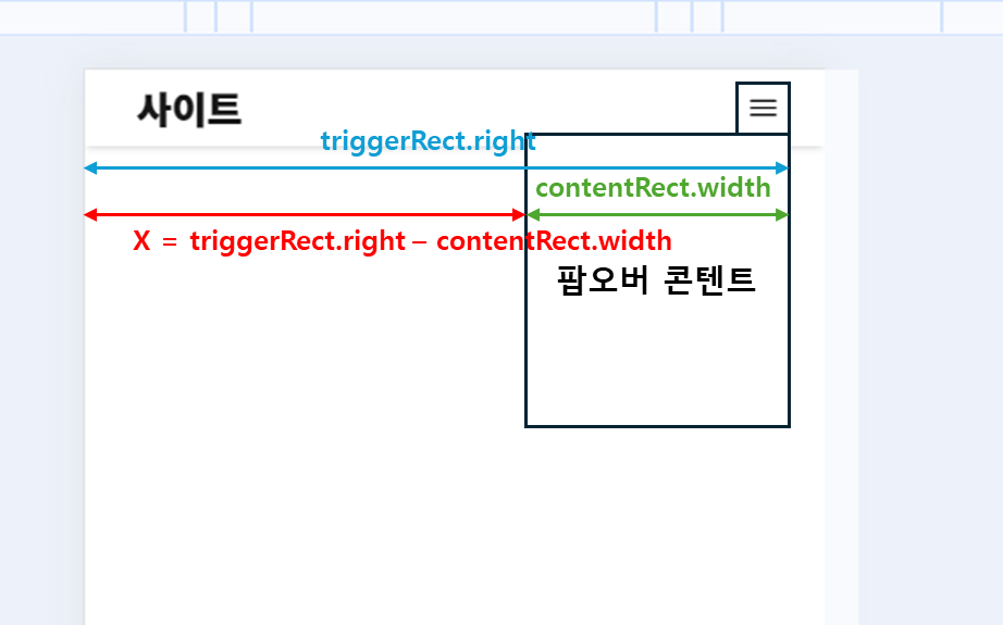
그리고 x값은 다음과 같이 구할 수 있다.
x = triggerRect.right - contentRect.width
이런식으로 triggerRect의 left, right, top, bottom과 contentRect의 width, height를 지지고 볶으면 적절한 위치에 배치시킬 수 있다.
그 과정이 calculatePosition에 모두 정리되어 있다.
triggerRect.right + contentRect.width는 PopoverContent의 제일 최우단의 좌표이므로 이것이 화면의 width를 뜻하는 viewPortWidth보다 넘으면 오른쪽을 벗어난 경우라는 것이다.
이 경우에 내가 방금 설명한 방식으로 가로방향 x값이 결정된다.
나머지 세로방향도 계산해서 함수를 만들 수 있다.
const calculatePosition = () => {
  if (triggerRef.current && contentRef.current) {
    const triggerRect = triggerRef.current.getBoundingClientRect();
    const contentRect = contentRef.current.getBoundingClientRect();
    const viewportWidth = window.innerWidth;
    const viewportHeight = window.innerHeight;

    let x = triggerRect.left;
    let y = triggerRect.bottom;

    if (triggerRect.right + contentRect.width > viewportWidth) {
      x = triggerRect.right - contentRect.width;
    }

    if (triggerRect.bottom + contentRect.height > viewportHeight) {
      y = -contentRect.height;
    }

    setPosition({ x, y });
  }
};
그리고 뷰포트의 크기가 변경될때마다 calculatePosition을 재계산해주어야한다.
resize 이벤트는 브라우저 환경에 따라 1초에 수십번을 요청할 수도 있는 계산량이 많은 함수이기 때문에 lodash의 debounce로 요청을 최소화하여 최적화를 할 수도 있다.
  useEffect(() => {
    if (isOpen) {
      calculatePosition(); // 초기 위치 계산
      window.addEventListener('resize', calculatePosition); // resize 이벤트 감지
    }

    return () => {
      window.removeEventListener('resize', calculatePosition); // cleanup
    };
  }, [isOpen]);
Context API로 props를 변경하기
하지만 props를 뚫어서 사용하게 되면 외부에서 Popover를 사용할때 intellisense에서 ref, isOpen 같은 것들이 추천되어버린다.
DX를 개선하기 위해선 Popover 의 내부적으로 Context API를 사용하게 해서 외부에서는 props에 접근하지 못하도록 한다.
PopoverProvider, Popover
createContext를 통해 PopoverContext를 생성하고 이를 기반으로 PopoverProvider 내부에서 isOpen, open, close, position, triggerRef, contentRef를 공유할 수 있도록 구현한다.
type PopoverContextType = {
  isOpen: boolean;
  open: () => void;
  close: () => void;
  position: Position;
  triggerRef: React.RefObject<HTMLButtonElement>;
  contentRef: React.RefObject<HTMLDivElement>;
};

const PopoverContext = createContext<PopoverContextType | undefined>(undefined);

export const PopoverProvider = ({ children }: { children: ReactNode }) => {
  const [isOpen, setIsOpen] = useState(false);
  const [position, setPosition] = useState<Position>({ x: 0, y: 0 });

  const triggerRef = useRef<HTMLButtonElement>(null);
  const contentRef = useRef<HTMLDivElement>(null);

  const open = () => setIsOpen(true);
  const close = () => setIsOpen(false);

  const calculatePosition = () => {
    if (triggerRef.current && contentRef.current) {
      const triggerRect = triggerRef.current.getBoundingClientRect();
      const contentRect = contentRef.current.getBoundingClientRect();
      const viewportWidth = window.innerWidth;
      const viewportHeight = window.innerHeight;

      let x = triggerRect.left;
      let y = triggerRect.bottom;

      if (triggerRect.right + contentRect.width > viewportWidth) {
        x = triggerRect.right - contentRect.width;
      }

      if (triggerRect.bottom + contentRect.height > viewportHeight) {
        y = -contentRect.height;
      }

      setPosition({ x, y });
    }
  };

  useEffect(() => {
    if (isOpen) {
      calculatePosition(); // 초기 위치 계산
      window.addEventListener('resize', calculatePosition); // resize 이벤트 감지
    }

    return () => {
      window.removeEventListener('resize', calculatePosition); // cleanup
    };
  }, [isOpen]);

  return (
    <PopoverContext.Provider value={{ isOpen, open, close, position, triggerRef, contentRef }}>
      {children}
    </PopoverContext.Provider>
  );
};

export const Popover = ({ children }: { children: ReactNode }) => {
  return <PopoverProvider>{children}</PopoverProvider>;
};
PopoverTrigger, PopoverContent .. 그리고 asChild
트리거와 콘텐트는 기존에는 props를 받았으나 이제는 context를 사용하게 되었기에, if(!context)로 조건을 체크해줘야한다.
그리고 추가적으로 asChild===true일 때, 그 위치에 그대로 onClick, ref를 적용시키도록 하고, asChild===false일 때는, <button>으로 Wrapping하여 children을 적용시키도록 한다.
export const PopoverTrigger = ({
  asChild = false,
  children,
}: PropsWithChildren<{ asChild: boolean }>) => {
  const context = useContext(PopoverContext);

  if (!context) {
    throw new Error('PopoverTrigger는 Popover내부에서 호출해야 합니다.');
  }

  const { open, triggerRef } = context;

  if (asChild && isValidElement(children)) {
    return React.cloneElement(children as ReactElement, { ref: triggerRef, onClick: open });
  }

  return (
    <button ref={triggerRef} onClick={open}>
      {children}
    </button>
  );
};

export const PopoverContent = ({ children }: { children: ReactNode }) => {
  const context = useContext(PopoverContext);

  if (!context) {
    throw new Error('PopoverContent는 Popover내부에서 호출해야 합니다.');
  }

  const { isOpen, close, position, contentRef } = context;

  if (!isOpen) return null;

  return (
    <div
      className="absolute border border-gray-300 bg-white p-4"
      style={{
        top: 0,
        left: 0,
        transform: `translate(${position.x}px, ${position.y}px)`,
      }}
      ref={contentRef}
    >
      {children}
      <button onClick={close} style={{ marginTop: '10px' }}>
        Close
      </button>
    </div>
  );
};
결과
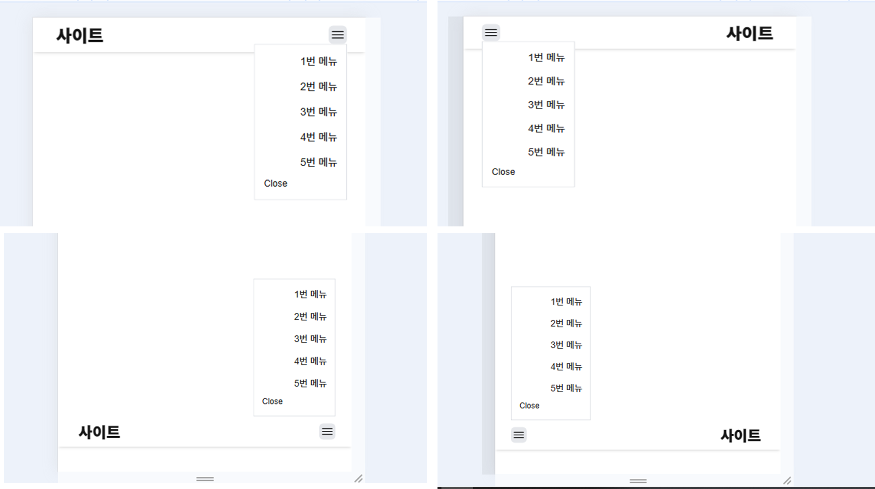
이렇게되면 성공적으로 Popover가 화면밖으로 튀어나오지 않고 렌더링된다.
PopoverContent 외부영역을 누르면 닫히게 하기
마우스가 클릭되었을때, 커서가 contentRef 내부에 있는지 확인해주면 된다.
useEffect(() => {
    const handleClickOutside = (event: MouseEvent) => {
      if (
        contentRef.current &&
        !contentRef.current.contains(event.target as Node) // 클릭한 영역이 Content 내부가 아닌 경우
      ) {
        close();
      }
    };

    document.addEventListener('mousedown', handleClickOutside); // 마우스 클릭 이벤트 추가

    return () => {
      document.removeEventListener('mousedown', handleClickOutside); // 컴포넌트 언마운트 시 제거
    };
  }, [close, contentRef]);
위 함수를 PopoverProvider에 넣어주면 잘 되는 것을 확인할 수 있다.
결론
이렇게 만든 Popover는 다음처럼 사용할 수 있다.
<header className="sticky bottom-0 flex items-center justify-between bg-white px-8 py-1 shadow-md backdrop-blur">
      <Link href="/">
        <h1 className="p-2 text-3xl font-extrabold">사이트</h1>
      </Link>
      <Popover>
        <PopoverTrigger asChild>
          <button className="block rounded-lg p-1 hover:bg-gray-200 md:hidden">
            <svg xmlns="http://www.w3.org/2000/svg" width="24" height="24" viewBox="0 0 30 30">
              <path d="M 3 7 A 1.0001 1.0001 0 1 0 3 9 L 27 9 A 1.0001 1.0001 0 1 0 27 7 L 3 7 z M 3 14 A 1.0001 1.0001 0 1 0 3 16 L 27 16 A 1.0001 1.0001 0 1 0 27 14 L 3 14 z M 3 21 A 1.0001 1.0001 0 1 0 3 23 L 27 23 A 1.0001 1.0001 0 1 0 27 21 L 3 21 z"></path>
            </svg>
          </button>
        </PopoverTrigger>
        <PopoverContent>
          <ul className="flex w-32 flex-col items-end justify-end gap-4">
            <li>
              <Link className="text-lg hover:font-bold" href="/1">
                1번 메뉴
              </Link>
            </li>
            <li>
              <Link className="text-lg hover:font-bold" href="/2">
                2번 메뉴
              </Link>
            </li>
            <li>
              <Link className="text-lg hover:font-bold" href="/3">
                3번 메뉴
              </Link>
            </li>
            <li>
              <Link className="text-lg hover:font-bold" href="/4">
                4번 메뉴
              </Link>
            </li>
            <li>
              <Link className="text-lg hover:font-bold" href="/5">
                5번 메뉴
              </Link>
            </li>
          </ul>
        </PopoverContent>
      </Popover>
</header>
Radix UI식으로 Popover를 직접구현해보았다. 각종 이벤트들과 최적화 하는 방법을 생각해볼 수 있었다.
그리고 화면에 벗어나지 않도록 생각해야하는 로직또한 배울 수 있었다.
추가적으로 개선할 점이 있다면, PopoverContent는 createPortal을 활용할 수 있을 것 같다.
또 Next.js 14 환경이어서, intersept router를 활용한다면 팝오버가 열린상태의 링크도 만들 수 있을 것 같다.
이는 다음 게시글에서 확장해서 공부해보겠다.