Emotion
리액트에선 Styled Component 말고도 Emotion이라는 CSS 스타일링 툴이 있다.
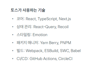
토스에서는 Emotion을 사용하고 상태관리는 Recoil을 사용하고 있다.
이외에도 카카오뱅크, 카카오 자체에서도 Emotion 을 사용하는 경우도 있다.
이 Emotion에 대해 가볍게 공부해보자.
설치
npm install @emotion/react
위의 명령어를 통해 설치한다.
사용법
Styled Component를 했다면 styled.div``; styled(Component)``;를 많이 사용했을 것이다.
Emotion은 css()를 사용한다.
import { css } from "@emotion/react";
이 css를 원하는 컴포넌트의 속성으로 넣어준다.
가령, 가로가 100px 세로 200px에 배경이 검은색인 div를 그리고 싶다면?
객체형 스타일
function BackDiv() {
  return (
  	<div
    	css={css({
    	backgroundColor: "black",
    	width: 100px,
    	height: 200px
    	})}
  	>
    </div>
  );
문자형 스타일
function BackDiv() {
  return (
  	<div
    	css={css`
    	backgroundColor: "black",
    	width: 100px,
    	height: 200px
    	`}
  	>
    </div>
  );
이런식으로 사용할 수 있다.
css 스타일 명칭도 전부 JSX의 일부이기 때문에, 스몰카멜케이스로 적어야한다.
가변 스타일링
Styled Component에는 아래와 같이 props를 가져와 스타일링을 특정 변수에 따라 다르게 표현할 수 있었다.
// 선언
const StyledText = styled.h1`
	color: ${(props) => {props.isRed ? "red": "black"}};
`;
// 사용
<StyledText isRed={true}>
빨강입니다
</StyledText>
<StyledText isRed={false}>
검정입니다
</StyledText>emotion도 이와 유사하게 사용이 가능하다.
const colors = {
  default: "black",
  warning: "red",
  safe: "green",
};

function Button({ children, variant = "default" }) {
  return (
    <button
      css={{
        color: colors[variant],
      }}
    >
      {children}
    </button>
  );
}

export default Button;
import Button from "./Button";
function App() {
return (
<>
<Button variant="default">Default</Button>
<Button variant="warning">Warning</Button>
<Button variant="green">Green</Button>
</>
);
}