0322 수업
matplotlib
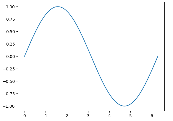
import matplotlib.pyplot as plt
import numpy as np

x = np.linspace(0, 2*np.pi, 200) # 0 ~ 2파이 까지 범위에서 200개의 값을 가지는 균일 간격 배열 생성
y = np.sin(x) #sin값

fig, ax = plt.subplots() #figure: 그림 전체, axes: 그래프 영역
ax.plot(x,y)
plt.show()
✅결과
seaborn
import numpy as np
import pandas as pd
import matplotlib.pyplot as plt
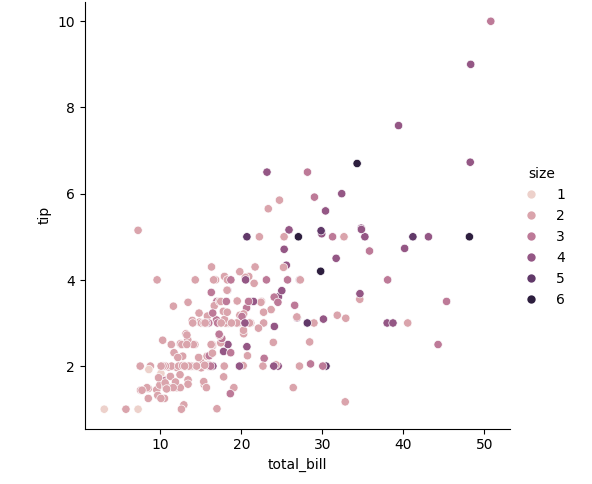
import seaborn as sns
df = sns.load_dataset("tips")
sns.relplot(data=df, x="total_bill", y="tip", hue="size", palette = "ch:r=-.5, 1=.75") #그냥 .. 색 명도 조절
#hue: 색상 구분 기준✅결과
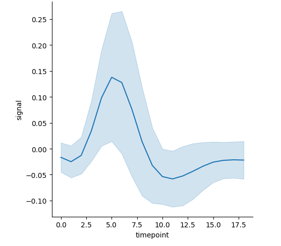
import seaborn as sns

df = sns.load_dataset("fmri")
sns.relplot(data=df, kind="line", x="timepoint", y="signal", errorbar="sd") #표준편차로 에러바 표현

#에러바 : 평균 값 주변의 편차를 나타내는 선
✅결과
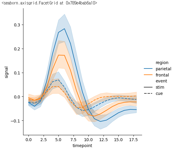
sns.relplot(data=df, x="timepoint", y="signal", kind="line", hue="region", style="event")
#event:점선 실선 기준으로 판단
✅결과
실습
아아
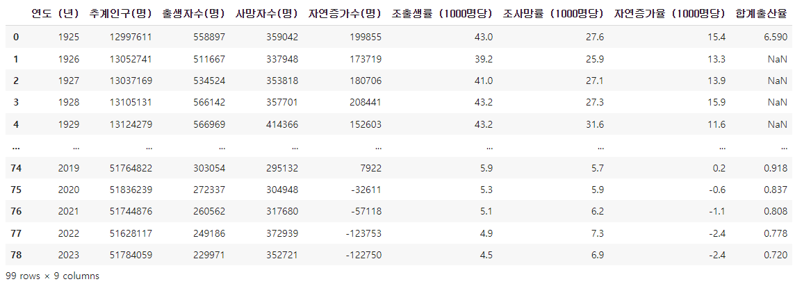
💡위키피디아 대한민국의 인구수 데이터 시각화하기
import pandas as pd
import seaborn as sns
import matplotlib.pyplot as plt
url = "https://ko.wikipedia.org/wiki/%EB%8C%80%ED%95%9C%EB%AF%BC%EA%B5%AD%EC%9D%98_%EC%9D%B8%EA%B5%AC"
table = pd.read_html(url, header=None) #열의 이름이 지정돼 있지 않으면 None으로 표시

#table[4]는 1925~1944년 table[5]는 1945~2023
df = table[4]
df2 = table[5]

new_df = pd.concat([df, df2]) #concat함수를 이용해서 두 데이터 합쳐주기
print(new_df)
✅결과
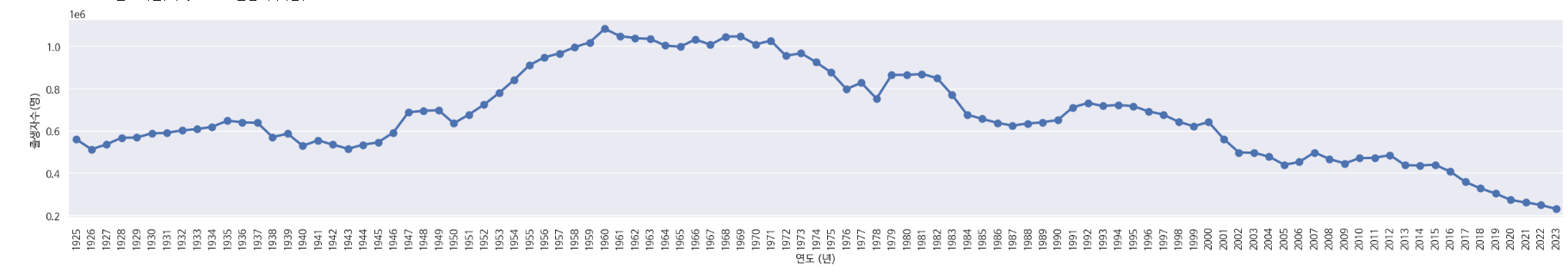
plt.figure(figsize=(30,4))
plt.xticks(rotation=90)
sns.pointplot(data=new_df, x="연도 (년)", y="출생자수(명)")✅결과
출생자 사망자 비교
plt.figure(figsize=(30,4))
plt.xticks(rotation=90)
sns.pointplot(data=new_df, x="연도 (년)", y="출생자수(명)")
sns.pointplot(data=new_df, x="연도 (년)", y="사망자수(명)", color="orange")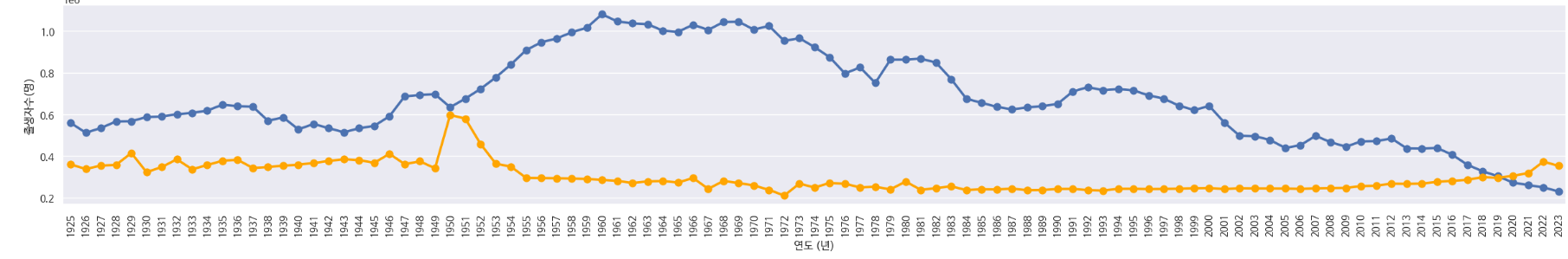

공부 중입니다 ..