0329 수업
import numpy as np
import matplotlib.pyplot as plt
import seaborn as sns
import pandas as pd
import datetime
plt.rcParams['figure.dpi'] = 150 # 해상도 조절
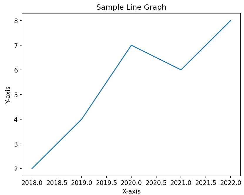
# 간단한 데이터 생성
x_values = [2018, 2019, 2020, 2021, 2022]
y_values = [2, 4, 7, 6, 8]
# 선 그래프 생성
plt.plot(x_values, y_values)
# 레이블과 이름 생성
plt.xlabel('X-axis')
plt.ylabel('Y-axis')
plt.title('Sample Line Graph')
# Display the graph
plt.show()
# 그래프 결과 연도가 소수점으로 반영됨 > 문자형으로 바꾸든 .. 다른 방법 필요
✅결과
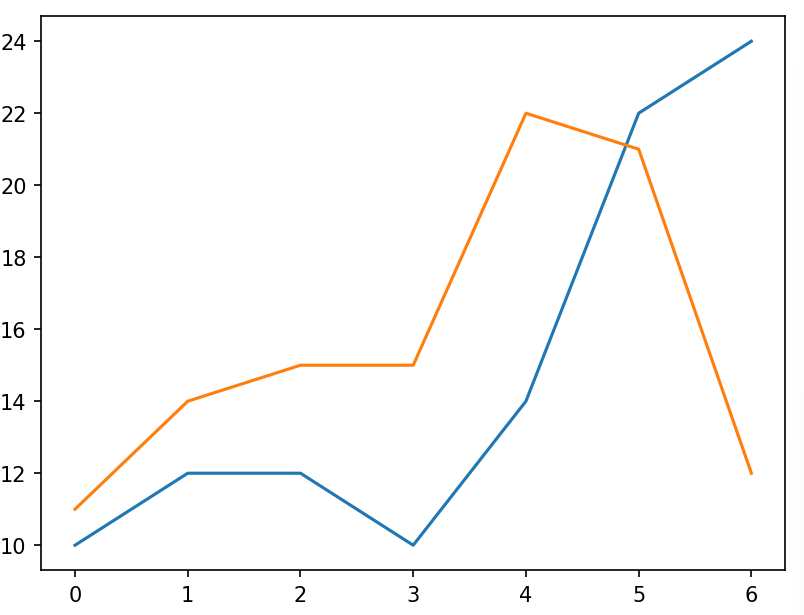
선 그래프 2개 겹쳐서 그리기
x_values = [0, 1, 2, 3, 4, 5, 6]
y_values_1 = [10, 12, 12, 10, 14, 22, 24]
y_values_2 = [11, 14, 15, 15, 22, 21, 12]

plt.plot(x_values, y_values_1)
plt.plot(x_values, y_values_2)

plt.show()
✅결과
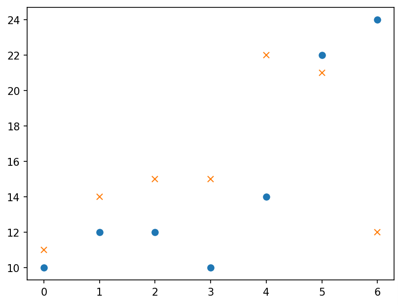
점으로 표현
x_values = [0, 1, 2, 3, 4, 5, 6]
y_values_1 = [10, 12, 12, 10, 14, 22, 24]
y_values_2 = [11, 14, 15, 15, 22, 21, 12]

plt.plot(x_values, y_values_1, 'o')
plt.plot(x_values, y_values_2, 'x')

plt.show()
✅결과
레이블 지정하기
plt.plot([0, 1, 2, 3, 4], [0, 1, 4, 9, 16])
plt.plot([0, 1, 2, 3, 4], [0, 1, 8, 27, 64])

plt.legend(['potato', 'tomato'], loc=6) #legend ; 범례 지정

plt.show()
# 레이블을 먼저 달아주면 범례 자동 적용
plt.plot([0, 1, 2, 3, 4], [0, 1, 4, 9, 16], label="potato")
plt.plot([0, 1, 2, 3, 4], [0, 1, 8, 27, 64], label="tomato")
plt.legend() # 꼭 적어줘야 한다.
plt.show()✅결과
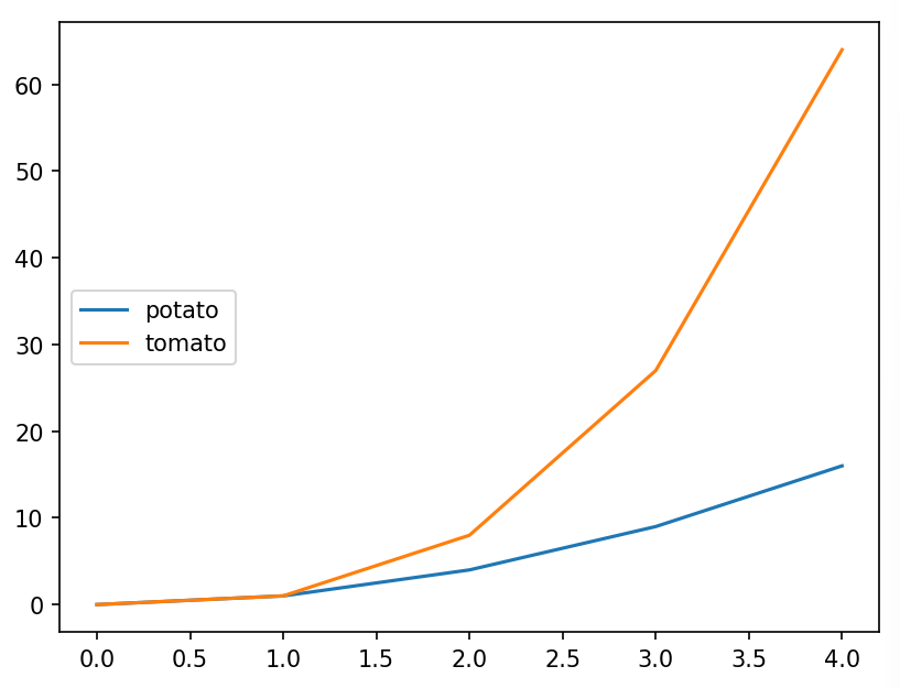
💡loc : 범례의 위치 조정 (딱히 설정 안 해도 알아서 선 안 가리도록 잘 설정해줌)
0: best
1: upper right
2: upper left
3: lower left
4: lower right
5: right
6: center left
7: center right
8: lower center
9: upper center
10: center
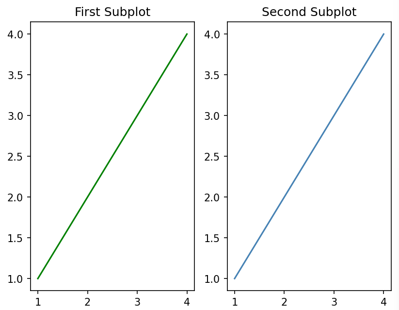
여러 구역을 만들어서 그래프 여러개를 배치
x = [1, 2, 3, 4]
y = [1, 2, 3, 4]

#subplot : (행, 열, 인덱스)

# First Subplot
plt.subplot(1, 2, 1)
plt.plot(x, y, color='green')
plt.title('First Subplot')

# Second Subplot
plt.subplot(1, 2, 2)
plt.plot(x, y, color='steelblue')
plt.title('Second Subplot')

# Display both subplots
plt.show()
✅결과
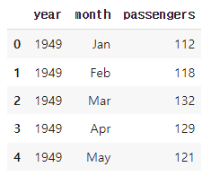
비행 데이터로 실습
# 비행 데이터 불러오기

df = sns.load_dataset('flights') #sns 내장 데이터셋
df.head()
✅결과
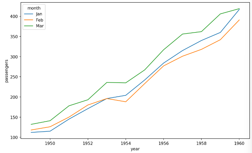
# 항공 데이터 선 그래프 시각화

temp_months = ['Jan', 'Feb', 'Mar']
df = df[df['month'].isin(temp_months)] #isin ; temp_months 리스트에 있는 값들과 일치한 행 선택 > 1, 2, 3월 값만 선택됨

fig = plt.figure(figsize=(10, 6))
fig.set_facecolor('white')
sns.lineplot(data=df, x='year', y='passengers',
             hue='month',
             hue_order=temp_months) ## '월'을 나타내는 경우 특정 월만 표시해야 할때에는 반드시 hue_order를 지정해야한다.
plt.show()

#hue_order ; 범례 요소의 순서 지정 > 1,2,3월 순서대로 지정할 수 있도록
✅결과
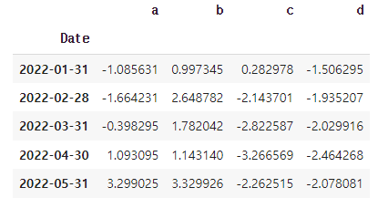
wide 형태의 데이터셋 생성
np.random.seed(123) # for reproducibility

# 2022-01-01 부터 100개의 날짜 생성, 인덱스 이름은 Date
index = pd.date_range("1 1 2022",
                      periods=100,
                      freq="m",
                      name="Date")
# 평균이 0이고 표준편차가 1인 정규분포에 따르는 난수 설
data = np.random.randn(100, 4).cumsum(axis=0)

wide_df = pd.DataFrame(data, index, ['a', 'b', 'c', 'd'])

# wide_df.shape
# (100, 4)

wide_df.head()
✅결과
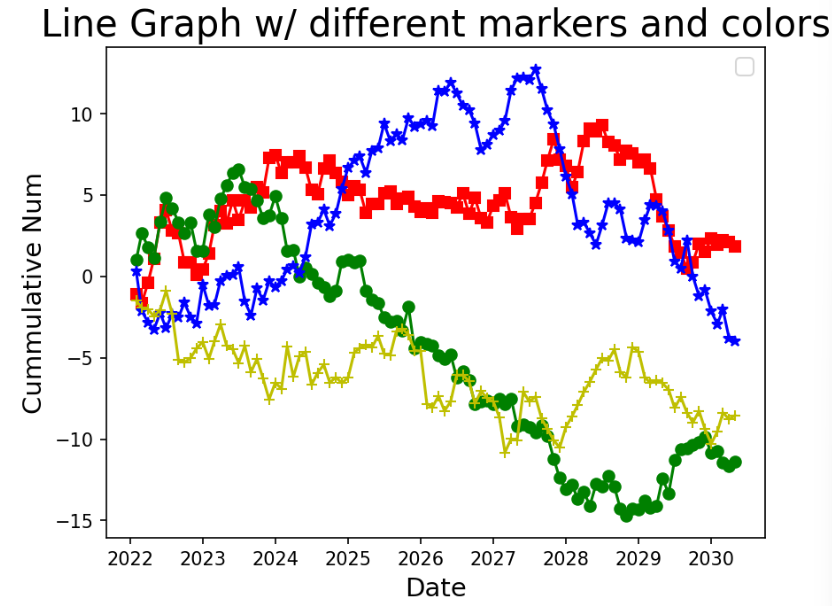
# wide 형태 데이터 선그래프 시각화

plt.plot(wide_df.index, wide_df.a, marker='s', color='r')
plt.plot(wide_df.index, wide_df.b, marker='o', color='g')
plt.plot(wide_df.index, wide_df.c, marker='*', color='b')
plt.plot(wide_df.index, wide_df.d, marker='+', color='y')

plt.title('Line Graph w/ different markers and colors', fontsize=20)
plt.ylabel('Cummulative Num', fontsize=14)
plt.xlabel('Date', fontsize=14)
plt.legend(fontsize=12, loc='best')

plt.show()
✅결과
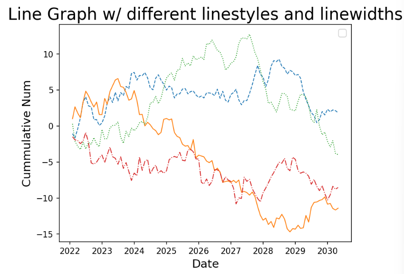
# 선 스타일 변경하여 시안성 향상

plt.plot(wide_df.index, wide_df.a, linestyle='--', linewidth=1) # 'dashed'
plt.plot(wide_df.index, wide_df.b, linestyle='-', linewidth=1) # solid
plt.plot(wide_df.index, wide_df.c, linestyle=':', linewidth=1) # dotted
plt.plot(wide_df.index, wide_df.d, linestyle='-.', linewidth=1) # dashdotted

plt.title('Line Graph w/ different linestyles and linewidths', fontsize=20)
plt.ylabel('Cummulative Num', fontsize=14)
plt.xlabel('Date', fontsize=14)
plt.legend(fontsize=12, loc='best')

plt.show()
✅결과
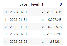
wide 형태의 데이터를 누적 형태로 변환
# stack()을 통해 모든 그룹 하나의 컬럼으로 변환 > 가로형 데이터를 세로형 데이터로 변경
long = wide_df.stack()
long_df = pd.DataFrame(long).reset_index() #level_1 : 원래 인덱스의 레벨, 0: 원래 데이터
long_df.head()
✅결과
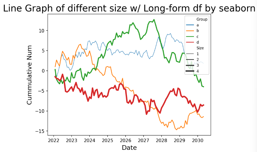
# 컬럼명 변환
long_df.columns = ['Date', 'Group', 'CumVal']

#  'Size' 컬럼 추가('Group' 컬럼 이용)
long_df['Size'] = np.where(long_df['Group'] == 'a', 1,
                           np.where(long_df['Group'] == 'b', 2,
                           np.where(long_df['Group'] == 'c', 3, 4)))
long_df.head(n=12)
✅결과
캐글 데이터셋 이용해서 실습하기
# 데이터 불러오기
from google.colab import drive
drive.mount('/content/drive')
# https://www.kaggle.com/datasets/rohitsahoo/sales-forecasting?select=train.csv
df = pd.read_csv("/content/drive/MyDrive/train.csv")
# 데이터 샘플 확인
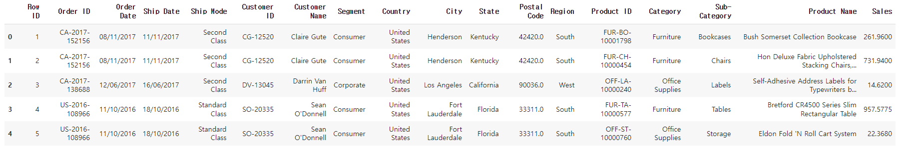
df.head()✅결과
# date 컬럼 날짜형식 변환
df['Date2']= pd.to_datetime(df['Order Date'])
# 날짜 오름차순 정렬
df = df.sort_values(by='Date2')
# 연도 컬럼 생성
df['Year'] = df['Date2'].dt.year
## 선 그래프 용 데이터셋 생성
# 2018년 데이터만 필터링
df_line=df[df.Year == 2018]
# 2018년 일 별 매출액 가공
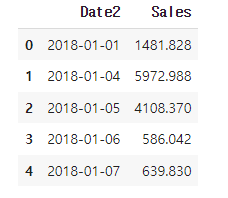
df_line = df_line.groupby('Date2')['Sales'].sum().reset_index()
df_line.head()✅결과
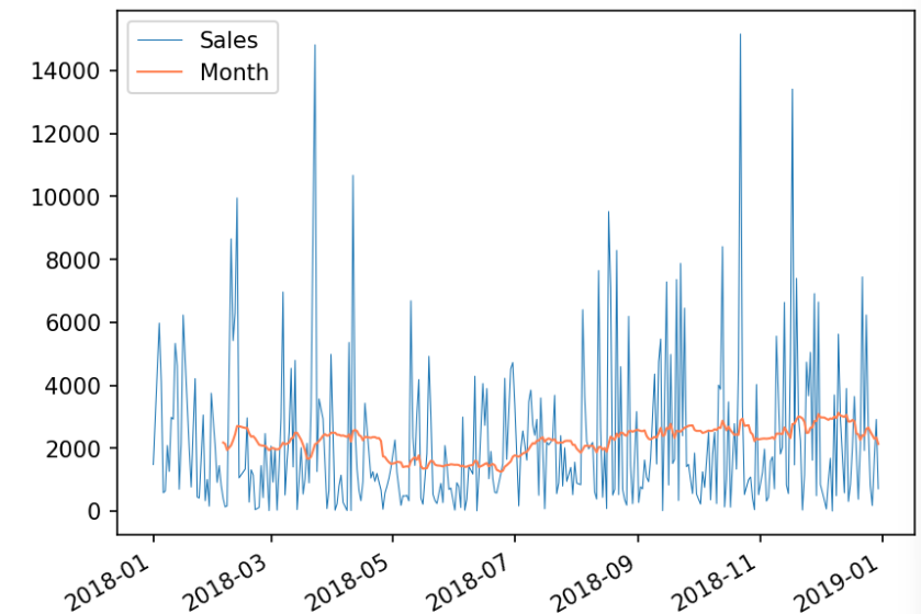
# 30일 이동평균 생성
df_line['Month'] = df_line['Sales'].rolling(window=30).mean() #윈도우크기를 30으로 설정 > 매 30개의 데이터마다 이동평균 계산됨

# 선 그래프 시각화
ax = df_line.plot(x='Date2', y='Sales',linewidth = "0.5")
df_line.plot(x='Date2', y='Month', color='#FF7F50', linewidth = "1", ax=ax)
✅결과
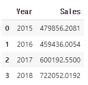
# 연도 별 판매량 데이터 가공
df_bar_1 = df.groupby('Year')['Sales'].sum().reset_index()

df_bar_1.head()
✅결과
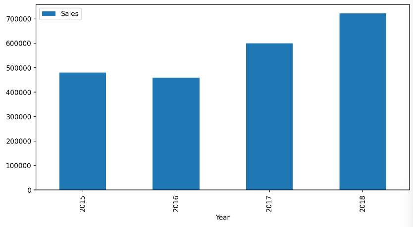
# 연도 별 매출액 막대 그래프 시각화
ax = df_bar_1.plot.bar(x='Year', y='Sales', rot=90, figsize=(10,5))
✅결과
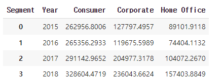
#연도별, 고객 세그먼트 별 매출액 데이터 가공
df_bar_2 = df.groupby(['Year', 'Segment'])['Sales'].sum().reset_index()

# 고객 세그먼트를 컬럼으로 피벗
df_bar_2_pv = df_bar_2.pivot(index='Year',
                             columns='Segment',
                             values='Sales').reset_index()

df_bar_2_pv.head()
✅결과
# 연도 별 고객 세그먼트 별 매출액 누적 막대 그래프 시각화
df_bar_2_pv.plot.bar(x='Year', stacked=True, figsize=(10,7))
✅결과

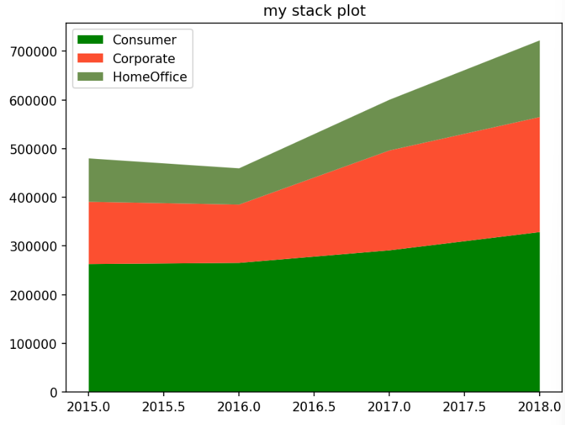
# 누적 영역 그래프 시각화

colors = ['g','#fc4f30','#6d904f']
labels = ['Consumer','Corporate','HomeOffice']

# 컬럼명 변경
df_bar_2_pv.rename(columns={'Home Office':'HomeOffice'},inplace=True)

plt.stackplot(df_bar_2_pv.Year,df_bar_2_pv.Consumer,df_bar_2_pv.Corporate,df_bar_2_pv.HomeOffice, labels = labels, colors=colors)

plt.legend(loc='upper left')
plt.title('my stack plot')
plt.tight_layout()

plt.show()
✅결과

공부 중입니다 ..