
🔍react-calendar란?
React에서 사용되는 달력 라이브러리이다.
지난 프로젝트에서 달력 기능을 사용해야 했었다. 그러나 기본적으로 제공되는 디자인으로는 서비스 디자인과 너무 달랐기 때문에 react-calendar의 디자인을 어떻게 변경했었는지를 기록한다.
react-calendar 라이브러리
https://www.npmjs.com/package/react-calendar
버전 기록을 보니 꾸준히 업데이트가 되고 있다! 라이브러리를 사용할 때는 버전 관리가 꾸준히 진행되고 있는 라이브러리를 사용하는 것이 좋다고 얼핏 들었다. (아무래도 그렇겠지..? ㅎㅎ)
💻react-calendar 라이브러리 사용하기
react-calendar 라이브러리 세팅
별거 없다! 당시 나는 패키지 매니저로 npm을 사용하고 있었기 때문에 바~로 설치를 해줬다.
npm i react-calendar

or

yarn add react-calendar
react-calendar 불러오기
import { useState } from 'react';
import Calendar from 'react-calendar;

function App() {
  return (
    <div>
      <Calendar />
    </div>
  );
}
이렇게 작성하면 아래처럼 보인다. (진짜 못생김)
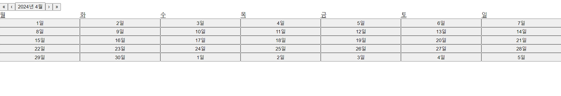
react-calendar의 기본적인 기능은 아래와 같다.
<나>를 클릭하면 월 단위로 이동 가능<<나>>를 클릭하면 년 단위로 이동 가능- 현재 월을 클릭하면 원하는 달로 이동할 수 있는 기능
react-calendar props 확인
내가 추가적으로 구현해야 하는 기능은 아래와 같다.
- 기본적으로 오늘 날짜가 선택되어 있어야 함.
- 기간을 선택할 수 있어야 함.
- 이전 달, 혹은 다음 달 날짜를 선택하면 해당 달로 이동하는 기능
- 기간 선택이 완료된 후 선택된 기간을 텍스트 출력할 수 있어야 함.
이제 내가 구현해야 하는 기능들을 구현해야 한다. react-calendar에서 어떤 설정을 할 수 있는지 보자!!
props가 엄청 많다. 하나하나 읽어보면서 나한테 맞는 props를 찾아야 한다.
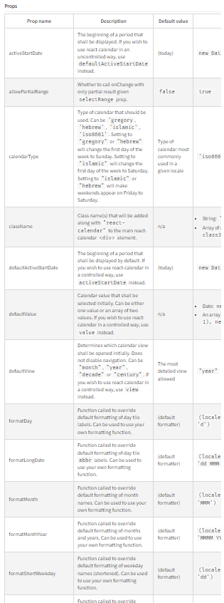
defaultValue: 처음에 선택되는 달력 값. 하나의 값일 수도, 두 값의 배열일 수도 있다.- 기본적으로 오늘 날짜가 선택되어 있어야 했기 때문에, 해당 props를 사용하기로 했다.
selectRange: 사용자가 두 개의 날짜를 선택하는지의 여부를 결정하는 값. 기본 값 false- 기간을 설정해야 하기 때문에 이 props를 true로 사용하기로 했다.
goToRangeStartOnSelect: 범위의 끝을 선택할 때 범위의 시작 부분으로 이동 여부를 결정하는 값. 기본 값 true- 사용성을 위해 다음 달 날짜를 클릭하면 보여지는 달을 이동시키는 것이 필요했기 때문에, 해당 props를 사용하기로 했다.
onChange: 사용자가 달력을 클릭하면 호출되는 함수.- 이유가 필요 없다. 당연히 필요하다!!
react-calendar 기능 구현
import moment from 'moment'; // 날짜 형식을 위해 추가로 설치한 날짜 라이브러리
import { useState } from 'react';
import Calendar from 'react-calendar';
type ValuePiece = Date | null;
type Value = ValuePiece | [ValuePiece, ValuePiece];
const App = () => {
const [value, setValue] = useState<[Date, Date]>([new Date(), new Date()]);
const [dateText, setDateText] = useState<{ [key: string]: string }>({
startDate: moment(new Date()).format('YYYY-MM-DD'),
endDate: moment(new Date()).format('YYYY-MM-DD'),
});
const handleChange = (value: Value) => {
const selectedDate = value as [Date, Date];
setDateText({
startDate: moment(selectedDate[0]).format('YYYY-MM-DD'),
endDate: moment(selectedDate[1]).format('YYYY-MM-DD'),
});
};
return (
<div>
<div>
<span>선택된 날짜 : </span>
<span>{`${dateText.startDate} - ${dateText.endDate}`}</span>
</div>
<Calendar
defaultValue={value}
onChange={handleChange}
selectRange={true}
goToRangeStartOnSelect={false}
/>
</div>
);
};
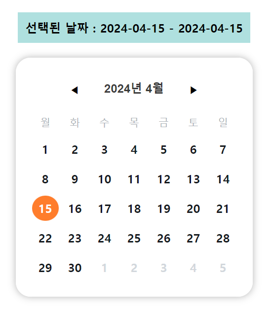
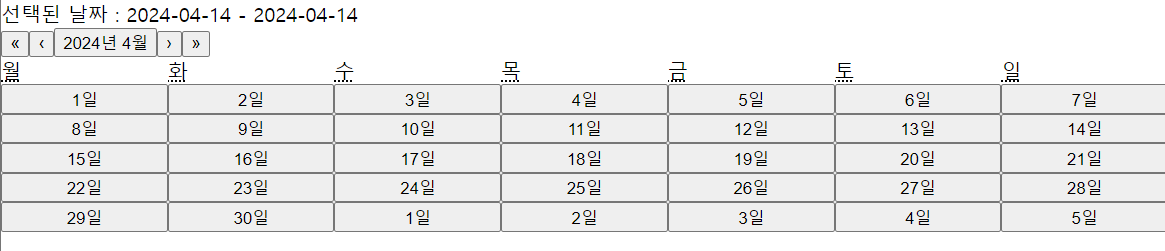
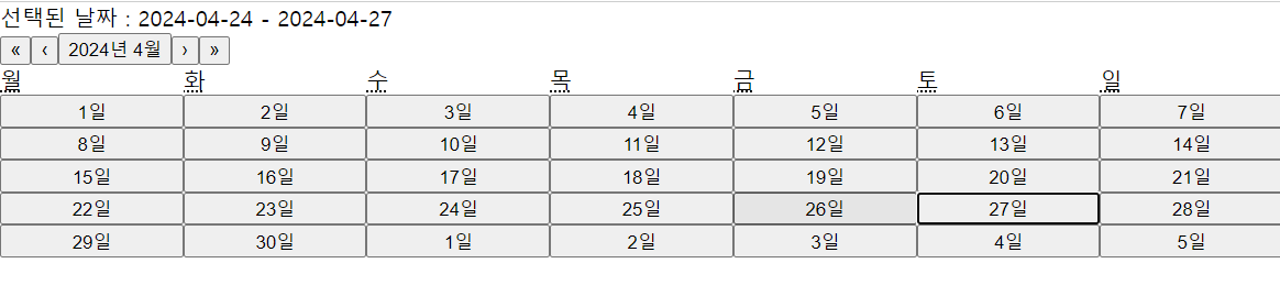
export default App;위와 같이 구현했을 때, 화면은 이렇게 구성된다.
1) 기간을 아직 설정하지 않은 상태
2) 기간을 설정한 상태 (4월 24일, 4월 27일 설정)
좋다!! 어느 정도 기능은 구현은 완료가 된 것 같다. 이제 이 개떡같은 디자인을 바꿔보자.
react-calendar 디자인 변경
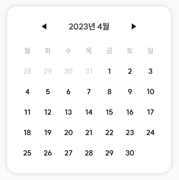
디자이너가 만들어준 달력은 이렇게 예뻤는데... 지금 달력은 너무 마음에 안든다!!!
찾아보니 라이브러리에서 기본적으로 제공하는 디자인이 있다고 한다! 바로 적용해보자.
import 'react-calendar/dist/Calendar.css';별 거 없다. 라이브러리에 있는 css 파일을 import만 해주면 된다.
훨씬 보기 좋아졌다. 그래도 여전히 손 볼게 많으니 하나씩 수정해보자.
참고로 css는 styled-components를 사용할 예정이다.
라이브러리 디자인은 어떻게 수정하면 될까? 힌트는 아까 import한 css 파일이다.
해당 css 파일은 라이브러리들이 들어있는 node_modules 폴더 중에서도 react-calendar 폴더에서 찾을 수 있다.
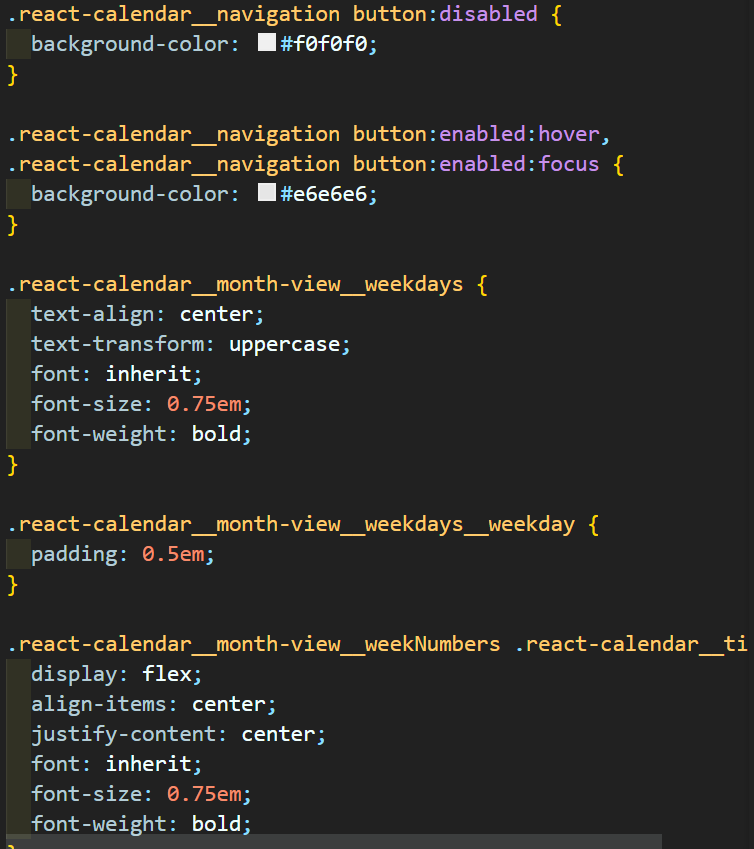
내가 이 파일을 발견했을 때 선택할 수 있는 건 2가지였다.
1. css 파일을 직접 고친다.
2. 여기 적힌 css 파일의 className을 호출해서 수정한다.
나는 2번을 선택했고, class명은 개발자 도구의 element를 적극 활용해서 찾아 변경했다.
하나 하나 설명하기에는 너무 어려우니 코드를 첨부하겠다.
import moment from 'moment';
import { useState } from 'react';
import Calendar from 'react-calendar';
import 'react-calendar/dist/Calendar.css';
import styled from 'styled-components';

type ValuePiece = Date | null;
type Value = ValuePiece | [ValuePiece, ValuePiece];

const App = () => {
  const [value, setValue] = useState<[Date, Date]>([new Date(), new Date()]);
  const [dateText, setDateText] = useState<{ [key: string]: string }>({
    startDate: moment(new Date()).format('YYYY-MM-DD'),
    endDate: moment(new Date()).format('YYYY-MM-DD'),
  });

  const handleChange = (value: Value) => {
    console.log('test');
    console.log(value);
    const selectedDate = value as [Date, Date];
    setDateText({
      startDate: moment(selectedDate[0]).format('YYYY-MM-DD'),
      endDate: moment(selectedDate[1]).format('YYYY-MM-DD'),
    });
  };

  return (
    <Container>
      <div className="selected-date">
        <span>선택된 날짜 : </span>
        <span>{`${dateText.startDate} - ${dateText.endDate}`}</span>
      </div>
      <CalendarContainer>
        <Calendar
          defaultValue={value}
          onChange={handleChange}
          selectRange={true}
          goToRangeStartOnSelect={false}
          formatDay={(_, date) => moment(date).format('D')}
          prevLabel={'◀'}
          prev2Label={null}
          nextLabel={'▶'}
          next2Label={null}
        />
      </CalendarContainer>
    </Container>
  );
};

export default App;

const Container = styled.div`
  display: flex;
  flex-direction: column;
  align-items: center;
  margin: 40px;

  .selected-date {
    padding: 10px;
    background-color: #afe0df;
    margin-bottom: 20px;

    font-family: SUIT;
    font-weight: 700;
    font-size: 16px;
  }
`;

const CalendarContainer = styled.div`
  border-radius: 20px;
  box-shadow: 0px 0px 10px 0px rgba(0, 0, 0, 0.3);

  .react-calendar {
    width: 320px;
    padding: 20px;
    border: none;
    border-radius: 20px;
    font-family: SUIT;
  }

  /* 달력 헤더(네비게이션) */
  .react-calendar__navigation {
    justify-content: center;
    align-items: center;
    margin-bottom: 8px;

    button {
      min-width: 20px;
      background-color: white;
    }

    button:enabled:hover,
    button:enabled:focus {
      background-color: white;
    }

    .react-calendar__navigation__arrow {
      padding: 2px;
    }

    .react-calendar__navigation__label {
      flex-grow: 0 !important;
      padding: 0px 30px;

      span {
        /* B4Bold */
        font-weight: 700;
        font-size: 16px;
        line-height: 140%;
        color: #3c3c3c;
      }
    }
  }

  /* 달력 몸통 */
  .react-calendar__viewContainer {
    button {
      font-size: 16px;
      line-height: 140%;
      font-weight: 700;
      color: #15191d;
    }
    .react-calendar__tile--hasActive,
    .react-calendar__tile--hasActive abbr {
      background-color: #ff7d2c;
      color: white;
    }
  }

  .react-calendar__month-view {
    .react-calendar__month-view__weekdays abbr {
      /* B4 */
      font-size: 14px;
      line-height: 140%;
      font-weight: 500;
      color: #aeb3b8;
      text-decoration: none;
    }

    .react-calendar__month-view__days {
      button {
        background-color: white;
      }

      .react-calendar__tile {
        width: 40px;
        height: 40px;

        display: flex;
        justify-content: center;
        align-items: center;
        padding: 2px;

        abbr {
          /* B4Bold */
          font-weight: 700;
          font-size: 16px;
          line-height: 140%;
          color: #15191d;

          width: 100%;
          padding: 6px 0px;
        }
      }

      .react-calendar__tile--now abbr {
        color: #ff7d2c;
        background-color: white;
      }

      .react-calendar__month-view__days__day--neighboringMonth abbr {
        color: #d2d7dc;
      }

      .react-calendar__tile--active,
      .react-calendar__tile--range {
        abbr {
          background-color: #ff7d2c;
          color: white;
        }
      }

      .react-calendar__tile--rangeEnd abbr {
        border-radius: 50%;
      }
    }
  }
`;
추가된 수정사항만 언급하자면 아래와 같다.
prevLabel,prev2Label,nextLabel,next2Label사용- 연도와 달을 이동하는 버튼은 css로 변경할 수 없었다.
- Calendar의 props가 존재했고 해당 props에 값을 넣어 변경했다.
formatDay- 달력에 있는 모든 날짜가 N일로 표시되어 있었다.
- fotmatDay로 형식 변경이 가능했기 때문에 moment를 이용해 변경했다.
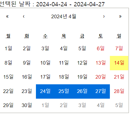
완성 화면
완성된 화면은 아래와 같다.
확실히 예뻐지고 디자인대로 구현된 것 같다!!