shop 페이지 만들어보기
목표 페이지
각 상품에 마우스를 올리면
이런식으로 상품명과 가격이 약간의 딜레이후 보이도록.
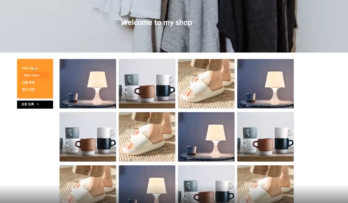

v1에서는 상품 이미지 쪽만 만들것
<div class="itemWrap"> <div class="item"> <div class="imgBox"> <img src="./img/item1.jpeg" alt="탁상용 조명"> </div> <div class="textBox"> <p class="textBox__name">탁상용 조명</p> <p class="textBox__price">250,000원</p> </div> </div> <div class="item"> <div class="imgBox"> <img src="./img/item2.png" alt="머그컵"> </div> <div class="textBox"> <p class="textBox__name">머그컵</p> <p class="textBox__price">16,000원</p> </div> </div> <div class="item"> <div class="imgBox"> <img src="./img/item3.jpeg" alt="슬리퍼"> </div> <div class="textBox"> <p class="textBox__name">슬리퍼</p> <p class="textBox__price">20,000원</p> </div> </div> </div>*{ box-sizing: border-box; } html, body { margin: 0px ; padding: 0px ; } .itemWrap { display: flex; flex-direction: row; justify-content: space-between; align-items: flex-start; flex-wrap: wrap; } .item{ width: calc(25% - 7px) ; aspect-ratio: 6 / 5; position: relative; overflow: hidden; border-radius: 10px; margin-top: 10px; } .imgBox { width: 100%; height: 100%; } .imgBox img { width: 100%; height: 100%; object-fit: cover; } .textBox { width: 100%; height: 100%; position: absolute; top: 0; left: 0; display: flex; flex-direction: column; justify-content: flex-end; align-items: flex-start; padding: 20px; z-index: 3; } .textBox p { color: white; margin: 5px 0 0 0; } .textBox__name { font-size: 22px; font-weight: 500; opacity: 0; transform: translateY(100px); } .textBox__price{ font-size: 16px; font-weight: 400; opacity: 0; transform: translateY(100px); } .item:after { width: 100%; height: 100%; content:""; display: block; background-color: rgba(0,0,0,0.1); position: absolute; top: 0; left: 0; z-index: 2; opacity: 0; } .item:hover:after{ opacity: 1; } .item:hover .imgBox img { transform: scale(1.1); filter: blur(3px); } .item:hover .textBox__name{ opacity: 1; transform: translateY(0px); } .item:hover .textBox__price{ opacity: 1; transform: translateY(0px); } .item:after, .item .imgBox img, .item .textBox__name, .item .textBox__price { transition: all 0.4s ease-in-out; }