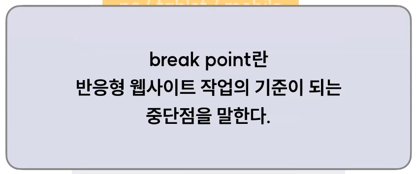
breakPoint
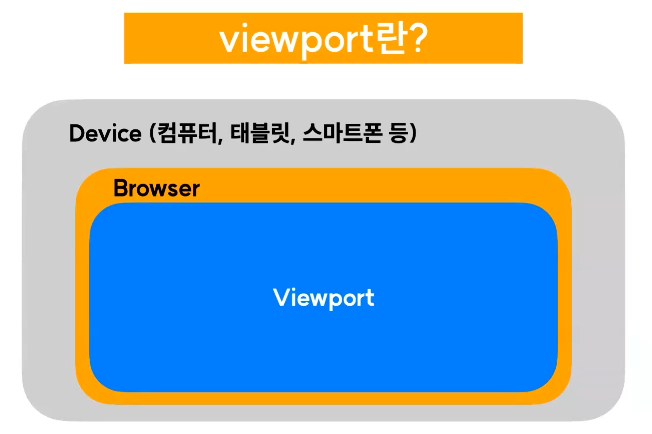
디바이스에서 실제로 내용이 들어가는 부분 ( 주소창, 북마크바 등 제외)
여기서 기준점은 뷰포트를 기준으로 하게됨
~~px 이상 이하 이런것
일반적으로 나누는 break point, 실무에서는 세부 조정은 팀끼리 정해서 하는것 (정해진 답은 없음)


예시
.container {
    background-color: red;
    padding: 30px;
}
.contents {
    color: white;
}
.contents:after {
    content: "저는 PC 입니다.";
}
/* 3단 break point로 해보자*/
/* PC 기본 설정 */
@media screen and (max-width: 767px) {
    /* mobile */
    .container{
        background-color: blue;
    }
    .contents:after{
        content: "저는 모바일 입니다.";
    }
}
@media screen and (min-width: 768px) and (max-width: 1023px) {
    /* tablet */
    .container{
        background-color: green;
    }
    .contents:after{
        content: "저는 태블릿 입니다.";
    }
}