시작
Create Visual Balance Using the text-align Property
텍스트 정렬 속성을 사용하여 시각적 균형 만들기
text-align: justify;
justify: 양쪽 정렬 (자동 줄바꿈시 오른쪽 경계선 부분 정리)
text-align: center;
text-align: right;
h4 {
text-align: center;
}
p {
text-align: justify;
}
Adjust the Width of an Element Using the width Property
.fullCard {
width: 245px;};
Adjust the Height of an Element Using the height Property
height: 25px;
Use the strong Tag to Make Text Bold
strong 태그는 font-weight: bold;의 값을 전달.
Stanford University.
Use the u Tag to Underline Text
텍스트에 밑줄을 그으려면 u 태그를 사용
u 태그는 text-decoration: underline;의 값을 전달.
Ph.D. students
Use the em Tag to Italicize Text
em 태그를 사용하여 텍스트 기울임꼴 표시
em 태그는 font-style: italic;의 값을 전달.
Use the s Tag to Strikethrough Text
s Tag
s 태그는 text-decoration: line-through;의 값을 전달.
<h4><s>Google</s>Alphabet</h4>
Create a Horizontal Line Using the hr Element
hr 태그를 사용하여 포함 요소의 너비에 수평선을 추가
HTML에서 hr은 자체 닫는 태그이므로 별도의 닫는 태그가 필요하지 않습니다.
Adjust the background-color Property of Text
텍스트를 포함하는 요소에 배경색을 추가
RGB 값의 범위는 0 ~ 255입니다. 알파 값은 완전 불투명 또는 단색인 1부터 완전 투명 또는 투명인 0까지 가능
```
h4 {
text-align: center;
background-color: rgba(45, 45, 45, 0.1);
padding: 10px;
}
```
Adjust the Size of a Heading Element Versus a Paragraph Element
font-size: 27px;
Add a box-shadow to a Card-like Element
상자 그림자 속성은 요소에 하나 이상의 그림자를 적용
offset-x (how far to push the shadow horizontally from the element)
offset-y (how far to push the shadow vertically from the element)
blur-radius
spread-radius
color
쉼표를 사용하여 각 상자 그림자 요소의 속성을 분리하여 여러 상자 그림자를 만들 수 있습니다.
#thumbnail{
box-shadow: 0 10px 20px rgba(0,0,0,0.19), 0 6px 6px rgba(0,0,0,0.23);
}
Decrease the Opacity of an Element
CSS의 불투명도 속성은 항목의 불투명도 또는 반대로 투명도를 조정하는 데 사용됩니다
opacity: 0.7;
Use the text-transform Property to Make Text Uppercase
text-transform:uppercase;
Set the font-size for Multiple Heading Elements
다중 헤딩 요소의 글꼴 크기 설정
Set the font-weight for Multiple Heading Elements
Set the font-size of Paragraph Text
p {
line-height: 25px;
}
Set the line-height of Paragraphs
Adjust the Hover State of an Anchor Tag
a:hover {
color: blue;
}
Change an Element's Relative Position
CSS는 각 HTML 요소를 자체 상자로 취급하며, 일반적으로 CSS 박스 모델이라고 한다. 블록 수준 항목은 자동으로 새 줄(제목, 단락 및 구분)에서 시작하고 인라인 항목은 주변 내용(예: 이미지 또는 범위)에 위치합니다. 이런 식으로 요소의 기본 레이아웃을 문서의 일반 흐름이라고 부르지만, CSS는 이를 재정의하기 위한 위치 속성을 제공
요소의 위치가 상대적인 것으로 설정relative
요소의 위치를 상대적인 위치로 변경해도 정상적인 흐름에서 제거되지 않습니다. 요소의 다른 요소는 여전히 해당 항목이 기본 위치에 있는 것처럼 작동합니다.
h2 {
position: relative;
top: 15px;
}
Move a Relatively Positioned Element with CSS Offsets
h2 {
position: relative;
left: 15px;
bottom: 10px;
}
Lock an Element to its Parent with Absolute Positioning
absolute
요소를 상위 컨테이너에 상대적으로 제자리에 잠급니다.
#searchbar {
position: absolute;
top: 50px;
right: 50px;
}
Lock an Element to the Browser Window with Fixed Positioning
fixed absolute
고정 위치와 절대 위치의 한 가지 중요한 차이점은 사용자가 스크롤할 때 고정 위치를 가진 요소가 움직이지 않는다는 것입니다.
position: fixed;
top: 0px;
left: 0px;
Push Elements Left or Right with the float Property
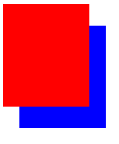
Change the Position of Overlapping Elements with the z-index Property
요소가 겹치면 z축을 써서 순서를 바꿀 수 있다.
z-index: 2;
Center an Element Horizontally Using the margin Property
마진을 auto로 하면 요소가 중앙에 온다.
margin: auto;
Learn about Complementary Colors
.blue {
background-color: #0000FF;
}
.yellow {
background-color: #FFFF00;
}
Learn about Tertiary Colors
.orange {
background-color: #FF7F00;
}
.cyan {
background-color: #00FFFF;
}
.raspberry {
background-color: #FF007F;
}

Adjust the Color of Various Elements to Complementary Colors
Adjust the Hue of a Color
색조는 사람들이 일반적으로 '색'이라고 생각하는 것Hue
Saturation 포화도는 색상의 회색의 양
Lightness
.green {
background-color: hsl(120, 100%, 50%);
}
.cyan {
background-color: hsl(180, 100%, 50%);
}
.blue {
background-color: hsl(240, 100%, 50%);
}
Adjust the Tone of a Color
CSS의 hsl() 옵션을 사용하면 색조를 쉽게 조정할 수 있습니다. 흰색을 순수한 색상과 섞으면 그 색의 틴트가 생기고, 검은색을 더하면 음영이 생긴다. 또는 회색을 추가하거나 색조와 음영을 모두 사용하여 톤을 생성할 수 있습니다. hsl()의 's'와 'l'은 각각 포화도와 명도를 나타냅니다. 채도 백분율은 회색의 양을 변경하고 밝기 백분율은 색상의 흰색 또는 검은색 양을 결정
nav {
background-color: hsl(180, 80%, 25%);
}
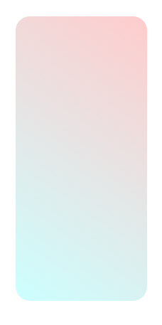
Create a Gradual CSS Linear Gradient
배경 속성의 선형 기울기() 함수를 통해 액세스할 수 있습니다
background-image: linear-gradient(35deg, #CCFFFF, #FFCCCC);
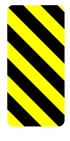
Use a CSS Linear Gradient to Create a Striped Element
repeating-linear-gradient()
반복 선형 기울기() 함수는 지정된 기울기 패턴을 반복한다는 큰 차이를 가지고 선형 기울기()와 매우 유사하다. 반복 선형 변환은 다양한 값을 사용할 수 있지만, 단순화를 위해 이 과제에서 각도 값과 색상 중지 값을 사용합니다
background: repeating-linear-gradient(
45deg,
yellow 0px,
yellow 40px,
black 40px,
black 80px
);
Create Texture by Adding a Subtle Pattern as a Background Image
배경에 질감과 흥미를 더하고 더 돋보이게 하는 한 가지 방법은 미묘한 패턴을 추가
Use the CSS Transform scale Property to Change the Size of an Element
요소의 스케일을 변경하기 위해 CSS는 스케일() 함수와 함께 변환 속성을 갖는다. 다음 코드 예제에서는 페이지에 있는 모든 문단 요소의 크기를 두 배로 늘립니다.
p {
transform: scale(2);
}
#ball2 {
left: 65%;
transform: scale(1.5); }
Use the CSS Transform scale Property to Scale an Element on Hover
변환 속성(transform )에는 요소 크기 조정, 이동, 회전, 스큐 등을 수행할 수 있는 다양한 기능이 있습니다
div:hover{
transform: scale(1.1);
}
Use the CSS Transform Property skewX to Skew an Element Along the X-Axis
Skew비스듬하게 되다
변환 속성의 다음 함수는 skewX()로, 선택한 요소를 X(수평) 축을 따라 주어진 정도만큼 꼬인다.
#bottom {
background-color: blue;
transform: skewX(24deg); }
Use the CSS Transform Property skewY to Skew an Element Along the Y-Axis
#top {
background-color: red;
transform: skewY(-10deg); }
Create a Graphic Using CSS
초승달 모양
요소의 그림자를 설정하는 상자 그림자와 요소의 모서리 둘레를 제어하는 테두리 반지름 속성을 함께 사용해야 합니다.
옆으로 약간 상쇄되는 선명한 그림자를 가진 둥글고 투명한 물체를 만들 것입니다. 그림자는 실제로 여러분이 보는 달 모양이 될 것입니다
원형 객체를 만들려면 테두리 반지름 속성을 50%의 값으로 설정해야 합니다.
이전 문제에서 상자 그림자 속성은 오프셋-x, 오프셋-y, 블러-반경, 스프레드-반경 및 색상 값을 순서대로 사용한다는 것을 기억할 수 있습니다. 블러 반지름 및 스프레드 반지름 값은 옵션입니다.

.center {
position: absolute;
margin: auto;
top: 0;
right: 0;
bottom: 0;
left: 0;
width: 100px;
height: 100px;
background-color: transparent;
border-radius: 50%;
box-shadow: 25px 10px 0 0 blue;
}
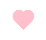
Create a More Complex Shape Using CSS and HTML
하트 모양
::before ::after
Learn How the CSS @keyframes and animation Properties Work
@keyframes 애니메이션
총 8개의 애니메이션 속성 animation-name animation-duration
#rect {
animation-name: rainbow;
animation-duration: 4s;
}
@keyframes rainbow {
0% {
background-color: blue;
}
50% {
background-color: green;
}
100% {
background-color: yellow;
}
}
Use CSS Animation to Change the Hover State of a Button
CSS @keyframes를 사용하여 호버 상태의 버튼 색상을 변경할 수 있습니다.
ms는 밀리초를 의미하며, 여기서 1000ms는 1s와 같습니다
button:hover {
animation-name: background-color;
animation-duration: 500ms;
}
@keyframes background-color {
100% {
background-color: #4791d0;
}
}
버튼 기본색(파란색)에 갖다대면 색이 하늘색으로 바뀐다.
Modify Fill Mode of an Animation
다만 위의 방식은 5초 지나면 다시 원래 색으로 돌아감. 이걸 안돌아가고 바뀐채로 있도록 하자.
애니메이션 채우기 모드 속성을 전달로 설정하여 수행할 수 있습니다
animation-fill-mode: forwards;
Create Movement Using CSS Animation
CSS 오프셋 속성을 애니메이션 규칙에서 사용하여 이동을 만들 수 있습니다.
Create Visual Direction by Fading an Element from Left to Right
애니메이션 요소의 불투명도를 변경하여 화면의 오른쪽에 도달하면 애니메이션 요소가 점차 희미해집니다
@keyframes fade {
50% {
left: 60%;
opacity: 0.1;
}
}
Animate Elements Continually Using an Infinite Animation Count
애니메이션 반복의 횟수를 정하기.
animation-iteration-count: infinite;
Make a CSS Heartbeat using an Infinite Animation Count
animation-iteration-count: infinite;
Animate Elements at Variable Rates
@keyframes 규칙을 50%로 변경하여 star-1의 클래스 이름을 가진 요소의 애니메이션 비율을 변경합니다.
@keyframes twinkle-1 {
50% {
transform: scale(0.5);
opacity: 0.5;
}
}
Animate Multiple Elements at Variable Rates
Change Animation Timing with Keywords
기본값은 easy로 느리게 시작하여 중간에 속도를 높이다가 마지막에 다시 속도를 낮춥니다. 다른 옵션으로는 초기에는 속도가 빠른 Easy-out, 초기에는 속도가 느린 Easy-in, 그리고 마지막에는 속도가 빨라지는 Easy-in, 또는 전체적으로 일정한 애니메이션 속도를 적용하는 Linear 등이 있다.
#ball1 {
left:27%;
animation-timing-function: linear;
}
#ball2 {
left:56%;
animation-timing-function: ease-out;
}
Learn How Bezier Curves Work
CSS는 베지어 곡선을 사용하여 애니메이션이 어떻게 재생되는지 보다 세밀하게 제어할 수 있는 키워드 이외의 옵션을 제공한다.
animation-timing-function: cubic-bezier(0.25, 0.25, 0.75, 0.75);
Use a Bezier Curve to Move a Graphic
animation-timing-function: cubic-bezier(0, 0, 0.58, 1);
Make Motion More Natural Using a Bezier Curve
animation-timing-function: cubic-bezier(0.311, 0.441, 0.444, 1.649);
완료!