목차
- 플렉스 박스 레이아웃 속성
display: flex | inline-flex;: 플렉스 컨테이너 지정flex-direction: 플렉스 항목에서 주축과 방향 지정flex-wrap: 컨테이너 너비보다 항목이 많을 경우 줄 바꿈 여부 지정flex-flow: 배치 방향과 줄 바꿈을 한 번에 지정justify-content: 주축에서 플렉스 항목 정렬 방법 지정align-items: 교차축에서 플렉스 항목 정렬 방법 지정align-self: 특정 플렉스 항목의 정렬 방법 지정align-content: 여러 줄일 때 교차축 정렬 방법 지정flex: 플렉스 항목의 너비를 줄이거나 늘림- 그리드 레이아웃 속성
display: grid | inline-grid;: 그리드 컨테이너 지정grid-template-columns: 컬럼 지정grid-template-rows: 줄 높이 지정grid-column-gap: 컬럼과 컬럼 사이 간격 지정grid-row-gap: 줄과 줄 사이 간격 지정grid-gap: 컬럼과 줄 사이 간격 한꺼번에 지정grid-column-start: 컬럼 시작 라인 번호 지정grid-column-end: 컬럼 마지막 라인 번호 지정grid-column: 컬럼 시작 번호와 끝 번호 사이에 슬래시(/)를 넣어 사용grid-row-start: 줄 시작 라인 번호 지정gris-row-end: 줄 끝 라인 번호 지정grid-row: 줄 시작 번호와 끝 번호 사이에 슬래시(/)를 넣어 사용grid-area: 템플릿 이름 지정grid-template-areas: grid-area를 사용해 템플릿 그리드 생성minmax( ): 최소값, 최대값 지정하는 함수repeat( ): 같은 값을 여러 번 반복할 때 사용하는 함수
그리드 레이아웃
그리드 레이아웃이란?
웹 사이트를 여러 개의 컬럼으로 나눈 후 웹 요소를 화면에 맞게 배치하는 것
- 반응형 웹 디자인을 사용한 사이트는 화면 너비에 따라 웹 문서의 요소를 재배치해야 하는데, 재배치하기 위한 기준이 되는 레이아웃이 그리드 레이아웃이다.
- 그리드 레이아웃을 사용하면 화면을 규칙적으로 배열하게 되어 레이아웃을 일관성 있게 유지 가능하다.
특징
- 시각적으로 안정된 디자인을 만들 수 있다.
- 업데이트가 편한 웹 디자인을 구성할 수 있다.
- 요소를 자유롭게 배치할 수 있다.
그리드 레이아웃을 만드는 방법
- CSS의 float속성 사용
- 플렉서블(=플렉스) 박스 레이아웃 사용
- flexible box layout : 그리드 레이아웃을 기본으로 하고 각 박스를 원하는 위치에 따라 배치하는 것
- 수평 또는 수직 방향 중 하나를 주축으로 하고 박스를 배치
- 순서대로 배치하다가 화면 너비를 넘어가면 다음 줄로 이동해서 다시 순서대로 배치
- CSS 그리드 레이아웃 적용
- CSS grid layout : 수평과 수직 어느 방향이든 배치 가능한 것
- 마치 레고 블록에 끼워 마추듯 요소를 배치하는 것
플렉스 박스 레이아웃 용어
- 플렉스 컨테이너(부모 박스) : 플렉스 박스 레이아웃을 적용할 대상을 묶는 요소
- 플렉스 항목(자식 박스) : 플렉스 박스 레이아웃을 적용할 대상
- 주축 : 플렉스 컨테이너 안에서 플렉스 항목을 배치하는 기본 방향
- 교차축 : 주축과 교차하는 방향
플렉스 박스 레이아웃 속성
display: flex | inline-flex;: 플렉스 컨테이너 지정display: flex | inline-flex;- flex : 컨테이너 안의 플렉스 항목을 블록 레벨 요소로 배치
- inline-flex : 컨테이너 안의 플렉스 항목을 인라인 레벨 요소로 배치
- 플렉스 레이아웃을 만들려면, 플렉스 항목들을 플렉스 컨테이너로 묶어 주어야 함
- 플렉스 컨테이너로 인식하려면 display속성을 지정해야 함
flex-direction: 플렉스 항목에서 주축과 방향 지정flex-direction: row | row-reverse | column | column-reverse;- row(기본값) : 주축을 가로로 지정, 왼쪽 ➔ 오른쪽으로 배치
- row-reverse : 주축 가로, 오른쪽 ➔ 왼쪽으로 배치
- column : 주축을 세로로 지정, 위쪽 ➔ 아래쪽 배치
- column-reverse : 주축 세로, 아래쪽 ➔ 위쪽 배치
flex-wrap: 컨테이너 너비보다 항목이 많을 경우 줄 바꿈 여부 지정flex-wrap: nowrap | wrap | wrap-reverse;- nowrap(기본값) : 플렉스 항목을 한 줄에 표시
- wrap : 플렉스 항목을 여러 줄에 표시
- 주축이 row이면 왼쪽➔오른쪽으로 배치하다가, 아래로 내려가서 다시 왼쪽➔오른쪽으로 배치
- wrap-reverse : 플렉스 항목을 여러 줄에 표시하되, 시작점과 끝점이 바뀜
- 주축이 row이면 왼쪽➔오른쪽으로 배치하다가, 위로 올라가서 다시 왼쪽➔오른쪽으로 배치
- 줄 바꿈으로 속성을 지정하면, 웹 브라우저 화면의 너비를 줄이거나 늘릴 때 여러 줄로 표시되는 것을 확인할 수 있음
flex-flow: 배치 방향과 줄 바꿈을 한 번에 지정flex-flow: flex-direction값 flex-wrap값;- 기본값은
flex-flow: row nowrap;
- 기본값은
justify-content: 주축에서 플렉스 항목 정렬 방법 지정justify-content: flex-start | flex-end | center | space-between | space-around;- flex-start : 주축의 시작점에 맞춰 배치
| --1-- --2-- --3-- --4-- | - flex-end : 주축이 끝점에 맞춰 배치
| --1-- --2-- --3-- --4-- | - center : 주축의 중앙에 맞춰 배치
| --1-- --2-- --3-- --4-- | - space-between : 첫번째와 끝 항목을 주축의 시작점과 끝점에 배치한 후 그 사이 항목 간 간격을 같은 간격으로 배치
| --1-- --2-- --3-- --4-- | - space-around : 모든 항목을 주축에 같은 간격으로 배치
| --1-- --2-- --3-- --4-- |
- flex-start : 주축의 시작점에 맞춰 배치
align-items: 교차축에서 플렉스 항목 정렬 방법 지정align-items: flex-start | flex-end | center | baseline | stretch;- flex-start : 교차축의 시작점에 맞춰 배치
- flex-end : 교차축의 끝점에 맞춰 배치
- center : 교차축의 중앙에 배치
- baseline : 교차축의 문자 기준선에 맞춰 배치
- stretch : 플렉스 항목을 늘력 교차축에 가득 차게 배치
align-self: 특정 플렉스 항목의 정렬 방법 지정align-self: flex-start | flex-end | center | baseline | stretch;align-items와 속성값 동일
align-items와 align-self의 차이점
- align-items는 플렉스 컨테이너 선택자 안에서 속성을 지정하여 플렉스 항목들의 정렬 방법을 지정
- align-self는 특정 플렉스 항목 선택자 안에서 속성을 지정하여 그 플렉스 항목만 지정
align-content: 여러 줄일 때 교차축 정렬 방법 지정align-content: flex-start | flex-end | center | space-between | space-around | stretch;align-items와 align-content의 차이점
- align-items는 한 줄일 때 사용하는 속성 (교차축 기준으로 플렉스 항목 정렬)
- align-content는 여러 줄일 때 사용하는 속성 (교차축 기준으로 줄 자체 정렬)
- 한 줄일 때는 효과가 적용되지 않는다. 즉,
flex-wrap: nowrap;일때는 효과가 없다.
- 한 줄일 때는 효과가 적용되지 않는다. 즉,
flex: 플렉스 항목의 너비를 줄이거나 늘림- 이 부분은 공부를 더 해보고 정리해야 할 것 같다
- 플렉스 컨테이너(부모 박스)에 설정하는 속성 :
display,flex-direction,flex-wrap,flex-flow,justify-content,align-items,align-content- 플렉스 항목(자식 박스)에 설정하는 속성 :
align-self,flex
예시
<style>
  .default{
    width: 400px;
    height: 200px;
    background-color: tomato;
    text-align: center;
    line-height: 50px; /* line-height : 한 줄의 간격 */

    display: flex;
    flex-direction: row; /* row(디폴트)이면 왼-오 => 주축 가로로 설정 */
    flex-wrap: wrap-reverse; /* 위에 이어서 줄 바꿈 */

    justify-content: center; /* 주축 가운데 정렬 */
    align-items: center; /* 교차축 가운데 정렬 */
  }
  .item{
    width: 80px;
    height: 50px;
    color: white;
    background-color: blue;
    border: 3px solid white;
  }
</style>
...
<div class="default">
  <div class="item">.ITEM1</div>
  <div class="item">.ITEM2</div>
  <div class="item">.ITEM3</div>
  <div class="item">item4</div>
  <div class="item">item5</div>
  <div class="item">item6</div>
  <div class="item">item7</div>
  <div class="item">item8</div>
  <div class="item">item9</div>
</div>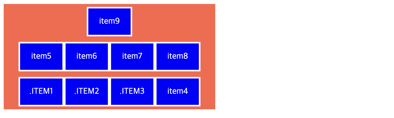
CSS 그리드 레이아웃 속성
display: grid | inline-grid;: 그리드 컨테이너 지정display: grid | inline-grid;- grid : 컨테이너 안의 항목을 블록 레벨 요소로 배치
- inline-grid : 컨테이너 안의 항목을 인라인 레벨 요소로 배치
grid-template-columns: 컬럼 지정grid-template-rows: 줄 높이 지정grid-template-columns: 크기1 크기2 ...; grid-template-rows: 크기;- 컬럼과 줄의 크기와 개수를 지정하려면 두 속성을 각각 사용
- grid-template-columns은 그리드 컨테이너 안에 몇 개의 컬럼을 배치할지와 각 컬럼의 너비를 지정
- 상대적인 크기 지정하는 fr단위 사용 가능
grid-template-columns: 1fr 2fr 1fr;: 컬럼을 1:2:1로 배치 - 값이 반복될 때 repeat()함수 사용 가능
grid-template-columns: repeat(3, 1fr);: 1fr을 3번 반복한 것으로 컬럼을 1:1:1로 배치 - 최소, 최대 지정하는 minmax()함수 사용 가능
grid-template-rows: minmax(100px, auto);: 줄 높이를 최소 100px로 하고, 내용이 많을 경우 다 표시가능한 만큼 높이가 늘어나도록 설정 - 컬럼 개수를 자동으로 지정하는 auto-fit, auto-fill값 사용 가능
grid-template-columns: repeat(auto-fit | auto-fill, 너비);- auto-fit : 컬럼을 지정한 너비만큼만 표시하고 남는 공간은 그대로 둠
- auto-fill : 컬럼을 화면 너비만큼 꽉 채움
grid-column-gap: 컬럼과 컬럼 사이 간격 지정grid-row-gap: 줄과 줄 사이 간격 지정grid-gap: 컬럼과 줄 사이 간격 한꺼번에 지정grid-column-gap: 컬럼간격; grid-row-gap: 줄간격; grid-gap: 줄간격 컬럼간격;grid-column-start: 컬럼 시작 라인 번호 지정grid-column-end: 컬럼 마지막 라인 번호 지정grid-column: 컬럼 시작 번호와 끝 번호 사이에 슬래시(/)를 넣어 사용grid-row-start: 줄 시작 라인 번호 지정gris-row-end: 줄 끝 라인 번호 지정grid-row: 줄 시작 번호와 끝 번호 사이에 슬래시(/)를 넣어 사용grid-column-start: 컬럼시작라인번호; grid-column-end: 컬럼끝라인번호; grid-column: 컬럼시작번호/끝번호; grid-row-start: 줄시간라인번호; grid-row-end: 줄끝라인번호; grid-row: 줄시간번호/끝번호;
예시
<style>
  #wrapper {
    width: 700px; /* 너비 700px */
    display: grid;
    grid-template-columns: repeat(3, 1fr); /* 컬럼 3개, 1:1:1로 배치 */
    grid-template-rows: repeat(3, 100px); /* 줄 100px 3개 */
  }
  .box1{
    background-color: #3689ff;
    grid-column: 1/4;
  }
  .box2{
    background-color: #00cf12;
    grid-row: 2/4;
  }
  .box3{
    background-color: #ff9019;
    grid-column: 2/4;
    grid-row-start: 2;
  }
  .box4{
    background-color: #ffd000;
    grid-column: 3/4;
    grid-row-start: 3;
  }
</style>
...
<div id="wrapper">
  <div class="box1">box1</div>
  <div class="box2">box2</div>
  <div class="box3">box3</div>
  <div class="box4">box4</div>
</div> 
grid-area: 템플릿 이름 지정grid-area: 템플릿명;grid-template-areas: grid-area를 사용해 템플릿 그리드 생성grid-template-areas: "템플릿명 템플릿명 ..." "템플릿명 템플릿명 ...";
예시
<style>
  #wrapper {
    width: 700px; /* 너비 700px */
    display: grid;
    grid-template-columns: repeat(3, 1fr); /* 컬럼 3개, 1:1:1로 배치 */
    grid-template-rows: repeat(3, 100px); /* 줄 100px 3개 */

    grid-template-areas:
    "box1 box1 box1"
    "box2 box3 box3"
    "box2 . box4";
  }
  .box1{
    background-color: #3689ff;
    grid-area: box1;
  }
  .box2{
    background-color: #00cf12;
    grid-area: box2;
  }
  .box3{
    background-color: #ff9019;
    grid-area: box3;
  }
  .box4{
    background-color: #ffd000;
    grid-area: box4;
  }
</style>
...
<div id="wrapper">
  <div class="box1">box1</div>
  <div class="box2">box2</div>
  <div class="box3">box3</div>
  <div class="box4">box4</div>
</div>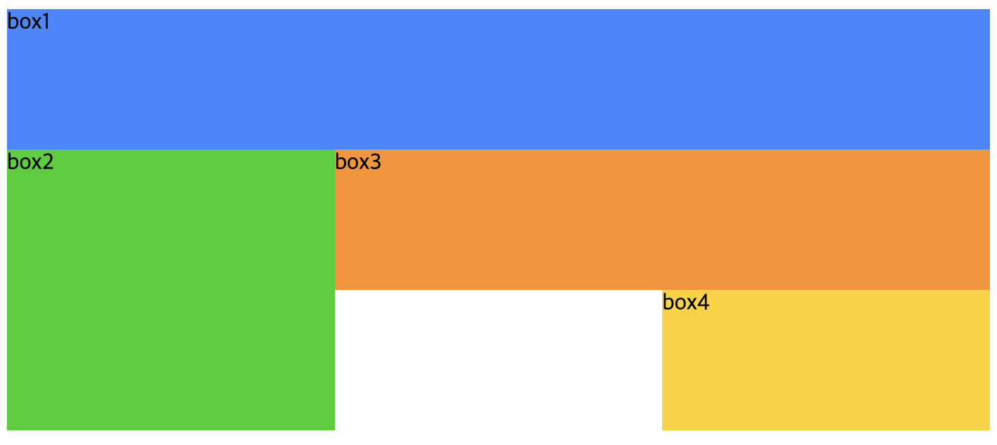
예시
<style>
  .default{
    width: 400px;
    height: 200px;
    background-color: tomato;
    text-align: center;
    line-height: 50px; /* line-height : 한 줄의 간격 */

    display: grid;
    grid-template-columns: 100px 100px 100px;
    grid-template-rows: 50px 70px 100px;
  }
  .item{
    width: 80px;
    height: 50px;
    color: white;
    background-color: blue;
    border: 3px solid white;
  }
</style>
...
<div class="default">
  <div class="item">.ITEM1</div>
  <div class="item">.ITEM2</div>
  <div class="item">.ITEM3</div>
  <div class="item">item4</div>
  <div class="item">item5</div>
  <div class="item">item6</div>
  <div class="item">item7</div>
  <div class="item">item8</div>
  <div class="item">item9</div>
  <div class="item">item10</div>
</div>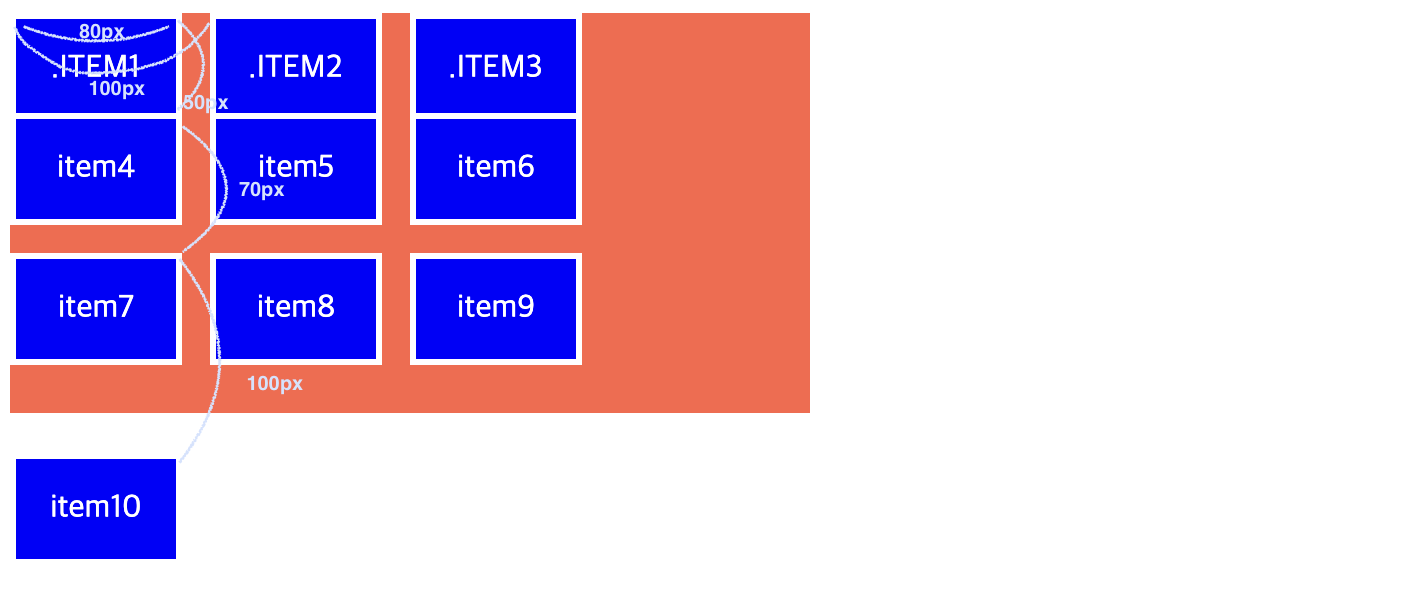

개발, 분석 배운 내용 정리하기!