파일 구조 ✍️
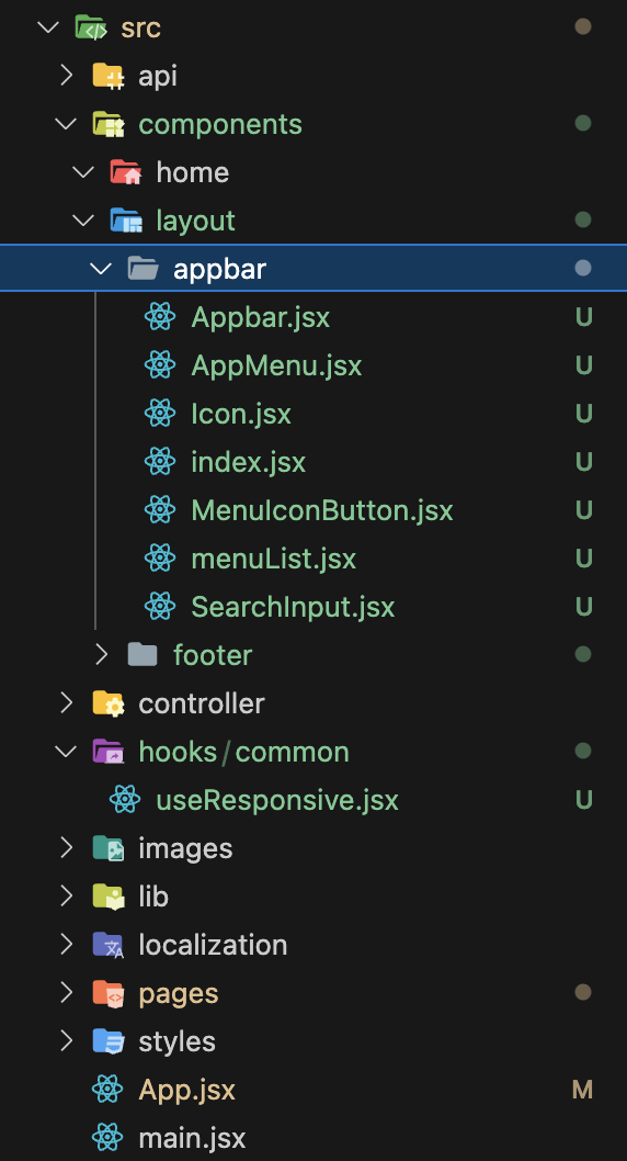
오늘의 핵심 파일
- src/components/layout/appbar
- src/hooks/common/useResponsive.jsx
1. src/components/layout/appbar/index.jsx 🟢
MUI에서 Appbar에 대한 컴포넌트 코드를 긁어왔다. 파일의 효율적 관리를 위해 세부적인 내용들을 개별 컴포넌트로 분리했고, 각각의 컴포넌트들은 단일한 index.jsx 파일로부터 export 된다.
import Icon from "./Icon";
import SearchInput from "./SearchInput";
import AppMenu from "./AppMenu";
import MenuIconButton from "./MenuIconButton";

export { Icon, SearchInput, AppMenu, MenuIconButton };
2. src/components/layout/appbar/Icon.jsx 🟢
사이트의 Icon을 담당할 파일이다. 현재는 Typography를 통해 영역만 확보해놓은 상황이다.
import React from "react";
import { Box, Typography } from "@mui/material";

const Icon = () => {
  return (
    <Box>
      <Typography variant="h6" noWrap component="div">
        MUI
      </Typography>
    </Box>
  );
};

export default Icon;
3. src/components/layout/appbar/SearchInput.jsx 🟢
import React from "react";
import SearchIcon from "@mui/icons-material/Search";
import { styled, alpha } from "@mui/material/styles";
import { Box, InputBase } from "@mui/material";

const SearchIconWrapper = styled("div")(({ theme }) => ({
  padding: theme.spacing(0, 2),
  height: "100%",
  position: "absolute",
  pointerEvents: "none",
  display: "flex",
  alignItems: "center",
  justifyContent: "center",
}));

const StyledInputBase = styled(InputBase)(({ theme }) => ({
  color: "inherit",
  "& .MuiInputBase-input": {
    padding: theme.spacing(1, 1, 1, 0),
    paddingLeft: `calc(1em + ${theme.spacing(4)})`,
    transition: theme.transitions.create("width"),
    width: "100%",
    [theme.breakpoints.up("md")]: {
      width: "20ch",
    },
  },
}));

const SearchInput = () => {
  return (
    <Box
      sx={{
        position: "relative",
        borderRadius: (theme) => theme.shape.borderRadius,
        backgroundColor: (theme) => alpha(theme.palette.common.white, 0.15),
        "&:hover": {
          backgroundColor: (theme) => alpha(theme.palette.common.white, 0.25),
        },
        marginRight: (theme) => theme.spacing(2),
        marginLeft: 0,
        width: { sm: "auto", sx: "100%" },
        marginLeft: { sm: 5 },
      }}
    >
      <SearchIconWrapper>
        <SearchIcon />
      </SearchIconWrapper>
      <StyledInputBase
        placeholder="Search…"
        inputProps={{ "aria-label": "search" }}
      />
    </Box>
  );
};

export default SearchInput;
4. src/components/layout/appbar/AppMenu.jsx 🟢
import React from "react";
import { Box, Button } from "@mui/material";
import { menuList } from "./menuList";

const AppMenu = () => {
  return (
    <Box
      sx={{
        flex: 1,
        display: "flex",
        padding: "0 40px",
        columnGap: "25px",
      }}
    >
      {menuList?.map((menu) => (
        <Button key={menu?.name}>{menu?.name}</Button>
      ))}
    </Box>
  );
};

export default AppMenu;
5. src/components/layout/appbar/MenuIconButton.jsx 🟢
import React from "react";
import { Box, IconButton } from "@mui/material";
import MenuIcon from "@mui/icons-material/Menu";

const MenuIconButton = () => {
  return (
    <Box>
      <IconButton
        size="large"
        edge="start"
        color="inherit"
        aria-label="open drawer"
        sx={{ mr: 2 }}
      >
        <MenuIcon />
      </IconButton>
    </Box>
  );
};

export default MenuIconButton;
6. src/components/layout/appbar/menuList.jsx 🟢
export const menuList = [
  { name: "메뉴 1", path: "/" },
  { name: "메뉴 2", path: "/" },
  { name: "메뉴 3", path: "/" },
  { name: "메뉴 4", path: "/" },
];
7. src/components/layout/appbar/Appbar.jsx 🟢
import * as React from "react";
import { AppBar, Box, Container } from "@mui/material";

import {
  Icon,
  AppMenu,
  MenuIconButton,
  SearchInput,
} from "@/components/layout/appbar";
import useResponsive from "@/hooks/common/useResponsive";

export default function PrimarySearchAppBar() {
  const { renderBasedOnResponsive } = useResponsive();

  return (
    <Box>
      <AppBar
        position="sticky"
        sx={{ zIndex: 999, top: 0, backgroundColor: "black" }}
      >
        <Container
          sx={{
            display: "flex",
            padding: { lg: "0 20px", xs: "0 16px" },
            alignItems: "center",
          }}
          disableGutters
        >
          {/* Component 1 */}
          <Icon sx={{ display: { xs: "none", sm: "block" } }} />
          {/* Component 2, 조건부 렌더링 */}
          {renderBasedOnResponsive(
            () => (
              <SearchInput />
            ),
            () => (
              <AppMenu />
            )
          )}

          {/* Component 3 */}
          <MenuIconButton />
        </Container>
      </AppBar>
    </Box>
  );
}
8. src/hooks/common/useResponsive.jsx 🟣
import { useMediaQuery } from "@mui/material";

const useResponsive = () => {
  const isMobile = useMediaQuery((theme) => theme.breakpoints.down("lg"));

  const renderBasedOnResponsive = (
    componentsForMobile,
    componentsForDesktop
  ) => {
    return isMobile ? componentsForMobile() : componentsForDesktop();
  };

  return { isMobile, renderBasedOnResponsive };
};

export default useResponsive;
요약 🔵
- MUI에서 Appbar에 대한 코드를 긁어옴
- 효율적인 관리를 위해, 해당 코드를 component 단위로 분리함
- 분리된 components를 index.jsx로 모아서 export 함
- 반응형에 필요한 상태를 통합적으로 관리하기 위해, useResponsive라는 커스텀 훅으로 분리함
Write a little every day, without hope, without despair ✍️