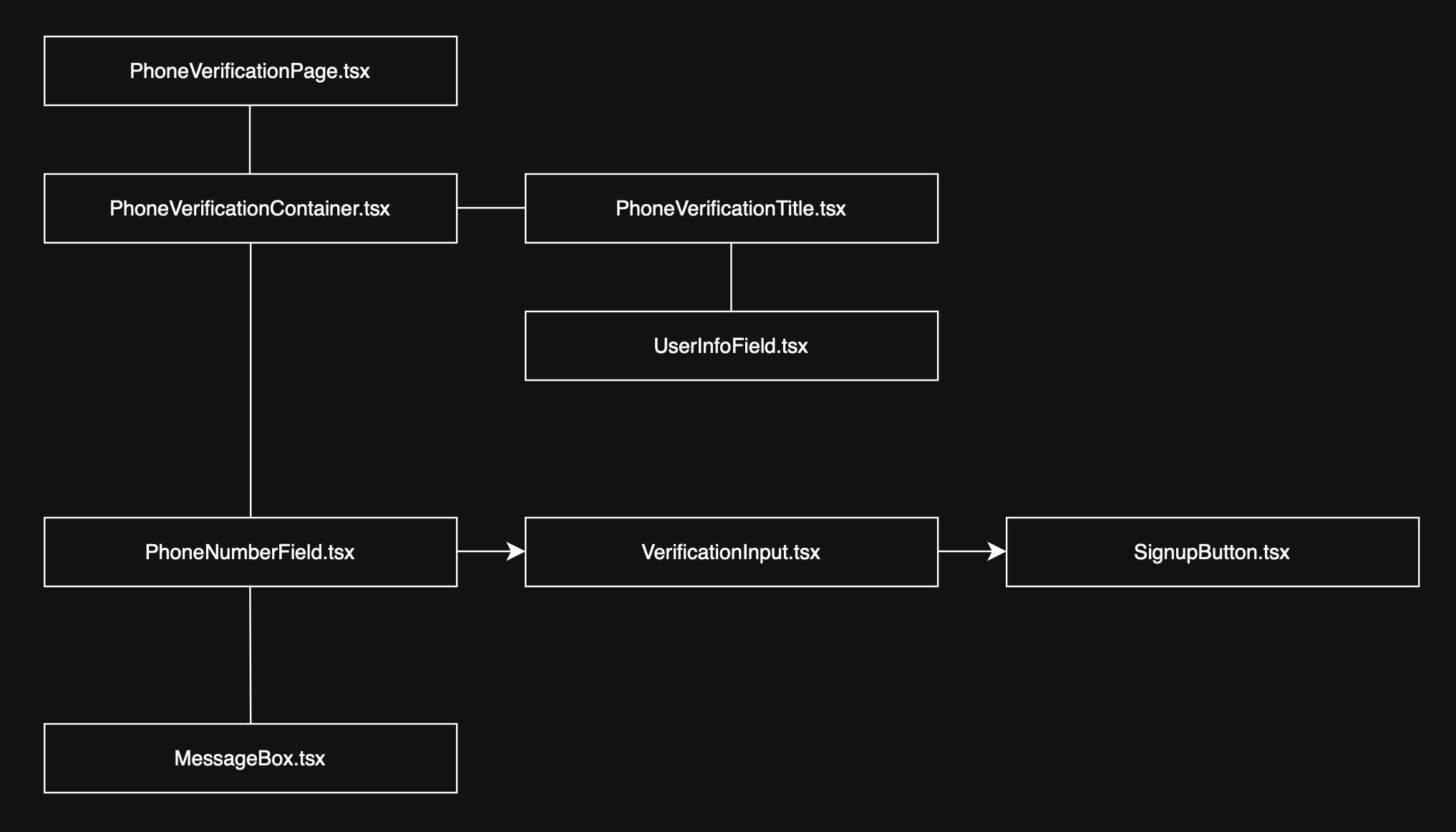
휴대폰 인증 과정 정리 - Frontend 🎨
1. PhoneVerificationPage.tsx ✅
1-1. View ⚙️
	<PageContainer>
      <ComponentWrapper sx={{ maxWidth: "600px" }}>
        <Box sx={{ padding: 4 }}>
          <PhoneVerificationContainer
            userInfo={userInfo}
            setUserInfo={setUserInfo}
            onSignupComplete={handleCompleteSignup}
          />
        </Box>
      </ComponentWrapper>
    </PageContainer>
핵심 로직 및 상태를 자식 컴포넌트인 PhoneVerificationContainer에 props 형태로 전달합니다.
1-2. Logic ⚙️
  useEffect(() => {
    if (userInfo) {
      localStorage.setItem("userInfo", JSON.stringify(userInfo));
    }
  }, [userInfo]);
유저 정보가 존재할 경우, 해당 정보를 localstorage에 저장합니다. 브라우저를 새로고침해도 유저 정보가 유지됩니다.
  useEffect(() => {
    const storedUserInfo = localStorage.getItem("userInfo");
    if (storedUserInfo) {
      const parsedUserInfo = JSON.parse(storedUserInfo);
      setUserInfo(parsedUserInfo);
    }
  }, []);
localstorage에 저장된 userInfo를 불러와, 전역 상태로 저장합니다. 유저 정보에 대한 상태 복원의 기능을 수행합니다.
  const handleCompleteSignup = async () => {
    if (!userInfo) {
      throw new Error("유저 정보가 없습니다.");
    }

    if (!userInfo.phoneNumber) {
      throw new Error("전화번호 인증이 완료되지 않았습니다.");
    }

    try {
      const newCompleteUserInfo = {
        ...userInfo,
        isExist: true,
        id: userInfo?.id,
        email: userInfo?.email,
        name: userInfo?.name,
        phoneNumber: userInfo.phoneNumber,
        provider: userInfo.provider,
      };

      const result = await handleCompleteSignupWithAPI(newCompleteUserInfo);

      if (!result.success) {
        throw new Error(result.message || "회원가입 중 오류가 발생했습니다.");
      }

      localStorage.removeItem("userInfo");

      return;
    } catch (error) {
      console.error("회원가입 처리 중 오류:", error);
      throw error;
    }
  };
전화번호 인증이 완료된 userInfo를 기반으로 회원가입 API를 호출합니다. 성공 시 localstorage에 있던 userInfo를 제거하여 상태를 초기화합니다.
2. PhoneVerificationContainer.tsx ✅
2-1. View ⚙️
    <Container maxWidth="sm">
      <Box sx={{ py: 4 }}>
        <PhoneVerificationTitle step={currentStep} totalSteps={3} />
        <UserInfoField userInfo={userInfo} setUserInfo={setUserInfo} />
        {renderCurrentStep()}
        <MessageBox
          message={messageState.message}
          messageType={messageState.type}
          open={messageState.open}
          onClose={closeMessage}
          isExistingUser={messageState.isExistingUser}
          isSignupComplete={messageState.isSignupComplete}
        />
      </Box>
    </Container>
PhoneVerificationContainer에서는, 단계 표시를 위한 타이틀 / 유저 정보 필드 / 단계에 따른 컴포넌트 / 메세지 모달을 보여주고 있음을 확인할 수 있습니다.
  const renderCurrentStep = () => {
    switch (currentStep) {
      case 1:
        return (
          <PhoneNumberField
            onSuccess={(msg) => showMessage(msg, "success")}
            onError={(msg) => showMessage(msg, "error")}
            onPhoneNumberChange={handlePhoneNumberChange}
            onCodeSent={handleCodeSent}
            onExistingUser={handleExistingUser}
          />
        );
      case 2:
        return (
          <VerificationInput
            phoneNumber={phoneNumber}
            onSuccess={(msg) => showMessage(msg, "success")}
            onError={(msg) => showMessage(msg, "error")}
            onVerified={handleVerificationSuccess}
            onResendCode={handleResendCode}
          />
        );
      case 3:
        return (
          <SignupButton
            onClick={handleSignupComplete}
            isLoading={isSignupLoading}
            disabled={!isVerified}
          />
        );
      default:
        return null;
    }
  };
특별히, 단계에 따라서 서로 다른 컴포넌트를 렌더링하도록 설정했습니다.
2-2. Logic ⚙️
PhoneVerificationContainer에서 작성한 주요 로직들은, 각각의 컴포넌트에 props의 형태로 전달될 것이기에, 이 부분에서 설명하지는 않겠습니다.
다만 하위 컴포넌트에서(=실제로 사용하는 부분에서), PhoneVerificationContainer의 로직을 사용 중이라는 사실을 언급하도록 하겠습니다.
3. PhoneVerificationTitle.tsx ✅
3-1. View ⚙️
PhoneVerificationTitle은 이미지 / 현재 단계 / 단계별 설명 / 단계 인디케이터 / 하단 구분선으로 구성되어 있습니다.
    <Box sx={{ mb: 4 }}>
      {/* 상단 이미지 */}
      <Box
        component="img"
        src={verification1}
        alt="휴대폰 인증 이미지"
        sx={{
          animation: "floating 3s ease-in-out infinite",
          "@keyframes floating": {
            "0%": { transform: "translateY(0px)" },
            "50%": { transform: "translateY(-10px)" },
            "100%": { transform: "translateY(0px)" },
          },
          width: "100%",
          maxWidth: 200,
          mx: "auto",
          display: "block",
          mb: 2,
        }}
      />

      {/* 단계 표시 및 단계별 제목 */}
      <Box sx={{ textAlign: "center", mb: 3 }}>
        {/* 현재 단계 표시 */}
        <Typography variant="body2" color="text.secondary" sx={{ mb: 1 }}>
          {step}/{totalSteps} 단계
        </Typography>

        {/* 단계별 설명 텍스트 */}
        <Typography
          variant="body1"
          color="text.secondary"
          sx={{ maxWidth: 400, mx: "auto" }}
        >
          {stepTitles[step as keyof typeof stepTitles]}
        </Typography>
      </Box>

      {/* 하단 점 형태의 단계 인디케이터 */}
      <Box
        sx={{
          display: "flex",
          gap: 1,
          justifyContent: "center",
          mb: 3,
        }}
      >
        {Array.from({ length: totalSteps }, (_, index) => (
          <Box
            key={index}
            sx={{
              width: 8,
              height: 8,
              borderRadius: "50%",
              bgcolor: index < step ? "#b8dae1" : "divider",
              transition: "all 0.3s",
              transform: index < step ? "scale(1.2)" : "scale(1)",
            }}
          />
        ))}
      </Box>

      {/* 하단 구분선 */}
      <Box
        sx={{
          borderBottom: "1px solid",
          borderColor: "divider",
          width: "100%",
          opacity: 0.3,
        }}
      />
    </Box>
3-2. Logic ⚙️
PhoneVerificationContainer에서 currentStep과 totalSteps(=3)를 props로 전달받고, 해당 정보를 보여주고 있습니다.
특별한 로직이 있는 부분은 아니고, 단순히 props로 전달받은 정보를 렌더링 하는 컴포넌트입니다.
4. UserInfoField.tsx ✅
4-1. View ⚙️
<Paper
  elevation={0}
  sx={{
    mb: 4,
    borderRadius: 3,
    overflow: "hidden",
    border: "1px solid",
    borderColor: "divider",
  }}
>
  {/* 상단 타이틀 영역 */}
  <Box
    sx={{
      py: 1.5,
      px: 3,
      borderBottom: "1px solid",
      borderColor: "divider",
      bgcolor: "background.paper",
    }}
  >
    <Typography
      variant="subtitle2"
      fontWeight={600}
      sx={{ color: "#b8dae1" }}
    >
      회원 정보
    </Typography>
  </Box>

  {/* 사용자 정보 본문 영역 */}
  <Box
    sx={{
      p: 3,
      display: "flex",
      alignItems: "center",
      gap: 2,
      flexDirection: { xs: "column", sm: "row" },
    }}
  >
    {/* 사용자 이니셜을 표시하는 아바타 */}
    <Avatar
      sx={{
        width: 80,
        height: 80,
        bgcolor: "#ffffff",
        color: "#b8dae1",
        border: `2px solid #b8dae1`,
        fontSize: 32,
        fontWeight: "bold",
      }}
    >
      {nameInitial}
    </Avatar>

    {/* 이름 및 이메일 정보 */}
    <Box sx={{ width: "100%" }}>
      {/* 이름 정보 블록 */}
      <Box sx={{ mb: 2 }}>
        <Box sx={{ display: "flex", alignItems: "center", mb: 0.5 }}>
          <PersonIcon
            fontSize="small"
            sx={{ color: "text.secondary", mr: 1 }}
          />
          <Typography variant="caption" color="text.secondary">
            이름
          </Typography>
        </Box>
        <Typography variant="body1" fontWeight={500}>
          {name}
        </Typography>
      </Box>

      {/* 이메일 정보 블록 */}
      <Box>
        <Box sx={{ display: "flex", alignItems: "center", mb: 0.5 }}>
          <EmailIcon
            fontSize="small"
            sx={{ color: "text.secondary", mr: 1 }}
          />
          <Typography variant="caption" color="text.secondary">
            이메일
          </Typography>
        </Box>
        <Typography variant="body1" fontWeight={500}>
          {email}
        </Typography>
      </Box>
    </Box>
  </Box>
</Paper>
4-2. Logic ⚙️
PhoneVerificationContainer에서 userInfo와 setUserInfo를 props의 형태로 전달받은 후, 현재 가입 절차를 진행 중인 유저에 대한 정보를 렌더링 합니다.
UserInfoField 역시 특별한 로직이 있는 것은 아닙니다. 단순히 props로 전달받은 정보를 렌더링 하는 컴포넌트입니다.
5. PhoneNumberField.tsx ✅
5-1. View ⚙️
// 모션 효과로 컴포넌트 진입 시 fade-in + 아래에서 위로 슬라이드 애니메이션 적용
<motion.div
  initial={{ opacity: 0, y: 20 }}
  animate={{ opacity: 1, y: 0 }}
  transition={{ duration: 0.5 }}
>
  {/* 휴대폰 인증 섹션 컨테이너 */}
  <Paper
    elevation={0}
    sx={{
      mb: 4,
      p: 3,
      borderRadius: 3,
      border: "1px solid",
      borderColor: borderColor,
      backgroundColor: theme.palette.background.paper,
    }}
  >
    {/* 섹션 제목 */}
    <Typography
      variant="subtitle1"
      fontWeight={600}
      sx={{ mb: 2, color: keyColor }}
    >
      휴대폰 번호 인증
    </Typography>

    {/* 휴대폰 번호 입력 필드 + 인증 버튼 */}
    <Box sx={{ mb: 2, position: "relative" }}>
      {/* 전화번호 입력창 */}
      <TextField
        fullWidth
        label="휴대폰 번호"
        placeholder="+821012345678"
        value={phoneNumber}
        onChange={(e) => setPhoneNumber(e.target.value)}
        onFocus={() => setIsFocused(true)}
        onBlur={() => setIsFocused(false)}
        margin="normal"
        variant="outlined"
        error={phoneNumber !== "" && !isValidFormat}
        helperText={
          phoneNumber !== "" && !isValidFormat
            ? "올바른 형식의 전화번호를 입력해주세요. (예: +821012345678)"
            : " "
        }
        InputProps={{
          startAdornment: (
            // 입력창 왼쪽에 전화기 아이콘 표시
            <InputAdornment position="start">
              <PhoneIcon
                sx={{
                  color: isFocused ? keyColor : "action.active",
                  transition: "color 0.3s",
                }}
              />
            </InputAdornment>
          ),
          sx: {
            borderRadius: 2,
            transition: "all 0.3s",
            "&.Mui-focused": {
              boxShadow: `0 0 0 2px ${keyColor}40`,
            },
          },
        }}
        sx={{
          "& .MuiOutlinedInput-root": {
            transition: "all 0.3s",
            "&.Mui-focused .MuiOutlinedInput-notchedOutline": {
              borderColor: keyColor,
            },
          },
          "& .MuiInputLabel-root.Mui-focused": {
            color: keyColor,
          },
        }}
      />

      {/* 인증 코드 발송 버튼 */}
      <Button
        variant="contained"
        onClick={debouncedSendCode}
        disabled={isSending || !phoneNumber.trim() || !isValidFormat}
        fullWidth
        sx={{
          mt: 2,
          mb: 1,
          height: "50px",
          borderRadius: 2,
          textTransform: "none",
          fontWeight: 600,
          boxShadow: `0 8px 16px ${keyColor}30`,
          bgcolor: keyColor,
          "&:hover": {
            bgcolor: `${keyColor}e0`,
            boxShadow: `0 12px 20px ${keyColor}40`,
            transform: "translateY(-2px)",
          },
          "&.Mui-disabled": {
            bgcolor: theme.palette.mode === "dark" ? "#464646" : "#e0e0e0",
            color: theme.palette.mode === "dark" ? "#8a8a8a" : "#a6a6a6",
          },
          transition: "all 0.3s",
        }}
        endIcon={!isSending && <SendIcon />}
      >
        {/* 로딩 상태에 따라 버튼 내용 변경 */}
        {isSending ? (
          <CircularProgress size={24} color="inherit" />
        ) : (
          "인증 코드 발송"
        )}
      </Button>
    </Box>

    {/* 하단 안내 문구 */}
    <Typography
      variant="caption"
      color="text.secondary"
      sx={{ display: "block", textAlign: "center" }}
    >
      국가 코드를 포함한 휴대폰 번호를 입력해주세요
    </Typography>
  </Paper>
</motion.div>
PhoneNumberField는 step 1에 해당하는 필드입니다. 사용자로부터 전화번호를 입력받고, 해당 전화번호를 통해 인증 코드를 요청하는 단계입니다.
5-2. Logic ⚙️
// 인증 코드 발송 함수
const sendCode = async () => {
  // 입력된 전화번호가 비어 있다면 에러 메시지 표시 후 종료
  if (!phoneNumber.trim()) {
    onError("전화번호를 입력해주세요.");
    return;
  }

  // 전화번호 형식이 올바르지 않다면 에러 메시지 표시 후 종료
  if (!isValidPhoneNumber(phoneNumber)) {
    onError("유효한 전화번호를 입력해주세요. (예: +821012345678)");
    return;
  }

  // 발송 중 상태로 표시 (버튼 비활성화 등)
  setIsSending(true);

  try {
    // 서버에 인증 코드 발송 요청 (POST)
    const response = await axios.post("http://localhost:3000/api/send-code", {
      toPhoneNumber: phoneNumber.trim(),
    });

    // 서버 응답에서 "기존 유저"인지 확인
    if (response.data.isExistingUser) {
      // 기존 유저이면 콜백 실행 후 종료
      onExistingUser();
      return;
    }

    // 새 유저이면 성공 메시지 콜백 실행
    onSuccess(response.data.message || "인증 코드가 발송되었습니다!");
    onCodeSent(); // 인증 코드 발송 완료 처리 콜백 실행
  } catch (error: unknown) {
    // 에러가 axios 관련 에러인지 확인
    if (axios.isAxiosError(error)) {
      if (!error.response) {
        // 서버 응답이 없다면 네트워크 문제로 간주
        onError("네트워크 연결에 실패했습니다. 인터넷을 확인해주세요.");
      } else {
        // 409 Conflict: 이미 존재하는 유저
        if (error.response.status === 409) {
          onExistingUser();
          return;
        }

        // 기타 서버 에러 메시지 표시
        const errorMessage =
          error.response.data?.message || "인증 코드 발송에 실패했습니다.";
        onError(errorMessage);
      }
    } else {
      // axios 에러가 아닌 일반적인 예외
      onError("알 수 없는 오류가 발생했습니다.");
    }
  } finally {
    // 항상 실행됨: 로딩 상태 해제
    setIsSending(false);
  }
};
step 1, 즉 휴대전화 입력 후 발송에 대한 핵심 로직입니다.
5-2-1. onSuccess 🟣
  const showMessage = (
    message: string,
    type: "info" | "success" | "error",
    isExistingUser = false,
    isSignupComplete = false
  ) => {
    setMessageState({
      open: true,
      message,
      type,
      isExistingUser,
      isSignupComplete,
    });
  };
신규 유저일 때 가장 먼저 실행되는 함수는 onSuccess입니다. onSuccess는 PhoneVerificationContainer에서 showMessage라는 이름으로 정의된 함수입니다.
message 상태를 업데이트합니다. messageState는 향후 MessageBox에서 사용될 예정입니다. 휴대전화 번호에 대한 api 요청이 정상적으로 수행되었을 때, 가장 먼저 성공에 대한 모달이 나타난다고 이해하면 되겠습니다.
5-2-2. onCodeSent 🟣
  const handleCodeSent = () => {
    setCurrentStep(2);
    setUserInfo((prev) => (prev ? { ...prev, phoneNumber } : null));
  };
성공 모달이 나타난 후 바로 실행되는 함수입니다. PhoneVerificationContainer에서 handleCodeSent라는 함수로 정의되었습니다.
휴대전화 번호에 대한 api 요청이 성공했으니, step을 2로 업데이트하고, 유저 정보에 phoneNumber를 추가해 주는 로직입니다.
5-2-3. onExistingUser 🟣
  const handleExistingUser = () => {
    showMessage(
      "이미 가입된 회원입니다. 로그인 페이지로 이동합니다.",
      "success",
      true
    );
  };
로직 중간중간에 포함된 onExistingUser 함수는 PhoneVerificationContainer에서 handleExistingUser로 정의되어 있습니다. 이미 가입된 회원에게 보여줄 메세지를 업데이트하는 함수입니다.
5-2-4. onPhoneNumberChange 🟣
  const handlePhoneNumberChange = (phone: string) => {
    setPhoneNumber(phone);
    setUserInfo((prev) => (prev ? { ...prev, phoneNumber: phone } : null));
  };
onPhoneNumberChange는 handlePhoneNumberChange로 정의되어 있습니다. 전화번호 입력 시, 해당 내용을 userInfo에 반영하는 함수입니다.
5-2-5. onError 🟣
  const showMessage = (
    message: string,
    type: "info" | "success" | "error",
    isExistingUser = false,
    isSignupComplete = false
  ) => {
    setMessageState({
      open: true,
      message,
      type,
      isExistingUser,
      isSignupComplete,
    });
  };
onError의 경우에도 동일한 메세지 함수를 활용합니다. 에러에 대해서는 두 번째 인자로 "error" 문자열을 전달하면 되겠습니다.
PhoneNumberField는 회원가입 단계 중 step 1에 해당하는 컴포넌트로, 사용자의 전화번호를 입력받아 인증 코드를 요청하는 화면입니다.
버튼 클릭 시 sendCode 함수가 실행되어 서버에 인증 요청을 보내고, 결과에 따라 다양한 콜백이 호출됩니다. 신규 유저의 경우 onSuccess → onCodeSent 순으로 실행되어 성공 메시지를 표시하고 step을 2로 진행하며 유저 정보에 전화번호를 저장합니다.
기존 유저인 경우 onExistingUser가 실행되어 로그인 안내 메시지를 띄웁니다. 전화번호 입력 도중에는 onPhoneNumberChange가 호출되어 실시간으로 userInfo를 갱신합니다. 모든 오류 상황은 onError를 통해 공통 메시지 함수 showMessage를 사용해 처리되며, 이때 타입은 "error"로 전달됩니다.
6. VerificationInput.tsx ✅
6-1. View ⚙️
    <motion.div
      initial={{ opacity: 0, y: 20 }}
      animate={{ opacity: 1, y: 0 }}
      transition={{ duration: 0.5 }}
    >
      <Paper
        elevation={0}
        sx={{
          mb: 4,
          p: 3,
          borderRadius: 3,
          border: "1px solid",
          borderColor: borderColor,
          backgroundColor: theme.palette.background.paper,
        }}
      >
        {/* 상단: 제목 + 타이머 or 새로고침 아이콘 */}
        <Box
          sx={{
            display: "flex",
            justifyContent: "space-between",
            alignItems: "center",
            mb: 2,
          }}
        >
          {/* 제목: '인증 코드 확인' */}
          <Typography
            variant="subtitle1"
            fontWeight={600}
            sx={{ color: keyColor }}
          >
            인증 코드 확인
          </Typography>

          {/* 우측: 타이머 or 새로고침 버튼 */}
          <Box sx={{ display: "flex", alignItems: "center", gap: 1 }}>
            {/* 타이머 표시: 타이머가 활성화되어 있을 때만 표시 */}
            {timerActive && (
              <Typography
                variant="body2"
                sx={{
                  color: timeLeft < 60 ? "error.main" : "text.secondary",
                  fontWeight: timeLeft < 60 ? 600 : 400,
                }}
              >
                {formatTime()}
              </Typography>
            )}

            {/* 타이머가 0일 경우: 새로고침 아이콘 노출 */}
            {timeLeft === 0 && (
              <IconButton
                onClick={handleResendCode}
                size="small"
                sx={{
                  color: keyColor,
                  "&:hover": {
                    bgcolor: `${keyColor}20`,
                  },
                }}
              >
                <RefreshIcon />
              </IconButton>
            )}
          </Box>
        </Box>

        {/* 인증 코드 입력 필드 */}
        <TextField
          fullWidth
          label="인증 코드"
          placeholder="6자리 코드 입력"
          value={verificationCode}
          onChange={handleCodeChange}
          margin="normal"
          variant="outlined"
          type="text"
          InputProps={{
            startAdornment: (
              <InputAdornment position="start">
                <LockIcon sx={{ color: "action.active" }} />
              </InputAdornment>
            ),

            endAdornment: verificationCode.length === 6 && (
              <InputAdornment position="end">
                <CheckCircleIcon sx={{ color: successColor }} />
              </InputAdornment>
            ),

            sx: {
              borderRadius: 2,
              letterSpacing: "0.2em",
              fontWeight: 500,
              transition: "all 0.3s",
              "&.Mui-focused": {
                boxShadow: `0 0 0 2px ${keyColor}40`,
              },
            },
          }}
          inputProps={{
            inputMode: "numeric",
            pattern: "[0-9]*",
            maxLength: 6,
          }}
          sx={{
            "& .MuiOutlinedInput-root": {
              transition: "all 0.3s",
              "&.Mui-focused .MuiOutlinedInput-notchedOutline": {
                borderColor: keyColor,
              },
            },
            "& .MuiInputLabel-root.Mui-focused": {
              color: keyColor,
            },
          }}
        />

        {/* 인증 확인 버튼 */}
        <Button
          variant="contained"
          onClick={handleVerifyCode}
          disabled={isButtonDisabled}
          fullWidth
          sx={{
            mt: 2,
            mb: 1,
            height: "50px",
            borderRadius: 2,
            textTransform: "none",
            fontWeight: 600,
            bgcolor: keyColor,
            boxShadow: `0 8px 16px ${keyColor}30`,
            "&:hover": {
              bgcolor: `${keyColor}e0`,
              boxShadow: `0 12px 20px ${keyColor}40`,
              transform: "translateY(-2px)",
            },
            "&.Mui-disabled": {
              bgcolor: theme.palette.mode === "dark" ? "#464646" : "#e0e0e0",
              color: theme.palette.mode === "dark" ? "#8a8a8a" : "#a6a6a6",
            },
            transition: "all 0.3s",
          }}
          endIcon={!isVerifying && <VerifiedIcon />}
        >
          {isVerifying ? (
            <CircularProgress size={24} color="inherit" />
          ) : (
            "인증 확인"
          )}
        </Button>

        {/* 안내 메시지: 코드 입력 안내 */}
        <Typography
          variant="caption"
          color="text.secondary"
          sx={{ display: "block", textAlign: "center", mt: 1 }}
        >
          SMS로 전송된 6자리 코드를 입력하세요
        </Typography>

        {/* 시간 만료 시 안내 메시지 */}
        {timeLeft === 0 && (
          <Typography
            variant="caption"
            color="error"
            sx={{ display: "block", textAlign: "center", mt: 1 }}
          >
            인증 시간이 만료되었습니다. 새로고침 버튼을 클릭해 주세요.
          </Typography>
        )}
      </Paper>
    </motion.div>
SMS로 받은 인증 코드를 입력하고, 해당 인증 코드를 버튼 클릭을 통해 백엔드로 전송할 때의 화면에 대한 코드입니다.
6-2. Logic ⚙️
  const handleVerifyCode = async () => {
    if (!verificationCode) {
      onError("인증 코드를 입력해주세요.");
      return;
    }

    if (!phoneNumber) {
      onError("전화번호를 먼저 입력해주세요.");
      return;
    }

    if (timeLeft === 0) {
      onError("인증 시간이 만료되었습니다. 새로운 인증 코드를 요청해주세요.");
      return;
    }

    setIsVerifying(true);

    try {
      const response = await axios.post(
        "http://localhost:3000/api/verify-code",
        {
          verificationCode: verificationCode,
          phoneNumber: phoneNumber,
        }
      );

      const message = response.data.message || "전화번호가 인증되었습니다!";
      onSuccess(message);

      if (response.status === 201 || response.status === 200) {
        onVerified();
      }
    } catch (error: unknown) {
      if (axios.isAxiosError(error) && error.response) {
        const errorMessage =
          error.response.data?.message || "인증에 실패했습니다.";
        onError(errorMessage);
      } else {
        onError("인증에 실패했습니다. 다시 시도해주세요.");
      }
    } finally {
      setIsVerifying(false);
    }
  };
handleVerifyCode 함수는 VerificationInput 컴포넌트에서 버튼을 클릭했을 때 실행되는 함수로, VerificationInput의 핵심 로직이라 할 수 있겠습니다.
verificationCode와 phoneNumber, 그리고 timeLeft에 대한 검증을 우선적으로 수행합니다. onSuccess와 onError에 대한 로직은 이전과 동일하게 수행되니 설명을 생략하겠습니다.
  const handleVerificationSuccess = () => {
    setIsVerified(true);
    setCurrentStep(3);
    setUserInfo((prev) => (prev ? { ...prev, phoneNumber } : null));
  };
onVerified 함수가 특징적입니다. onVerified는 handleVerificationSuccess로 정의되어 있습니다. verification이 성공했으니 step을 3로 업데이트하고, phoneNumber를 userInfo에 다시 반영해야겠죠. 해당 로직을 수행하는 함수입니다.
handleVerifyCode 함수는 인증 버튼 클릭 시 실행되며, 입력된 인증 코드(verificationCode), 전화번호(phoneNumber), 남은 시간(timeLeft)에 대한 유효성 검사를 선행하고, 조건을 만족하면 백엔드에 인증 요청을 보냅니다.
인증 성공 시 onSuccess 콜백을 실행하고, 응답 상태가 200 또는 201이면 onVerified를 호출합니다. onVerified는 내부적으로 handleVerificationSuccess를 실행하며, 이 함수는 사용자의 인증 상태를 isVerified: true로 설정하고, 인증 단계(step)를 3으로 이동시킨 뒤, userInfo에 전화번호를 반영합니다.
7. SignupButton.tsx ✅
7-1. View ⚙️
    <Paper
      elevation={0}
      sx={{
        mb: 4,
        p: 3,
        borderRadius: 3,
        border: "1px solid",
        borderColor:
          theme.palette.mode === "dark" ? `${keyColor}40` : `${keyColor}30`,
        backgroundColor: theme.palette.background.paper,
      }}
    >
      <Box sx={{ mb: 2 }}>
        <Typography
          variant="subtitle1"
          fontWeight={600}
          sx={{ color: keyColor }}
        >
          회원가입 완료
        </Typography>
        <Typography variant="body2" color="text.secondary" sx={{ mt: 1 }}>
          모든 인증이 완료되었습니다. 아래 버튼을 클릭하여 회원가입을
          완료하세요.
        </Typography>
      </Box>

      <Button
        variant="contained"
        onClick={handleSignup}
        fullWidth
        disabled={isLoading || disabled}
        sx={{
          mt: 2,
          height: "50px",
          borderRadius: 2,
          textTransform: "none",
          fontWeight: 600,
          bgcolor: keyColor,
          boxShadow: `0 8px 16px ${keyColor}30`,
          "&:hover": {
            bgcolor: `${keyColor}e0`,
            boxShadow: `0 12px 20px ${keyColor}40`,
            transform: "translateY(-2px)",
          },
          "&.Mui-disabled": {
            bgcolor: theme.palette.mode === "dark" ? "#464646" : "#e0e0e0",
            color: theme.palette.mode === "dark" ? "#8a8a8a" : "#a6a6a6",
          },
          transition: "all 0.3s",
        }}
        endIcon={isLoading ? undefined : <HowToRegIcon />}
      >
        {isLoading ? (
          <CircularProgress size={24} color="inherit" />
        ) : (
          "회원가입 완료하기"
        )}
      </Button>
    </Paper>
최종 회원가입 완료를 처리하는 컴포넌트입니다.
7-2. Logic ⚙️
  const handleSignup = async () => {
    try {
      if (onClick) {
        await onClick();
      }
      navigate("/sign-in");
    } catch (error) {
      console.error("Signup error:", error);
    }
  };
위 함수는 결국, '최종 가입 유저'로 업데이트하는 함수입니다.
목차 1번에서 언급한, handleCompleteSignup 함수 내부에 있는 handleCompleteSignupWithAPI 함수를 실행합니다.
8. MessageBox.tsx ✅
8-1. View ⚙️
    <Dialog
      open={open}
      onClose={onClose}
      maxWidth="sm"
      fullWidth
      sx={{
        "& .MuiDialog-paper": {
          borderRadius: 4,
          overflow: "hidden",
          boxShadow: `0 20px 60px ${colors[messageType].main}20`,
          border: `1px solid ${colors[messageType].main}20`,
        },
        "& .MuiBackdrop-root": {
          backgroundColor: "rgba(0, 0, 0, 0.3)",
          backdropFilter: "blur(8px)",
        },
      }}
    >
      <motion.div
        initial={{ scale: 0.7, opacity: 0, y: 50 }}
        animate={{ scale: 1, opacity: 1, y: 0 }}
        transition={{
          duration: 0.4,
          type: "spring",
          stiffness: 300,
          damping: 20,
        }}
      >
        <Box
          sx={{
            position: "relative",
            background: colors[messageType].gradient,
            borderBottom: `3px solid ${colors[messageType].main}`,
            "&::before": {
              content: '""',
              position: "absolute",
              top: 0,
              left: 0,
              right: 0,
              height: "1px",
              background: `linear-gradient(90deg, transparent, ${colors[messageType].main}40, transparent)`,
            },
          }}
        >
          <IconButton
            onClick={onClose}
            sx={{
              position: "absolute",
              right: 12,
              top: 12,
              color: "text.secondary",
              backgroundColor: "rgba(255, 255, 255, 0.1)",
              backdropFilter: "blur(10px)",
              "&:hover": {
                backgroundColor: "rgba(255, 255, 255, 0.2)",
                transform: "scale(1.1)",
              },
              transition: "all 0.2s ease",
              zIndex: 1,
            }}
          >
            <CloseIcon fontSize="small" />
          </IconButton>

          <DialogContent sx={{ textAlign: "center", py: 5, px: 4 }}>
            <Box
              sx={{
                display: "flex",
                flexDirection: "column",
                alignItems: "center",
                gap: 3,
              }}
            >
              <motion.div
                initial={{ scale: 0, rotate: -180 }}
                animate={{ scale: 1, rotate: 0 }}
                transition={{ delay: 0.2, type: "spring", stiffness: 400 }}
              >
                <Box
                  sx={{
                    color: colors[messageType].main,
                    display: "flex",
                    alignItems: "center",
                    justifyContent: "center",
                    width: 80,
                    height: 80,
                    borderRadius: "50%",
                    background: `linear-gradient(135deg, ${colors[messageType].main}10, ${colors[messageType].main}20)`,
                    border: `2px solid ${colors[messageType].main}30`,
                    backdropFilter: "blur(10px)",
                  }}
                >
                  {icons[messageType]}
                </Box>
              </motion.div>

              <motion.div
                initial={{ opacity: 0, y: 20 }}
                animate={{ opacity: 1, y: 0 }}
                transition={{ delay: 0.3 }}
              >
                <Typography
                  variant="h5"
                  fontWeight={700}
                  sx={{
                    color: colors[messageType].main,
                    mb: 1,
                    letterSpacing: "-0.5px",
                  }}
                >
                  {titles[messageType]}
                </Typography>
              </motion.div>

              <motion.div
                initial={{ opacity: 0, y: 20 }}
                animate={{ opacity: 1, y: 0 }}
                transition={{ delay: 0.4 }}
              >
                <Typography
                  variant="body1"
                  sx={{
                    color: "text.primary",
                    textAlign: "center",
                    lineHeight: 1.7,
                    fontSize: "1.05rem",
                    fontWeight: 400,
                    maxWidth: "300px",
                  }}
                >
                  {message}
                </Typography>
              </motion.div>
            </Box>
          </DialogContent>

          <DialogActions sx={{ px: 4, pb: 4, justifyContent: "center" }}>
            <motion.div
              initial={{ opacity: 0, y: 20 }}
              animate={{ opacity: 1, y: 0 }}
              transition={{ delay: 0.5 }}
            >
              <Button
                onClick={handleButtonClick}
                variant="contained"
                size="large"
                sx={{
                  bgcolor: colors[messageType].main,
                  color: "white",
                  borderRadius: 3,
                  px: 5,
                  py: 1.5,
                  textTransform: "none",
                  fontWeight: 600,
                  fontSize: "1rem",
                  boxShadow: `0 8px 24px ${colors[messageType].main}40`,
                  "&:hover": {
                    bgcolor: colors[messageType].main,
                    opacity: 0.9,
                    transform: "translateY(-2px)",
                    boxShadow: `0 12px 32px ${colors[messageType].main}50`,
                  },
                  "&:active": {
                    transform: "translateY(0px)",
                  },
                  transition: "all 0.3s ease",
                }}
                endIcon={getButtonIcon()}
              >
                {getButtonText()}
              </Button>
            </motion.div>
          </DialogActions>
        </Box>
      </motion.div>
    </Dialog>
PhoneVerificationContainer에서 지속적으로 관리한 messageState에 대한 세부적인 내용을 렌더링 합니다.
8-2. Logic ⚙️
  const closeMessage = () => {
    setMessageState((prev) => ({ ...prev, open: false }));
    if (messageState.isExistingUser || messageState.isSignupComplete) {
      setTimeout(() => {
        navigate("/sign-in");
      }, 300);
    }
닫기 버튼을 제외하고는, 특별히 추가되는 로직은 없습니다.