오늘 한 일
- 웹 프론트엔드 공부
Omnifood Project - Responsive Web Design
배운 것
Media Query
/* 뷰포트 width가 breakpoint 이하이면 css문을 실행 */
@media (max-width: breakpoint) {
  ...
  적용할 css문
  ...
}

/* 예시 */
@media (max-width: 600px) {
  .section-hero {
    border: 20px dashed blue;
    background-color: blue;
  }
}-
Breakpoint는 popular devices를 기반한 것이 아니라, 모바일, 태블릿, 랩탑 등 여러 폼팩터의 screen ranges를 기반으로 선정하거나, 이상적으로는 뷰포트 크기를 조절해가면서 페이지가 이상해지는 시점(when design breaks down)으로 선정하는 것이 좋다. -
아래 html 문장이 head 내에 없으면
responsive design이 적용되지 않는다. (모바일 기기에서 그냥 zoom 되어 표시됨)
<meta name="viewport" content="width=device-width, initial-scale=1.0" />- Media Query에서의
1rem(또는 1em)은 html font-size에 기반하지 않고 약16px고정값이다.
/**************************/
/* BELOW 1200px = 75em (Landscape Tablets) */
/**************************/

@media (max-width: 75em) {
  ...
}
아래와 같은 grid에서 logo, contact us 부분이 2번째 column을 css만 수정하여 각각 1:1만큼 차지하게 하려면?
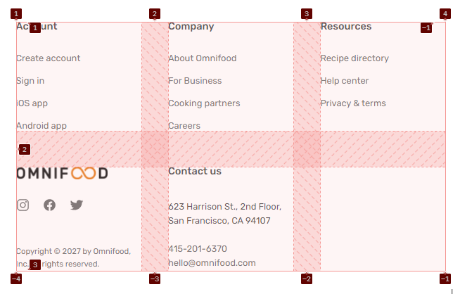
→ grid가 6개의 column을 갖게 하고 grid-column 속성을 사용하여 1번째 column의 Account, Company, Resources 부분은 각각 2개 column만큼, 2번째 column의 logo, contact us 부분은 각각 3개 column만큼 공간을 차지하게 하면 된다.
.grid--footer {
    grid-template-columns: repeat(6, 1fr);
  }

  .nav-col {
    grid-row: 1;
    grid-column: span 2;
  }

  .logo-col,
  .address-col {
    grid-column: span 3;
  }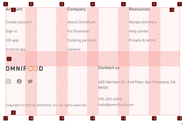
실습 결과 캡쳐
내일 할 일
- 웹 프론트엔드 공부
Omnifood Project - Effects, Optimizations and Deployment
기록하기