Framer-motion with Typescript
React에서 간단한 animation을 편하게 사용하는 라이브러리
npm install framer-motionimport {motion} from "framer-motion"
1. Basic - transition
Idea
- motion : motion.div 등으로 요소를 motion으로 만들기
- initial, animate로 움직이기
- variants를 생성해서 할당하기
- transition 옵션을 사용하기
code
const boxVariants = {
  start: {
    scale: 0,
  },

  end: {
    scale: 1,
    transition: {
      type: "tween",
      bounce: 0.8,
      duration: 2,
      delayChildren: 2, // 자식요소 애니메이션 딜레이 설정
      staggerChildren: 0.5, // 자식요소 순차적 딜레이 설정
    },
  },
};

const circleVariants = {
  start: {
    scale: 0,
    opacity: 0,
  },
  end: {
    scale: 1.2,
    opacity: 1,
    transition: {
      type: "spring",
      bounce: 0.8,
    },
  },
};

const Variants = () => {
  return (
    <>
      <Box variants={boxVariants} initial="start" animate="end">
        // 위와 아래는 같음
        // 하위요소는 부모요소의 initial,animate의 이름을 그대로 상속받음.
    	<Circle variants={boxVariants} initial="start" animate="end" />
        <Circle />

         // 새로정의한 variants를 받음, initial, animate는 각각 "start", "end"임.
        <Circle variants={circleVariants} />
        <Circle variants={circleVariants} />
        <Circle variants={circleVariants} />
        <Circle variants={circleVariants} />
      </Box>
    </>
  );
};

export default Variants;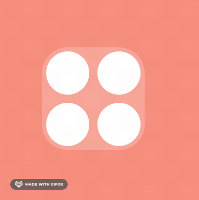
2. Gestures - hover , drag
Idea
- 유저가 motion이 지원하는 제스처를 하는 동안 수행할 애니메이션을 정의할 수 있음.
- 자주 쓰는 제스처 :
whileHover,whileTap,whileFocus,whileDragwhileInView: 뷰포트에 들어온 동안 실행 (viewport={{once : true, root: ref }})
code
일반 제스처사용
const boxVariants = {
  hover: { scale: 1.5, rotateZ: "90deg" },
  tab: { borderRadius: "100px", scale: 1 },
  drag: { backgroundColor: "rgb(46,123,250)", transition: { duration: 2 } },
};

// hover
return <Box variants={boxVariants} whileHover="hover" />

// drag , tab
return <Box variants={boxVariants} whileTap="tab" />
드래그 사용
const boxVariants = {
  hover: { scale: 1.5, rotateZ: "90deg" },
  tab: { borderRadius: "100px", scale: 1 },
  drag: { backgroundColor: "rgb(46,123,250)", transition: { duration: 2 } },
};

// 드래그 영역 제한을 위한 ref
const containerRef = useRef<HTMLDivElement>(null);

// 감싸고 있는 요소에 ref
<ConstraintBox ref={biggerBoxRef}>
 //drag 요소에 dragConstraints에 설정
        <Box
          drag=""  /* "x" || "y" 로 drag 축 고정 가능 */
          dragElastic={0.5} /* force Elastic : 마우스에 탄성 */
          dragSnapToOrigin /* 원래자리로 돌아가기 */
          /* 드래그 영역 제한 {top: 50, bottom: 50, left: 50,right: 50} or ref설정 */
          dragConstraints={biggerBoxRef}
          variants={boxVariants}
          whileHover="hover"
          whileDrag="drag"
          whileTap="tab"
        />
</ConstraintBox>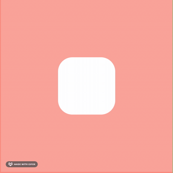
3. Motion Value
3.1 Motion Value Basic
Idea
- motion value를 사용하면 react components는 motionvalue값 변화로는 다시 render 되지 않음.
- MotionValues는 애니메이션 값의 상태와 속도를 추적함. => 추적한 값으로 animation 상태를 바꿀때 사용함.
code
import { motion, useMotionValue } from "framer-motion"

export function MyComponent() {
  const x = useMotionValue(0)

  // 이렇게 하면 components 렌더가 1번만 되니까 실시간으로 체크할 수 없음.
  console.log(x.get())

  // 실시간으로 값을 체크하기 위해서 x가 변할때 x의 값을 받아와야함.
  uesEffect(() => {
  x.onChange(() => console.log(x.get()))
  },[x])

  return <motion.div style={{ x }} drag="x" />
}
3.2 useTransform
Idea
- motion value 값을 실시간으로 다른 값으로 변경함.
- 역시 react components의 렌더사이클을 건드리지 않음.
- native에 interfore 이랑 비슷함.
const x = useMotionValue(0)
const input = [-200, 0, 200]
const output = [0, 1, 0]

// input , output 배열의 길이는 값아야 함.
const opacity = useTransform(x, input, output)

// 배경도 바꿀수 있음, rgba 값 or gradients
const gradient = useTransform(
    x,
    [-800, 800],
    [
      "linear-gradient(135deg, rgb(0, 210, 238), rgb(0, 83, 238))",
      "linear-gradient(135deg, rgb(0, 238, 155), rgb(238, 178, 0))",
    ]
  );

// 어떻게 변하는지 실시간으로 보기
useEffect(() => {
opacity.onChange(() => console.log(opacity.get()))
}, [x])

return <motion.div drag="x" style={{ x, opacity }} />
3.3 Motion value Help Func - useViewportScroll 등
Idea
- Motion Value를 이용한 다른 훅으로 편하게 변경해보기
- Motion Value 처럼 해당값의 변화가 components를 렌더링 시키지 않음.
const {scrollX, scrollY, scrollXProgress, scrollYProgress} = useViewportScroll();
// scrollX, scrollY : px,
// progress : 0 ~ 1,

const gradient = useTransform(
    scrollYProgress,
    [-800, 800],
    [
      "linear-gradient(135deg, rgb(0, 210, 238), rgb(0, 83, 238))",
      "linear-gradient(135deg, rgb(0, 238, 155), rgb(238, 178, 0))",
    ]
  );

// 값 실시간 보기
  useEffect(() => {
    scrollYProgress.onChange(() => console.log("스크롤y비율 : ", scrollYProgress.get()));
  }, [scrollY, scrollYProgress]);
4. svg motion - pathLength
svg를 움직여보자
Idea
- motion.svg , motion.path로 움직일 요소 결정
- panLength : 0 ~ 1
- animate 되는 요소마다 transition 다르게 주기
예제
const svgVariants: Variants = {

  start: {
    pathLength: 0,
    fill: "rgba(255,255,255,0)",
  },

  end: {
    pathLength: 1,
    fill: "rgba(255,255,255,1)",


    // default, animate 값을 변경하는 값마다 다르게 설정가능
    transition: {
      // default: 선언하지 않은 모든 요소에 적용할 옵션
      default: { duration: 3 },
      // fill: 'fill'요소에 적용할 옵션
      fill: { duration: 5 },
    },
  },
};

const SvgAnimation = () => {
  return (
    <>
      <Svg xmlns="http://www.w3.org/2000/svg" viewBox="0 0 448 512">
        <motion.path
          variants={svgVariants}
          initial="start"
          animate="end"
          d="M224 373.12c-25.24-31.67-40.08-59.43-45-83.18-22.55-88 112.61-88 90.06 0-5.45 24.25-20.29 52-45 83.18zm138.15 73.23c-42.06 18.31-83.67-10.88-119.3-50.47 103.9-130.07 46.11-200-18.85-200-54.92 0-85.16 46.51-73.28 100.5 6.93 29.19 25.23 62.39 54.43 99.5-32.53 36.05-60.55 52.69-85.15 54.92-50 7.43-89.11-41.06-71.3-91.09 15.1-39.16 111.72-231.18 115.87-241.56 15.75-30.07 25.56-57.4 59.38-57.4 32.34 0 43.4 25.94 60.37 59.87 36 70.62 89.35 177.48 114.84 239.09 13.17 33.07-1.37 71.29-37.01 86.64zm47-136.12C280.27 35.93 273.13 32 224 32c-45.52 0-64.87 31.67-84.66 72.79C33.18 317.1 22.89 347.19 22 349.81-3.22 419.14 48.74 480 111.63 480c21.71 0 60.61-6.06 112.37-62.4 58.68 63.78 101.26 62.4 112.37 62.4 62.89.05 114.85-60.86 89.61-130.19.02-3.89-16.82-38.9-16.82-39.58z"
        ></motion.path>
      </Svg>
    </>
  );
};
5. Animtaion Presence
설명
Animation Presence : 컴포넌트임. react에서 사라지는 components를 animate 처리해줌.
5.1 Basic - show & hide
idea
그냥 사라지는 데 애니메이션 처리를 해보자
const [isShow, setIsShow] = useState(false);
const toggleIsShow = () => setIsShow(prev => !prev);

// 생기거나 사라질때 애니메이션을 정의
const boxVariants: Variants ={
start: {opacity: 0},
end: {opacity: 1},
exit: {y: -40, opacity: 0}
}

return (<>
  <button onClick={toggleIsShow} >눌러보세요</button>
  <AnimationPresence>
    // 1. show condition 할당 2. 생거나 사라질 때 애니메이션 처리 할당
  {isShow
      && <motion.div
               variants={boxVariants}
               initial="start"
               animate="end"
               exit="exit"
               style={{width: 100, height: 100, backgroundColor: "white"}} /> }
  </AnimationPresence>
</>)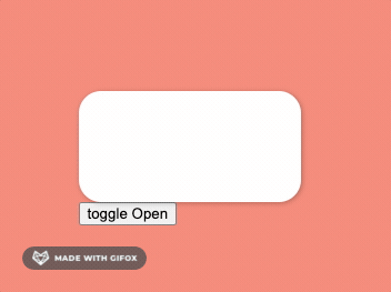
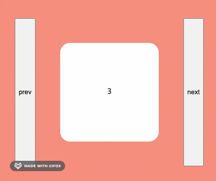
5.2 Slide - show & hide animation, exitBeforeEnter
---
idea
- slide 사라지거나 생길때 애니메이션 조작 (AnimationPresence)
- custom props으로 animate variants 조정하기 (custom props)
- AnimationPresence의 props
=> exitBeforeEnter: 하위요소의 exit가 끝난 뒤에 animate가 실행된다
// 보이게할 인덱스 선택
const dataArray = [1, 2, 3, 4, 5, 6, 7]
const [visibleIndex, setVisibleIndex] = useState(0);
// variants custom을 위한 변수 선언
const [isBack, setIsBack] = useState(false);

const nextIndex = () => {
  setIsBack(false);
  if(dataArray.length > visibleIndex) {
    setVisibleIndex(prev + 1)
  } else {
  	setVisibleIndex(0)
  }
}

 const prevIndex = () => {
   setIsBack(true)
  if(visibleIndex > 0) {
    setVisibleIndex(prev - 1)
  } else {
  	setVisibleIndex(dataArray.length)
  }
 }

   // slide animation 정의
  const slideVariants: Variants = {
  	start:(isBack: boolean) => ({
    x: isBack ? 500 : -500,
    opacity: 0,
    scale: 0
    }),
    end: {
    	x: 0,
      opacity: 1,
      scale: 1,
    },
    exit:(isBack: boolean) => ({
    	x: isBack ? -500 : 500,
      opacity: 0,
      scale: 0
    })
  }

 return <>
   <button onClick={prevIndex}>이전 슬라이드</button>
   // animationPresence에 custom 설정, option props 주기
   <AnimationPresence custom={back} exitBeforeEnter >
     {dataArray.map((item , i) => i === visibleIndex ?

                    // 조작할 요소에 custom props 할당.
                    // => variants에서 custom props을 받음.
                    <Box
                      custom={isBack}
                      variants={slideVariants}
                      initial="start"
                      animate="end"
                      exit="exit"
                      key={i}>
                      {i}
                    </Box>
                    : null)}
   </AnimationPresence>
   <button onClick={nextIndex}>다음 슬라이드</button>
   <>
}
6. Layout
설명
layout animation, shared layout animation
6.1 layout animation
설명
렌더링 될 때, style or css의 변화를 감지해서 animate 해준다.
const [clicked, setClicked] = useState(false);
const toggleClick = () => setClicked((prev) => !prev);
return (
<Container>
<button onClick={toggleClick}>click</button>
{/* 01. layout */}
<Box
style={{
justifyContent: clicked ? "center" : "flex-start",
alignItems: clicked ? "center" : "flex-start",
}}
>
<Circle layout />
<Circle layout />
</Box>
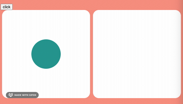
)6.2 shared layout animation
설명
layoutId로 state의 상태에 따라 한쪽에 생기고 다른 한쪽이 사라질때 애니메이션 처리를 해줌.
code
return (
  <BoxContainer>
        <Box
          style={{
            justifyContent: clicked ? "center" : "flex-start",
            alignItems: clicked ? "center" : "flex-start",
          }}
        >
          {clicked && <Circle layoutId="circle" />}
        </Box>
        <Box
          style={{
            justifyContent: clicked ? "center" : "flex-start",
            alignItems: clicked ? "center" : "flex-start",
          }}
        >
          {!clicked && <Circle layoutId="circle" />}
        </Box>
    </BoxContainer>
)
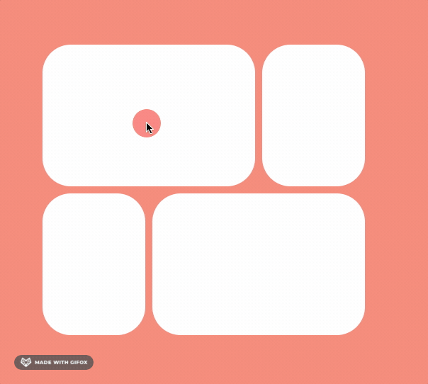
7. Final - modal
Idea
- Animation Presence를 컴포넌트 안에 modal 만들고
- layoutId 를 바꿔가면서 실행 시키자
code
// modal id state
const [id, setId] = useState<string | null>(null);
const onChangeId = () => setId(Item.toString());

return (
  // 바닥판
	<Grid>
        {[1, 2, 3, 4].map((item) => (
          <Box
            key={item}
            layoutId={item + ""}
            onClick={onChangeId}
          ></Box>
        ))}
      </Grid>
  // 모달올라오는 부분
      <AnimatePresence>
        {id && (
          <Overlay
            onClick={() => setId(null)}
            initial={{ opacity: 0 }}
            animate={{ opacity: 1 }}
            exit={{ opacity: 0 }}
          >
            <Box
              layoutId={id}
              style={{
                width: 400,
                height: 200,
              }}
            ></Box>
          </Overlay>
        )}
      </AnimatePresence>
)

취업전에는 기술스택을, 취업후에는 고도화를 하자