프로젝트를 하다보면 자주 사용되는 UI 컴포넌트들이 있다.
가령 버튼 모양이나 유저 이미지 같은 것들 말이다.
그런 것들은 미리 스타일링 해놓고 필요할 때마다 해당 스타일의 클래스 이름을 붙이면 스타일이 자동으로 완성된다.
Sass로 좀 더 쉽게 모듈화를 하는 방법을 알아보자.
플레이스 홀더
플레이스 홀더는 공통된 스타일을 지정하는 데 사용된다.
mixin과 비슷해 보이지만 mixin과는 다르게 인자를 받을 수 없고, 따라서 mixin보다 확장성이 떨어진다.
그래서 사실상 mixin을 써도 무방하다.
플레이스 홀더를 만드는 방법은 %다음에 이름을 붙이고 스타일링을 하면 된다.
사용할 때는 사용하려는 선택자에 @extend <플레이스홀더 이름> 을 쓰고 추가로 더 스타일링을 넣으면 된다.
%base {
  @include inline-flexbox;
  @include text-style(12);
  font-weight: 700;
  height: 20px;
  padding: 0 6px;
  border-radius: 4px;
}
태그
다음은 tag-base라는 플레이스 홀더로 태그의 기본 공통 스타일을 만들고, 그 아래 tag-base를 사용하여 좀 더 쉽게 스타일링을 만들었다.
%tag-base {
  @include inline-flexbox;
  @include text-style(12);
  font-weight: 700;
  height: 20px;
  padding: 0 6px;
  border-radius: 4px;
}

.tag-red {
🔸@extend %tag-base;
  color: $white;
  background-color: $red;
}
.tag-green {
🔸@extend %tag-base;
  color: $white;
  background-color: $green;
}
.tag-yellow {
🔸@extend %tag-base;
  color: $primary;
  background-color: yellow;
}
이제 html 태그에 스타일링 해놓은 클래스의 이름만 붙이면 지정해놓은 스타일이 자동으로 적용이 된다.
<div class="tag-red">
  <div>붉은색</div>
</div>
<div class="tag-green">
  <div>푸른색</div>
</div>
<div class="tag-yellow">
 <div>그 사이 3초 그 짧은 시간</div>
</div>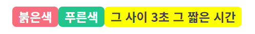
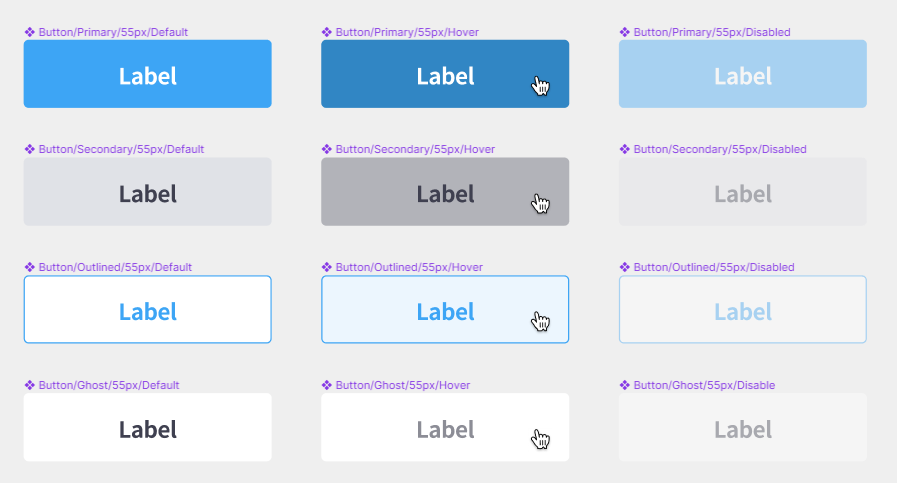
버튼
이제 자주 쓰이는 버튼 스타일을 모듈화 해보자.
버튼은 크게 3가지를 신경쓰면 된다. 버튼 스타일, 상태, 사이즈 이다.
예시로는 4가지 버튼 스타일을 만들어 볼 것이다.
일반적으로 버튼의 상태는 평상시 상태, 호버 상태, Disabled 상태가 있다.
플레이스 홀더로 공통 스타일을 만들고 이를 이용해 스타일 모듈을 만들어보자.
상태에 따른 스타일링은 버튼 스타일에 종속되도록 하였다.
// 공통 스타일
%btn-base {
  @include inline-flexbox; //글자 중앙정렬
  padding: 0 8px;
  border-radius: 4px;
  font-weight: 700;
  transition: all 0.2s ease-in-out;

  &:disabled {
    opacity: 0.4;
    cursor: not-allowed; //클릭금지 아이콘 나옴
  }
}

// 버튼 스타일
.btn-primary {
  @extend %btn-base;
  color: $white;
  background-color: $blue;

  // disabled가 아닌 것의 hover일 때
  &:not(:disabled):hover {
    background-color: $blue-dark;
  }
}
.btn-secondary {
  @extend %btn-base;
  color: $primary;
  background-color: $border;

  &:not(:disabled):hover {
    background-color: $tertiary;
  }
}
.btn-outlined {
  @extend %btn-base;
  color: $blue;
  background-color: $white;
  border: 1px solid $blue;

  &:not(:disabled):hover {
    background-color: $blue-light;
  }
}
.btn-ghost {
  @extend %btn-base;
  color: $primary;
  background-color: transparent;

  &:not(:disabled):hover {
    color: $secondary;
  }
}
그리고 3가지 높이의 버튼 사이즈가 있다고 해보자. 버튼의 width는 버튼 안의 내용에 따라 달라질 수 있으므로 height 값만 설정해준다.
저번에 만들어 놓은 text-style mixin을 활용해서 스타일링을 하였다.
이렇듯, mixin은 한 번 만들어 놓으면 계속 쓸 수 있다. 변수나 모듈화도 마찬가지.
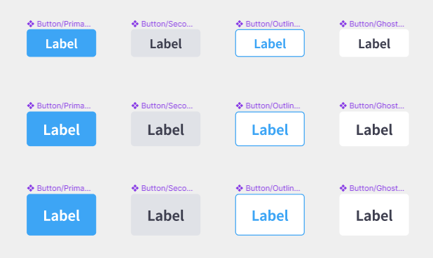
// 버튼 사이즈
.btn-32 {
  height: 32px;
  @include text-style(14);
}
.btn-40 {
  height: 40px;
  @include text-style(16);
}
.btn-48 {
  height: 48px;
  @include text-style(16);
}
.btn-55 {
  height: 55px;
  @include text-style(18);
}
html태그에서 사용할 때에는 스타일 클래스와 사이즈 클래스를 입력해주어 스타일링을 할 수 있다.
또한 태그에 disabled 속성을 넣어주면 이도 인식하여 자동으로 스타일링이 된다.
	<div>
      <button type="button" class="btn-primary btn-32">primary</button>
      <button type="button" class="btn-secondary btn-40">secondary</button>
      <button type="button" class="btn-outlined btn-48">outlined</button>
      <button type="button" class="btn-ghost btn-55">ghost</button>
    </div>

 	<div>
      <button type="button" class="btn-primary btn-32" disabled>primary</button>
      <button type="button" class="btn-secondary btn-40" disabled>
        secondary
      </button>
      <button type="button" class="btn-outlined btn-48" disabled>
        outlined
      </button>
      <button type="button" class="btn-ghost btn-55" disabled>ghost</button>
    </div>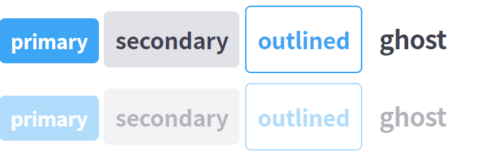
정리
이렇게 모듈화로 스타일링을 해놓으면 html 태그에서 클래스만 모듈의 이름으로 넣어주면 자동으로 스타일링이 된다.
처음에 조금 귀찮더라도 필수로 만들어야 하는 부분이라는 것을 잘 기억해두자.

개발자로서 성장하는 데 큰 도움이 된 글이었습니다. 감사합니다.