
오늘은 CSS flex 개념에 대해서 배웠는데.. 한번에 이해하려니 너무 힘들어서... 정리를 해보려고 한다.. 구글링을 하던 중 정말 정리를 잘해둔 블로그를 하나 찾아서 블로그 내용과 함께 오늘 배운 내용을 복습 해보려고 한다! (링크는 아래에 있다)
Flex 의 속성
flex는 컨테이너에 적용하는 속성과 아이템에 적용하는 속성이 있다
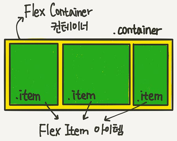
부모 요소인 div.container를 Flex Container(플렉스 컨테이너)라고 부르고,
자식 요소인 div.item들을 Flex Item(플렉스 아이템)이라고 한다
1.Flex Container
1-1. display: flex 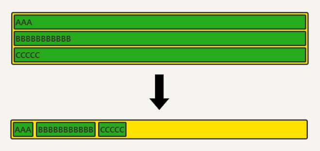
.container {
	display : flex;
 }
Flex 아이템들은 가로 방향으로 배치한다
inline 요소 처럼 자신이 가진 내용물의 width 만큼만 차지하게 된다
height는 컨테이너의 높이만큼 늘어난다 (float와의 차이점 중 하나)
1-1-1. inline-flex 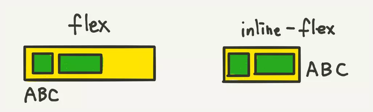
아이템의 배치와 관련이 있다기 보다는, 컨테이너가 주변 요소들과 어떻게 어우러질지 결정하는 값이라고 생각하면 쉽다
아이템들이 배치된 방향의 축을 메인축(Main Axis), 메인축과 수직인 축을 수직축 또는 교차축(Cross Axis)이라고 부르는데 내가 참고한 블로그에서 아주 신박한 방법을 제시했다
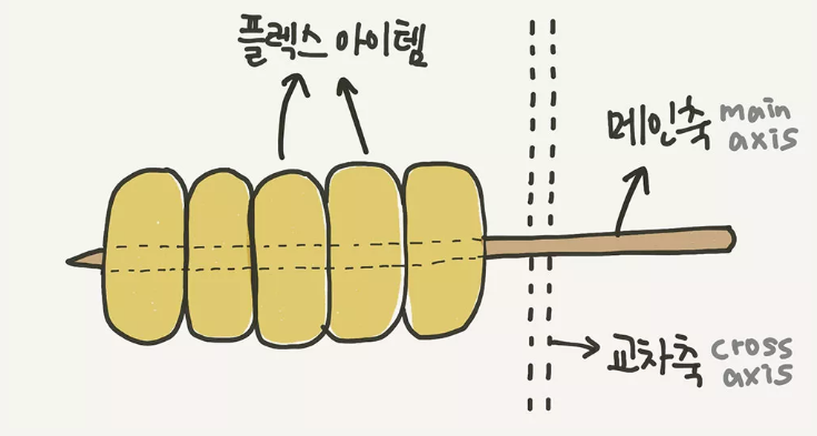
바로 메인축을 오뎅 꼬치라고 생각하면 된다고 한다
1-2. flex-direction : 정렬 축 정하기 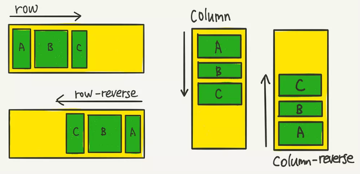
flex-direction: row;
// 아이템들이 행(가로) 방향으로 배치됩니다.

flex-direction: column;
//아이템들이 열(세로) 방향으로 배치됩니다.

flex-direction: row-reverse;
//아이템들이 역순으로 가로 배치됩니다.

flex-direction: column-reverse;
//아이템들이 역순으로 세로 배치 됩니다.
메인축(오뎅꼬치)의 방향을 가로로 할건지 세로로 할건지를 결정
flex-direction 속성은 부모 요소에 설정해주는 속성
자식 요소들을 정렬할 정렬 축을 정한다
아무 설정도 해주지 않으면 기본적으로 가로 정렬을 한다
1-3. flex-wrap : 줄넘김 처리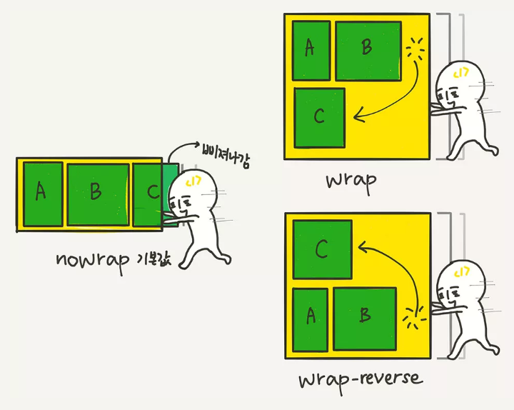
.container {
	flex-wrap: nowrap;
    //줄바꿈 X, 넘치면 그냥 삐져 나감

	flex-wrap: wrap;
    //줄바꿈 O, float이나 inline-block으로 배치한 요소들과 비슷하게 동작

	flex-wrap: wrap-reverse;
    //줄바꿈 O, 아이템을 역순으로 배치
 }
컨테이너가 아이템들을 한 줄에 담을 여유 공간이 없을 때 아이템 줄바꿈을 어떻게 할지 결정하는 속성
1-4. flex-flow : 정렬 + 줄넘김 처리
flex-direction과 flex-wrap을 한꺼번에 지정할 수 있는 단축 속성
.container {
	  	flex-flow: row wrap;

  아래의 두 줄을 줄여 쓴 것
	  	flex-direction: row;
	  	flex-wrap: wrap;
}
이후에 justify 와 align 개념이 나오는데 여기서 또 신박한 설명이 나온다 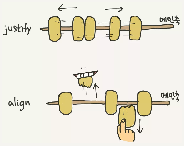
-
“justify”는 메인축(오뎅꼬치) 방향으로 정렬
-
“align”은 수직축(오뎅을 뜯어내는) 방향으로 정렬
-
저스트 가로 아 수직이다
1-5. justify-content : 메인축 방향 정렬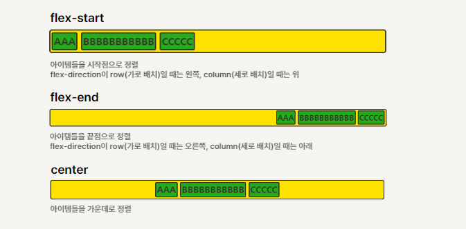
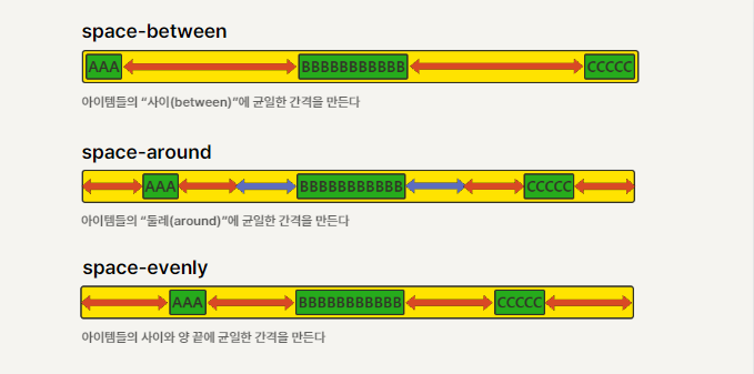
.container {
    justify-content: flex-start;
    justify-content: flex-end;
    justify-content: center;
    justify-content: space-between;
    justify-content: space-around;
    justify-content: space-evenly;
}
메인축 방향으로 아이템을들 정렬하는 속성
space-evenly는 IE, 엣지에서는 지원이 안됨
1-6. align-items : 수직축 방향 정렬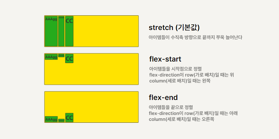
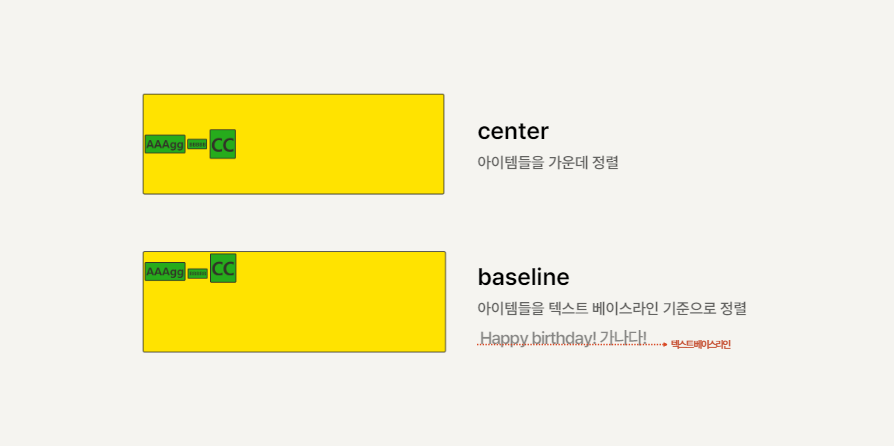
.container {
    align-items: stretch;
    align-items: flex-start;
    align-items: flex-end;
    align-items: center;
    align-items: baseline;
}
justify-content: center;
align-item: center;
를 해주면 가운데 정렬이 쉽다
1-7. align-content : 여러 행 정렬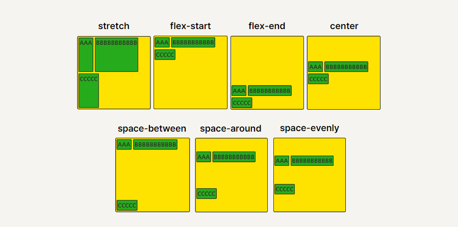
.container {
      flex-wrap: wrap;
      align-content: stretch;
      align-content: flex-start;
      align-content: flex-end;
      align-content: center;
      align-content: space-between;
      align-content: space-around;
      align-content: space-evenly;
}
flex-wrap: wrap;이 설정된 상태에서, 아이템들의 행이 2줄 이상 되었을 때의 수직축 방향 정렬을 결정하는 속성
space-evenly는 IE, 엣지에서는 지원이 안됨
엉금엉금