[React/Next.js] StoryBook 으로 컴포넌트 관리하기 (with TypeScript, Tailwind CSS)
Next.js - Page Router
목록 보기
8/11

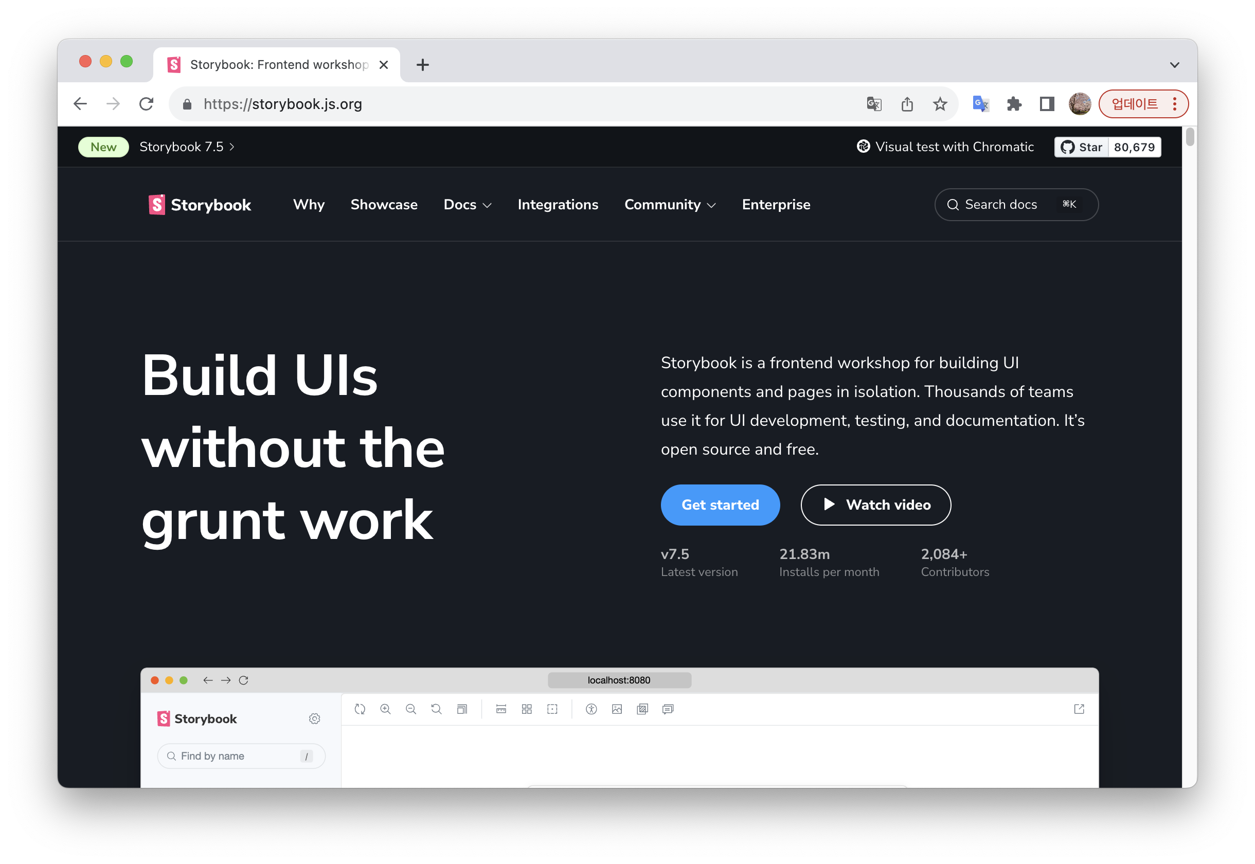
스토리북이란?
- 컴포넌트 기반의 뷰를 위한 독립적인 UI 개발 환경
- 처음 리액트를 기반으로 개발되었고, 이후 Vue, Angular, Web Components, Svelte 등 다양한 프레임워크를 지원하고 있음.
- 스토리북은 컴포넌트를 목록화하여 보고 싶은 컴포넌트를 언제든 확인 가능하도록 만들어준다.
- 스토리북의 컴포넌트는 Mockup 상태 값을 넣어줄 수 있도록 되어있어 각종 상태 값에 따라 바로바로 디자인이 변경되는 것을 확인하실 수 있고 또한, 각 개체별로 볼 수도 있지만 페이지 단위로 여러 가지 컴포넌트를 묶어 보여줄 수도 있음.
- 위와 같은 기능을 제공함으로써 개발 요건을 반영하여 기획, 디자인 파트와 같이 확인하며 협업이 가능
- 스토리북을 확인하면서 여러 케이스를 미리 테스트할 수 있고 이렇게 검수를 선진행하여 수정이 필요한 경우 빠르게 확인한 내용을 반영하여 작업함에 있어 수월하게 진행할 수 있도록 도와줌.
- Storybook 공식문서
스토리북 설치하기
- 다음 명령어를 실행하여
Storybook설치
npm install --save-dev sb- 스토리북을 초기화하여 필요한 라이브러리 설치하기
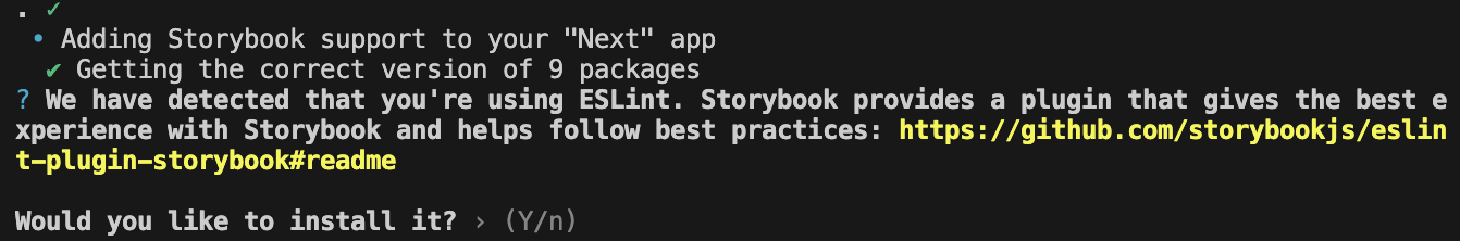
npx sb init --builder webpack5- eslintPlugin 설치
- eslint를 사용하고 있으면 자동으로 인식하고 플러그인 설치 여부에 대한 질문이 나온다.
y를 입력하여 설치
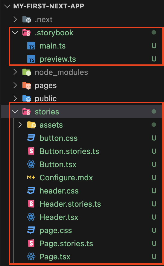
- 설치가 완료되면 Storybook 설정 파일과 Storybook 샘플코드가 함께 생성됨
./.storybook/...:Storybook에 대한 설정 파일./stories/...:Storybook의 샘플 코드
스토리북 실행
- 다음 명령어를 실행하여 Storybook 실행
npm run storybook- 브라우저에
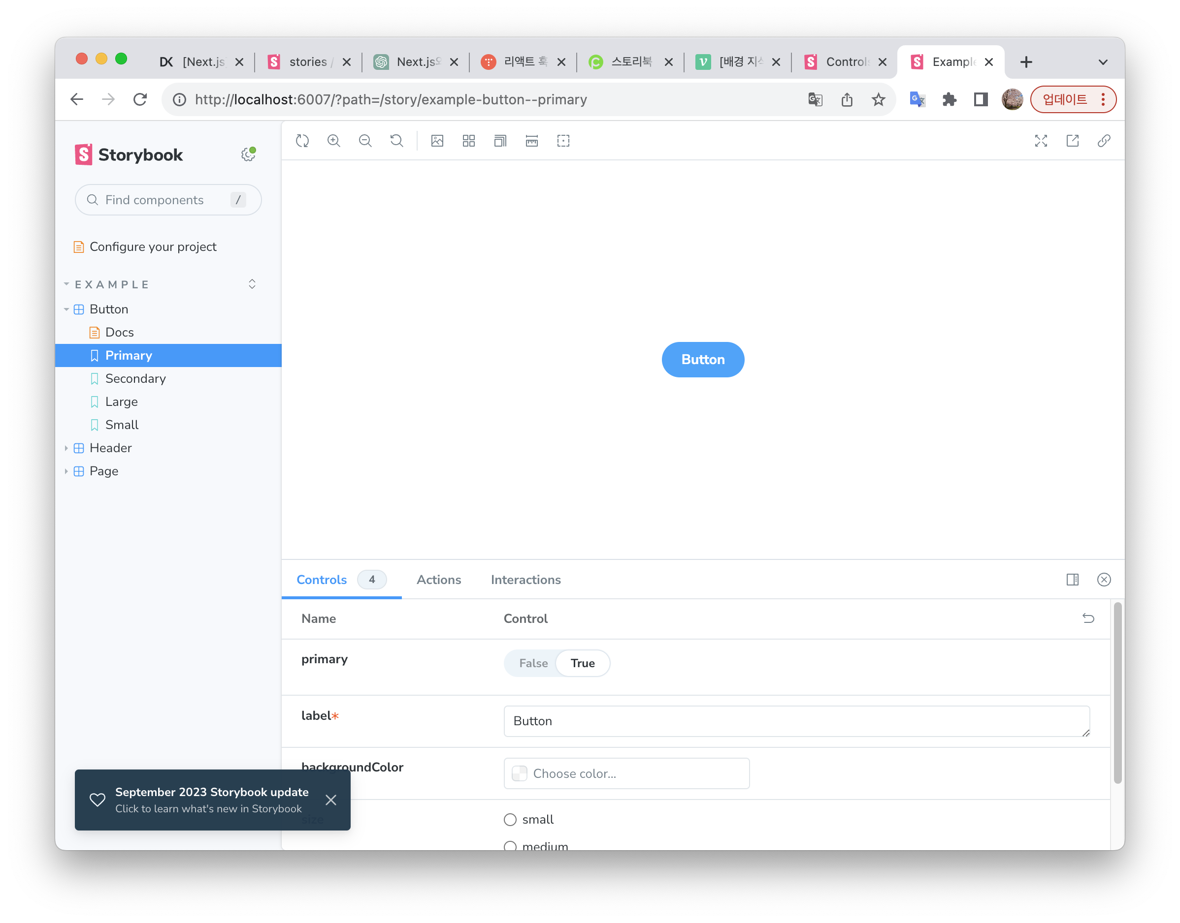
http://localhost:6006/이 자동으로 열리며, 스토리북이 실행됨
- 샘플코드로 작성된 컴포넌트 확인 가능
스토리북 사용법
- 샘플 코드는 이제 필요 없으니 삭제하고, 직접 코드를 작성해보면서 사용법에 대해 알아보겠다.
스토리북 설정
- 우선
Next.js의globals.css를Storybook에서도 사용할 수 있도록./storybook/preview.ts파일을 열고 다음과 같이 수정
import type { Preview } from '@storybook/react';
import '../src/styles/globals.css'; // 추가

const preview: Preview = {
  parameters: {
    actions: { argTypesRegex: '^on[A-Z].*' },
    controls: {
      matchers: {
        color: /(background|color)$/i,
        date: /Date$/i,
      },
    },
  },
};

export default preview;- TailwindCSS를 사용하는 경우,
globals.css파일에 아래 코드가 반드시 추가되어 있어야 함.
@tailwind base;
@tailwind components;
@tailwind utilities;- Storybook이 프로젝트 내 stories 파일을 전부 인식할 수 있도록
./.storybook/main.js파일을 열고 다음과 같이 수정
module.exports = {
  "stories": [
    "../**/*.stories.mdx",
    "../**/*.stories.@(js|jsx|ts|tsx)"
  ],
  ...
}- 이제는 어떠한 폴더에서든
.stories.tsx파일명을 가지면,Storybook이 이를 인식하여 화면에 표시하게 된다. - 나는 아래와 같은 구조로 컴포넌트와 스토리를 만들 것이다.
MyComponent
	|- index.tsx
|- MyComponent.stories.tsx- 이렇게 작성하면, 폴더를 그대로 컴포넌트로 사용할 수 있다.
import '@components/MyComponent'컴포넌트 만들기
- 프로젝트에서 사용할 컴포넌트를 먼저 만든다.
- props로 버튼 label과 색상을 받는 버튼을 만들어보자.
components/atoms/StyledButton/index.tsx파일을 만들고 아래와 같이 작성
interface ButtonProps {
  label: string;
  backgroundColor?: string;
}

function StyledButton({ label, backgroundColor }: ButtonProps) {
  return (
    <button type="button" className={`${backgroundColor} text-white p-2 rounded-2xl`}>
      {label}
    </button>
  );
}

StyledButton.defaultProps = {
  backgroundColor: 'bg-blue-500',
};

export default StyledButton;
스토리 작성하기
- 같은 위치에
StyledButton.stories.tsx를 만들어 스토리 작성
메타데이터 객체 생성하기
- 먼저 스토리 대상 컴포넌트를 불러오고, 메타데이터 객체를 작성한다.
import { ComponentMeta } from '@storybook/react';
import StyledButton from '.'; // 스토리 대상 컴포넌트 불러오기

// 파일 안의 스토리 설정 (메타데이터 객체)
export default {
  // 그룹명
  title: 'stories/Button',
  // 사용하는 컴포넌트
  component: StyledButton,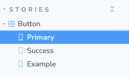
} as ComponentMeta<typeof StyledButton>;- 작성한 그룹 명은 스토리북에서 아래와 같이 디렉터리 구조로 표현된다.
argTypes를 설정하여 스토리북에서 control 가능하게 만들 수도 있다.
import { ComponentMeta } from '@storybook/react';
import StyledButton from '.'; // 스토리 대상 컴포넌트 불러오기

// 파일 안의 스토리 설정 (메타데이터 객체)
export default {
  // 그룹명
  title: 'stories/Button',
  // 사용하는 컴포넌트
  component: StyledButton,
	argTypes: {
    backgroundColor: { control: 'text' },
  },
} as ComponentMeta<typeof StyledButton>;
스토리 작성하기
- 먼저 템플릿을 만들고, 해당 템플릿을 바인딩해서 스토리를 생성한다.
import { ComponentStory } from '@storybook/react';

const Template: ComponentStory<typeof StyledButton> = (args) => <StyledButton {...args} />;

export const Primary = Template.bind({});
Primary.args = {
  backgroundColor: 'bg-blue-500',
  label: 'Primary Button',
};- airbnb eslint 사용하는 경우 템플릿 정의시 함수형 컴포넌트를 사용해야한다.
const Template: ComponentStory<typeof StyledButton> = function Template(args) {
  return <StyledButton {...args} />;
};
결과
- 정상 출력 확인
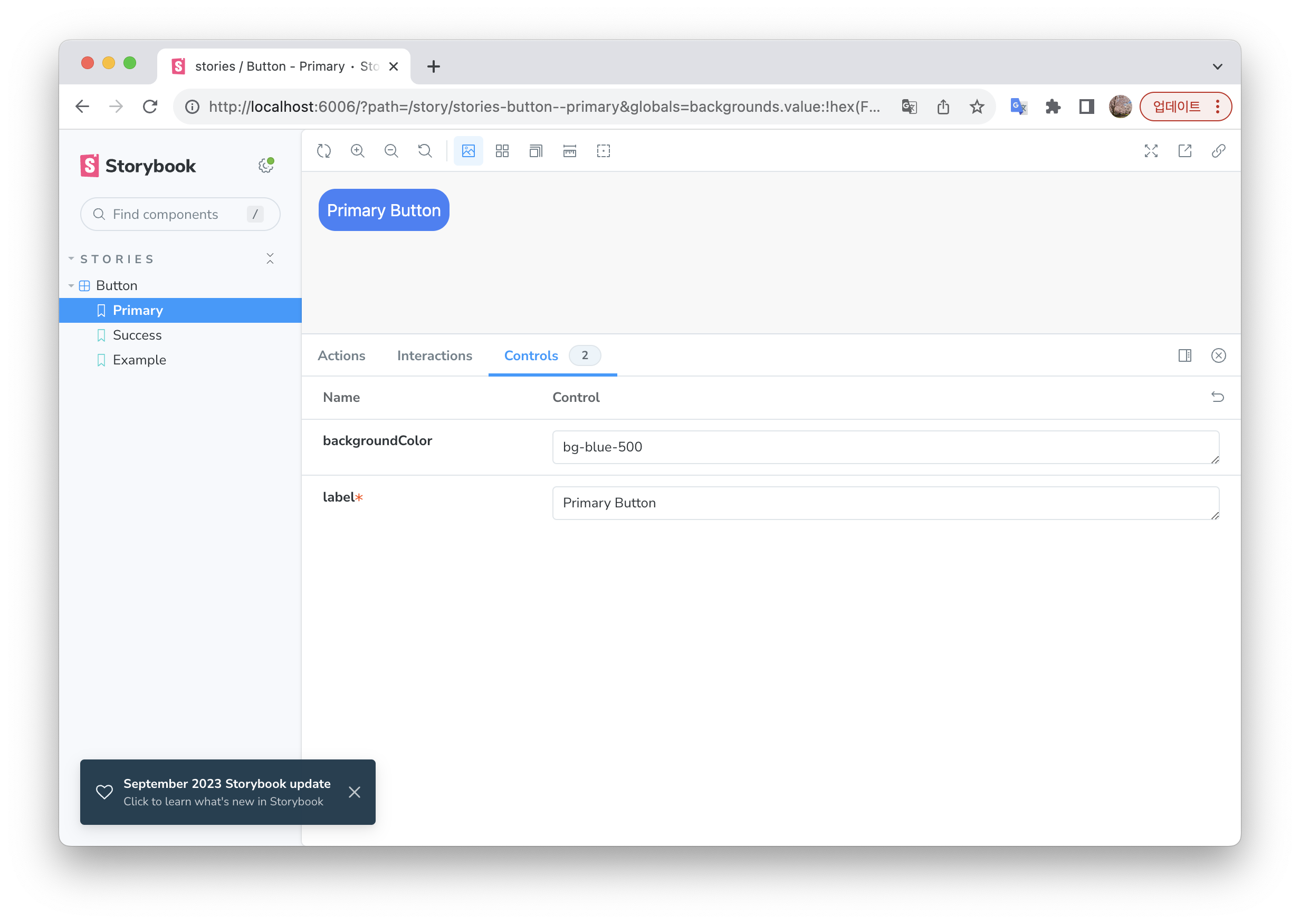
- 아래와 같이
controls값을 수정하면 스토리북에서 바로 변경된 값을 확인할 수 있다.
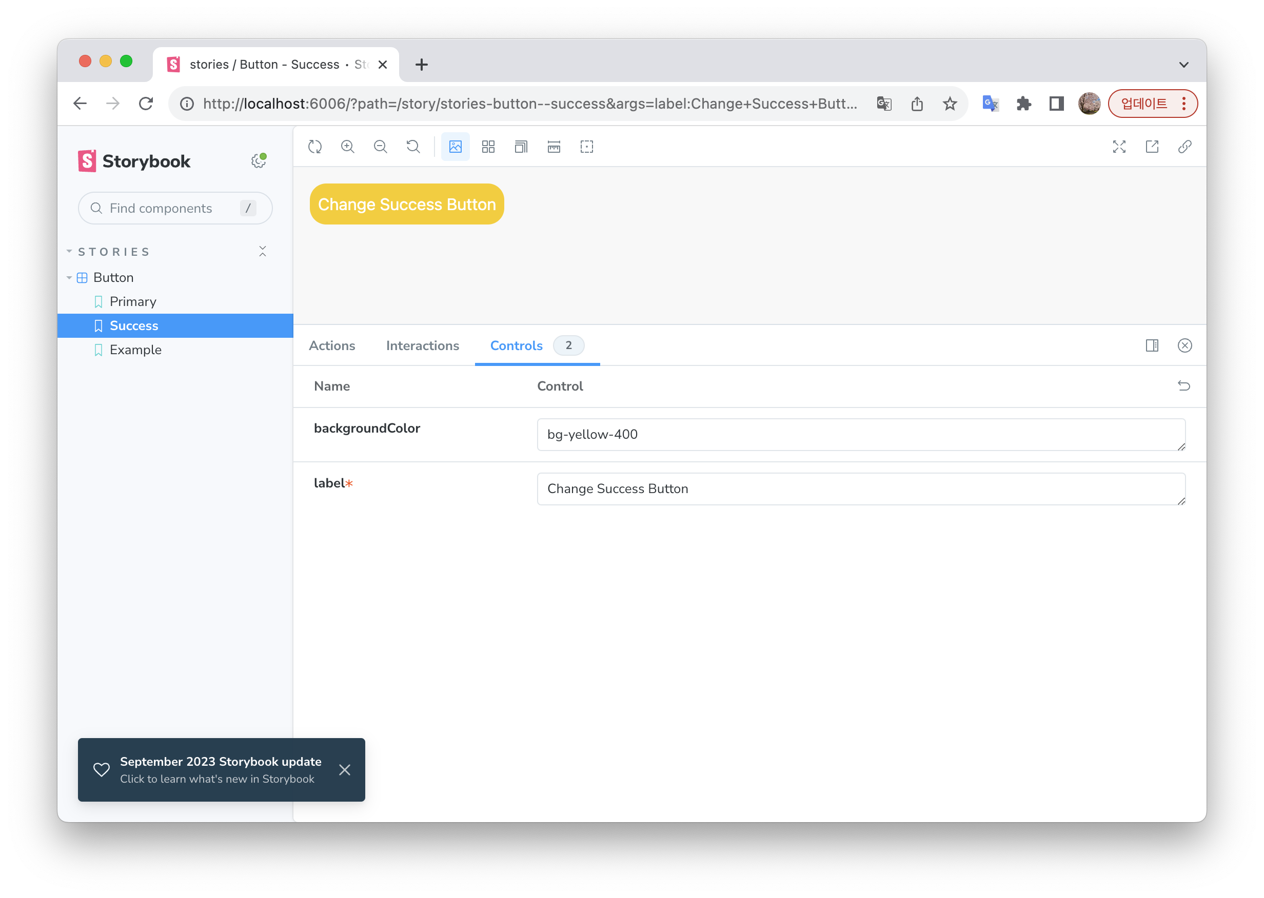
- 그러나 tailwind CSS
className으로 설정했던backgroundColor은 수정하면 확인 할 수 없는 문제가 발생한다.
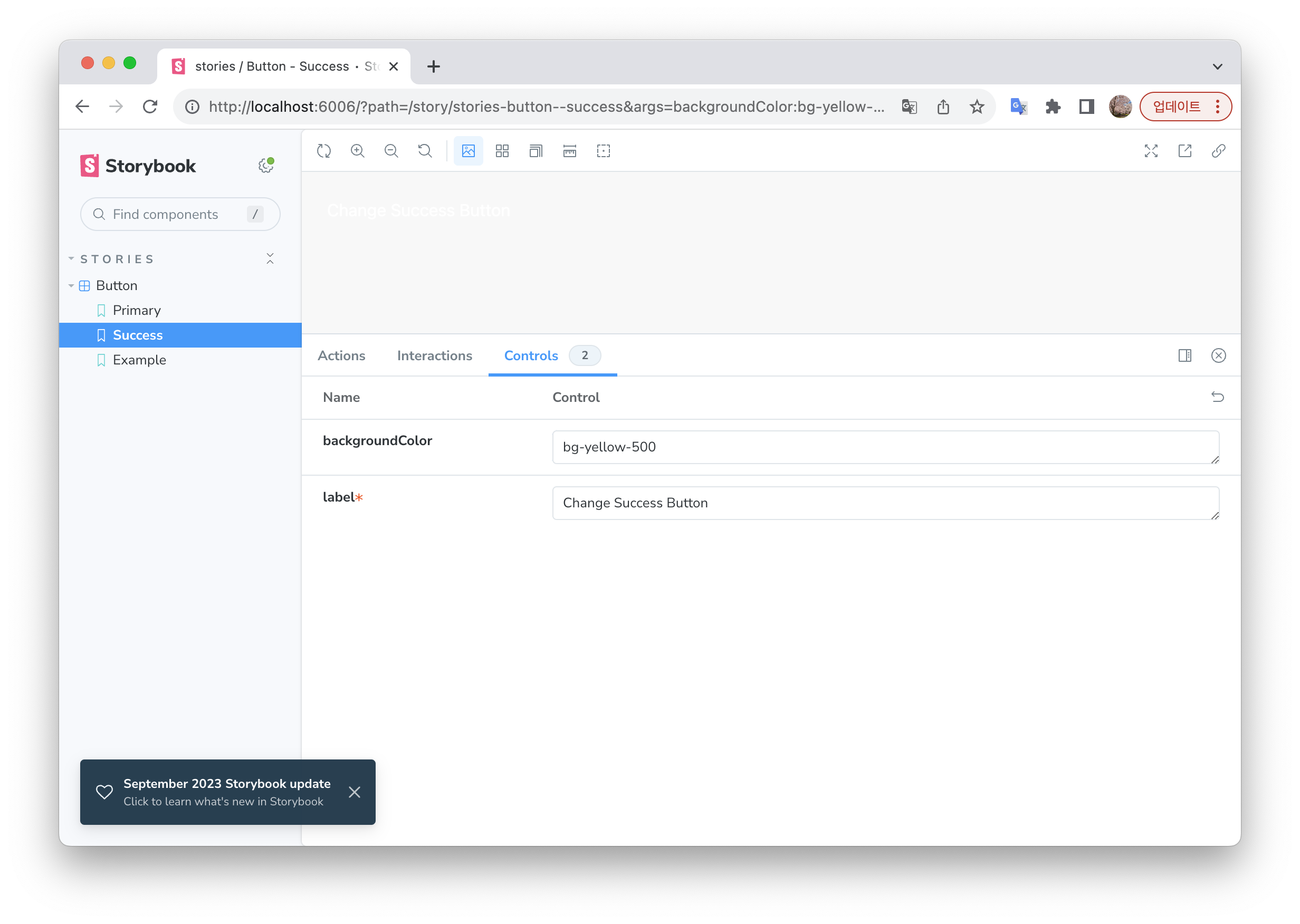
- 아직 해결 방법은 찾지 못했지만, 직접 스토리 파일에서 코드를 수정하고 새로고침 하면 바로 스토리북에서 변화를 확인 가능하다.
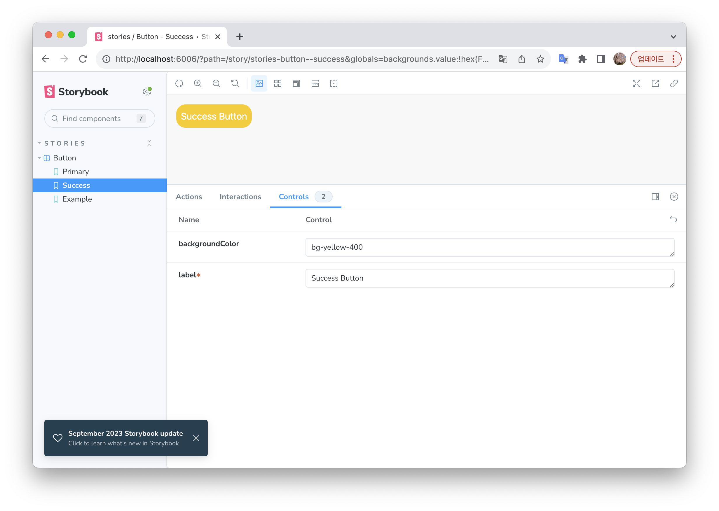
export const Success = Template.bind({});
Success.args = {
  backgroundColor: 'bg-yellow-500',
  label: 'Success Button',
};
- 스토리북에서 보이는 화면과 버튼을 직접 사용해봤을때와 똑같다!
import React from 'react';
import StyledButton from '@/components/atoms/StyledButton';

function test() {
  return <StyledButton label="버튼 테스트" />;
}

export default test;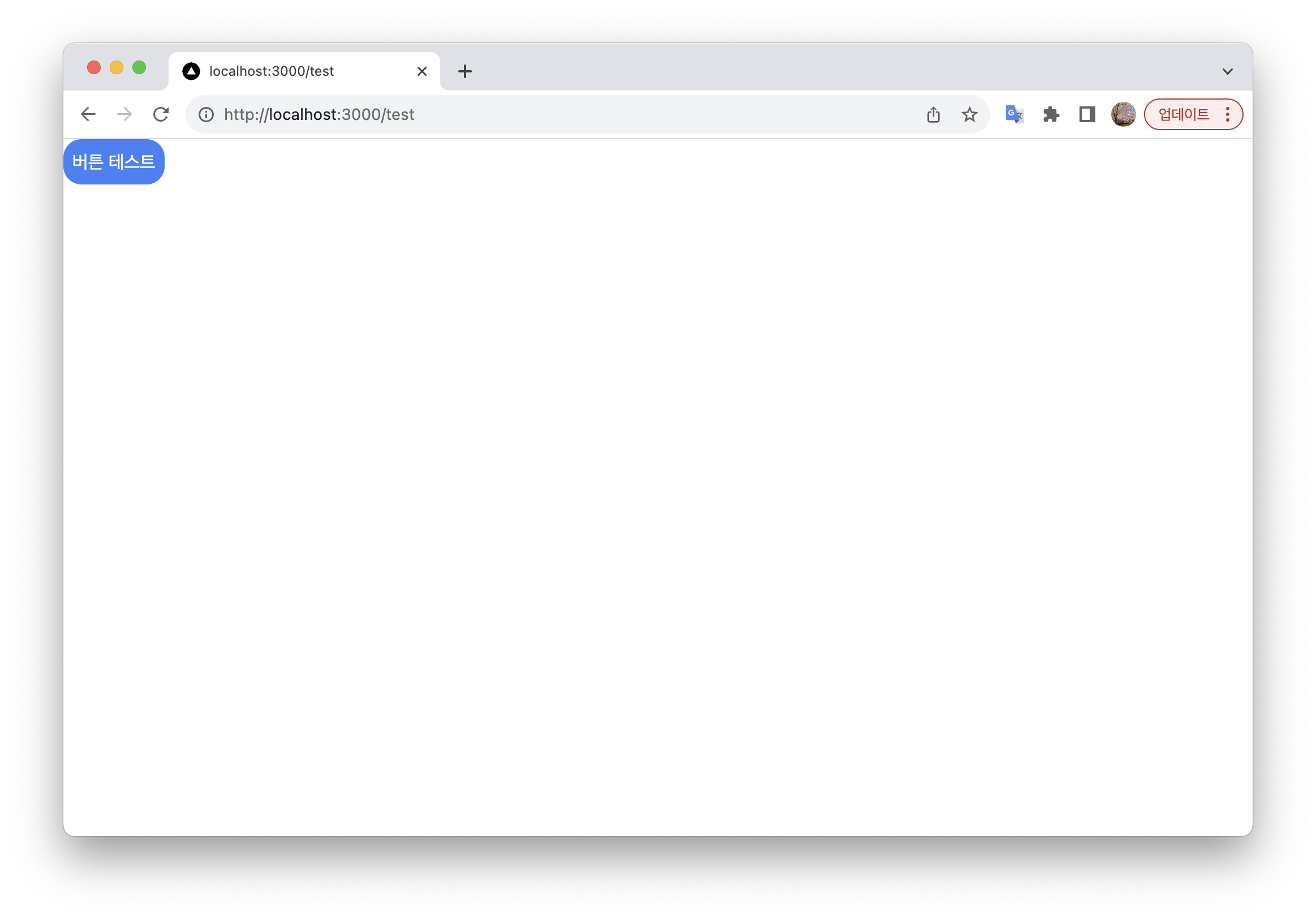
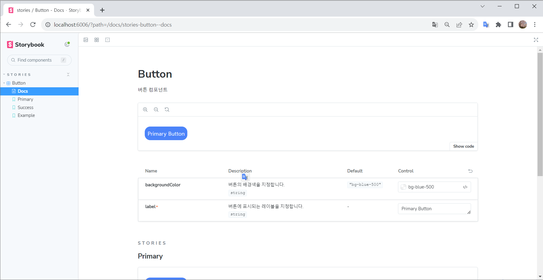
문서화하기
- 메타데이터 객체에
tags: ['autodocs']옵션을 추가
export default {
  // 그룹명
  title: 'stories/Button',
  // 자동으로 문서 생성
  tags: ['autodocs'], // 추가
  // 사용하는 컴포넌트
  component: StyledButton,
  // Docs에 출력할 description 작성
  argTypes: {
    backgroundColor: {
      description: '버튼의 배경색을 지정합니다.',
    },
    label: {
      description: '버튼에 표시되는 레이블을 지정합니다.',
    },
  },
} as ComponentMeta<typeof StyledButton>;- StoryBook이 자동으로 JsDocs 내용을 인식하고 문서를 생성한다.
전체 코드
StyledButton/index.tsx
interface ButtonProps {
  label: string;
  backgroundColor?: string;
}

/**
 * 버튼 컴포넌트
 * @param {string} backgroundColor - 버튼의 배경색을 지정
 * @param {string} label - 버튼에 표시되는 레이블을 지정
 */
function StyledButton({ label, backgroundColor }: ButtonProps) {
  return (
    <button type="button" className={`${backgroundColor} text-white p-2 rounded-2xl`}>
      {label}
    </button>
  );
}

StyledButton.defaultProps = {
  backgroundColor: 'bg-blue-500',
};

export default StyledButton;
StyledButton/StyledButton.stories.tsx
import React from 'react';
import { ComponentStory, ComponentMeta } from '@storybook/react';
import StyledButton from '.';

// 파일 안의 스토리 설정 (메타데이터 객체)
export default {
  // 그룹명
  title: 'stories/Button',
  // 자동으로 문서 생성
  tags: ['autodocs'],
  // 사용하는 컴포넌트
  component: StyledButton,
  argTypes: {
    backgroundColor: {
      description: '버튼의 배경색을 지정합니다.',
    },
    label: {
      description: '버튼에 표시되는 레이블을 지정합니다.',
    },
  },
} as ComponentMeta<typeof StyledButton>;

const Template: ComponentStory<typeof StyledButton> = (args) => <StyledButton {...args} />;

export const Primary = Template.bind({});
Primary.args = {
  backgroundColor: 'bg-blue-500',
  label: 'Primary Button',
};

export const Success = Template.bind({});
Success.args = {
  backgroundColor: 'bg-yellow-500',
  label: 'Success Button',
};

export const Example = Template.bind({});
Example.args = {
  backgroundColor: 'bg-green-500',
  label: 'Example Button',
};
스토리북 업데이트
ComponentMeta, ComponentStory를 사용해서 스토리 작성시 아래와 같이 VSCode에서 취소선이 출력됨을 발견하였다.

- 안내 메시지를 확인해보았더니
'ComponentMeta' is deprecated.ts(6385)더 이상 안쓰는 모듈이라고 나와있음... - 공식 문서 를 확인해보니 스토리북이 업데이트 되면서 작성법이 훨씬 간단해졌다는 것을 알게되었다! (공식문서를 잘읽자..)
- 아래와 같이 수정 가능
import StyledButton from '.';

// 파일 안의 스토리 설정 (메타데이터 객체)
export default {
  // 그룹명
  title: 'stories/Button',
  // 자동으로 문서 생성
  tags: ['autodocs'],
  // 사용하는 컴포넌트
  component: StyledButton,
  argTypes: {
    backgroundColor: {
      description: '버튼의 배경색을 지정합니다.',
    },
    label: {
      description: '버튼에 표시되는 레이블을 지정합니다.',
    },
  },
};

export const Primary = {
  args = {
    backgroundColor: 'bg-blue-500',
    label: 'Primary Button',
  }
};

export const Success = {
  args = {
    backgroundColor: 'bg-yellow-500',
    label: 'Success Button',
  }
};
References

코드로 꿈을 펼치는 개발자의 이야기, 노력과 열정이 가득한 곳 🌈