
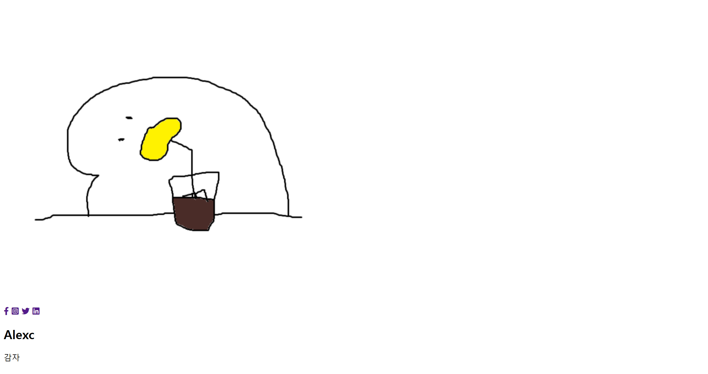
html과 css를 사용하여 Animated-Profile Card를 만들어 보았다.
HTML
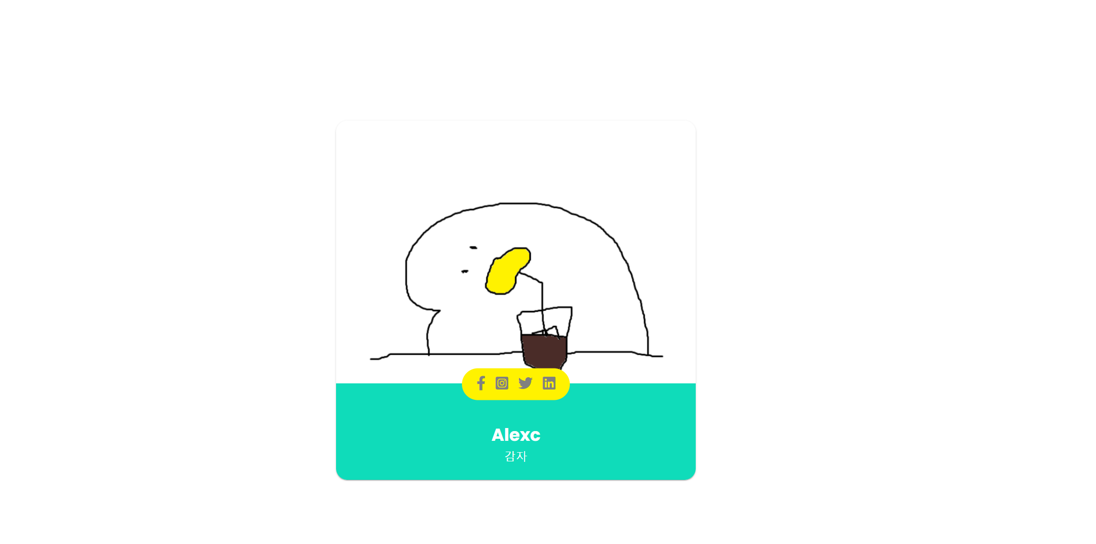
<!DOCTYPE html>
<html lang="en">
<head>
    <meta charset="UTF-8" />
    <meta name="viewport" content="width=device-width, initial-scale=1.0" />
    <title>profile_card</title>
    <script src="https://kit.fontawesome.com/7d4b429529.js" crossorigin="anonymous"></script> <!-- 아이콘 fontawesome -->
    <link rel="stylesheet" href="./style.css" />
</head>
<body>
    <article class="container">
        <img src="a.png" alt="profile photo" />
        <div class="title_container">
            <div class="icons_container">
                <div class="icons">
                    <a href="#"><i class="fab fa-facebook-f"></i></a>
                    <a href="#"><i class="fab fa-instagram-square"></i></a>
                    <a href="#"><i class="fab fa-twitter"></i></a>
                    <a href="#"><i class="fab fa-linkedin"></i></a>
                </div>
            </div>
            <div class="inner_container">
                <h2>Alexc</h2>
                <p>감자</p>
            </div>
        </div>
    </article>
</body>
</html>
CSS
body
@import url("https://fonts.googleapis.com/css2?family=Poppins:wght@200;300;400;500;600;700&display=swap");
* {
  margin: 0;
  padding: 0;
  box-sizing: border-box;
  font-family: "Poppins", sans-serif;
}
body {
  display: flex;
  justify-content: center;
  align-items: center;
  height: 100vh;
}
container, container img
.container {
  width: 500px;
  height: 500px;
  position: relative;
  box-shadow: 0px 2px 1px -1px rgba(0, 0, 0, 0.2),
    0px 1px 1px 0px rgba(0, 0, 0, 0.14), 0px 1px 3px 0px rgba(0, 0, 0, 0.12);
  border-radius: 16px;
  overflow: hidden;
}
.container img {
  width: 100%;
}
inner container, icon container
.inner_container {
  position: absolute;
  width: 500px;
  display: flex;
  flex-direction: column;
  align-items: center;
  justify-content: center;
  bottom: 0px;
  padding: 15px 0;
  background: #fff;
  height: 100px;
  transition: all 0.3s ease;
}
.icons_container {
  position: absolute;
  bottom: 80px;
  display: flex;
  justify-content: center;
  background: #fff;
  width: 500px;
  padding: 10px 0 0;
  transform: scaleY(0);
  transform-origin: bottom;
  transition: all 0.3s ease;
}
icons
.icons {
  transform: translateY(50%);
  padding: 10px 20px;
  border-radius: 30px;
  background: #fff;
  display: flex;
  justify-content: center;
  gap: 14px;
  transition: all 0.3s ease;
}
.icons i {
  font-size: 20px;
  color: grey;
}
.icons i a {
  color: grey;
}
hover
.container:hover .icons_container,
.container:hover .inner_container {
  transform: scaleY(1);
  background: rgb(15, 220, 186);
  color: #fff;
}
.container:hover .icons {
  transform: translateY(-70%);
  background: #fff200;
  color: grey;
}
.container:hover .icons > a {
  color: grey;
}
.icons a:hover i {
  color: rgb(15, 220, 186);
}

멋진 회오리 감자가 되는 그날까지 https://monicx.tistory.com/