반응형 웹(드림코딩)
반응형 웹 미디어 쿼리 사용
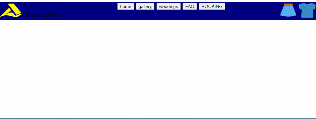
드림코딩에 나오는 반응형 nav바 만들기를 듣고
간단히 형태만 나올수 있도록 만들어 보았다.
움짤도 한번 만들어 보고싶어서 만들어 봤습니다.
@media screen and (max-width: 800px) {
  nav {
    background-color: aqua;
    display: flex;
    flex-direction: column;
  }

  .logo {
    display: flex;
    justify-content: space-between;
    align-items: center;
  }

  .context {
    display: flex;
    justify-content: center;
    flex-direction: column;
  }
max-width는 최대 800px 까지는 아래 css 적용하겠다는 뜻
min-width는 최소 800px 이상은 되야 css 적용한다는 뜻