ListView Animation 구현 비교(XML vs Jetpack Compose)

사진: Unsplash의 Thomas Bormans
서두
Jetpack Compose의 많은 장점들 중 가장 먼저 떠오르는 것은 ListView를 간결한 코드를 통해 구현할 수 있다는 점과, Animation을 쉽게 구현할 수 있다는 것이다.
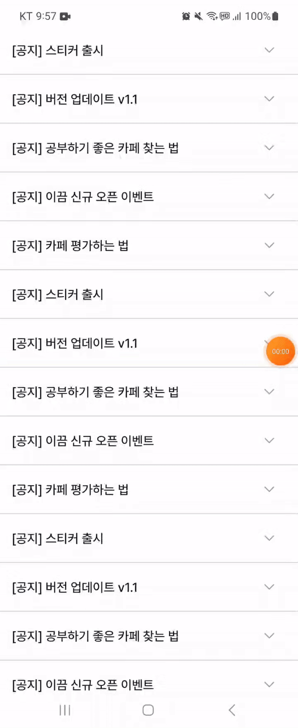
오늘은 위와 같은 많은 앱에서 사용되는 Dropdown 버튼을 눌렀을 경우 아이템뷰가 확장이 되는 리스트뷰를 xml과 Compose로 각각 구현해보는 것을 통해 코드를 비교해보도록 할 것이다.
XML
우선 XML에서는 RecyclerView를 통해 요구사항을 구현할 수 있다.
아는 것 처럼 RecyclerView 를 통해 뷰를 구현하는 경우 RecyclerView의 Adapter 와 ViewHolder 를 구현 해줘야 한다.(+ xml이므로 당연히 xml layout들도)
라이브러리와 BaseRecyclerViewAdapter 또는 BaseViewHolder를 사용하여 boilerplate 코드의 양을 조금이나마 줄일 수 있겠지만, 기본적인 코드 구성은 다음과 같다
NoticeAdapter
class NoticeAdapter(private var noticeList: List<NoticeItem>) :
    RecyclerView.Adapter<NoticeViewHolder>() {

    override fun onCreateViewHolder(parent: ViewGroup, viewType: Int) =
        NoticeViewHolder(
            ItemNoticeBinding.inflate(
                LayoutInflater.from(parent.context),
                parent,
                false
            )
        )

    override fun onBindViewHolder(holder: NoticeViewHolder, position: Int) {
        val notice = noticeList[position]
        holder.bind(notice)

        with(holder.binding) {
            clNotice.setOnClickListener {
                notice.isExpanded = !notice.isExpanded
                toggleLayout(notice.isExpanded, ivNoticeExpand)
                notifyItemChanged(position)
            }
        }
    }

    override fun getItemCount() = noticeList.size

    private fun toggleLayout(isExpanded: Boolean, view: View) {
        if (isExpanded) {
            view.animate().setDuration(200).rotation(180f)
        } else {
            view.animate().setDuration(200).rotation(0f)
        }
    }
}
커스텀하게 애니메이션을 만들어줄 수 있겠지만, RecyclerView의 Adapter에서 제공하는 Notify~ 함수를 사용할 경우 기본적으로 ItemView의 content의 fadeIn, Out, ItemView의 ExpandVertically, CollapseVertically Animation을 지원해주기 때문에 따로 커스텀한 애니메이션 관련 코드는 작성하지 않았다.
NoticeViewHolder
class NoticeViewHolder(val binding: ItemNoticeBinding) : RecyclerView.ViewHolder(binding.root) {

    fun bind(notice: NoticeItem) {
        currentItem = notice
        binding.apply {
            tvNoticeTitle.text = notice.title
            tvNoticeDate.text = notice.date
            tvNoticeDescription.text = notice.description
            ivNoticeExpand.rotation = if (notice.isExpanded) 180f else 0f
            llLayoutExpand.visibility = if (notice.isExpanded) View.VISIBLE else View.GONE
        }
    }
}
item_notice.xml
<?xml version="1.0" encoding="utf-8"?>
<androidx.constraintlayout.widget.ConstraintLayout xmlns:android="http://schemas.android.com/apk/res/android"
    xmlns:app="http://schemas.android.com/apk/res-auto"
    xmlns:tools="http://schemas.android.com/tools"
    android:layout_width="match_parent"
    android:layout_height="wrap_content"
    tools:ignore="HardcodedText">

    <androidx.constraintlayout.widget.ConstraintLayout
        android:id="@+id/cl_notice"
        android:layout_width="0dp"
        android:layout_height="wrap_content"
        android:paddingVertical="18dp"
        app:layout_constraintEnd_toEndOf="parent"
        app:layout_constraintStart_toStartOf="parent"
        app:layout_constraintTop_toTopOf="parent">

        <TextView
            android:id="@+id/tv_notice_title"
            style="@style/TextLMedium"
            android:layout_width="0dp"
            android:layout_height="wrap_content"
            android:layout_marginStart="16dp"
            android:layout_marginEnd="16dp"
            android:ellipsize="end"
            android:maxLines="1"
            android:textColor="@color/gray_900"
            app:layout_constraintBottom_toBottomOf="parent"
            app:layout_constraintEnd_toEndOf="@id/iv_notice_expand"
            app:layout_constraintStart_toStartOf="parent"
            app:layout_constraintTop_toTopOf="parent"
            tools:text="[공지] 공부하기 좋은 카페 찾는 방법" />

        <ImageView
            android:id="@+id/iv_notice_expand"
            android:layout_width="wrap_content"
            android:layout_height="wrap_content"
            android:layout_marginEnd="16dp"
            android:contentDescription="Search Keyword Delete"
            android:src="@drawable/ic_arrow_drop_down"
            app:layout_constraintBottom_toBottomOf="parent"
            app:layout_constraintEnd_toEndOf="parent"
            app:layout_constraintTop_toTopOf="parent" />

    </androidx.constraintlayout.widget.ConstraintLayout>

    <View
        android:id="@+id/line_notice_bottom"
        android:layout_width="0dp"
        android:layout_height="1dp"
        android:background="@color/gray_300"
        app:layout_constraintEnd_toEndOf="parent"
        app:layout_constraintStart_toStartOf="parent"
        app:layout_constraintTop_toBottomOf="@id/cl_notice" />

    <LinearLayout
        android:id="@+id/ll_layout_expand"
        android:layout_width="match_parent"
        android:layout_height="wrap_content"
        android:background="@color/gray_50"
        android:orientation="vertical"
        android:visibility="gone"
        app:layout_constraintTop_toBottomOf="@id/line_notice_bottom"
        tools:visibility="visible">

        <TextView
            android:id="@+id/tv_notice_date"
            style="@style/TextXsRegular"
            android:layout_width="match_parent"
            android:layout_height="wrap_content"
            android:layout_marginHorizontal="16dp"
            android:paddingTop="10dp"
            android:textColor="@color/gray_400" />

        <View
            android:layout_width="match_parent"
            android:layout_height="18dp"
            android:background="@color/gray_50" />

        <TextView
            android:id="@+id/tv_notice_description"
            style="@style/TextMRegular"
            android:layout_width="match_parent"
            android:layout_height="wrap_content"
            android:layout_marginHorizontal="16dp"
            android:ellipsize="end"
            android:maxLines="4"
            android:paddingBottom="18dp"
            android:textColor="@color/gray_500" />

    </LinearLayout>

</androidx.constraintlayout.widget.ConstraintLayout>
Activity
class ViewActivity : AppCompatActivity() {

    private val binding by lazy { ActivityViewBinding.inflate(layoutInflater) }

    private val noticeAdapter by lazy { NoticeAdapter(notices) }

    override fun onCreate(savedInstanceState: Bundle?) {
        super.onCreate(savedInstanceState)
        setContentView(binding.root)

        initView()
    }

    private fun initView() {
        binding.rvNotice.apply {
            adapter = noticeAdapter
            val colorDrawable = ColorDrawable(ContextCompat.getColor(context, R.color.gray_300))
            val dividerItemDecoration = DividerItemDecoration(context, DividerItemDecoration.VERTICAL)
            dividerItemDecoration.setDrawable(colorDrawable)
            addItemDecoration(dividerItemDecoration)
        }
    }
}
activity_view.xml
<?xml version="1.0" encoding="utf-8"?>
<androidx.constraintlayout.widget.ConstraintLayout xmlns:android="http://schemas.android.com/apk/res/android"
    xmlns:app="http://schemas.android.com/apk/res-auto"
    xmlns:tools="http://schemas.android.com/tools"
    android:layout_width="match_parent"
    android:layout_height="match_parent">

    <androidx.recyclerview.widget.RecyclerView
        android:id="@+id/rv_notice"
        android:layout_width="0dp"
        android:layout_height="wrap_content"
        android:layout_marginTop="16dp"
        app:layoutManager="androidx.recyclerview.widget.LinearLayoutManager"
        app:layout_constraintEnd_toEndOf="parent"
        app:layout_constraintStart_toStartOf="parent"
        app:layout_constraintTop_toTopOf="parent"
        tools:listitem="@layout/item_notice" />

</androidx.constraintlayout.widget.ConstraintLayout>
...간단한 기능이지만 상당히 많은 코드를 필요로 하는 걸 확인할 수 있다.
커스텀한 애니메이션을 추가하거나, 클릭리스너를 interface로 빼내서 구현할 경우 좀 더 코드가 늘어날 수도 있을 것이다.
참고로 클릭 리스너를 ViewHolder내에 init 블록에서 구현 함으로써, onBindViewHolder가 호출될때마다 클릭리스너를 재설정하지 않도록 하여, 오버헤드를 줄일 수도 있다.
하지만 ViewHolder에서는 adapter의 notify~ 함수를 호출 할 수 없기에, 이를 우회하는 방식으로 구현을 해야하며, 그 로직이 복잡해지게 되므로, 편의상 onBindViewHolder에서 클릭리스너를 설정해주는 방식으로 코드를 작성하였다.
Jetpack Compose
Compose 에선 코드가 어떻게 달라질까?
Jetpack Compose 에서는 LazyColumn을 통해 이를 구현할 수 있다.
NoticeCard
@Composable
fun NoticeCard(
    modifier: Modifier = Modifier,
    date: String,
    title: String,
    description: String,
) {
    var expandedState by remember { mutableStateOf(false) }
    val rotationState by animateFloatAsState(targetValue = if (expandedState) 180f else 0f)

    Box(
        modifier = modifier
            .fillMaxWidth()
            .noRippleClickable {
                expandedState = !expandedState
            }
    ) {
        Column(modifier = Modifier.fillMaxWidth()) {
            Row(
                modifier = Modifier.padding(
                    start = 16.dp,
                    end = 16.dp,
                    // 기본적으로 위아래로 padding 이 존재하는게 확인되어 더 적은 수치로 적용
                    top = 9.dp,
                    bottom = 9.dp
                ),
                verticalAlignment = Alignment.CenterVertically,
            ) {
                Text(
                    modifier = Modifier.weight(1f),
                    text = title,
                    color = Gray900,
                    style = TextLMedium,
                    maxLines = 1,
                    overflow = TextOverflow.Ellipsis
                )
                IconButton(
                    modifier = Modifier
                        .padding(start = 16.dp)
                        .rotate(rotationState),
                    onClick = { expandedState = !expandedState }
                ) {
                    val image = painterResource(
                        id = R.drawable.ic_arrow_drop_down,
                    )
                    Image(
                        painter = image,
                        contentDescription = "Delete",
                    )
                }
            }
            AnimatedVisibility(visible = expandedState) {
                ExpandedContent(
                    date = date,
                    description = description
                )
            }
        }
    }
}

@Composable
fun ExpandedContent(
    modifier: Modifier = Modifier,
    date: String,
    description: String
) {
    Column(
        modifier = modifier
            .fillMaxWidth()
            .background(color = Gray50)
            .padding(start = 16.dp, end = 16.dp, top = 10.dp, bottom = 18.dp)
    ) {
        Text(
            text = date,
            color = Gray400,
            style = TextXsRegular,
        )
        Spacer(modifier = Modifier.height(18.dp))
        Text(
            text = description,
            color = Gray500,
            style = TextMRegular,
            maxLines = 4,
            overflow = TextOverflow.Ellipsis
        )
    }
}
Activity
class ComposeActivity : ComponentActivity() {
    override fun onCreate(savedInstanceState: Bundle?) {
        super.onCreate(savedInstanceState)
        setContent {
            ExpandableListTheme {
                Surface(color = Color.White) {
                    LazyColumn {
                        itemsIndexed(notices) { index, _ ->
                            NoticeCard(
                                title = notices[index].title,
                                date = notices[index].date,
                                description = notices[index].description
                            )
                            if (index < notices.lastIndex)
                                Divider(color = Gray300, thickness = 1.dp)
                        }
                    }
                }
            }
        }
    }
}
끝이다... wow
RecyclerView를 대체하는 녀석이긴 하지만, 그 동작 방식은 다르기에 DividerItemDecoration과 같은 것은 어떤식으로 적용해야할지 궁금했었는데 그냥 item 아래에 Divider를 넣어주면 되는 형식이었다. DividierItemDecoration과 같이 마지막 아이템의 아래에는 구분선이 존재하지 않아야하므로 itemsIndexed를 사용하여 index를 통해 분가 처리를 해주었다.
@Composable
fun ColumnScope.AnimatedVisibility(
    visible: Boolean,
    modifier: Modifier = Modifier,
    enter: EnterTransition = fadeIn() + expandVertically(),
    exit: ExitTransition = fadeOut() + shrinkVertically(),
    label: String = "AnimatedVisibility",
    content: @Composable AnimatedVisibilityScope.() -> Unit
) {
    val transition = updateTransition(visible, label)
    AnimatedEnterExitImpl(transition, { it }, modifier, enter, exit, content)
}
AnimatedVisibility 내부 구현을 확인해보면 enter와 exit의 기본 값이 수직 확장, 축소이므로 별도로 animation을 명시해주지 않았다.(아마 가장 많이 쓰이는 animation이기에 기본값으로 할당해둔 것으로 추측된다.)
다양한 애니메이션들을 지원해주기 때문에 개발에 편의성이 정말 좋아진 것을 확인할 수 있었다.
참고로 animation이 xml과 살짝 다른 부분이 있긴하다.
adapter.notify함수에서 제공하는 animation은 확장, 축소되는 뷰가 애니메이션이 진행되는 동안 뷰의 content가 fadeIn, fadeOut만 되는데,
AnimatedVisibility로 구현한 animation은 확장, 축소되는 뷰의 content가 위 아래로 움직여서 글의 썸네일처럼 숨겨져 있다가 아래로 나오고 다시 들어가는 것 처럼 보인다.
github에서 비교 영상을 확인할 수 있다.
또한, 다음과 같이 별도로 애니메이션 관련 코드를 몇줄 정도 지정 해주면
           AnimatedVisibility(
                visible = expandedState,
                enter = fadeIn() + expandVertically(
                    animationSpec = spring(
                        dampingRatio = Spring.DampingRatioMediumBouncy,
                        stiffness = Spring.StiffnessLow
                    )
                )
            ) {
                ExpandedContent(
                    date = date,
                    description = description
                )
            }
다음과 같이 통통 튀는 애니메이션을 구현할 수 있다. xml에서는 어떻게 구현 해야할지 머리가 아프다...
느낀점
xml의 코드가 익숙하긴 하지만, 추가적으로 애니메이션 등을 커스텀하게 구현할 때 숙련도가 부족하여 어려움을 느꼈는데, Compose로는 손쉽게 구현할 수 있어, Compose가 가지고 있는 강력함을 확인할 수 있었다.
처음에 Compose를 배우면서 Compose가 Android 개발에 진입 장벽을 낮춰준다고들 하였을때, 코루틴과 아키텍처의 개념과 같은 것들을 기본적으로 알고 있어야 한다고 생각하여 동의하지 않았다(학습을 하면 할수록, UI의 상태관리와 관련하여 어려운 부분들도, 존재하기에)
그런데 뭐 하면 할수록 어려운건 무엇이든 똑같은 것 같고, 이번에 다룬 주제에선 확실히 Compose가 비교적 훨씬 적은 코드로 요구사항을 손쉽게 구현 할 수 있기에, 입문자 분들도 충분히 구현할 수 있을 것 같다는 생각이 들었다.
아래 레포의 링크를 통해 전체 코드를 확인할 수 있습니다.
https://github.com/easyhooon/ExpandableList
reference)
https://android-dev.tistory.com/59
https://youtu.be/Hjb_JSxM4uE?si=7WKMs3z1L1gPgE_V
https://github.com/easyhooon/DiaryApp/blob/master/core/util/src/main/java/com/example/util/DiaryHolder.kt
https://betterprogramming.pub/recyclerview-expanded-1c1be424282c
https://medium.com/@nikola.jakshic/how-to-expand-collapse-items-in-recyclerview-49a648a403a6