Flexbox
요소들을 가로로 나란히 놓거나, 세로 가운데 정렬을 하거나, 공간을 균등하게 나누는 작업이 Flexbox 이전에는 꽤 까다로웠다. float를 쓰거나, inline-block에 여백을 계산하거나. Flexbox가 등장하면서 이런 레이아웃 작업이 직관적으로 바뀌었다.
Flexbox 기본
display: flex를 부모에 지정하면 Flexbox가 활성화된다. 자식 요소들이 flex item이 된다.
<div class="container">
  <div class="item">A</div>
  <div class="item">B</div>
  <div class="item">C</div>
</div>
.container {
display: flex;
}기본적으로 자식들이 가로로 나란히 배치된다.
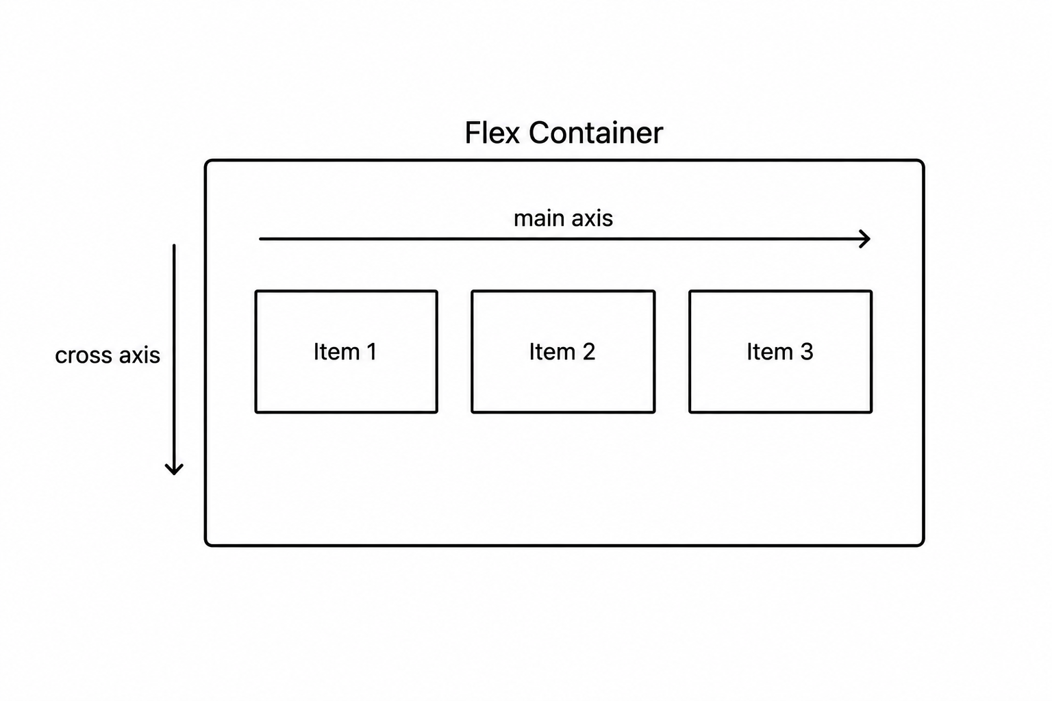
주축과 교차축
Flexbox는 두 개의 축을 기준으로 동작한다.
- 주축(main axis) — 아이템이 나열되는 방향
- 교차축(cross axis) — 주축과 수직인 방향
flex-direction — 주축 방향
.container {
flex-direction: row; /* 가로 (기본값) */
flex-direction: row-reverse; /* 가로 역방향 */
flex-direction: column; /* 세로 */
flex-direction: column-reverse; /* 세로 역방향 */
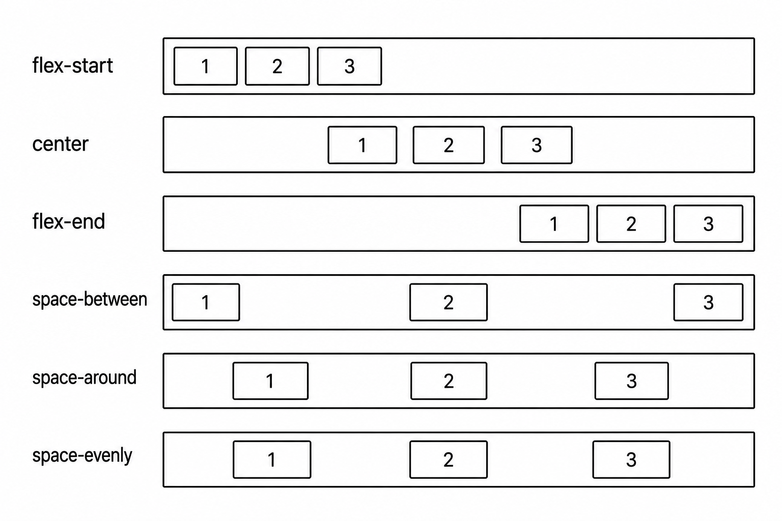
}justify-content — 주축 정렬
아이템들을 주축 방향으로 어떻게 배치할지 지정한다.
.container {
  justify-content: flex-start;    /* 시작점에 모음 (기본값) */
  justify-content: flex-end;      /* 끝점에 모음 */
  justify-content: center;        /* 가운데 */
  justify-content: space-between; /* 양 끝 고정, 사이 균등 */
  justify-content: space-around;  /* 아이템 양쪽에 균등 여백 */
  justify-content: space-evenly;  /* 모든 여백 균등 */
}
align-items — 교차축 정렬
아이템들을 교차축 방향으로 어떻게 배치할지 지정한다.
.container {
  align-items: stretch;     /* 교차축 방향으로 늘림 (기본값) */
  align-items: flex-start;  /* 교차축 시작점 */
  align-items: flex-end;    /* 교차축 끝점 */
  align-items: center;      /* 교차축 가운데 */
  align-items: baseline;    /* 텍스트 기준선 맞춤 */
}
가운데 정렬
Flexbox로 수평·수직 가운데 정렬을 가장 간단하게 할 수 있다.
.container {
  display: flex;
  justify-content: center; /* 주축(가로) 가운데 */
  align-items: center;     /* 교차축(세로) 가운데 */
  height: 300px;
}
flex-wrap — 줄바꿈
아이템이 컨테이너를 넘칠 때 줄바꿈 여부를 지정한다.
.container {
  flex-wrap: nowrap;   /* 줄바꿈 없음 (기본값) — 넘쳐도 한 줄 */
  flex-wrap: wrap;     /* 넘치면 다음 줄로 */
}
flex — 아이템의 크기 비율
자식 아이템에 지정하는 속성이다. 남은 공간을 어떻게 나눌지 비율로 설정한다.
.item-a { flex: 1; }  /* 1 비율 */
.item-b { flex: 2; }  /* 2 비율 — item-a의 두 배 */
.item-c { flex: 1; }  /* 1 비율 */
/* 전체 4 비율 → a: 25%, b: 50%, c: 25% */
align-self — 개별 아이템 교차축 정렬
align-items는 모든 아이템에 적용되지만, 특정 아이템만 다르게 하고 싶을 때 쓴다.
.item-special {
  align-self: flex-end;
}
자주 쓰는 Flexbox 패턴
/* 가로 네비게이션 */
nav {
  display: flex;
  justify-content: space-between;
  align-items: center;
}

/* 카드 그리드 */
.card-list {
  display: flex;
  flex-wrap: wrap;
  gap: 16px;
}

/* 세로 가운데 정렬 */
.hero {
  display: flex;
  flex-direction: column;
  justify-content: center;
  align-items: center;
  height: 100vh;
}
gap 속성으로 아이템 사이 간격을 한 번에 설정할 수 있다.
Flexbox는 1차원(가로 또는 세로) 레이아웃에 최적화되어 있다. 가로 정렬과 세로 정렬의 기준이 되는 주축과 교차축만 머릿속에 있으면, justify-content와 align-items가 자연스럽게 읽힌다.

<- 개발 공부하는 나