
간단한 메뉴 구현
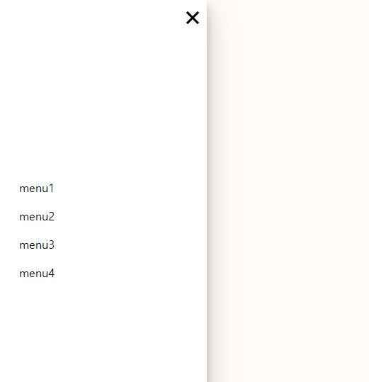
이미지를 이용해서 햄버거 버튼 클릭 시 사이드에 메뉴바가 나오는 것을 구현해보았다.
HTML
<body>
  <div class="box">
    <div class="container">
        <div class="header-menu">
          <button><img src="../javascript/img/close_btn.png" alt="close_btn"></button>
        </div>

      <ul class="top-menu">
        <li class="menu-items"><a href="#">menu1</a></li>
        <li class="menu-items"><a href="#">menu2</a></li>
        <li class="menu-items"><a href="#">menu3</a></li>
        <li class="menu-items"><a href="#">menu4</a></li>
      </ul>

        <ul class="bottom-menu">
          <li class="bottom-menu-item"></li>
        </ul>
      </div>
    </div>

  <div class="open-menu">
  	<button><img src="../javascript/img/menu_btn.webp"></button>
  </div>

</body>
CSS
<style>
  body { height: 100%; margin: 0; background: #fffbf6; color: black; font-family: 'Roboto', sans-serif; }
  .box { height: 100vh; width: 300px; position: absolute; left: -350px; z-index: 1001; background: white; overflow: hidden; text-align: left;
  -webkit-transition: -webkit-transform 250ms ease-in-out;
  transition: transform 250ms ease-in-out;
  }
  li { list-style-type: none; padding: 0px 0px 0px 0px; }
  ul { padding: 0px; margin: 0px; }
  button:focus { outline: none; }
  .active {
  -webkit-transform: translateX(350px);
  -moz-transform: translateX(350px);
  -o-transform: translateX(350px);
  -ms-transform: translateX(350px);
  transform: translateX(350px);
  box-shadow: 0 19px 38px rgba(78, 78, 78, 0.3), 0 15px 12px rgba(78, 78, 78, 0.3);
  -moz-box-shadow: 0 19px 38px rgba(78, 78, 78, 0.3), 0 15px 12px rgba(78, 78, 78, 0.3);
  -webkit-box-shadow: 0 19px 38px rgba(78, 78, 78, 0.3), 0 15px 12px rgba(78, 78, 78, 0.3);
  }
  .open-menu {display: inline-block;}
  .open-menu button { display: inline; z-index: 0; background: transparent; border: none; margin-top: 10px; margin-left: 25px; padding: 0px; cursor: pointer; }
  .open-menu img { width: 30px; height: 30px; }
  .header-menu { height: 50px; background-color: white; margin-bottom: 200px }
  .header-menu button { position: relative; left: 260px; background: transparent; border: none; margin-top: 10px; padding: 0px; cursor: pointer; }
  .header-menu img { width: 40px; height: 40px; }
  .top-menu { margin-top: 35px; }
  .top-menu a { text-decoration: none; color: black; font-weight: 500; font-size: 16rem; display: block; line-height: 40px; padding-left: 35px;  transition: .8s; }
  .top-menu a:hover { color: #74b5ff; transition: .5s; }
  .bottom-menu { position: absolute; bottom: 0px; width: 300px; background-color: white; text-align: center; }
  .bottom-menu li { padding-top: 20px; padding-bottom: 20px; padding-left: 0px; color: black; font-weight: 700; font-size: 13px; }

</style>
script
<script>
  $(function() {
    const box = $('.box');
    const button = $('.open-menu, .header-menu');
    button.on('click', function(){
        box.toggleClass('active');
    });
  });
</script>

Web publisher