🌊 Install 하기
https://mui.com/
mui 홈페이지 메인에서 설치 명령어를 복붙해서 설치한다
npm install @mui/material @emotion/react @emotion/stylednpm audit 에러가 나는데 무시하고 package.json에 라이브러리가 잘 설치됐는지 확인한다.
(package.json 의 dependencies에 추가된다)
❄️ Button 컴포넌트 사용하기
mui component 메뉴의 Button으로 가면 아래와 같이 샘플코드가 뜨는데
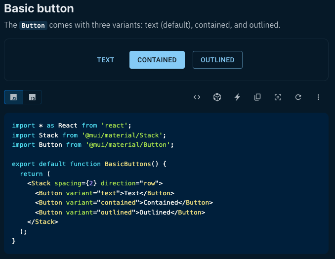
컴포넌트를 import 해주고 해당 태그를 사용하면서 variant 속성값으로 디자인한다.
그리고 페이지의 최하단에 해당 컴포넌트 API 링크가 있는데
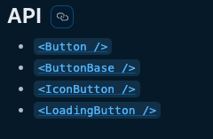
컴포넌트의 props 속성들을 볼 수 있다.
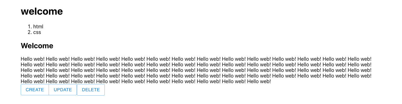
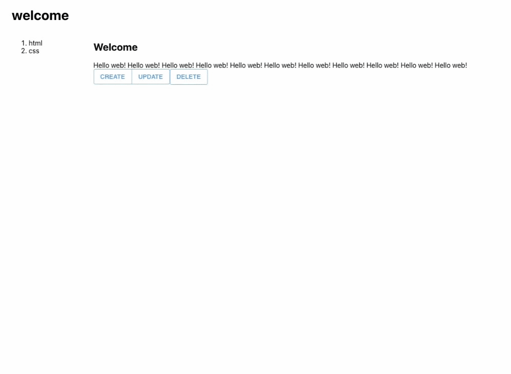
🌨️ ButtonGroup 컴포넌트 사용하기
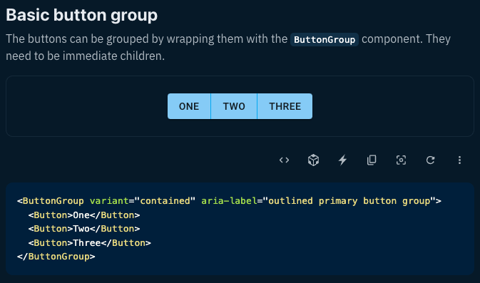
예를들어 Create, Update, Delete 버튼에서 Create 와 Update 버튼만 그룹핑할때 사용한다.
똑같이 컴포넌트 메뉴에서 Button Group 으로 가서 import 하고 사용한다.
function Article() {
  return (
    <article>
      <h2>Welcome</h2>
      Hello web!
      <br/>
      <ButtonGroup>
        <Button variant='outlined'>Create</Button>
        <Button variant='outlined'>Update</Button>
      </ButtonGroup>
      <Button variant='outlined'>Delete</Button>
    </article>
  )
}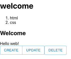
이렇게 두개 버튼이 묶여졌다.
☃️ Layout 컴포넌트 사용하기
🌨️ Container
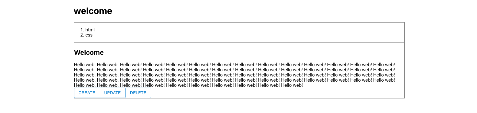
Container 컴포넌트를 사용하면 페이지의 양쪽 여백을 같게하면서 컨텐츠를 중앙에 배치해준다.
Fluid Container : max-width까지 화면에 꽉차게 배치한다.
Fixed Container : 고정된 값으로 반응형 width를 잡는다.
동일하게 import 하고 사용해준다.
🫧 fluid 인 경우
function App() {
  return (
    <Container maxWidth='sm' className="App">
      <Header></Header>
      <Nav></Nav>
      <Article></Article>
    </Container>
  );
}
지정한 max-width 까지는 화면에 꽉차게 텍스트가 배치되고,
그 이상일 경우 고정값을 유지한다.
🫧 fixed 인 경우
function App() {
  return (
    <Container fixed className="App">
      <Header></Header>
      <Nav></Nav>
      <Article></Article>
    </Container>
  );
}
각 반응형 width 별로 효율적으로 크기를 가져간다.
🌨️ Grid
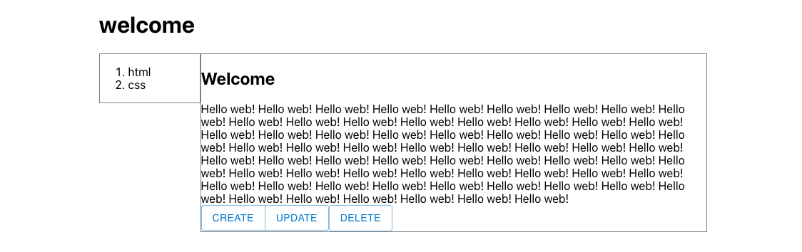
MUI의 Grid는 Bootstrap과 같이 화면을 12등분으로 가져간다.
동일하게 import 해주고 사용한다.
현재 수직정렬 되어있는 2개의 컨텐츠를 (border로 표시해둔 곳) 수평정렬 해보자.
function App() {
  return (
    <Container fixed className="App">
      <Header></Header>
      <Grid container>
        <Grid item xs={2}>
          <Nav></Nav>
        </Grid>
        <Grid item xs={10}>
          <Article></Article>
        </Grid>
      </Grid>
    </Container>
  );
}
Grid를 사용할 컴포넌트 (Nav 와 Article) 상단에 각각 Grid 컴포넌트를 추가하고, 또 그 상단에 Grid 컴포넌트로 묶어준다.
최상단 Grid 에는 container 속성을, 각각 하위 Grid 에는 item 속성을 넣어주고
xs 속성으로 각 Grid의 사이즈를 지정한다.
(xs 가 2 인경우 전체(12) 중에 2만큼의 영역을 차지한다)
⛄️ Dialog 컴포넌트 사용하기
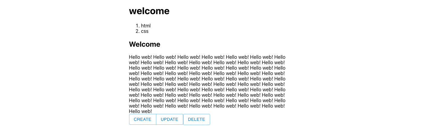
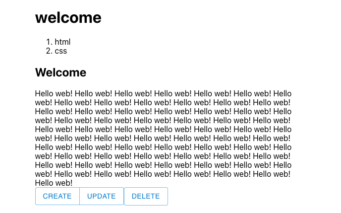
우선 Grid 를 위해 넣어준 style border 를 삭제하고, Article 에 긴 텍스트들도 정리해준다.
Create 버튼을 클릭하면 Dialog 가 뜨고, 그 내부에 있는 Cancel 버튼 클릭시 다시 Dialog 숨기기를 해보자.
우선 필요 컴포넌트 import
( state도 사용할거기때문에 import 해준다 )
import React, { useState } from 'react';
import Dialog from '@mui/material/Dialog';
import DialogActions from '@mui/material/DialogActions';
import DialogContent from '@mui/material/DialogContent';
import DialogContentText from '@mui/material/DialogContentText';
import DialogTitle from '@mui/material/DialogTitle';
우선 Dialog 부터 띄워보자 !
기본 Dialog 샘플코드를 가져와서 버튼만 추가해줬다.
function Article() {
const [open, setOpen] = useState(false);
return (
<article>
<h2>Welcome</h2>
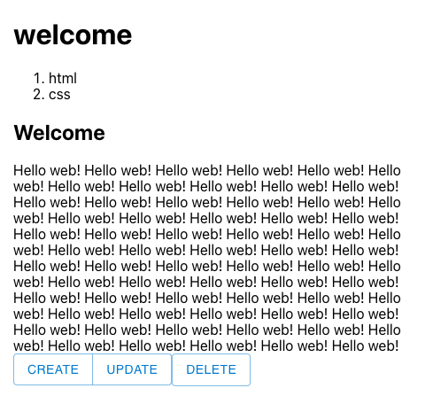
Hello web! Hello web! Hello web! Hello web! Hello web! Hello web! Hello web! Hello web! Hello web! Hello web! Hello web!
<br/>
<ButtonGroup>
<Button variant='outlined'>Create</Button>
<Button variant='outlined'>Update</Button>
</ButtonGroup>
<Button variant='outlined'>Delete</Button>
<Dialog open={true}>
<DialogTitle>Create</DialogTitle>
<DialogContent>
<DialogContentText>
Hello Created !!
</DialogContentText>
</DialogContent>
<DialogActions>
<Button variant='outlined'>Create</Button>
<Button variant='outlined'>Cancel</Button>
</DialogActions>
</Dialog>
</article>
)
}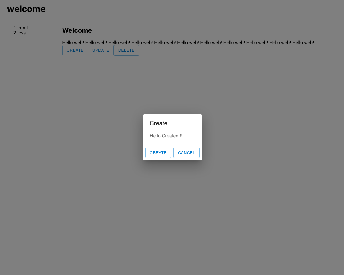
Dialog 컴포넌트에 open 속성값이 true 로 지정되어있기 때문에 무조건 Dialog가 노출된다.
Create 버튼을 클릭시에만 Dialog가 노출되고, 내부에 Cancel 버튼을 클릭시 다시 숨겨보자.
function Article() {
  const [open, setOpen] = useState(false);

  return (
    <article>
      <h2>Welcome</h2>
      Hello web! Hello web! Hello web! Hello web! Hello web! Hello web! Hello web! Hello web! Hello web! Hello web! Hello web!
      <br/>
      <ButtonGroup>
        <Button
          variant='outlined'
          onClick={() => {
            setOpen(true);
          }}>Create</Button>
        <Button variant='outlined'>Update</Button>
      </ButtonGroup>
      <Button variant='outlined'>Delete</Button>
      <Dialog open={open}>
        <DialogTitle>Create</DialogTitle>
        <DialogContent>
          <DialogContentText>
            Hello Created !!
          </DialogContentText>
        </DialogContent>
        <DialogActions>
          <Button variant='outlined'>Create</Button>
          <Button
            variant='outlined'
            onClick={() => {
              setOpen(false);
            }}>Cancel</Button>
        </DialogActions>
      </Dialog>
    </article>
  )
}
open state를 사용해서 Create 버튼 클릭시 {open} 을 true 로,
Cancel 버튼 클릭시 {open} 을 false 로 바꿔준다.
예뿌다
끗 - 😎