📌학습 내용
📖 transform
💡 rotate
• 오브젝트를 2차원으로 회전시킴
• 음수값: 왼쪽으로 회전
• 양수값: 오른쪽으로 회전
transform: rotate(-15deg);
💡 scale
• (width, height)값에 주어진 배율대로 크기 변화
• 축소할 때는 0~1까지 숫자 부여
transform: scale(2, 3);
💡 skew
• 오브젝트를 3차원으로 회전시킴
• (x축, y축) 순서로 적어줌
transform: skew(10deg, 20deg);
💡 translate
• 오브젝트의 위치를 변경함
•(x축, y축) 순서로 적어줌
transform: translate(100px, 100px);
💡 prefix
각 브라우저의 하위버전에 'html과 css 표준에 정의되지 않은 실험적인 기능'을 적용할 때 붙여줌
        -webkit-transform: rotate(10deg);   /*크롬&사파리*/
        -moz-transform: rotate(10deg);   /*파이어폭스*/
        -ms-transform: rotate(10deg);   /*익스플로러*/
        -o-transform: rotate(10deg);   /*오페라*/
        transform: rotate(10deg);
📖 transition
애니메이션이 변화하는 과정을 보여주도록 컨트롤함
        transition-property: width;
        /*적용 영역*/

        transition-duration: 2s;
        /*지속 시간*/

        transition-timing-function: linear;
        /*속도의 성격*/

        transition-delay: 1s;
        /*마우스를 올리거나 내린 후 1s 뒤 변화 시작*/
timing-function종류
linear : (가장 많이 사용) 균일하게
ease : (기본값) 잠깐 느리게 빠르게 느리게
ease-in : 느리게 시작했다가 빠르게 끝남
ease-out : 빠르게 시작했다가 느리게 끝남
ease-in-out : 느리게 빠르게 느리게
💡 웹페이지 로딩 효율을 높이기 위해 한 줄로 정리
• duration과 delay 순서는 꼭 지켜줄 것: 先 duration 後 delay
• 숫자값을 하나만 입력하면 duration으로 인식함
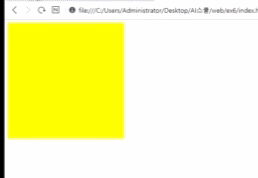
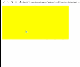
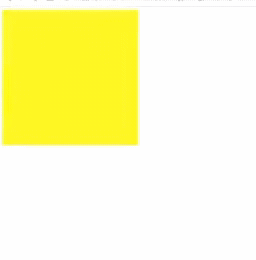
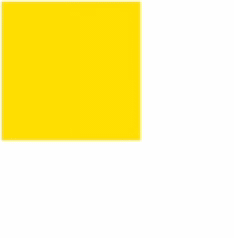
transition: width 2s linear 1s;🔎 transition 전
🔎 transition 후
📖 animation
💡 animation을 적용할 때는 @keyframes도 함께
      .animation {
          width: 300px;
          height: 300px;
          background-color: yellow;

          animation-name: changeWidth; /*이름 원하는대로*/
          animation-duration: 3s;
          animation-timing-function: linear;
          animation-delay: 1s;

          animation-iteration-count: 6; /*진행 횟수*/
          animation-direction: alternate; /*진행 방향*/
      }
• 방향을 지정할 때 normal은 기본 정방향
• alternate를 사용하면 한 방향으로 움직일 때마다 진행 횟수를 셈하므로 iteration-count를 6으로 입력하면 3회 왔다갔다 움직임
• animation-iteration-count: infinite;: 진행 무한반복
        @keyframes changeWidth {
            from {
                width: 300px;
                height: 300px;
                background-color: yellow;
            }

            to {
                width: 600px;
                height: 600px;
                background-color: pink;
            }
        }
• from to 는 0% 100%로 써줘도 됨 = 중간 과정 지정 가능!
          50% {
              background-color: orange;
          }
💡 키즈가오 사자 움직임 따라해보기

        .spin-lion {
            width: 150px;
            height: 150px;
            background-color: blue;

            animation-name: spinLion;
            animation-duration: 1.5s; /*=1500ms*/
            animation-timing-function: linear;
            animation-iteration-count: infinite;
            animation-direction: alternate;
        }

        @keyframes spinLion {
            from { transform: rotate(-10deg); }

            to { transform: rotate(10deg); }
        }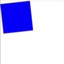
• 위 코드 한 줄로 정리하기
animation: spinLion 1.5s linear infinite alternate;💡 prefix
animation에 prefix를 적용할 때는 @keyframes에도 함께 적용해줘야 함
      -webkit-animation: spinLion 1.5s linear infinite alternate;
      animation: spinLion 1.5s linear infinite alternate;


      @-webkit-keyframes spinLion {
          from { -webkit-transform: rotate(-10deg); }

          to { -webkit-transform: rotate(10deg); }
      }
      @keyframes spinLion {
          from { transform: rotate(-10deg); }

          to { transform: rotate(10deg); }
      }
⭐ 다양한 애니메이션 움직임 코드 사용
https://jeremyckahn.github.io/stylie/
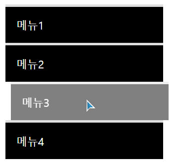
📖 실습(1) - 메뉴버튼
• 기본 디자인 적용
      .mouse-animation li {
          width: 250px;
          background-color: #000000;
          padding: 20px;

          border-top: solid 5px #dfdfdf;
      }

      .mouse-animation li a {
          color: #ffffff;
          font-size: 20px;
      }
• hover와 transition 적용
      .mouse-animation li {
          transition: opacity 0.5s, margin-left 0.5s;
      }

      .mouse-animation li:hover {
          opacity: 0.5;
          margin-left: 10px;
      }
메뉴 전체에 opacity를 적용하여 글씨 투명도에도 영향이 갈 수 있음
그 점을 피하기 위해서 rgba로 배경색만 지정하여 변경하는 법을 더 권장
      .mouse-animation li {
          background-color: rgba(0, 0, 0, 1)
      }

      .mouse-animation li:hover {
          background-color: rgba(0, 0, 0, 1);
          margin-left: 10px;
      }
⭐ 결과
📖 실습(2) - 무빙 박스
• 기본 디자인 적용
      .move-box {
          position: relative;
          width: 200px;
          height: 200px;
          background-color: red;

          animation-name: moveBox;
          animation-duration: 4s;
          animation-timing-function: linear;
          animation-delay: 1s;
          animation-iteration-count: infinite;
          animation-direction: alternate;
      }
• 색 변화
      @keyframes moveBox {
          0% {
              background-color: red;
          }
          25% {
              background-color: yellow;
          }
          50% {
              background-color: gray;
          }
          75% {
              background-color: blue;
          }
          100% {
              background-color: red;
          }
      }
• 움직임과 모양 변화 적용
      @keyframes moveBox {
          0% {
              left: 0;
              top: 0;
          }
          25% {
              left: 500px;
              top: 0;
          }
          50% {
              left: 500px;
              top: 500px;
              border-radius: 50%;
          }
          75% {
              left: 0;
              top: 500px;
          }
          100% {
              left: 0;
              top: 0;
          }
      }
• animation-play-state: running / paused
• animation-fill-mode: backwards;: 오브젝트의 원래 색과는 상관없이 animation 0% 속성값으로 최초 상태를 표현해줘 연결을 자연스럽게 함
      .move-box {
          background-color: red;

          animation-play-state: paused;
          animation-fill-mode: backwards;
      }

      @keyframes moveBox {
          0% {
              background-color: green;
          }
📖 실습(3) - 부모자식 애니메이션 적용
📎html
        <div class="outer-border">
            <div class="inner-border"></div>
        </div>
• 부모에 기본 디자인 적용
        .outer-border {
            display: flex;
            justify-content: center;
            align-items: center;

            width: 200px;
            height: 200px;
            border: solid 15px red;
            border-radius: 50%;

            margin: 0 auto;
            margin-top: 200px;

            animation: outerBorder 2s infinite;
        }

        @keyframes outerBorder {
            0% { border-color: red; }
            25% { border-color: yellow; }
            50% { border-color: blue; }
            75% { border-color: green; }
            100% { border-color: pink; }
        }
• 크기 변화 주기
        @keyframes outerBorder {
            0% { transform: scale(1); }
            25% { transform: scale(1.2); }
            50% { transform: scale(1.3); }
            75% { transform: scale(1.2); }
            100% { transform: scale(1); }
        }
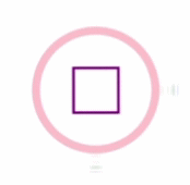
• 자식 디자인 적용
        .inner-border {
            width: 75px;
            height: 75px;
            border:  solid 5px purple;
        }
🔎 자식 영역이 부모의 scale을 상속받아 함께 크기 변화함

• 자식 회전시키기
        .inner-border {
            box-sizing: border-box;
            animation: innerBorder 2s infinite;
        }

        @keyframes innerBorder {
            0% { transform: rotate(0deg); }
            25% {}
            50% {}
            75% {}
            100% { transform: rotate(360deg); }
        }
• 테두리 색상과 굵기 변화시키기
        @keyframes innerBorder {
            0% { transform: rotate(0deg); }
            25% { border-color: blue;
                border-width: 10px; }
            50% { border-color: yellow;
                border-width: 20px; }
            75% { border-color: green;
                border-width: 40px; }
            100% { border-color: gray;
                border-width: 5px;
                transform: rotate(360deg); }
        }
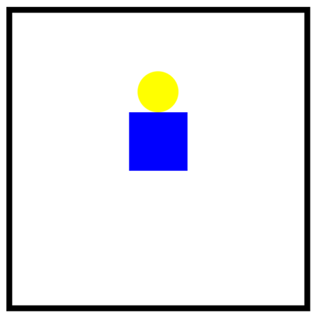
📖 실습(4) - 슈퍼마리오 동전
• 기본 디자인 적용
📎html
        <div class="mario-container">
                <div class="mario-coin"></div>
                <div class="mario-box"></div>
            </div>
📎CSS
        .mario-container {
            position: relative;

            width: 500px;
            height: 500px;
            border: solid 10px black;

            margin: 0 auto;
            margin-top: 200px;
        }

        .mario-container .mario-coin {
            position: relative;

            width: 70px;
            height: 70px;
            background-color: yellow;
            border-radius: 50%;

            margin: 0 auto;
            margin-top: 100px;
        }

        .mario-container .mario-box {
            width: 100px;
            height: 100px;
            background-color: blue;

            margin: 0 auto;
} 
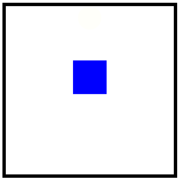
• box와 coin에 점프 효과 주기
.mario-container .mario-box {
	animation: jumpBox 0.5s linear infinite alternate ;
}

@keyframes jumpBox {
	0% { transform: translateY(0px) }
	50% { transform: translateY(-10px) }
	100% { transform: translateY(0px) }
}

/*coin은 아래로 내려오지 않고 위로 올라가 사라지도록*/
.mario-container .mario-coin {
	animation: jumpCoin 0.8s linear infinite alternate;
}

@keyframes jumpCoin {
	0% {
		transform: translateY(0px);
		opacity: 1;
	}
	50% {
		transform: translateY(-100px);
		opacity: 0.5;
	}
	100% {
		transform: translateY(-100px);
		opacity: 0;
	}
}
• coin 회전시키기
@keyframes jumpCoin {
	50% {
		transform: translateY(-100px) rotateY(180deg);
		opacity: 0.5;
	}
	100% {
		transform: translateY(-100px) rotateY(360deg);
		opacity: 0;
	}
}
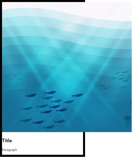
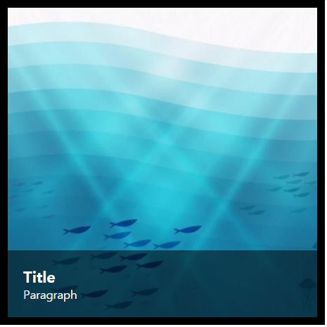
📖 실습(4) - hover 이미지 확대
📎html
        <div class="hover-image">
            <img src="url">

            <div class="image-info">
                <h2>Title</h2>
                <p>Paragraph</p>
            </div>
        </div>
📎CSS
        .hover-image {
            width: 400px;
            border: solid 10px #000000;
        }
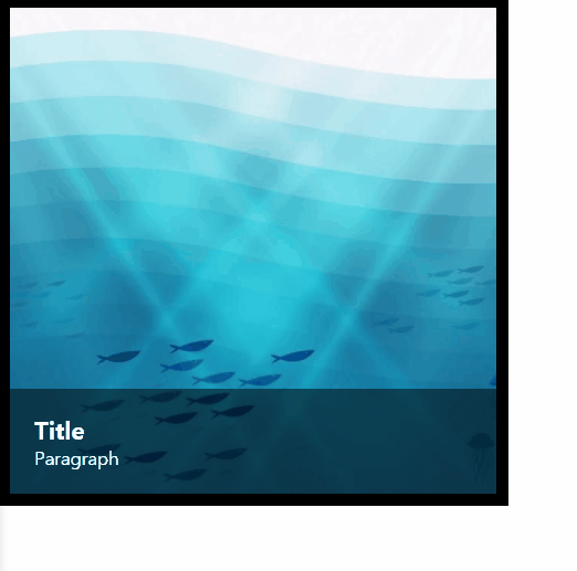
• border 영역 안으로 이미지 넣어주기
        .hover-image img {
            width: 100%;
        }
🔎 부모인 .hover-image의 넓이 상속
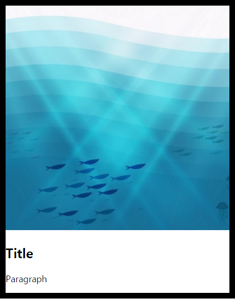
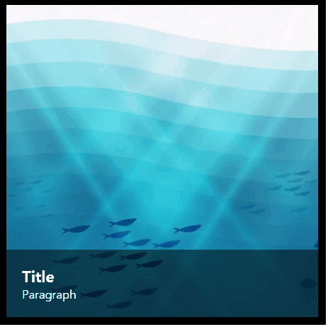
• 텍스트 영역 꾸미기
        .hover-image .image-info {
            background-color: rgba(0, 0, 0, 0.5);
            padding: 20px;
        }

        .hover-image .image-info h2, p {
            margin: 0;
            padding: 0;
            color: #ffffff;
        }

        .hover-image .image-info h2 {
            font-size: 20px;
        }

        .hover-image .image-info p {
            font-size: 15px;
        }
• 이미지와 텍스트 사이의 공백 제거하기
img태그의 자체적인 공백을 제거하는 역할로 vertical-align을 사용해줘야 함
        .hover-image img {
            vertical-align: middle;
        }
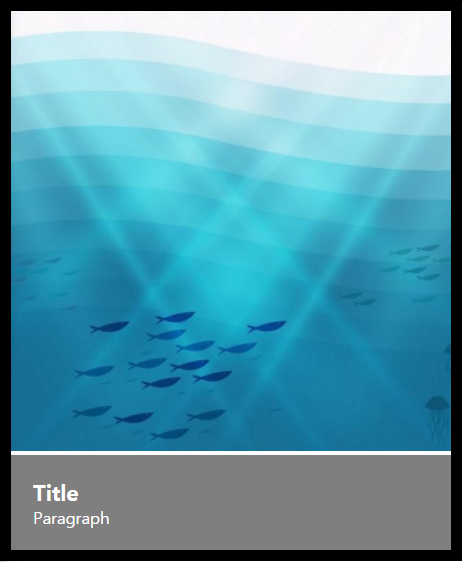
• 이미지 영역과 텍스트 영역을 병합하기
부모가 3차원일 때 자식 또한 3차원이라면 부모를 기준으로 width값을 설정할 수 있음
        .hover-image {
           position: relative;
       }

        .hover-image .image-info {
           box-sizing: border-box; /*영역을 정확히 잡아주기 위해 설정 */
           position: absolute;
           width: 100%  /*부모를 기준으로 100%*/

           left: 0;
			bottom: 0;
       }
🔎 자식 .image-info와 부모 .hover-image의 포지션을 3차원으로 지정해줌
🔎 부모가 3차원일 때 absolute는 부모를 좌표의 기준점으로 삼고 left: 0; bottom: 0;의 위치에 자리함
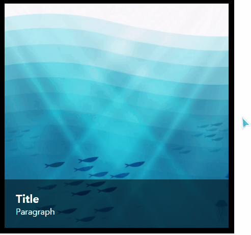
• 마우스를 올렸을 때 이미지 확대되게 하기
      .hover-image img {
          transition: transform 1s linear;
      }

      .hover-image:hover img {
          transform: scale(1.3);
      }
• 기존 영역을 벗어나지 않게 처리하기
이미지에 scale up을 할 때는 overflow: hidden; 같이 적용해줄 것
        .hover-image {
            overflow: hidden;
} 
• 마우스를 올렸을 때 커서를 a 태그처럼 나타내기
        .hover-image {
            cursor: pointer;
        }
• 텍스트 영역을 팝업 형태로 나타내기
        .hover-image .image-info {
            left: 0;
            bottom: -85px;
        }
🔎 보이는 영역을 벗어나게 bottom을 내려줌

        .hover-image .image-info {
            transition: bottom 0.3s linear;
        }

        .hover-image:hover .image-info {
            bottom: 0;
        }

        /* 이미지 확대 hover 속도를 텍스트 hover와 동일하게 맞춰줌 */
        .hover-image img {
            transition: transform 0.3s linear;
        }
📌어려운 점
— skew x축, y축으로 회전되는 게 어떤 방향인 건지 잘 그려지지 않았다.
— 강의 보다가 display: flex가 뭐더라? 하면서 멈칫함🤦♂️
📌해결 방법
skew(x, y)를 해체한다는 생각으로 skewx()와 skewy()를 각각 적용해서 오브젝트를 회전 시켜보니 좀 더 잘 이해가 됐다.
📌느낀 점
— 이전 강의에서 강사님이 처음 키즈가오 홈페이지를 보여주셨을 때 귀여운 동물 캐릭터들이 움직이는 헤더 부분과 메인 페이지에서 쌀알이 아래로 쭈욱 떨어지는 애니메이션이 참 인상 깊었다. 그땐 '저건 작업하기 어렵고 나는 한참 더 공부를 해야 따라할 수 있는 건가' 생각했는데 예상보다 빨리 연습 해볼 수 있을 것 같아서 좋았음!
— 분량이 길기도 하고 애니메이션 학습이라 결과물 기록하는 게 번거로워서 개발일지 쓰는 게 버거웠다... 😭