
🤔
styled-component에 이벤트가 발생했을 때, 다른 styled-component의 스타일을 바꾸고 싶은데, class 명이나 tag 명을 사용해서 스타일을 주고 싶지 않은 경우
<InputWrap width={width} height={height}>
  <StyledInput
  placeholder={placeholder ?? ' '}
  id={name}
  name={name}
  value={values[name] ?? ''}
  type={type ?? 'text'}
  onChange={onChangeInput ?? handleChange}
  error={errors[name]}
  touched={touched[name]}
  maxLength={maxLength ?? undefined}
  ref={ref ?? mockRef}
  onKeyPress={onKeyPress}
  readOnly={readOnly}
  onBlur={onBlurInput}
  tabIndex={tabIndex}
  />
  <Label className="label-name">
    <ContentName size={size} className="content-name">
    {label}
    </ContentName>
  </Label>
  {clearable && formik.values[name] && (
    <StyledClearBtn type="reset" onClick={onClear} size={size}>
    	<img src={ClearIcon} width="18px" height="18px" alt="clear_btn" />
    </StyledClearBtn>
  )}
</InputWrap>
const InputWrap = styled.div<{ width: number; height: number }>`
  display: flex;
  flex-direction: column;
  position: relative;
  width: ${({ width }) => `${width}px`};
  height: ${({ height }) => `${height}px`};

// 1.
  ${StyledInput}:focus + ${Label} ${ContentName},
  ${StyledInput}:not(:placeholder-shown) + ${Label} ${ContentName} {
    transform: translateY(-60%);
    left: 24px;
    font-size: 14px;
    color: #445cf2;
  }
// 2.
  ${StyledInput}:not(:focus) + ${Label} ${ContentName} {
    color: #a0a8ae;
  }
`;
😎
-
StyledInput에 focus된 경우Label안ContentName,StyledInput에 입력된 값이 있는 경우Label안ContentName의 스타일을 변경 -
StyledInput에 focus out 된 경우Label안ContentName스타일을 변경
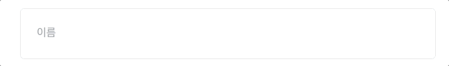
결과물

즐거움을 찾는 개발자🐯