MUI checkbox label list 커스텀(next.js)


next.js에서 MUI checkbox component로 위 레이아웃을 만들어보겠습니다.
https://mui.com/material-ui/react-checkbox/
이 링크가 기본 checkbox component 이고
"use client";

import styles from "./CheckboxFilterRow.module.css";
import { Checkbox, FormControlLabel, FormGroup } from "@mui/material";

type ContentItem = {
  title: string;
  content: string[];
};

type ContentList = ContentItem;

export default function CheckboxFilterRow({
  contentList = {
    title: "titleString",
    content: ["menu1", "menu2", "menu3", "menu4"],
  },
}: {
  contentList?: ContentList;
}) {
  return (
    <div className={styles.wrapper}>
      <FormGroup>
        <div className={styles.rowWrapper}>
          <div className={styles.rowTitle}>{contentList.title}</div>
          {contentList.content.map((content, index) => (
            <FormControlLabel
              key={`${contentList.title}-${index}`}
              control={<Checkbox />}
              label={content}
            />
          ))}
        </div>
      </FormGroup>
    </div>
  );
}
//css
.wrapper {
width: 100%;
height: 100%;
}
.rowWrapper {
width: 100%;
display: flex;
flex-direction: row;
justify-content: left;
align-items: center;
border: 1px solid var(--divider-color);
}
.rowTitle {
width: 160px;
}
이렇게 하면 간단히 만들 수 있습니다.
좀 더 나아가서 ALL 체크박스를 클릭 시 모두 선택되고 해지되게끔 만들어 보겠습니다.
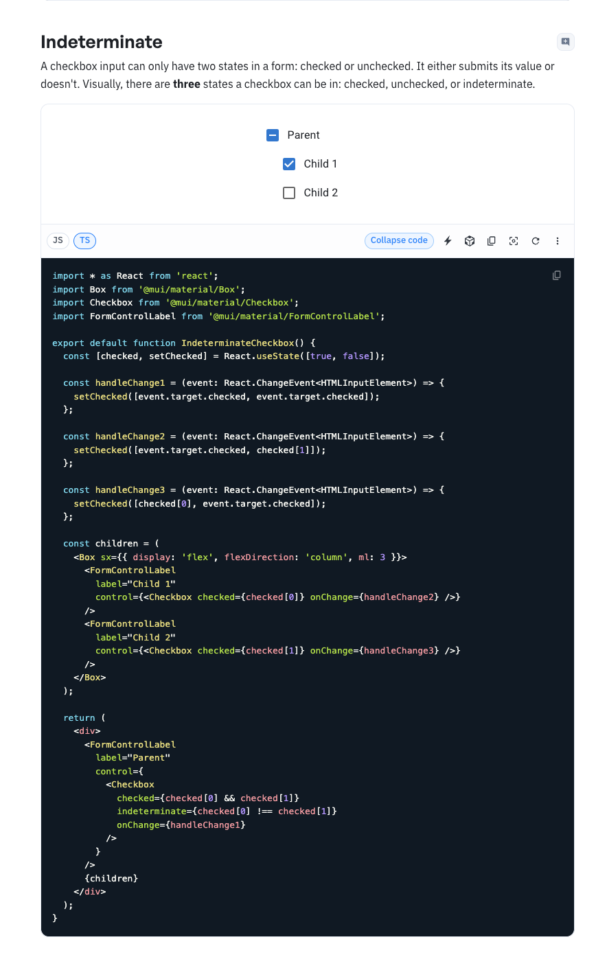
indeterminate 부분을 참고.
아래는 완성 미리보기 ->



code ->
"use client";
import React, { useState } from "react";
import styles from "./CheckboxFilterRow.module.css";
import { Box, Checkbox, FormControlLabel, FormGroup } from "@mui/material";
type ContentItem = {
title: string;
content: string[];
};
type ContentList = ContentItem;
export default function CheckboxFilterRow({
title: "titleString",
content: ["menu1", "menu2", "menu3", "menu4"],
}: {
contentList?: ContentList;
}) {
const [checked, setChecked] = React.useState(
Array(contentList.content.length).fill(false)
);
const handleChangeParent = (event: React.ChangeEvent<HTMLInputElement>) => {
const isChecked = event.target.checked;
setChecked(Array(contentList.content.length).fill(isChecked));
};
const handleChangeChild =
(index: number) => (event: React.ChangeEvent<HTMLInputElement>) => {
const newChecked = [...checked];
newChecked[index] = event.target.checked;
setChecked(newChecked);
};
return (
<div className={styles.wrapper}>
<div className={styles.rowWrapper}>
<div className={styles.rowTitle}>{contentList.title}</div>
<div className={styles.rowWrapper}>
<FormControlLabel
label="ALL"
control={
<Checkbox
checked={checked.every(Boolean)}
indeterminate={!checked.every(Boolean) && checked.some(Boolean)}
onChange={handleChangeParent}
/>
}
/>
<Box sx={{ display: "flex" }}>
{contentList.content.map((content, index) => (
<FormControlLabel
key={content}
label={content}
control={
<Checkbox
checked={checked[index]}
onChange={handleChangeChild(index)}
/>
}
/>
))}
</Box>
</div>
</div>
</div>
);
}
//css

.wrapper {
  width: 100%;
  height: 100%;
}

.rowWrapper {
  width: 100%;
  display: flex;
  flex-direction: row;
  justify-content: left;
  align-items: center;
  border: 1px solid var(--divider-color);
}

.rowTitle {
  width: 160px;
}
------
(+) Box component를 div 대신 사용할 때
...
return (
    <Box width="100%" height="100%">
      <Box
        width="100%"
        display="flex"
        flexDirection="row"
        justifyContent="left"
        alignItems="center"
      >
        <Box width={160}>{contentList.title}</Box>
        <Box
          width="100%"
          display="flex"
          flexDirection="row"
          justifyContent="left"
          alignItems="center"
          sx={{ border: `1px solid var(--divider-color)` }}
        >
          <FormControlLabel
            label="ALL"
            control={
              <Checkbox
                checked={checked.every(Boolean)}
                indeterminate={!checked.every(Boolean) && checked.some(Boolean)}
                onChange={handleChangeParent}
              />
            }
          />
          <Box sx={{ display: "flex" }}>
            {contentList.content.map((content, index) => (
              <FormControlLabel
                key={content}
                label={content}
                control={
                  <Checkbox
                    checked={checked[index]}
                    onChange={handleChangeChild(index)}
                  />
                }
              />
            ))}
          </Box>
        </Box>
      </Box>
    </Box>
  );
...
이렇게 Box 안에 style을 넣어서 대체 할 수 있습니다.
또 겹치는 건
const commonBoxStyle = {
  width: "100%",
  display: "flex",
  flexDirection: "row",
  justifyContent: "left",
  alignItems: "center",
};
이렇게 공통 스타일 변수로 정의 후
<Box
  {...commonBoxStyle}
  sx={{ border: `1px solid var(--divider-color)` }}
>
이렇게 가져다 사용 할 수도 있습니다.

개발로 먹고 살 예정