본 게시글은 정확한 정보를 담고있지 않을 수 있으므로 다른 자료도 참고하시길 바랍니다.
만약, 본 게시글이 잘못된 정보를 가지고 있다면 피드백 부탁드립니다. 감사합니다.
html 코드
<div class='parent'>
  <div class='child'>one</div>
  <div class='child'>two</div>
</div>
우연히 CSS 관련 블로그 글들을 찾다가 display: flex를 이용한 자식 요소 가운데 정렬 방식 2가지를 찾았다.
공통 조건: 부모 요소가
display: flex
1.margin: auto
2.justify-content: center,align-items: center
위의 html코드에서 parent에 flex를 적용한다.
.parent {
	display: flex;
    background-color: blue;
    width: 200px;
    height: 200px;
}
가로 세로 200px의 파란색 정사각형 부모 요소가 만들어졌다.
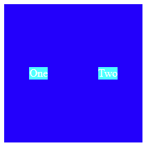
이제 자식 요소들에 margin: auto를 적용시켜보자
.child {
	margin: auto;
    background-color: aqua;
}
이제 자식 요소들에 margin이 공통적으로 적용이 되고 값이 auto이기 때문에 부모 요소가 차지하는 영역을 기준으로 상하좌우에 margin이 균등하게 적용된다.
코드 작동 확인
https://codepen.io/nearworld/pen/QWmdZJy
이번에는 justify-content: center, align-items: center를 적용시켜 보겠다.
justify-content는 가로 방향으로의 정렬이며 align-items는 세로 방향으로의 정렬을 의미한다.
.parent {
	display: flex;
    justify-content: center;
    align-items: center;
    background-color: blue;
    width: 200px;
    height: 200px;
}
.child {
	/* margin: auto; */
    background-color: aqua;
}
margin: auto를 주석처리하여 비활성화 시켰으므로 child에는 배경색 빼고는 어떠한 css설정도 적용되지 않았다.
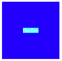
child에 margin이 없으므로 서로 딱 달라붙은 상태가 되었다.
각 2가지 방식은 부모가 display: flex일때 적용돼고 정렬되는 방식은 다르다.
상황에 따라 적절하게 자신이 원하는 방식을 쓰면 될듯하다.