🪫 기본 styling CSS
: 웹 프론트엔드 개발의 가장 기본적인 언어
❇️ 장점
- 웹 페이지 스타일링의 근본
- 초보자도 배우기 쉽다
- 별도의 설치 과정 / 설정이 필요 없다
- 브라우저가 직접 해석하므로, 처리 과정 없이 빠르게 로드된다
❎ 단점
- 코드를 깔끔하게 정리하기 어렵다
- 중복되는 코드를 재사용하기 어렵다
- 유지보수가 힘들다
이러한 CSS를 더 효율적으로 작성할 수 있도록 도와주는 CSS 전처리기(Preprocessor) 중 하나인 [ SASS (SCSS) ]에 대하여 알아보자_!
✨ SASS (SCSS)
[기본 사용]
터미널에 ...
npm i sass : 설치하기
App.scss OR index.scss : scss 확장자 파일 쓰기!
SASS
- Syntactically Awesome Style Sheets ( 문법적으로 짱멋진 스타일 시트 ) 의 줄임말
- 기존 CSS의 단점을 보완하고 효율성을 높이기 위해서 만들어진 문법
.button
  background: cornflowerblue
  border-radius: 5px
  padding: 10px 20px

  & :hover
    cursor: pointer
  &:disabled
    cursor: default
    background: grey
    pointer-events: none
⚛️ 들여쓰기사용
SCSS
- Sassy CSS( 깔쌈한 CSS )의 줄임말
- SASS 3버전에서 등장
- 호환성, 가독성 👍
.button{
  background: cornflowerblue;
  border-radius: 5px;
  padding: 10px 20px;

  & :hover{
    cursor: pointer;
    }
  &:disabled{
    cursor: default;
    background: grey;
    pointer-events: none;
    }
 }
⚛️ 중괄호 사용 → 기존 CSS랑 더 비슷해서 가독성 👍
➡️ CSS 코드 중첩, CSS 코드 변수화, CSS 속성 재사용 등 여러가지 기능을 제공!
1️⃣ 변수 사용
◻️ [CSS]
element1 {
    background-color: rgb(240, 240, 240);
    color: rgb(100, 100, 100);
}
element2 {
    background-color: rgb(240, 240, 240);
    color: rgb(100, 100, 100);
}
◼️ [SCSS]
$light-gray: rgb(240, 240, 240)
$dark-gray: rgb(100, 100, 100)

element1 {
    background-color: $light-gray;
	color: $dark-gray;
}
element2 {
    background-color: $light-gray;
	color: $dark-gray;
}
🔖 사용 TIP
- 동일한 값
background-color: rgb(240, 240, 240);을$light-gray라는 변수로 지정해준 후에
해당 element 속성에 변수명으로 넣어주기
2️⃣ 중첩
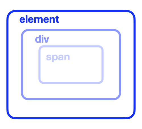
◻️ [CSS]
element {
    color: white;
}

element:hover{
    background-color: lightgray;
}

element div {
    color: gray;
}
element div span {
    color: blue;
}
◼️ [SCSS]
element {
    &:hover{
    background-color: lightgray;
    }
    color: white;
        div {
            color: gray;
                span {
                    color: blue;
        }
    }
}
🔖 사용 TIP
css코드에서 중복되는element라는 element를 겹쳐서 해당 element 안에 코드를 중첩해준다&으로 자기 자신을 선택할 수 있음 !!
3️⃣ 믹스인(Mixins)
: 반복되는 코드를 재사용할 수 있게 해주는 틀
[기본_사용법]
-
틀 만들기
@mixin 믹스인이름 {
재사용할 코드
} -
틀 사용하기
@include 믹스인이름;
1) 기본 사용 예제
◻️ [CSS]
element1 {
    display: flex;
    flex-direction: column;
    align-items: center;
}
element2 {
    display: flex;
    flex-direction: column;
    align-items: center;
}
element3 {
    display: flex;
    flex-direction: column;
    align-items: center;
}
◼️ [SCSS]
@mixin flex-column {
    display: flex;
    flex-direction: column;
    align-items: center;
}

element1 {
    @include flex-column;
}

element2 {
    @include flex-column;
}

element3 {
    @include flex-column;
}
🔖 사용 TIP
- 세 element의 css 속성이 전부 같을 때,
@mixin flex-column {}를 이용하여 flex-column 이라는 mixin을 만들어주고
@include flex-column;를 사용하여 일괄 적용
2) 심화 사용 예제
: 속성은 같지만, 값이 다를 때 ...
◻️ [CSS]
element1 {
    display: flex;
    flex-direction: column;
    align-items: center;
    gap: 20px
}
element2 {
    display: flex;
    flex-direction: row-reverse;
    align-items: flex-start;
    gap: 10px
}
element3 {
    display: flex;
    flex-direction: row;
    align-items: center;
    gap: 10px
}
◼️ [SCSS]
$gap-small: 10px;

@mixin flex ( $direction, $align: center , $gap: 20px) {
    display: flex;
    flex-direction: $direction;
    align-items: $align;
    gap: $gap
}
element1 {
    @include flex(column);
}
element2 {
    @include flex(row-reverse, flex-start, $gap-small);
}
element3 {
    @include flex($direction: row, $gap: 10px);
}
🔖 사용 TIP
-
@mixin flex ( $direction, $align: center , $gap: 20px) {}
여기서 $gap: 20px 이렇게 $gap의 기본값을 20px로 지정해줄 수 있음 -
element1: [flex mixin] 변수 중 맨 앞에 있는 $direction; 변수만 특정 지정 -
element2: [flex mixin] 변수 에서 $direction;, $align; 두 변수는 특정값 지정,
$gap 변수에는 맨 위에 지정한$gap-small: 10px;변수 사용 -
element3: [flex mixin] 변수 중 가운데 변수인 $align 변수는 기본값 지정이기 때문에, 해당 속성 직접 언급 지정
4️⃣ 상속(Inheritance)
◻️ [CSS]
.base-button, .primary-button, .secondary-button {
  padding: 10px;
  border-radius: 5px;
  font-size: 14px;
}

.primary-button {
  background-color: blue;
  color: white;
}

.secondary-button {
  background-color: gray;
  color: black;
}
◼️ [SCSS]
.base-button {
  padding: 10px;
  border-radius: 5px;
  font-size: 14px;
}

.primary-button {
  @extend .base-button;
  background-color: blue;
  color: white;
}

.secondary-button {
  @extend .base-button;
  background-color: gray;
  color: black;
}
🔖 사용 TIP
@extend를 사용하면 기존 스타일을 다른 클래스에서 재사용할 수 있습니다.
💄 SASS (SCSS) 장단점
❇️ 장점
- 코드 재사용이 가능해 유지보수 비용 감소
- 변수, 믹스인, 상속 등을 활용한 효율적인 스타일 관리
- 가독성이 좋고 유지보수하기 쉬운 코드 작성 가능
❎ 단점
- CSS 대비 추가 학습이 필요하다
- SCSS 코드를 CSS로 변환하는 과정이 필요해 조금 더 느리다
🍒 마무리 🍒
SCSS를 적극적으로 활용하여 CSS를 더욱 깔끔하고 체계적으로 관리할 수 있다 !