👩🎤 Emotion
Emotion은 JavaScript에서 CSS 스타일을 작성하기 위한 라이브러리이다.
CSS-in-JS로 JavaScript 내에서 CSS를 작성할 수 있게 도와준다.
Framework Agnostic과 React 두 가지 방식이 있다.
나는 리액트를 사용할 것이기 때문에 @emotion/react를 사용할 것이다.
🔎 사용 방법
1. 설치
# Framework Agnostic
$ npm install @emotion/css

# React
$ npm install @emotion/react
2. tsconfig.json 설정
{
...
 "compilerOptions": {
		...
		"jsx": "react-jsx",
    "jsxImportSource": "@emotion/react",
		...
	},
...
}
3. 기본 구조
import { css } from '@emotion/react';

const container = css`
  background-color: #FF0000;
  width: 10rem;
  height: 10rem;
`;

export default function App() {
  return (
    <>
      <div css={container}></div>
    </>
  );
}
jsx 코드에서 어떤 html 태그인지 한눈에 알아볼 수 있어서 이 방법도 좋은 것 같다.
import styled from '@emotion/styled';

const SomeComp = styled.div({
  backgroundColor: 'hotpink',
  width: '200px',
  height: '200px',
});

const AnotherComp = styled.div`
  background-color: ${(props) => props.color};
  width: 100px;
  height: 100px;
`;

export default function App() {
  return (
    <SomeComp>
      <AnotherComp color='green' />
    </SomeComp>
  );
}@emotion/styled를 추가로 설치하면 styled components와 사용법이 거의 같다.
🔆 globalStyles 적용
먼저 globalstyles을 선언한 파일을 만들어주고
// /src/styles/global.ts
import { css } from '@emotion/react';

export const globalStyles = css`
...

  html {
    font-size: 62.5%;
    font-family: 'Noto Sans KR', sans-serif;
		}
...
`;
최상위에서 Global 에 전달해주면 된다.
import { Global, css } from '@emotion/react';
import { globalStyles } from './styles/global';

const container = css`
  background-color: #FF0000;
  width: 10rem;
  height: 10rem;
`;

export default function App() {
  return (
    <>
      <Global styles={globalStyles} />
      <div css={container}></div>
    </>
  );
}
🌈 theme 적용
💡 ThemeProvider
Emotion에서 제공하는 ThemeProvider를 사용하면 앱 스타일에 테마를 적용할 수 있다. Context API로 이루어져 있어서 사용법은 어렵지 않다.
최상위 컴포넌트에 ThemeProvider를 감싸주고 theme props를 넣어준다.
import { ThemeProvider } from '@emotion/react';
import styled from '@emotion/styled';

const theme = {
  black: '#000',
  white: '#FFF',
};

export const Container = styled.div`
  background-color: ${(props : any) => props.theme.black};
  width: 100px;
  height: 100px;
`;

export default function App() {
  return (
    <ThemeProvider theme={theme}>
      <Container />
    </ThemeProvider>
  );
}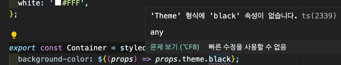
Emotion 경우 theme type 인식 기능을 제공하지 않으므로 위와 같은 방식으로 props를 any로 타입을 지정해주어야 오류 없이 사용할 수 있다.
그런데 any를 사용하면 타입 추론을 사용할 수 없기 때문에 타입스크립트를 사용하는 의미가 퇴색될뿐더러, 지정해 둔 테마가 많아질 수록 불편함이 늘어날 수 있다.
🔆 Theme 타입 선언하기
기본적으로 emotion의 props.theme는 빈 객체다. theme 타입을 정의하기 위해서는 사용자 고유의 선언 파일(emotion.d.ts)을 통해 타입 선언을 확장해야 한다.
💡 theme 타입 추출
테마가 추가될 때마다 일일히 타입을 정의하는 것은 번거롭다.
theme를 지정하는 파일을 따로 만든 후 typeof 를 통해 타입을 추출하고 타입을 정의해주자.
// theme.ts
export const theme = {
  black: '#000',
  white: '#FFF',
};

export type ThemeType = typeof theme;
💡 emotion.d.ts
import '@emotion/react';
import { ThemeType } from './theme';

declare module '@emotion/react' {
  export interface Theme extends ThemeType {}
}
추출한 테마를 emotion의 Theme 타입에 우리가 만든 ThemeType을 extends 해준다.
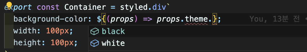
이 과정을 마치면 타입 추론을 통한 테마의 속성이 잘 뜨는 것을 확인할 수 있다.
💦 왜 이렇게 하면 될까?
- d.ts 는 타입을 정의하는 파일!
declare module '@emotion/react'→'@emotion/react'가 우리가 내부에 정의한 코드를 참조할 수 있게 한다.
'@emotion/react' 를 뜯어보면 빈 Theme 타입이 선언된 것을 확인할 수 있는데,
// node_modules/@emotion/react/types/index.d.ts

...

export interface Theme {}

...
node_modules/@emotion/react/types/index.d.ts 이 파일이 선언될 때, 우리가 정의한 emotion.d.ts의 declare module '@emotion/react' 내부를 참조하게 된다. 즉, 최종적으로 아래와 같이 읽어낸다.
export interface Theme {}

interface Theme extends ThemeType {}
interface의 선언 병합으로 두개의 타입이 합쳐진다.
선언 병합은 같은 이름으로 선언된 두 interface의 프로퍼티를 합치는 것이다.
interface Merged {
  fromFirst: string;
}

interface Merged {
  fromSecond: number;
}

// 다음과 같음:
// interface Merged {
// fromFirst: string;
// fromSecond: number;
// }
emotion(styled-components도 동일)은 빈 theme interface를 선언하여 이 theme을 ThemeProvider나, useTheme 등 다양한 곳에 참조시킨다.
그리고 정확한 theme의 타입은 라이브러리의 이용자에게 알아서 커스텀한 Theme를 선언 병합하여 사용할 수 있게 하는 것이다.
😎 마무리
Emotion과 Theme 기능을 사용해보며 interface의 선언 병합에 대해 다시 알아가는 시간이었다.
평소 타입을 선언할 때 재선언이 가능하고 두 타입을 합칠 수 있는 Interface 보다는 type을 선호해왔다. interface를 잘못 사용하면 가독성이 떨어지고 협업 시 잘못된 선언 병합이 된 경우도 있었기 때문이다. 또 선언 병합을 통해 원래의 타입이 무엇이었는지 꼬리를 물고 찾아가야하는 불편한 점도 있었다.
하지만 emotion과 같이 라이브러리에서 선언 병합이 가능하도록 열어둘 때는 매우 적절하고 유용한 기능이라는 것을 실제 사례를 통해 알게되었다.
(P.S. interface와 type 컨벤션 선택에 대해 더 자세히 알아보고 다음 블로그 글로 가져와야겠다.)
💦 추가 css 방식
styled의 props가 아닌 css로 theme를 사용하려면 인라인으로 넣어주어야한다.
혹시 분리가 가능한지 찾아보고 시도해봤지만 다 실패…..추후에 방법을 알게되면 내용을 추가하도록하겠습니다..
import { Global, ThemeProvider, css } from '@emotion/react';
import { globalStyles } from './styles/global';
import styled from '@emotion/styled';

const theme = {
  color: { black: '#000', white: '#FFF' },
};

//❌❌❌ 단순히 위에 선언된 theme만을 참조한다.
// const container = css`
//   background-color: ${theme.color.black};
//   width: 10rem;
//   height: 10rem;
// `;

export default function App() {
  return (
    <ThemeProvider theme={theme}>
      <div css={(theme) => ({ color: theme.color.black })}></div>
    </ThemeProvider>
  );
}
참고자료
https://emotion.sh/docs/typescript#define-a-theme
https://lasbe.tistory.com/168
https://happysisyphe.tistory.com/50