사진 크기를 조정한 마크다운이 적용이 안돼 가독성이 최악이다...
깃헙에 잘 정리되어있다!
앱개발 종합반 - 2 주차
[수업 목표]
- 리액트 네이티브(기술) & Expo(도구) 소개 및 설치
- 앱 화면 구현
- 앱개발 Javascript
01. 2 주차
- 리액트 네이티브 앱 개발을 더 편하고 쉽게 도와주는 Expo라는 도구로 앱 개발 진행
- 화면 그리는 법
- 구역(레이아웃)을 잡는 문법 언어 = JSX
- 화면 구역 태그. 글자 태그 등
02. 리액트 네이티브 & Expo
- 리액트 네이티브 = 리액트 (React) + 네이티브 (Native)
- 자바스크립트 언어 하나로 안드로이드, iOS 두 가지 앱 모두 만들어주는 라이브러리
- Expo는 안드로이드, iOS 코드를 건드려야 하는 상황에서 도와주는 툴
- 개발 중인 앱을 쉽게 확인해주는 앱 제공 (Expo 클라이언트 앱)
03. 리액트 네이티브 & Expo 설치
- Node & NPM 설치
- Yarn
// npm보다 가볍고 빠르게 자바스크립트 패키지 관리 자바스크립트 패키지 매니저 툴
npm install -g yarn- Expo 명령어 도구 설치
sudo npm install -g expo-cli

// npm : 노트 패키지 매니저 명령 실행
// -g : 컴퓨터 전역적 설치
// expo-cli : 설치할 패키지 이름- Expo 가입 및 로컬에 Expo 계정 세팅
expo login --username "Expo 사이트 가입당시 입력 name"
패스워드 입력
04. Expo 실행
expo init 폴더명
blank 타입 앱 선택
cd 폴더명
expo start (Expo 서버 On) <> command + c (Expo 서버 Off)- Run on Android device / emulator : 컴퓨터와 USB로 연결된 안드로이드 휴대폰 또는 안드로이드 시뮬레이터로 Expo 앱 실행
- Run on iOS simulator : 설치한 iOS 시뮬레이터로 Expo 앱 실행
- Run in web browser : 작성중인 Expo 앱을 브라우저에서 확인하는 버튼
- Send link with email : 개발중인 Expo 앱 링크를 통해 Expo 클라이언트 앱으로 개발중인 앱 확인
- Public or republic project : 앱을 Expo 공식 사이트에 업로드. 공식 사이트 배포 시, 안드로이드용 APK 파일, iOS용 ipa 파일 빌드하여 다룬로드 가능
시뮬레이터 : 가상의 휴대폰을 컴퓨터에 띄워놓는 것
- 안드로이드 스튜디오 or XCode 설치
- 안드로이드 스튜디오 > Configure의 SDK Manager 선택
- SDK Platform에서 Android 최신 버전 선택 > Apply 설치
- SDK Tools에서 4 항목 체크 후 설치
- Android SDK Build-Tools 30
- Android Emulator
- Android SDK Platform-Tools
- Intel x86 Emulator Accelerator (HAXM installer)
- AVD Manager에서 Create Virtual Device 선택
- 가장 최신의 안드로이드 버전 선택
expo start --android- XCode > preference > Location > command line tools에 XCode 버전 선택 확인
- Open Developer Tool > 시뮬레이터 설정 화면 확인
- 해당 시뮬레이터 화면에서 원하는 시뮬레이터 설치
expo start --ios- 기본 폴더 구조
assets : 앱이 동작되고 서비스되는데에 기본적으로 가지고 있는 이미지 및 아이콘 파일을 담는 폴더
node_modules : 라이브러리 저장 장소
App.js : 리액트 네이티브 앱이 시작되는 출발선 및 진입점
app.json : 앱의 이름, 출시 버전, 아이콘, 스플래시 스크린, 광고 설정 등 앱이 가지는 기본 정보 설정 파일
05. JSX 문법
// 리액트, 리액트 네이티브, 엑스포 라이브러리에서 꺼내 사용할 기능들을
// 이렇게 앞으로도 상단에 선언한다음 가져다 사용
import { StatusBar } from 'expo-status-bar';
import React from 'react';
import { StyleSheet, Text, View } from 'react-native';

// App.js는 App 함수를 내보내기 하고 있는 자바스크립트 파일
// 이 함수는 무언가?를 반환하고 있는데 결국 화면을 반환
export default function App() {
    // 화면을 반환
	// HTML 태그 같이 생긴 이 문법은 JSX라 불리우며 실제 화면을 그리는 문법

    // 경고창 없애기
    console.disableYellowBox = true;

    return (
        <View style={styles.container}>
            <Text>Open up App.js to start working on your app!</Text>
            <StatusBar style="auto" />
        </View>
    );
}

// styles 변수 이름 답게 화면을 그려주는, JSX문법을 꾸며주는 내용
const styles = StyleSheet.create({
    container: {
        flex: 1,
        backgroundColor: '#fff',
        alignItems: 'center',
        justifyContent: 'center',
    },
});
06. JSX 기본 문법
- return은 작성한 JSX 문법으로 구성된 화면을 앱상에서 보여주는 역할
- rendering(렌더링)은 JSX 문법을 화면에 그려주는 행위
- JSX < > 태그 < > </ > 엘리면트
- 모든 태그는 가져와서 사용
import { StatusBar } from 'expo-status-bar';
import React from 'react';
import { StyleSheet, Text, View } from 'react-native';

export default function App() {
  return (
    <View style={styles.container}>
      <Text>Open up App.js to start working on your app!</Text>
      <StatusBar style="auto" />
    </View>
  );
}- 태그는 항상 닫는 태그와 자체적으로 닫는 태그 구분해서 사용
export default function App() {
  return (
		//<View>는 결국 두번째 줄 밑에 </View>로 닫히면서 본인 영역을 갖는다
    <View style={styles.container}>
      <Text>Open up App.js to start working on your app!</Text>
			//statusBar는 본인 스스로 닫는 태그이므로 다음과 같이 사용이 가능합니다.
      <StatusBar style="auto" />
    </View>
  );
}- 모든 태그는 감싸는 최상위 엘리먼트 존제 (엘리먼트는 곧 태그 <>)
//App.js가 렌더링 하고 엘리먼트는 결국
//Text와 StatusBar엘리먼트를 감싸고 있는 View
export default function App() {
  return (
    <View style={styles.container}>
      <Text>Open up App.js to start working on your app!</Text>
      <StatusBar style="auto" />
    </View>
  );
}- return애 의해 렌더링 될 땐 항상 소괄호로 감싼다.
- JSX 문법 밖에서의 주석과 안에서의 주석은 다르다.
//JSX밖에서의 주석
import { StatusBar } from 'expo-status-bar';
import React from 'react';
import { StyleSheet, Text, View } from 'react-native';
//JSX밖에서의 주석
export default function App() {
	//JSX밖에서의 주석
  return (
		//JSX 밖에서의 주석
    <View style={styles.container}>
			{/*
				JSX 문법 안에서의 주석
			*/}
      <Text>Open up App.js to start working on your app!</Text>
      <StatusBar style="auto" />
    </View>
  );
}
07. View, Text, ScrollView
View
화면의 영역(레이아웃)을 잡아주는 엘리먼트
View 엘리먼트로 원하는 대로 화면 분할 가능 (StyleSheet와 같이 사용)
Text
앱에 글을 작성하기 위해 사용하는 엘리먼트
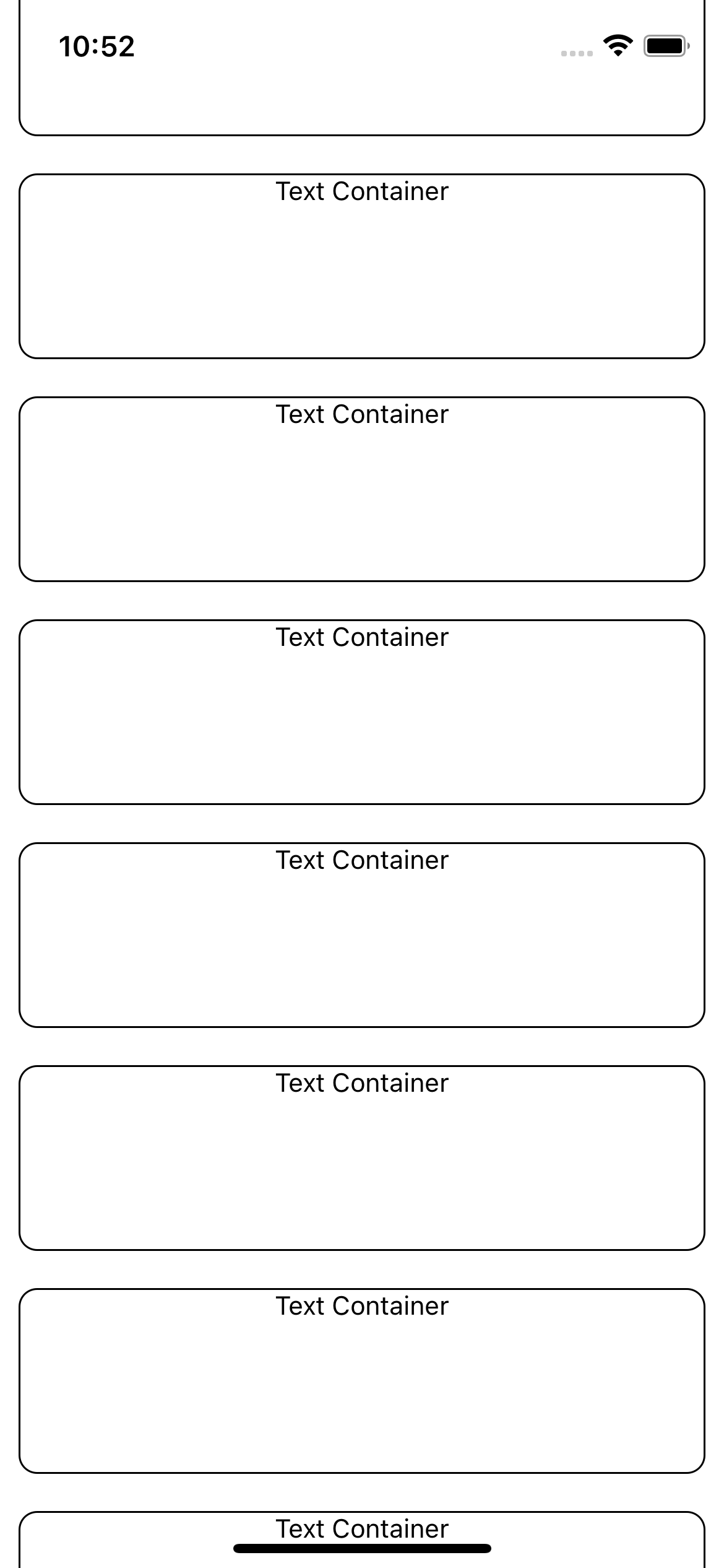
ScrollView
앱 화면을 벗어나는 영역의 경우 ScrollView 엘리먼트로 감싸면 스크롤이 가능
import React from 'react';
import { ScrollView, StyleSheet, Text, View } from 'react-native';

export default function App() {

  console.disableYellowBox = true;

  return (
    <ScrollView style={styles.container}>
        <View style={styles.textContainer}>
            <Text style={styles.textStyle}>Text Container</Text>
        </View>
        ...
    </ScrollView>
  );
}

const styles = StyleSheet.create({
  container: {
    flex: 1,
    backgroundColor: '#fff',
  },
  textContainer: {
    height:100,
    borderColor:'#000',
    borderWidth:1,
    borderRadius:10,
    margin:10
  },
  textStyle: {
    textAlign:"center"
  }
});
08. Button, Image
Button
onPress속성에 함수 연결(바인딩)
연결한 함수 구현부를 JSX 밖에서 구현하여 바인딩 가능
TouchableOpacity
임의의 영역과 디자인에 버튼 기능을 달고 싶을 때 주로 사용
Image
이미지 삽입 방식 2가지
1. assets 폴더의 이미지를 가져오기 {import}
2. 외부 이미지 링크 넣기 {url}
import React from 'react';
import { Alert, Button, ScrollView, StyleSheet, Text, TouchableOpacity, Image, View } from 'react-native';
import favicon from "./assets/favicon.png"

export default function App() {

  console.disableYellowBox = true;

  const customAlert = () => {
    Alert.alert("outside of JSX function")
  }

  return (
    <ScrollView style={styles.container}>
      <View style={styles.textContainer}>
        <Text style={styles.textStyle}>Text Container</Text>
        <Button
          style={styles.buttonStyle}
          title="Button"
          color="#FFAA4C"
          onPress={function(){
            Alert.alert('popup alert')
          }}
        />
        <Button
            style={styles.buttonStyle}
            title="Button"
            color="#5089C6"
            onPress={()=>{
              Alert.alert('popup alert')
            }}
          />
          <Button
            style={styles.buttonStyle}
            title="Button"
            color="#B980F0"
            onPress={() => {customAlert()}}
          />
          <Button
            style={styles.buttonStyle}
            title="Button"
            color="#F8E2CF"
            onPress={customAlert}
          />
      </View>
      <TouchableOpacity
        style={styles.textContainer}
        onPress={customAlert}>
        <Text style={styles.textStyle}>Text</Text>
      </TouchableOpacity>
      <View style={styles.textContainer}>
        <Image
          source={favicon}
          resizeMode={"repeat"}
          style={styles.imageStyle}
        />
      </View>
      <View style={styles.textContainer}>
        <Image
          source={{uri:'https://user-images.githubusercontent.com/60697742/127253669-56304aa4-b412-4312-9b9a-95d9d9118fcc.jpg'}}
          resizeMode={"cover"}
          style={styles.imageStyle}
        />
      </View>
    </ScrollView>
  );
}

const styles = StyleSheet.create({
  container: {
    flex: 1,
    backgroundColor: '#fff',
  },
  textContainer: {
    height:180,
    borderColor:'#000',
    borderWidth:1,
    borderRadius:10,
    margin:50
  },
  textStyle: {
    textAlign:"center"
  },
  imageStyle: {
    width:"100%",
    height:"100%",
    alignItems:"center",
    justifyContent:"center"
  }
});
09. Styles
- 모든 태그에 공통적인 속성 styles
- StyleSheet 기능을 가져와 적용
- style 속성 아래에서 만든 객체 키 값을 부여하여 적용
styles 속성에 styles 객체 container 키 연결
<View style={styles.container}>
StyleSheet 문법
- margin, padding
const styles = StyleSheet.create({
container: {
//영역을 잡는 속성입니다. 따로 자세히 다룹니다.
//flex: 1은 전체 화면을 가져간다는 뜻입니다
flex: 1,
//영역의 배경 색을 결정합니다
backgroundColor: '#fff',
//아래 두 속성은 영역 안의 컨텐츠들의 배치를 결정합니다.
//flex를 자세히 다룰때 같이 자세히 다룹니다
justifyContent:"center",
alignContent:"center"
},
textContainer: {
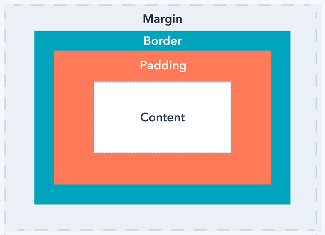
//영역의 바깥 공간 이격을 뜻합니다(하단 이미지 참조)
margin:10,
//영역 안의 컨텐츠 이격 공간을 뜻합니다(하단 이미지 참조)
padding: 10,
//테두리의 구부러짐을 결정합니다. 지금 보면 조금 둥글죠?
borderRadius:10,
//테두리의 두께를 결정합니다
borderWidth:2,
//테두리 색을 결정합니다
borderColor:"#000",
//테구리 스타일을 결정합니다. 실선은 solid 입니다
borderStyle:"dotted",
},
textStyle: {
//글자 색을 결정합니다. rgb, 값 이름, 색상코드 모두 가능합니다
color:"red",
//글자의 크기를 결정합니다
fontSize:20,
//글자의 두께를 결정합니다
fontWeight:"700",
//가로기준으로 글자의 위치를 결정합니다
textAlign:"center"
}
});10. Flex : 컨텐츠 위치
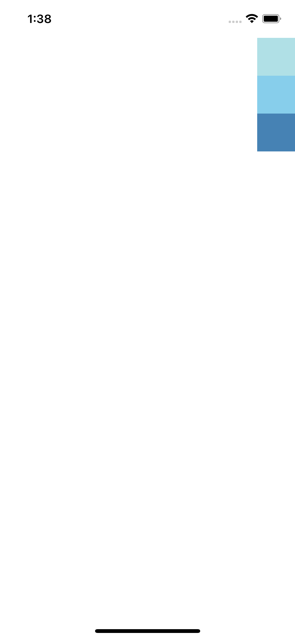
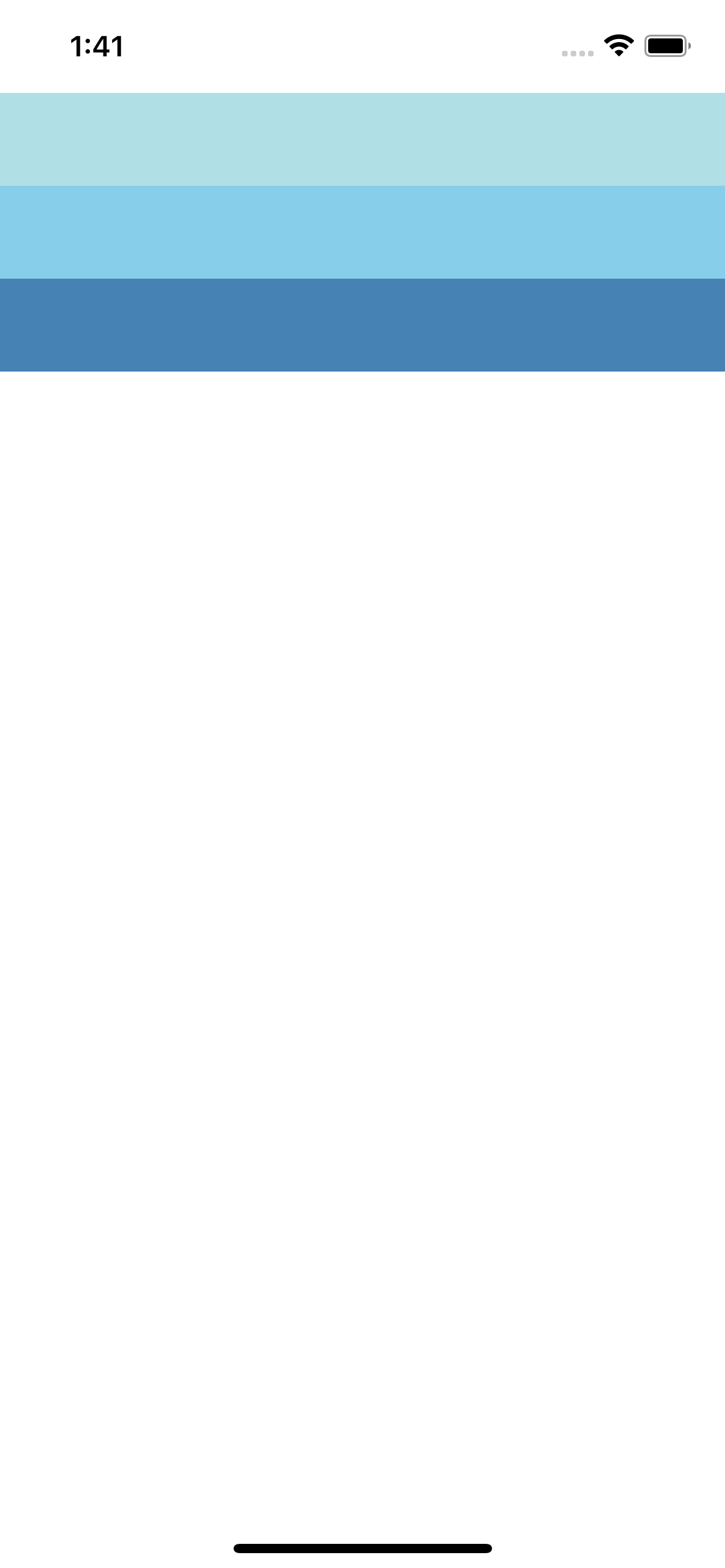
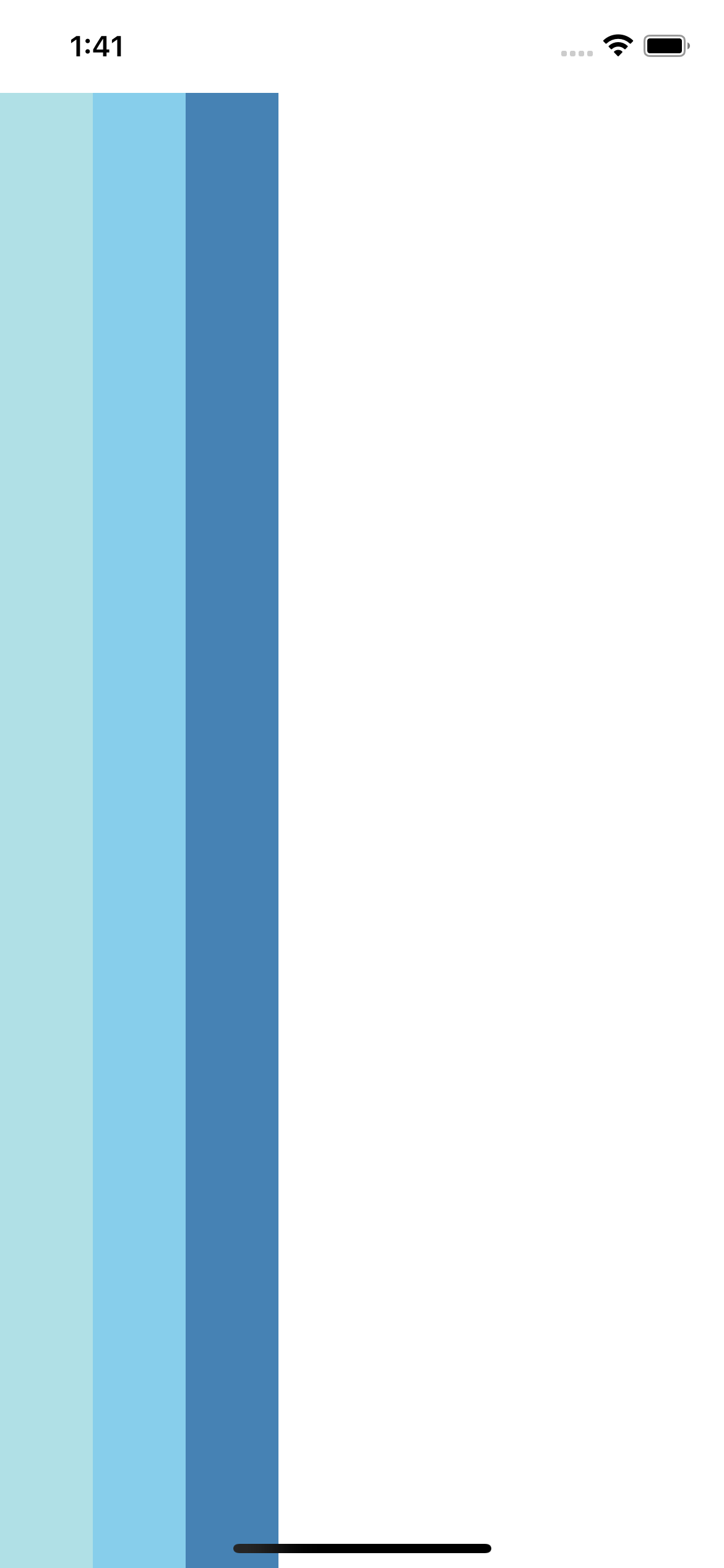
flex : 영역을 차지하는 속성. 위치한 곳의 영역을 flex 합 비율대로 가져간다.
flexDirection : 자리잡은 영역의 방향
- row : 가로
- column : 세로 (기본 값)
justifyContent : flexDirection과 동일한 방향으로 정렬하는 속성
column row

center flex-end space-around

flex-start space-between

row-space-around row-space-between
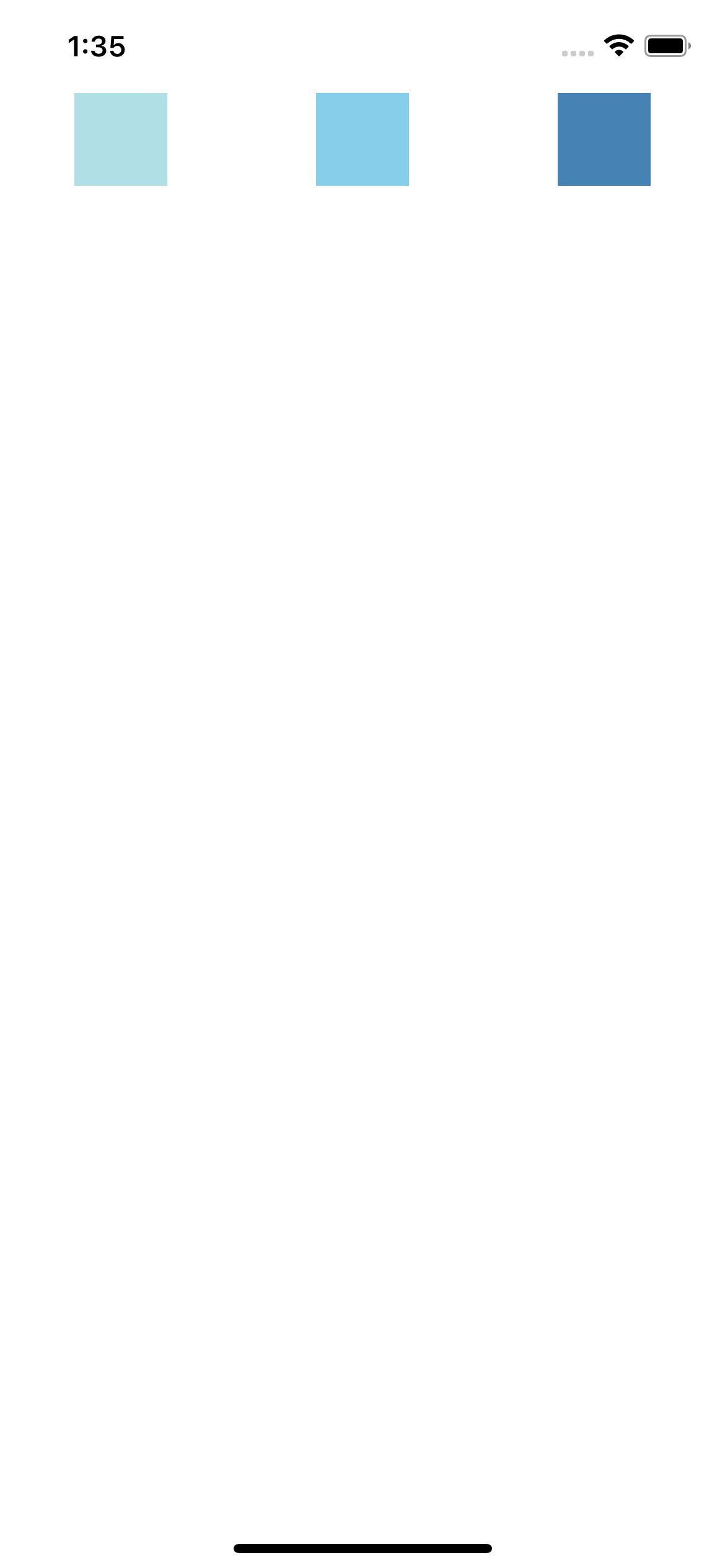
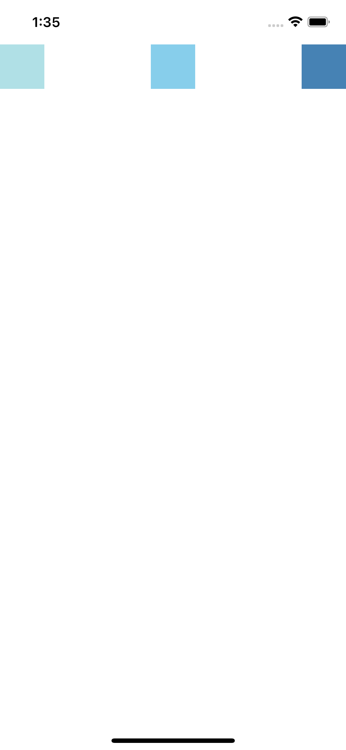
alignItems : Flex Direction과 수작 방향(반대 방향)으로 정렬
flexDirection을 column으로 했을 때 alignItems는 반대 축 row 기준으로 정렬
strech 속성은 해당 축의 크기를 지정하지 않으면 자동으로 영역 전체 차지
center flex flex-start flex-end
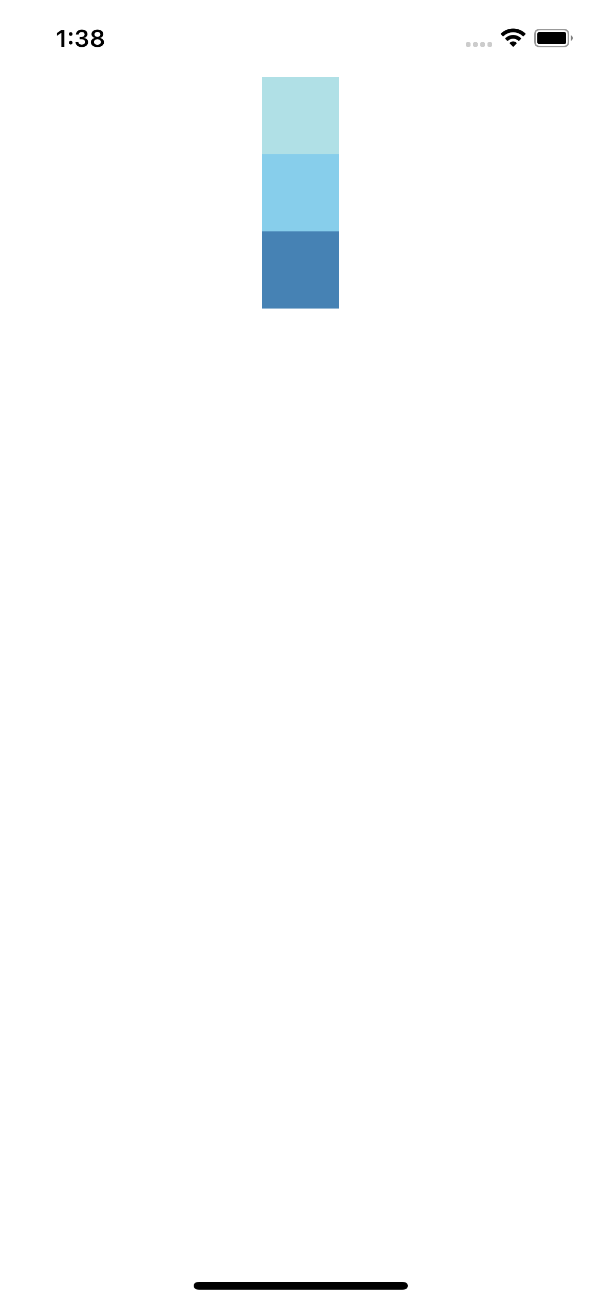
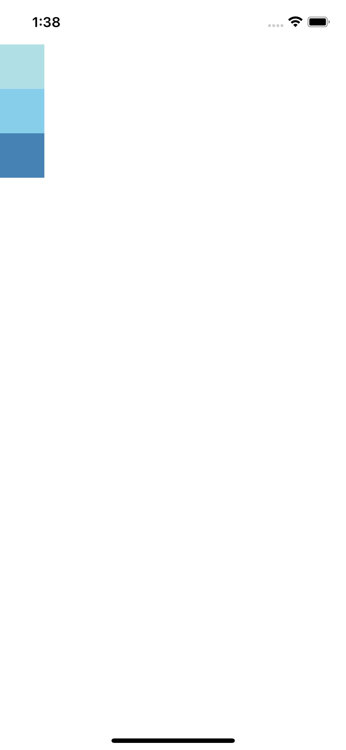
stretch-column stretch-row
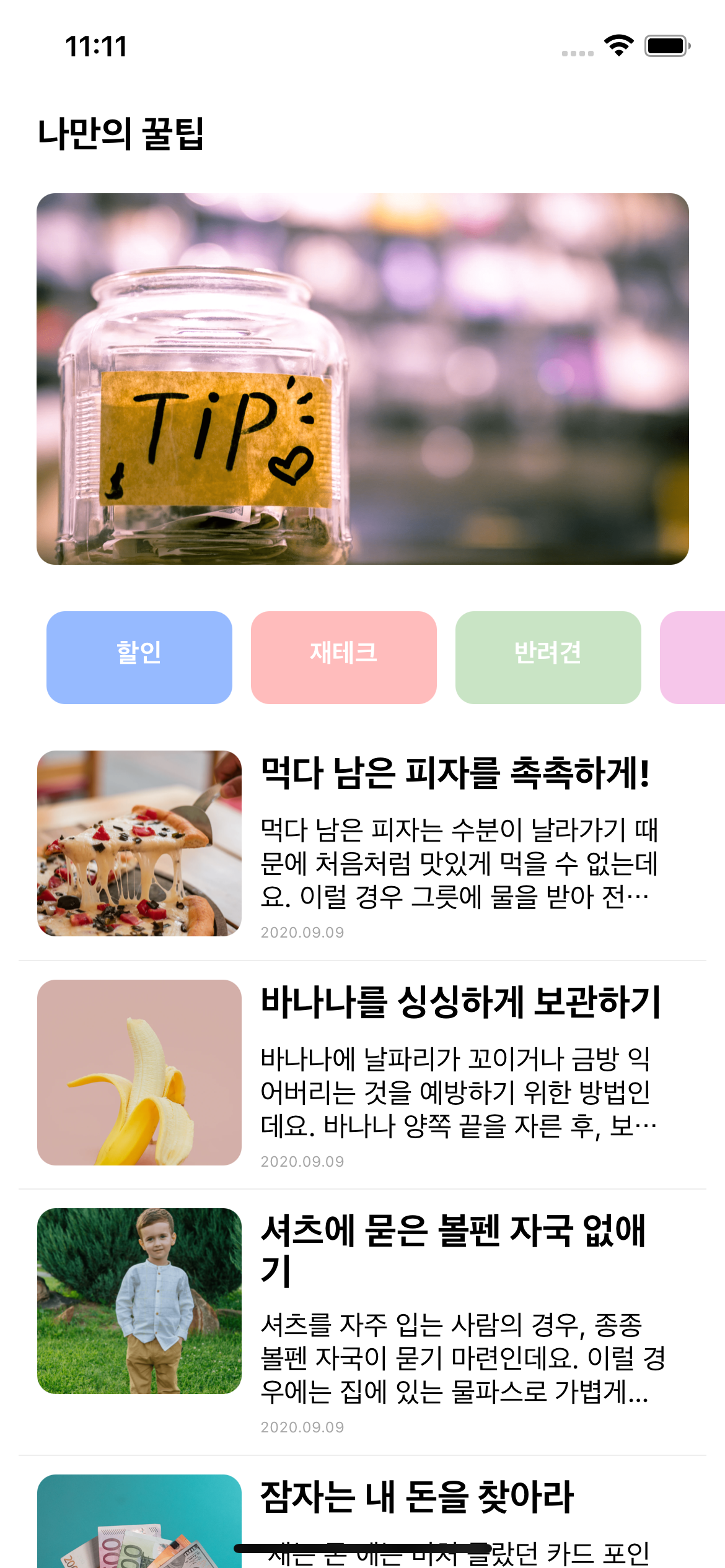
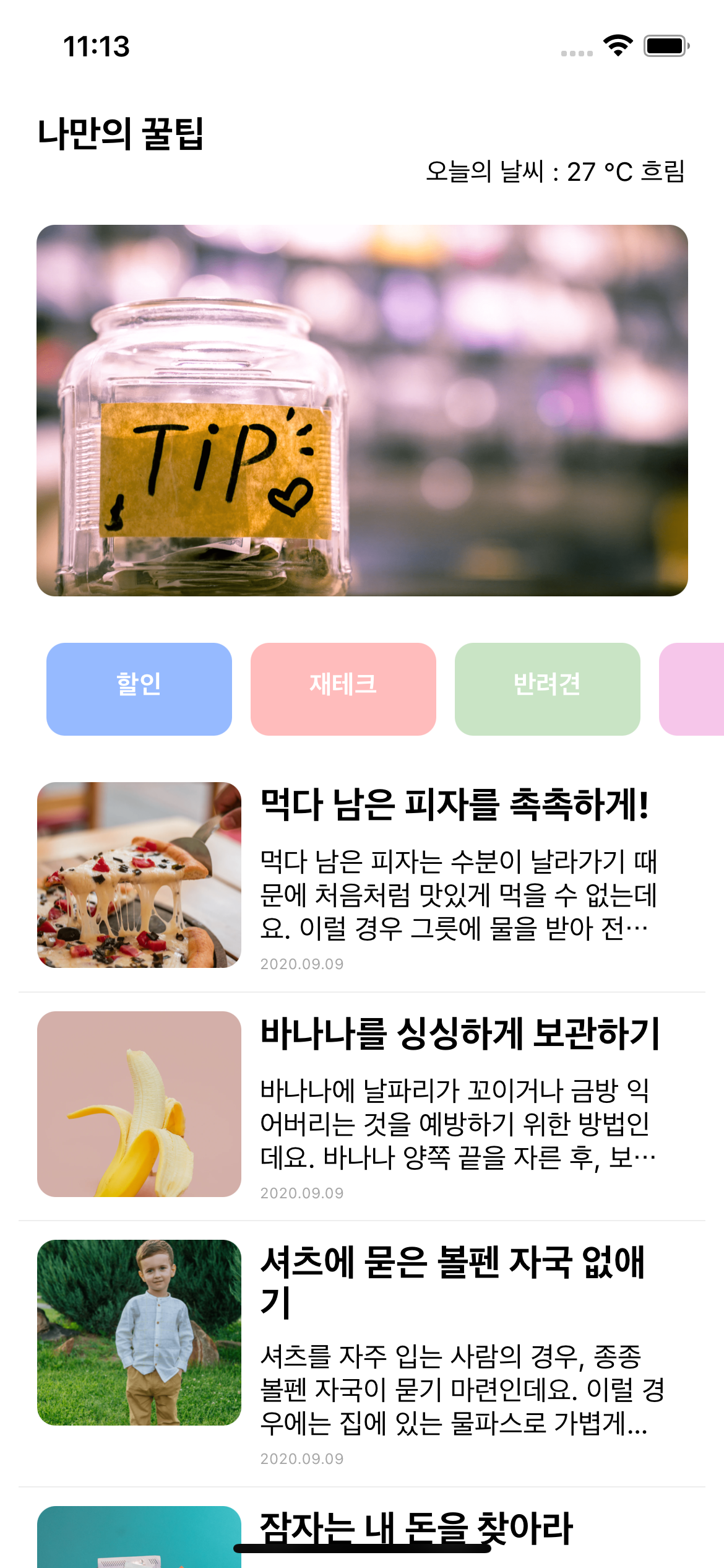
11. 실전 연습
- 필요한 태그 고려
- 해당 태그 속성, 기능 공식문서 활용히야 숙지
- 디자인 고려
12. 실전
기본 함수 골격
export default function App() {
  console.disableYellowBox = true;
  //return 구문 밖에서는 슬래시 두개 방식으로 주석
  return ()

}

const styles = StyleSheet.create({})
라이브러리 임포트
import React from 'react';
import main from './assets/main.png';
import { StyleSheet, Text, View, Image, TouchableOpacity, ScrollView} from 'react-native';
13. 모듈 & 반복문
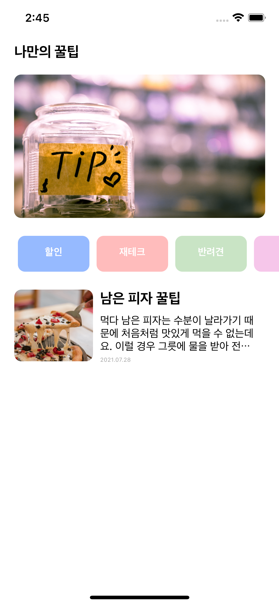
- 모듈 시스템은 하면을 그리는 함수 말고도 데이터를 다룰 때에도 유용
- ./ 현재 파일과 동일한 위치에서 불러올 파일을 찾는 코드
- ../ 현재 파일이 위치한 폴더보다 상위 위치에서 불러올 파일을 찾는 코드
- map은 { } 안에서 사용 가능, 즉, JSX 문법 안에서 구현 가능
<View style={styles.textContainer1}>
  {
    tip.map((content, i) => {
      return (
        <View style={styles.textContainer2} key={i}>
          <Image style={styles.cardImage} source={{url:content.image}} />
          <View style={styles.cardText}>
            <Text style={styles.cardTitle}>{content.title}</Text>
            <Text style={styles.cardDescription} numberOfLines={3}>{content.desc}</Text>
            <Text style={styles.cardDate}>{content.date}</Text>
          </View>
        </View>
      )
    })
  }
</View>
14. {} 표현식 & 조건문
<View style={styles.textContainer1}>
  {
    tip.map((content, i) => {
      return i % 2 == 0 ? (
        <View style={styles.textContainer2} key={i}>
          <Image style={styles.cardImage} source={{url:content.image}} />
          <View style={styles.cardText}>
            <Text style={styles.cardTitle}>{content.title}</Text>
            <Text style={styles.cardDescription} numberOfLines={3}>{content.desc}</Text>
            <Text style={styles.cardDate}>{content.date}</Text>
          </View>
        </View>
      ) : (
        <View style={styles.textContainer3} key={i}>
          <Image style={styles.cardImage} source={{url:content.image}} />
          <View style={styles.cardText}>
            <Text style={styles.cardTitle}>{content.title}</Text>
            <Text style={styles.cardDescription} numberOfLines={3}>{content.desc}</Text>
            <Text style={styles.cardDate}>{content.date}</Text>
          </View>
        </View>
      )
    })
  }
</View>