📝 플렉서블 박스 레이아웃
그리드 레이아웃을 기본으로 하고 각 박스를 원하는 위치에 따라 배치한다. 여유 공간이 생길 경우 너비나 높이를 적절하게 늘이거나 줄일 수 있다. 플렉스 박스는 수평 방향이나 수직 방향 중에서 한쪽을 주축으로 정하고 박스를 배치한다. 주축을 수평으로 정하면 박스를 왼쪽에서부터 오른쪽으로 순서대로 배치하는데, 화면 너비를 넘어가면 수직으로 이동해서 다시 순서대로 배치한다.
📒 플렉스 박스 항목을 배치하는 속성
플렉스 박스에는 플렉스 항목이 여러 개 있는데, 일괄적으로 한꺼번에 배치할 수도 있고, 주축이나 교차축 기준으로 다양하게 배치할 수도 있다.
| 종류 | 설명 |
|---|---|
| justify-content | 주축 방향의 정렬 방법 |
| align-items | 교차축 방향의 정렬 방법 |
| align-self | 교차축에 있는 개별 항목의 정렬 방법 |
| align-content | 교차축에서 여러 줄로 표시된 항목의 정렬 방법 |
📒플렉스 컨테이너를 지정하는 display 속성
플렉스 박스 레이아웃을 만들려면 먼저 웹 콘텐츠를 플렉스 컨테이너로 묶어야 한다. 특정 요소가 플렉스 컨테이너로 동작하려면 display 속성을 이용해 이 부분에 플렉스 레이아웃을 적용하겠다고 지정해야 한다.
| 종류 | 설명 |
|---|---|
| flex | 컨테이너 안의 플렉스 항목을 블록 레벨 요소로 배치 |
| inline-flex | 컨테이너 안의 플렉스 항목을 인라인 레벨 요소로 배치 |
📒 플렉스 방향을 지정하는 flex-direction 속성
플렉스 컨테이너 안에서 플렉스 항목을 배치하는 주축과 방향을 지정하는 속성
| 종류 | 설명 |
|---|---|
| row | 주축을 가로로 지정, 왼쪽에서 오른쪽으로 배치(기본값) |
| row-reverse | 주축을 가로로 지정, 반대로 오른쪽에서 왼쪽으로 배치 |
| column | 주축을 세로로 지정, 위쪽에서 아래쪽으로 배치 |
| column-reverse | 주축을 세로로 지정, 아래쪽에서 위쪽으로 배치 |
<!DOCTYPE html>
<html lang="ko">
<head>
  <meta charset="UTF-8">
  <style>
    .container {
      width: 700px;
      display: flex; /*플렉스 컨테이너 지정*/
      background-color: #eee;
      border: 1px solid #222;
      margin-bottom: 30px;
    }
    .box {
      padding: 5px 45px;
      margin: 5px;
      width: 80px;
      background-color: #222;
    }
    #opt1 { flex-direction: row; }
    #opt2 { flex-direction: row-reverse; }
    #opt3 { flex-direction: column; }
    #opt4 { flex-direction: column-reverse; }
    p {
      color: #fff;
      text-align: center;
    }
  </style>
</head>
<body>
  <div class="container" id="opt1">
    <div class="box"><p>1</p></div>
    <div class="box"><p>2</p></div>
    <div class="box"><p>3</p></div>
  </div>
  <div class="container" id="opt2">
    <div class="box"><p>1</p></div>
    <div class="box"><p>2</p></div>
    <div class="box"><p>3</p></div>
  </div>
  <div class="container" id="opt3">
    <div class="box"><p>1</p></div>
    <div class="box"><p>2</p></div>
    <div class="box"><p>3</p></div>
  </div>
  <div class="container" id="opt4">
    <div class="box"><p>1</p></div>
    <div class="box"><p>2</p></div>
    <div class="box"><p>3</p></div>
  </div>
</body>
</html>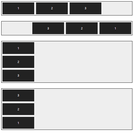
📒 플렉스 항목의 줄을 바꾸는 flex-wrap 속성
flex-wrap 속성은 플렉스 컨테이너 너비보다 많은 플렉스 항목이 있을 경우 줄을 바꿀지 여부를 지정한다.
| 종류 | 설명 |
|---|---|
| nowrap | 플렉스 항목을 한 줄에 표시한다(기본값). |
| wrap | 플렉스 항목을 여러 줄에 표시한다. |
| wrap-reverse | 플렉스 항목을 여러 줄에 표시, 시작점과 끝점이 바뀐다. |
<!DOCTYPE html>
<html lang="ko">
<head>
  <meta charset="UTF-8">
  <style>
    .container {
      display: flex; /*플렉스 컨테이너 지정*/
      background-color: #eee;
      border: 1px solid #222;
      margin-bottom: 30px;
    }
    .box {
      padding: 5px 45px;
      margin: 5px;
      width: 80px;
      background-color: #222;
    }
    #opt1 {
      flex-wrap: nowrap;
    }
    #opt2 {
      flex-wrap: wrap;
    }
    #opt3 {
      flex-wrap: wrap-reverse;
    }
    p {
      color: #fff;
      text-align: center;
    }
  </style>
</head>
<body>
  <div class="container" id="opt1">
    <div class="box"><p>1</p></div>
    <div class="box"><p>2</p></div>
    <div class="box"><p>3</p></div>
    <div class="box"><p>4</p></div>
    <div class="box"><p>5</p></div>
    <div class="box"><p>6</p></div>
  </div>
  <div class="container" id="opt2">
    <div class="box"><p>1</p></div>
    <div class="box"><p>2</p></div>
    <div class="box"><p>3</p></div>
    <div class="box"><p>4</p></div>
    <div class="box"><p>5</p></div>
    <div class="box"><p>6</p></div>
  </div>
  <div class="container" id="opt3">
    <div class="box"><p>1</p></div>
    <div class="box"><p>2</p></div>
    <div class="box"><p>3</p></div>
    <div class="box"><p>4</p></div>
    <div class="box"><p>5</p></div>
    <div class="box"><p>6</p></div>
  </div>
</body>
</html>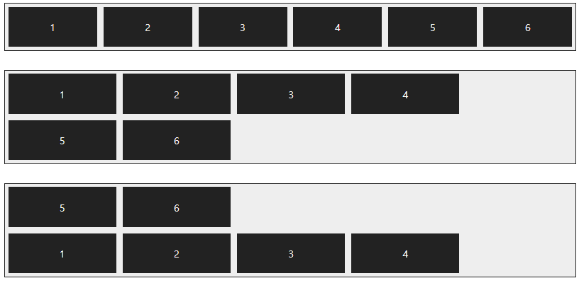
📒 배치 방향과 줄 바꿈을 한꺼번에 지정하는 flex-flow 속성
flex-direction 속성과 flex-wrap 속성을 한꺼번에 지정, 플렉스 항목의 배치 방향을 결정하거나 줄을 바꾼다. 기본값은 row nowrap
<!DOCTYPE html>
<html lang="ko">
<head>
  <meta charset="UTF-8">
  <style>
    .container {
      display: flex;
      background-color: #eee;
      border: 1px solid #222;
      margin-bottom: 10px;
    }
    #opt1 { flex-flow: row wrap; }
    #opt2 { flex-flow: row nowrap; }

    .box {
      padding: 5px 45px;
      margin: 5px;
      background-color: #222;
    }
    p {
      color: #fff;
      text-align: center;
    }
  </style>
</head>
<body>
  <div class="container" id="opt1">
    <div class="box"><p>1</p></div>
    <div class="box"><p>2</p></div>
    <div class="box"><p>3</p></div>
    <div class="box"><p>4</p></div>
    <div class="box"><p>5</p></div>
    <div class="box"><p>6</p></div>
  </div>
  <div class="container" id="opt2">
    <div class="box"><p>1</p></div>
    <div class="box"><p>2</p></div>
    <div class="box"><p>3</p></div>
    <div class="box"><p>4</p></div>
    <div class="box"><p>5</p></div>
    <div class="box"><p>6</p></div>
  </div>
</body>
</html>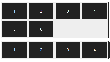
📒 주축 정렬 방법을 지정하는 justify-content 속성
주축에서 플렉스 항목 간의 정렬 방법을 지정한다.
| 종류 | 설명 |
|---|---|
| flex-start | 주축의 시작점에 맞춰 배치 |
| flex-end | 주축의 끝점에 맞춰 배치 |
| center | 주축의 중앙에 맞춰 배치 |
| space-between | 첫 번째 항목과 끝 항목을 주축의 시작점과 끝점에 배치한 후 나머지 항목은 그 사이에 같은 간격으로 배치 |
| space-around | 모든 항목을 주축에 같은 간격으로 배치 |
<!DOCTYPE html>
<html lang="ko">
<head>
  <meta charset="UTF-8">
  <meta name="viewport" content="width=device-width, initial-scale=1">
  <style>
    .container {
      display: flex;
      background-color: #eee;
      border: 1px solid #222;
      margin-bottom: 30px;
    }
    #opt1 {
      justify-content: flex-start;
    }
    #opt2 {
      justify-content: flex-end;
    }
    #opt3 {
      justify-content: center;
    }
    #opt4 {
      justify-content: space-between;
    }
    #opt5 {
      justify-content: space-around;
    }
    .box {
      padding: 5px 45px;
      margin: 5px;
      background-color: #222;
    }
    p {
      color: #fff;
      text-align: center;
    }
  </style>
</head>
<body>
  <div class="container" id="opt1">
    <div class="box"><p>1</p></div>
    <div class="box"><p>2</p></div>
    <div class="box"><p>3</p></div>
    <div class="box"><p>4</p></div>
  </div>
  <div class="container" id="opt2">
    <div class="box"><p>1</p></div>
    <div class="box"><p>2</p></div>
    <div class="box"><p>3</p></div>
    <div class="box"><p>4</p></div>
  </div>
  <div class="container" id="opt3">
    <div class="box"><p>1</p></div>
    <div class="box"><p>2</p></div>
    <div class="box"><p>3</p></div>
    <div class="box"><p>4</p></div>
  </div>
  <div class="container" id="opt4">
    <div class="box"><p>1</p></div>
    <div class="box"><p>2</p></div>
    <div class="box"><p>3</p></div>
    <div class="box"><p>4</p></div>
  </div>
  <div class="container" id="opt5">
    <div class="box"><p>1</p></div>
    <div class="box"><p>2</p></div>
    <div class="box"><p>3</p></div>
    <div class="box"><p>4</p></div>
  </div>
</body>
</html>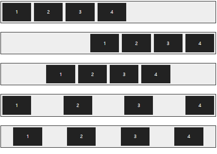
📒 교차축 정렬 방법을 지정하는 align-items 속성
교차축을 기준으로 플렉스 항목 간의 정렬 방법을 지정한다.
| 종류 | 설명 |
|---|---|
| flex-start | 교차축의 시작점에 맞춰 배치 |
| flex-end | 교차축의 끝점에 맞춰 배치 |
| center | 교차축의 중앙에 맞춰 배치 |
| baseline | 교차축의 문자 기준선에 맞춰 배치 |
| stretch | 플렉스 항목을 늘려 교차축에 가득 차게 배치 |
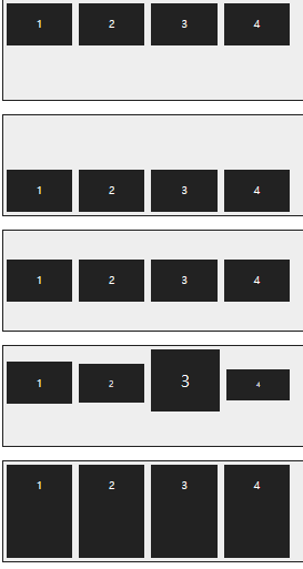
📒 특정 항목만 정렬 방법을 지정하는 align-self 속성
align-items 속성은 교차축을 기준으로 플렉스 항목의 정렬 방법을 결정하지만 그 중 특정 항목만 지정하고 싶다면 align-self 속성을 사용한다. align-items 속성은 플렉스 컨테이너를 지정하는 선택자에 사용하지만 align-self 속성은 플렉스 항목 선택자에 사용한다. align-self 속성값은 align-items 속성에서 사용하는 값과 같다.
<!DOCTYPE html>
<html lang="ko">
<head>
  <meta charset="UTF-8">
  <meta name="viewport" content="width=device-width, initial-scale=1">
  <style>
    .container {
      width: 450px;
      height: 150px;
      background-color: #eee;
      border: 1px solid #222;
      margin-bottom: 20px;
      display: flex; /*플렉스 컨테이너 지정*/
      align-items: center; /*교차축의 중앙에 배치*/
    }
    .box {
      padding: 5px 45px;
      margin: 5px;
      background-color: #222;
    }
    #box1 { align-self: flex-start; }
    #box3 { align-self:  stretch; }
    p {
      color: #fff;
      text-align: center;
    }
  </style>
</head>
<body>
  <div class="container">
    <div class="box" id="box1"><p>1</p></div>
    <div class="box"><p>2</p></div>
    <div class="box" id="box3"><p>3</p></div>
    <div class="box"><p>4</p></div>
  </div>
</body>
</html>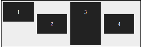
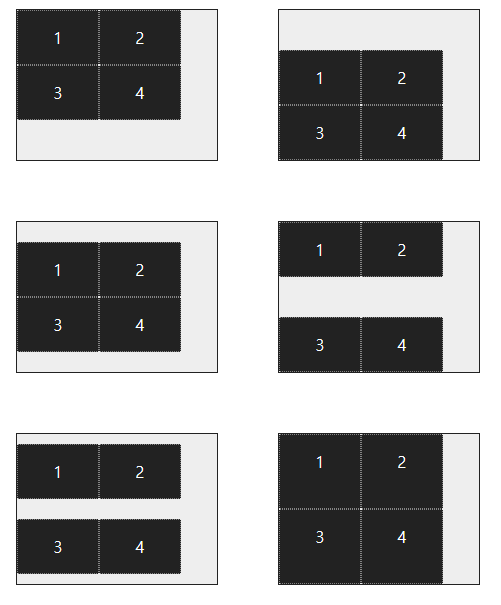
📒 여러 줄일 때 교차축 정렬 방법을 지정하는 align-content 속성
주축에서 줄 바꿈이 생겨서 플렉스 항목을 여러 줄로 표시할 때, align-content 속성을 사용하면 교차축에서 플렉스 항목 간의 간격을 지정할 수 있다.
<!DOCTYPE html>
<html lang="ko">
<head>
  <meta charset="UTF-8">
  <meta name="viewport" content="width=device-width, initial-scale=1.0">
  <style>
    .container {
      float: left;
      width: 200px;
      height: 150px;
      display: flex;
      flex-flow: row wrap;
      border: 1px solid #222;
      background-color: #eee;
      margin: 30px;
    }
    #opt1 {
      align-content: flex-start;
    }
    #opt2 {
      align-content: flex-end;
    }
    #opt3 {
      align-content: center;
    }
    #opt4 {
      align-content: space-between;
    }
    #opt5 {
      align-content: space-around;
    }
    #opt6 {
      align-content: stretch;
    }
    .box {
      width: 80px;
      background-color: #222;
      border: 1px dotted #e9e9e9;
    }
    p {
      color: #fff;
      text-align: center;
    }
  </style>
</head>
<body>
  <div class="container" id="opt1">
    <div class="box"><p>1</p></div>
    <div class="box"><p>2</p></div>
    <div class="box"><p>3</p></div>
    <div class="box"><p>4</p></div>
  </div>
  <div class="container" id="opt2">
    <div class="box"><p>1</p></div>
    <div class="box"><p>2</p></div>
    <div class="box"><p>3</p></div>
    <div class="box"><p>4</p></div>
  </div>
  <div class="container" id="opt3">
    <div class="box"><p>1</p></div>
    <div class="box"><p>2</p></div>
    <div class="box"><p>3</p></div>
    <div class="box"><p>4</p></div>
  </div>
  <div class="container" id="opt4">
    <div class="box"><p>1</p></div>
    <div class="box"><p>2</p></div>
    <div class="box"><p>3</p></div>
    <div class="box"><p>4</p></div>
  </div>
  <div class="container" id="opt5">
    <div class="box"><p>1</p></div>
    <div class="box"><p>2</p></div>
    <div class="box"><p>3</p></div>
    <div class="box"><p>4</p></div>
  </div>
  <div class="container" id="opt6">
    <div class="box"><p>1</p></div>
    <div class="box"><p>2</p></div>
    <div class="box"><p>3</p></div>
    <div class="box"><p>4</p></div>
  </div>
</body>
</html>