뷰티파이란?
뷰티파이는 완전 UI 프레임 워크로 Vue.js위에 만들어졌으며 개발자들에게 풍부한 유저경험을 쉽고 빠르게 만들 수 있게 하는 것이 목표이다. 머티리얼 디자인 스펙을 베이스로 한 컴포넌트들을 완성도 있게 제공 한다.
왜 뷰티파이인가?
2014년 릴리즈된 뷰js가 점점 성장 함에 따라 재사용성이 높은 컴포넌트들이 쏟아져 나왔고 그것을 모은 UI라이브러리들이 등장 하였다. 그중 뷰티파이는 머터리얼 디자인(메테리얼 디자인 = Material Design) 스펙을 정확히 지키고 있으며 모듈성, 반응성, 성능이 좋다고 한다. SASS변수를 이용한 스타일 적용에도 특화 되어 있다.
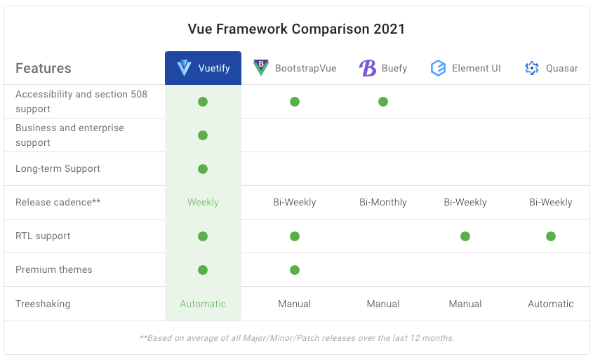
아래는 몇가지 다른 라이브러리 와의 비교표이다. 뷰티파이쪽 데이터를 쓰다보니 뷰티파이에 매우 유리하게 표현 되어 있지만 어느정도는 사실이다.
Nuxt 프로젝트에 뷰티파이 세팅 과정
프로젝트를 처음 만들때부터 제공되는 스타터 툴에서 뷰티파이를 선택 하면 셋팅이 매우 쉽게 끝난다.
yarn create nuxt-app <프로젝트명> 커맨드를 사용 해서 새 프로젝트를 생성하고 이어지는 기본값 설정 질답에 UI Framework를 Vuetify.js로 선택 한다.
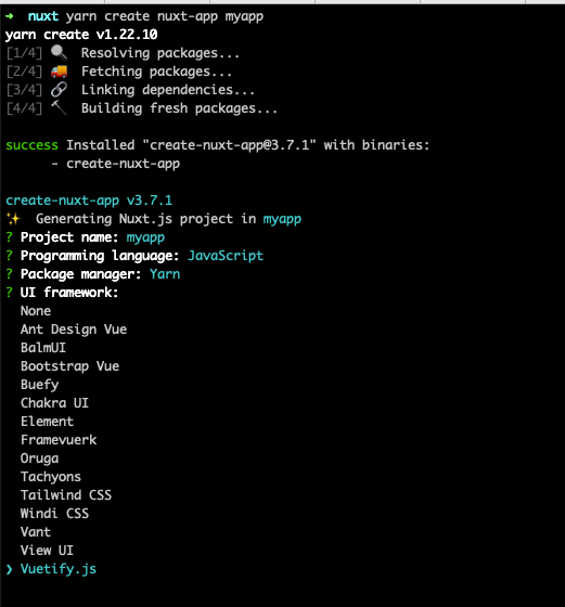
 nuxt yarn create nuxt-app myapp
yarn create v1.22.10
[1/4] 🔍  Resolving packages...
[2/4] 🚚  Fetching packages...
[3/4] 🔗  Linking dependencies...
[4/4] 🔨  Building fresh packages...

success Installed "create-nuxt-app@3.7.1" with binaries:
      - create-nuxt-app

create-nuxt-app v3.7.1
✨  Generating Nuxt.js project in myapp
? Project name: myapp
? Programming language: JavaScript
? Package manager: Yarn
? UI framework: Vuetify.js
? Nuxt.js modules: (Press <space> to select, <a> to toggle all, <i> to invert selection)
? Linting tools: (Press <space> to select, <a> to toggle all, <i> to invert selection)
? Testing framework: None
? Rendering mode: Universal (SSR / SSG)
? Deployment target: Server (Node.js hosting)
? Development tools: (Press <space> to select, <a> to toggle all, <i> to invert selection)
? Version control system: Git
기존에 이미 생성 되어 있는 프로젝트에 뷰티파이를 적용 하고자 한다면 yarn add vuetify 커맨드를 이용 해서 설치 하고 nuxt.config.js파일에 아래처럼 모듈을 추가 해주자.
...
  // Modules for dev and build (recommended): https://go.nuxtjs.dev/config-modules
  buildModules: [
    // https://go.nuxtjs.dev/vuetify
    '@nuxtjs/vuetify',
  ],
...
인스톨이 완료 된 후 해당 프로젝트 폴더로 이동 하자.
프로젝트가 잘 생성 되었다면 yarn dev커맨드를 이용 해서 서버를 실행 할 수 있다.
터미널에 표시된 URL http://localhost:3000을 웹브라우저로 열면 기본 뷰티파이 샘플코드로 pages/index.vue 파일이 작성 되어 있는 것을 확인 할 수 있다.
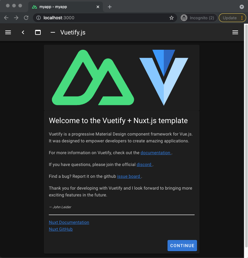
VSC - 비주얼스튜디오코드를 이용해 프로젝트 폴더를 열어보자.
그리고 pages/index.vue 파일을 열어보면 소스코드는 다음과 같다.
<template>
<v-row justify="center" align="center">
<v-col cols="12" sm="8" md="6">
<v-card class="logo py-4 d-flex justify-center">
<NuxtLogo />
<VuetifyLogo />
</v-card>
<v-card>
<v-card-title class="headline">
Welcome to the Vuetify + Nuxt.js template
</v-card-title>
<v-card-text>
<p>Vuetify is a progressive Material Design component framework for Vue.js. It was designed to empower developers to create amazing applications.</p>
<p>
For more information on Vuetify, check out the <a
href="https://vuetifyjs.com"
target="_blank"
rel="noopener noreferrer"
>
documentation
</a>.
</p>
<p>
If you have questions, please join the official <a
href="https://chat.vuetifyjs.com/"
target="_blank"
rel="noopener noreferrer"
title="chat"
>
discord
</a>.
</p>
<p>
Find a bug? Report it on the github <a
href="https://github.com/vuetifyjs/vuetify/issues"
target="_blank"
rel="noopener noreferrer"
title="contribute"
>
issue board
</a>.
</p>
<p>Thank you for developing with Vuetify and I look forward to bringing more exciting features in the future.</p>
<div class="text-xs-right">
<em><small>— John Leider</small></em>
</div>
<hr class="my-3">
<a
href="https://nuxtjs.org/"
target="_blank"
rel="noopener noreferrer"
>
Nuxt Documentation
</a>
<br>
<a
href="https://github.com/nuxt/nuxt.js"
target="_blank"
rel="noopener noreferrer"
>
Nuxt GitHub
</a>
</v-card-text>
<v-card-actions>
<v-spacer />
<v-btn
color="primary"
nuxt
to="/inspire"
>
Continue
</v-btn>
</v-card-actions>
</v-card>
</v-col>
</v-row>
</template>뷰티파이 컴포넌트 설명
기회가 된다면 다음 포스팅에서 뷰티파이를 이용해 다양한 웹 어플리케이션을 프로그래밍 해보자.
이번 포스팅에서는 헬로월드 수준으로 살짝만 살펴 보기로 한다.
뷰티파이의 컴포넌트 들은 v-지시자로 시작 한다.
<v-row>⇒ 부트스트랩의<div class="row">와 동치이며 코드적으로 가로 세로 정렬을 지원 해준다. 예를 들어 둘다 가운데 정렬 하기위해 아래와 같이 attribute가 들어 있는 것을 알 수 있다.
justify="center"
align="center"<v-col>⇒ 부트스트랩의<div class="col">과 동치이며 코드적으로col-화면사이즈-가로사이즈클래스를 지원 해준다. 예를 들어col-12 col-sm-8 col-md-6클래스가 아래와같이 코드로 표현 되어 있는 것을 알 수 있다.
cols="12" sm="8" md="6"<v-card>⇒ 스테틱 이미지를 패널화 해서 표시 하기 위해 설계된 카드형 표시 컴포넌트로 기본 CSS구성은 아래와 같다.
.v-card {
    border-width: thin;
    display: block;
    max-width: 100%;
    outline: none;
    text-decoration: none;
    transition-property: box-shadow, opacity;
    word-wrap: break-word;
    position: relative;
    white-space: normal;
}
이를 이용해서 샘플을 만들면 얼추 구글 앱들에서 보이는 머터리얼 디자인 느낌이 닌다. 예를 들어 아래 멋진 카드를 만들기 위한 샘플코드를 살펴 보자.
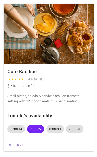
<template>
  <v-card
    :loading="loading"
    class="mx-auto my-12"
    max-width="374"
  >
    <template slot="progress">
      <v-progress-linear
        color="deep-purple"
        height="10"
        indeterminate
      ></v-progress-linear>
    </template>

    <v-img
      height="250"
      src="https://cdn.vuetifyjs.com/images/cards/cooking.png"
    ></v-img>

    <v-card-title>Cafe Badilico</v-card-title>

    <v-card-text>
      <v-row
        align="center"
        class="mx-0"
      >
        <v-rating
          :value="4.5"
          color="amber"
          dense
          half-increments
          readonly
          size="14"
        ></v-rating>

        <div class="grey--text ms-4">
          4.5 (413)
        </div>
      </v-row>

      <div class="my-4 text-subtitle-1">
        $ • Italian, Cafe
      </div>

      <div>Small plates, salads & sandwiches - an intimate setting with 12 indoor seats plus patio seating.</div>
    </v-card-text>

    <v-divider class="mx-4"></v-divider>

    <v-card-title>Tonight's availability</v-card-title>

    <v-card-text>
      <v-chip-group
        v-model="selection"
        active-class="deep-purple accent-4 white--text"
        column
      >
        <v-chip>5:30PM</v-chip>

        <v-chip>7:30PM</v-chip>

        <v-chip>8:00PM</v-chip>

        <v-chip>9:00PM</v-chip>
      </v-chip-group>
    </v-card-text>

    <v-card-actions>
      <v-btn
        color="deep-purple lighten-2"
        text
        @click="reserve"
      >
        Reserve
      </v-btn>
    </v-card-actions>
  </v-card>
</template>
<script>
  export default {
    data: () => ({
      loading: false,
      selection: 1,
    }),

    methods: {
      reserve () {
        this.loading = true

        setTimeout(() => (this.loading = false), 2000)
      },
    },
  }
</script>
알차고 세련된 디자인에 비해 코드가 그리 길지 않음을 알 수 있다. 무엇보다 모듈화가 잘되어 있어서 개발자가 본인의 사이트에 맞게 데이터는 물론 색깔이나 레이아웃 등을 자유자재로 커스터마이제이션 할 수 있게 설계 되어 있다.
<v-card-title>⇒ 카드형 컴포넌트가 가진 4가지 기본 자식 컴포넌트 (v-card-title,v-card-subtitle,v-card-text,v-card-actions) 중 하나로 제목을 표시 하는 용도이다. CSS를 살펴보면 아래와같이 코딩 되어 있다.
.v-card__title {
    align-items: center;
    display: flex;
    flex-wrap: wrap;
    font-size: 1.25rem;
    font-weight: 500;
    letter-spacing: 0.0125em;
    line-height: 2rem;
    word-break: break-all;
}
<v-card-text> ⇒ 텍스트를 포함 하기 위한 것으로 기본 값은 대략 아래와 같다. 디자인 자체 보다는 컨텐츠에 SEO최적화 등을 생각해 메타를 씌우는 용도도 크다고 할 수 있다.
.v-card__subtitle, .v-card__text {
    font-size: 0.875rem;
    font-weight: 400;
    line-height: 1.375rem;
    letter-spacing: 0.0071428571em;
}
<v-card-actions> ⇒ 버튼이나 링크 등을 flex로 디스플레이 하기 위한 소컴포넌트이다.
.v-card__actions {
    align-items: center;
    display: flex;
    padding: 8px;
}-
<v-card-spacer>⇒ 위 액션 컴포넌트 내에서 공백(.spacer{flex-grow: 1 !important;})을 줘서 한쪽으로 몰기 위해 사용 된다. -
<v-btn>⇒<a>링크를 생성하는 헬퍼 컴포넌트 이며 머터리얼 디자인풍의 버튼으로 표현 된다. 스피너나 로딩중, 프로그래스 등의 처리도 모두 가능 하게 설계 되어 있으므로 매우 유용하다.
마무리
잘 나가는 프레임워크 답게 문서화가 매우 잘 되어 있으므로 공식 홈페이지 가이드라인을 따라도 쉽게 금방 따라 할 수 있다. 관심이 있는 분들은 홈페이지도 한번씩 방문 해보자. 앞으로의 포스팅들에서 이 라이브러리들을 사용해서 실사용 예제를 만들어 보는 방향으로 진행해보겠다.