Front-end 국비지원 #011일
HTML / CSS
반응형 페이지 레이아웃01
reset.css 적용 css파일에 reset.css (여백, 불릿, 폰트 초기화 등 )반응형 웹
디스플레이 종류에 따라 화면의 크기가 자동으로 최적화되도록 조절되는 웹페이지.
파일을 넣고 css에서 @import url('reset.css'); 를 적용한다.
- 창크기가 줄어들어도 가로로 스크롤이 생기지 않고 설정한 비율을 그대로 유지한다.
HTML 구성
<body>
    <div id="wrap">
        <header id="header"></header>
        <section id="section"></section>
        <aside id="aside"></aside>
        <footer id="footer"></footer>
    </div>
</body>
CSS 구성
@charset "utf-8";
@import url('./reset.css');
body{
background: #000;
}
#wrap{
width: 1200px;
height: 800px;
background: red;
margin: 0 auto;
}
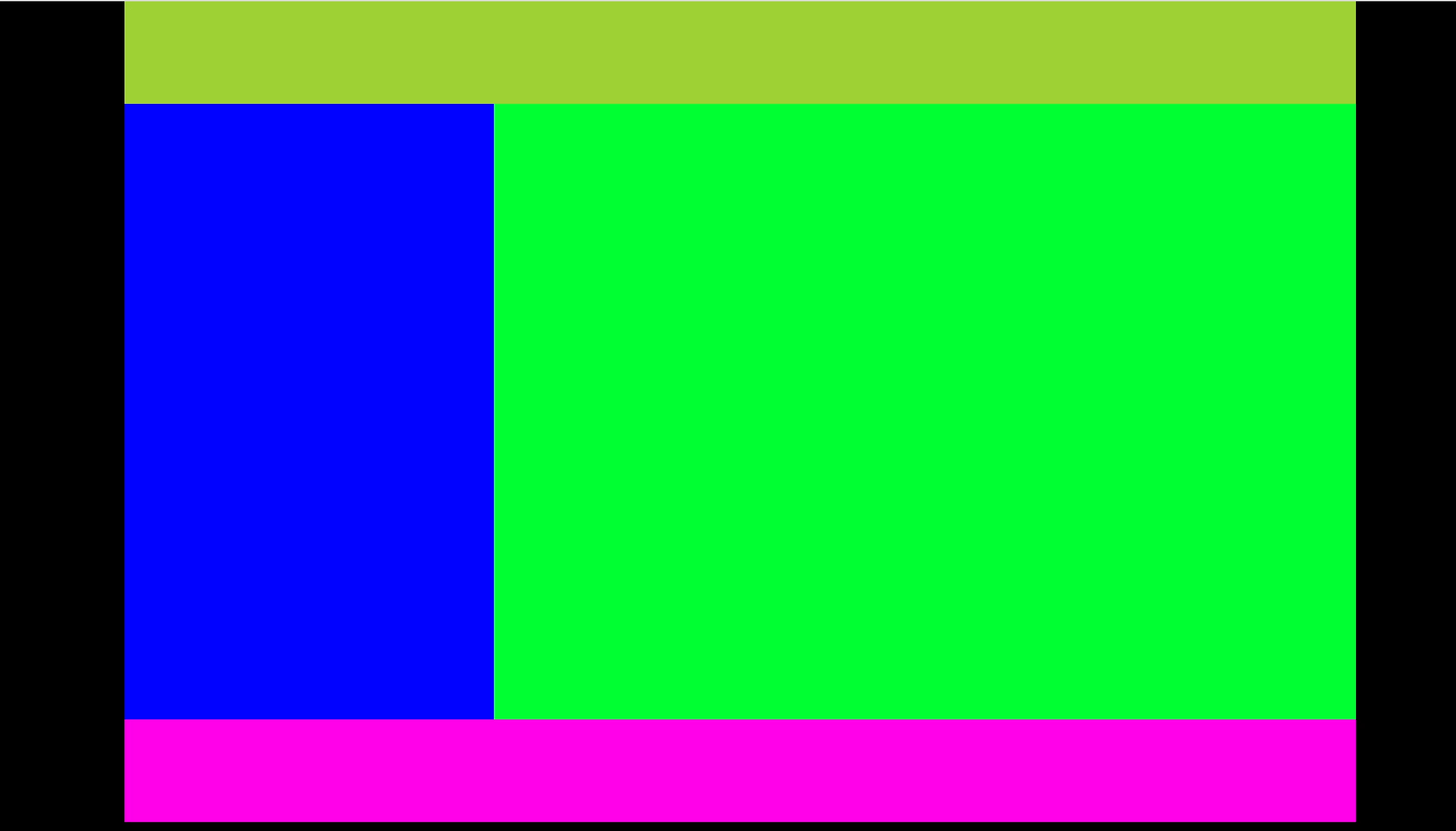
#header{
width: 100%;
height: 100px;
background: rgb(159, 209, 53);
}
#section{
width: 30%;
height: 600px;
background: rgb(0, 4, 255);
float: left;
}
#aside{
width: 70%;
height: 600px;
background: rgb(0, 255, 51);
float: left;
}
#footer{
width: 100%;
height: 100px;
background: rgb(255, 0, 234);
float: left;
}
@media screen and (max-width:1200px){
#wrap{width: 100%;}
}반응형 페이지 레이아웃02
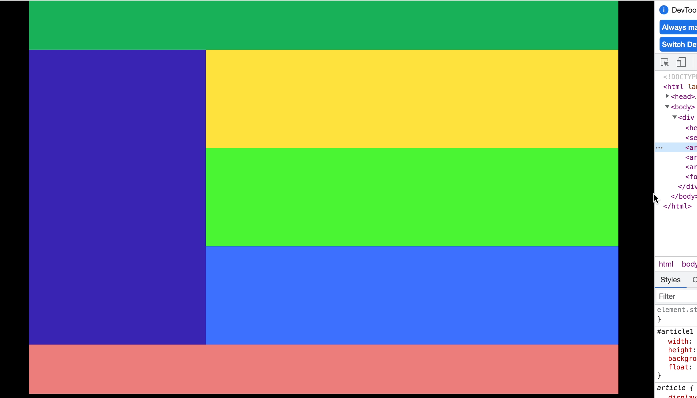
창크기를 줄이면 오른쪽 3개의 메뉴중 3번째 메뉴가 하단으로 맞춰지는 반응형 레이아웃
HTML 구성
<div id="wrap">
        <header id="header"></header>
        <section id="section"></section>
        <article id="article1"></article>
        <article id="article2"></article>
        <article id="article3"></article>
        <footer id="footer"></footer>
</div>
CSS 구성
@charset "utf-8";
@import url('./reset.css');
body{
    background: #000;
}
#wrap{
    width: 1200px;
    height: 800px;
    background: red;
    margin: 0 auto;
}
#header{
    width: 100%;
    height: 100px;
    background: rgb(22, 178, 89);
}
#section{
    width: 30%;
    height: 600px;
    background: rgb(56, 37, 178);
    float: left;
}
#article1{
    width: 70%;
    height: 200px;
    background: rgb(255, 226, 60);
    float: left;
}
#article2{
    width: 70%;
    height: 200px;
    background: rgb(74, 244, 52);
    float: left;
}
#article3{
    width: 70%;
    height: 200px;
    background: rgb(60, 112, 255);
    float: left;
}
#footer{
    width: 100%;
    height: 100px;
    background: rgb(236, 125, 123);
    clear: both;
}
@media screen and (max-width: 1000px){
    #wrap{
  		width: 100%;
  		overflow: hidden;
  	}
    #article1{
        height: 300px;
    }
    #article2{
        height: 300px;
    }
    #article3{
        width: 100%;
        height: 200px;
        clear: both;
    }
}
article3은 창을 줄이면 @media screen에서 float:left를 무효화 하고 clear:both를 적용한다.
반응형 페이지 레이아웃03
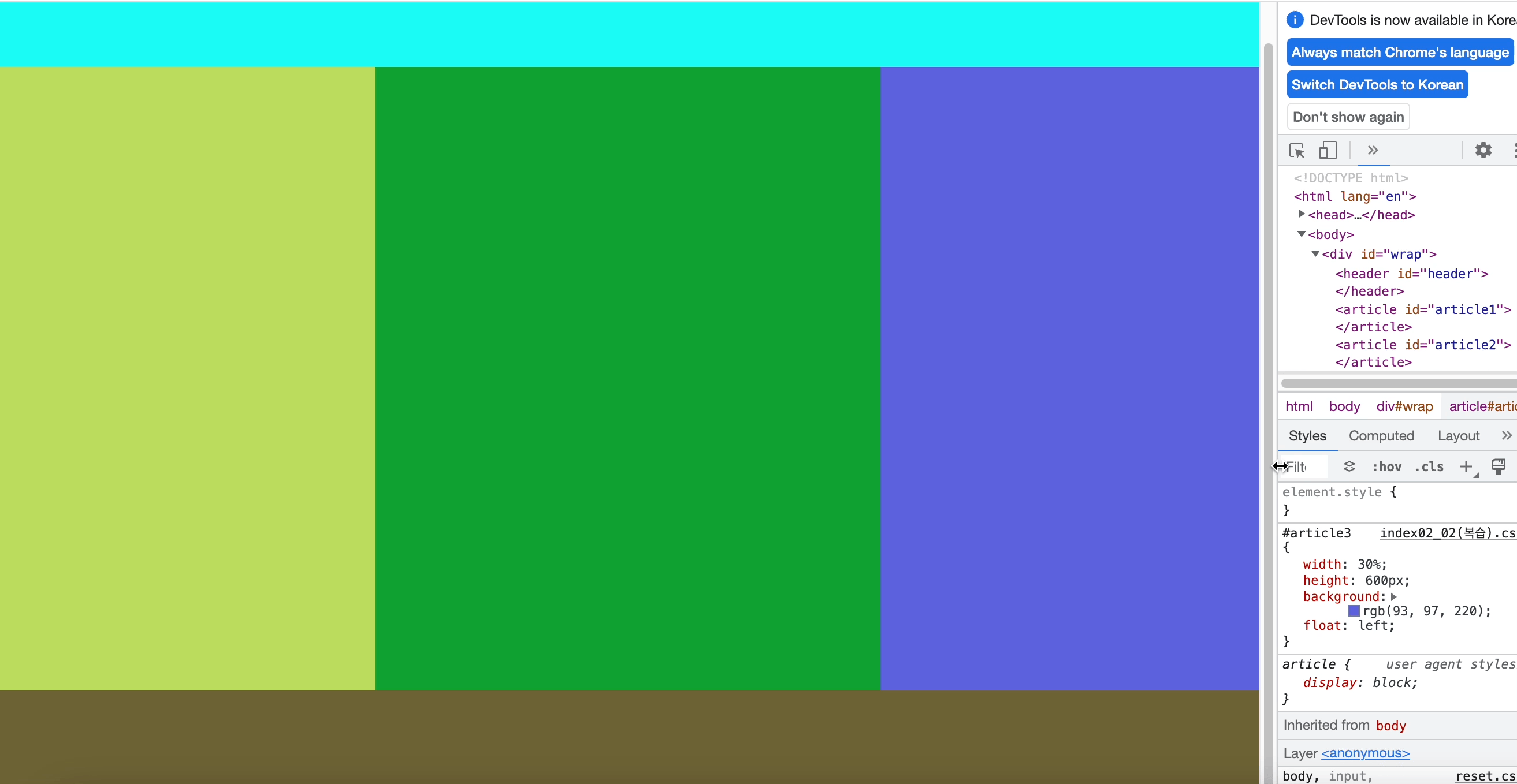
창크기를 줄이면 3번째 메뉴가 사라지는 반응형 레이아웃
HTML 구성
<div id="wrap">
        <header id="header"></header>
        <article id="article1"></article>
        <article id="article2"></article>
        <article id="article3"></article>
        <footer id="footer"></footer>
</div>
CSS 구성
@charset "utf-8";
@import url('./reset.css');
body{
    background: #000;
}
#wrap{
    width: 100%;
    height: 800px;
}
#header{
    width: 100%;
    height: 100px;
    background: rgb(25, 250, 246);
}
#article1{
    width: 30%;
    height: 600px;
    background: rgb(186, 220, 93);
    float: left;
}
#article2{
    width: 40%;
    height: 600px;
    background: rgb(19, 161, 50);
    float: left;
}
#article3{
    width: 30%;
    height: 600px;
    background: rgb(93, 97, 220);
    float: left;
}
#footer{
    width: 100%;
    height: 100px;
    background: rgb(109, 99, 53);
    float: left;
}
@media screen and (max-width: 900px) {
    #article1{width: 50%;}
    #article2{width: 50%;}
    #article3{display: none;}
}
article3은 창이 줄어들면 @media screen에서 display: none 을 적용하여 사라지게 한다.
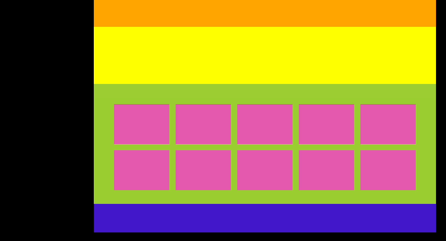
반응형 페이지 레이아웃04
창이 줄어들면 메뉴가 바뀌는 레이아웃
HTML 구성
<div id="wrap">
        <header id="header"></header>
        <section id="section"></section>
        <article id="article">
            <ul>
                <li></li>
                <li></li>
                <li></li>
                <li></li>
                <li></li>
                <li></li>
                <li></li>
                <li></li>
                <li></li>
                <li></li>
                <li></li>
                <li></li>
            </ul>
        </article>
        <footer id="footer"></footer>
    </div>
CSS 구성
@charset "utf-8";
@import url('./reset.css');
body{
    background: #000;
}
#wrap{
    width: 1200px;
    background: red;
    margin: 0 auto;
}
#header{
    width: 100%;
    height: 100px;
    background: orange;
}
#section{
    width: 100%;
    height: 200px;
    background: yellow;
}
#article{
    width: 90%;
    height: 300px;
    padding: 5%;
    background: yellowgreen;
    overflow: hidden;
}
#article>ul{
    width: 100%;
}
#article ul li{
    width: 18%;
    height: 140px;
    background: rgb(227, 89, 174);
    margin: 1%;
    float: left;
}
#article ul li:nth-child(11){display: none;}
#article ul li:nth-child(12){display: none;}
#footer{
    width: 100%;
    height: 100px;
    background: rgb(66, 24, 202);
}
@media screen and (max-width: 1220px) {
    #wrap{width: 100%}
}
@media screen and (max-width: 1000px) {
    #article ul li{width: 23%; height: 87px;}
    #article ul li:nth-child(11){display: block;}
    #article ul li:nth-child(12){display: block;}
}
@media screen and (max-width: 800px) {
    #article ul li{width: 31.333%; height: 87px;}
    #article ul li:nth-child(10){display: none;}
    #article ul li:nth-child(11){display: none;}
    #article ul li:nth-child(12){display: none;}
}
@media screen and (max-width: 600px) {
    #article ul li{width: 48%; height: 144px;}
    #article ul li:nth-child(5){display: none;}
    #article ul li:nth-child(6){display: none;}
    #article ul li:nth-child(7){display: none;}
    #article ul li:nth-child(8){display: none;}
    #article ul li:nth-child(9){display: none;}
    #article ul li:nth-child(10){display: none;}
    #article ul li:nth-child(11){display: none;}
    #article ul li:nth-child(12){display: none;}
}
각 li 메뉴들을 display:none과 block을 잘 사용하여 활용한다.
반응형 페이지 레이아웃05
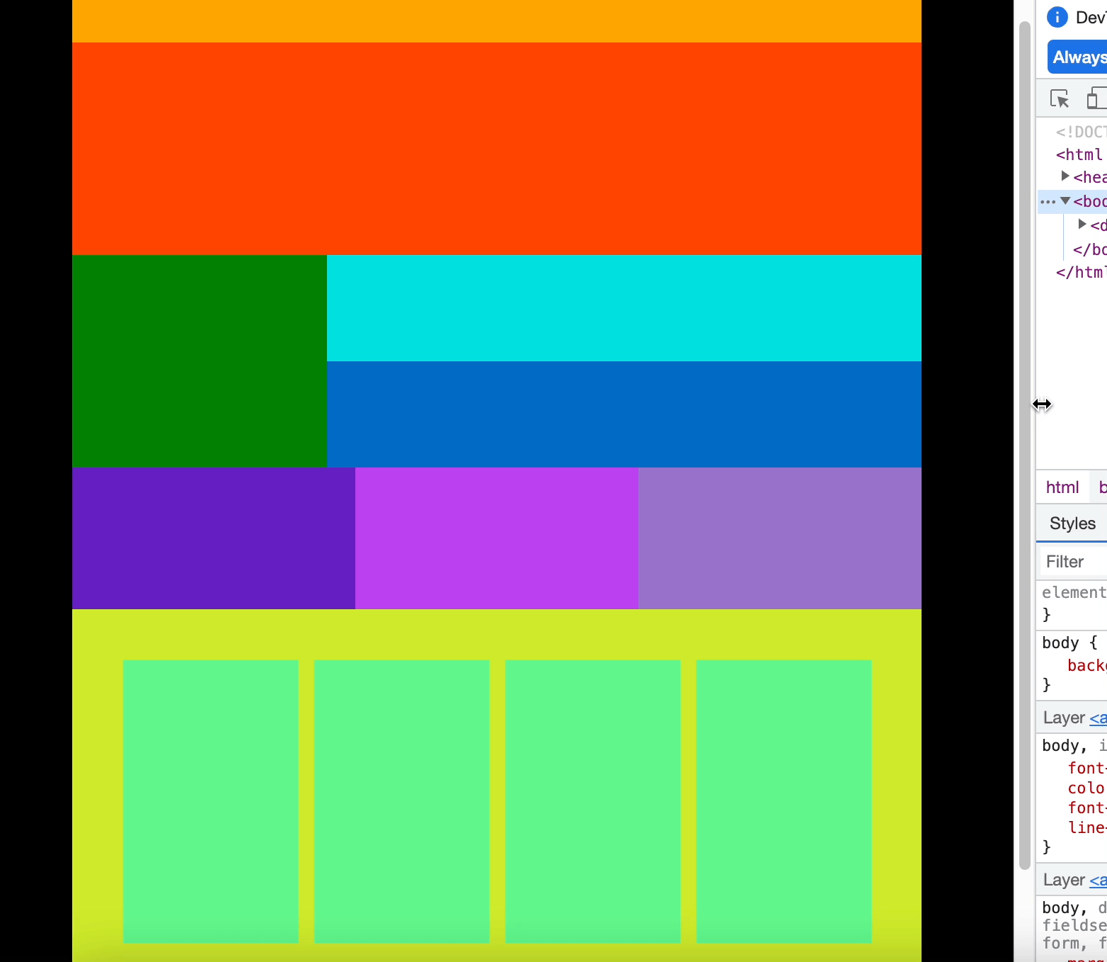
HTML 구성
 <div id="wrap">
    <header id="header"></header>
    <section id="banner"></section>
    <section id="content1">
        <nav id="nav"></nav>
        <article class="right_article1"></article>
        <article class="right_article2"></article>
    </section>
    <section id="content2">
        <article class="content2_box1"></article>
        <article class="content2_box2"></article>
        <article class="content2_box3"></article>
    </section>
    <section id="content3">
        <article class="content3_box1"></article>
        <article class="content3_box2"></article>
        <article class="content3_box3"></article>
        <article class="content3_box4"></article>
    </section>
    <footer id="footer"></footer>
   </div>
CSS 구성
@charset "utf-8";
@import url('./reset.css');
body{background: #000;}
#wrap{
    width: 1200px;
    height: 1400px;
    background: red;
    margin: 0 auto;
}
#header{
    width: 100%;
    height: 100px;
    background: orange;
}
#banner{
    width: 100%;
    height: 300px;
    background: orangered;
}
#content1{
    width: 100%;
    overflow: hidden;
}
#nav{
    width: 30%;
    height: 300px;
    background: green;
    float: left;
}
.right_article1{
    width: 70%;
    height: 150px;
    background: rgb(5, 224, 221);
    float: left;
}
.right_article2{
    width: 70%;
    height: 150px;
    background: rgb(2, 106, 198);
    float: left;
}
#content2{
    width: 100%;
    overflow: hidden;
}
.content2_box1{
    width: 33.333%;
    height: 200px;
    background: rgb(100, 32, 194);
    float: left;
}
.content2_box2{
    width: 33.333%;
    height: 200px;
    background: rgb(188, 65, 241);
    float: left;
}
.content2_box3{
    width: 33.333%;
    height: 200px;
    background: rgb(151, 113, 203);
    float: left;
}
#content3{
    background: rgb(205, 234, 42);
    overflow: hidden;
    padding: 5%;
}
.content3_box1{
    width: 23%;
    height: 400px;
    background: rgb(97, 246, 139);
    float: left;
    margin: 1%;
}/* 400 */
.content3_box2{
    width: 23%;
    height: 400px;
    background: rgb(97, 246, 139);
    float: left;
    margin: 1%;
}
.content3_box3{
    width: 23%;
    height: 400px;
    background: rgb(97, 246, 139);
    float: left;
    margin: 1%;
}
.content3_box4{
    width: 23%;
    height: 400px;
    background: rgb(97, 246, 139);
    float: left;
    margin: 1%;
}
#footer{
    width: 100%;
    height: 100px;
    background: #ededed;
}

@media screen and (max-width: 1200px) {
    #wrap{
  		width: 100%;
  	}
    .content2_box1{
        width: 50%;
        height: 200px;
    }
    .content2_box2{
        width: 50%;
        height: 200px;
    }
    .content2_box3{
        display: none;
    }
    .content3_box1{width: 31.333%;}
    .content3_box2{width: 31.333%}
    .content3_box3{width: 31.333%}
    .content3_box4{display: none;}
}