HTML / CSS
Grid
CSS 그리드 레이아웃(Grid Layout)은 페이지를 여러 주요 영역으로 나누거나, 크기와 위치 및 문서 계층 구조의 관점에서 HTML 기본 요소로 작성된 콘트롤 간의 관계를 정의하는 데 탁월
테이블과 마찬가지로 그리드 레이아웃은 세로 열과 가로 행을 기준으로 요소를 정렬할 수 있다. 하지만, 테이블과 달리 CSS 그리드는 다양한 레이아웃을 훨씬 더 쉽게 구현할 수 있다. 예를 들어, 그리드 컨테이너 속 자식 요소를, 마치 CSS로 일일이 위치를 지정해 준 것처럼, 실제로 겹치게 층을 지면서 자리를 잡도록 각 요소의 위치를 지정해 줄 수도 있다.
ex)
Grid 속성
display :그리드 컨테이너를 정의. 값은 gird, inline-gird
grid-template-rows : 행(Track)의 크기를 정의
grid-template-columns : 열(Track)의 크기를 정의
grid-template-areas : 영역 이름을 참조하여 템플릿 생성
grid-template : grid-template-xxx의 단축 속성
row-gap (grid-row-gap) : 행과 행 사이의 간격을 정의
column-gap (grid-column-gap) : 열과 열 사이의 간격을 정의
gap (grid-gap) : xxx-gap의 단축 속성
grid-auto-rows : 임시적인 행의 크기를 정의
grid-auto-columns : 임시적인 열의 크기를 정의
grid-auto-flow : 자동 배치 알고리즘 방식을 정의
gird : grid-tempate-xxx , grid-auto-xxx의 단축 속성
align-content : 그리드 콘텐츠를 수직 정렬
justify-content : 그리드 콘텐츠를 수평 정렬
place-content : align-content, justify-content의 단축 속성
align-items : 그리드 아이템들을 수직 정렬
justify-items : 그리드 아이템들을 수평 정렬
place-items : align-items, justify-items의 단축 속성
order : 그리드 아이템의 배치 순서를 지정
z-index :그리드 아이템의 쌓이는 순서를 지정
ex)
HTML
<body>
<div class="container">
<div>1</div>
<div>2</div>
<div>3</div>
<div>4</div>
<div>5</div>
<div>6</div>
</div>
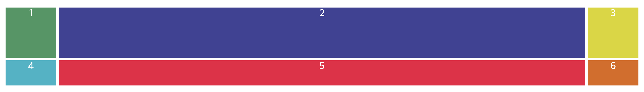
</body>CSS
.container{
    display: grid;
    grid-template-columns: 100px auto;
    grid-template-rows: 100px 100px 300px;
    gap: 5px;

.container div{color: #fff; font-size: 20px; text-align: center;}
.container div:nth-child(1){background: rgb(63, 151, 97);}
.container div:nth-child(2){background: rgb(63, 66, 151);}
.container div:nth-child(3){background: rgb(218, 214, 0);}
.container div:nth-child(4){background: rgb(29, 180, 199);}
.container div:nth-child(5){background: rgb(240, 13, 66);}
.container div:nth-child(6){background: rgb(224, 103, 16);}- display: grid
- grid-template-columns: 100px auto; / 가로 2칸은 100px 과 나머지 auto 값을 가진다.
- grid-template-rows: 100px 100px 300px; / 세로 3줄의 높이 값
- gap: 5px; / 사이의 갭은 5px이다.
ex)

HTML
<body>
<div class="container">
<div>1</div>
<div>2</div>
<div>3</div>
<div>4</div>
<div>5</div>
<div>6</div>
</div>
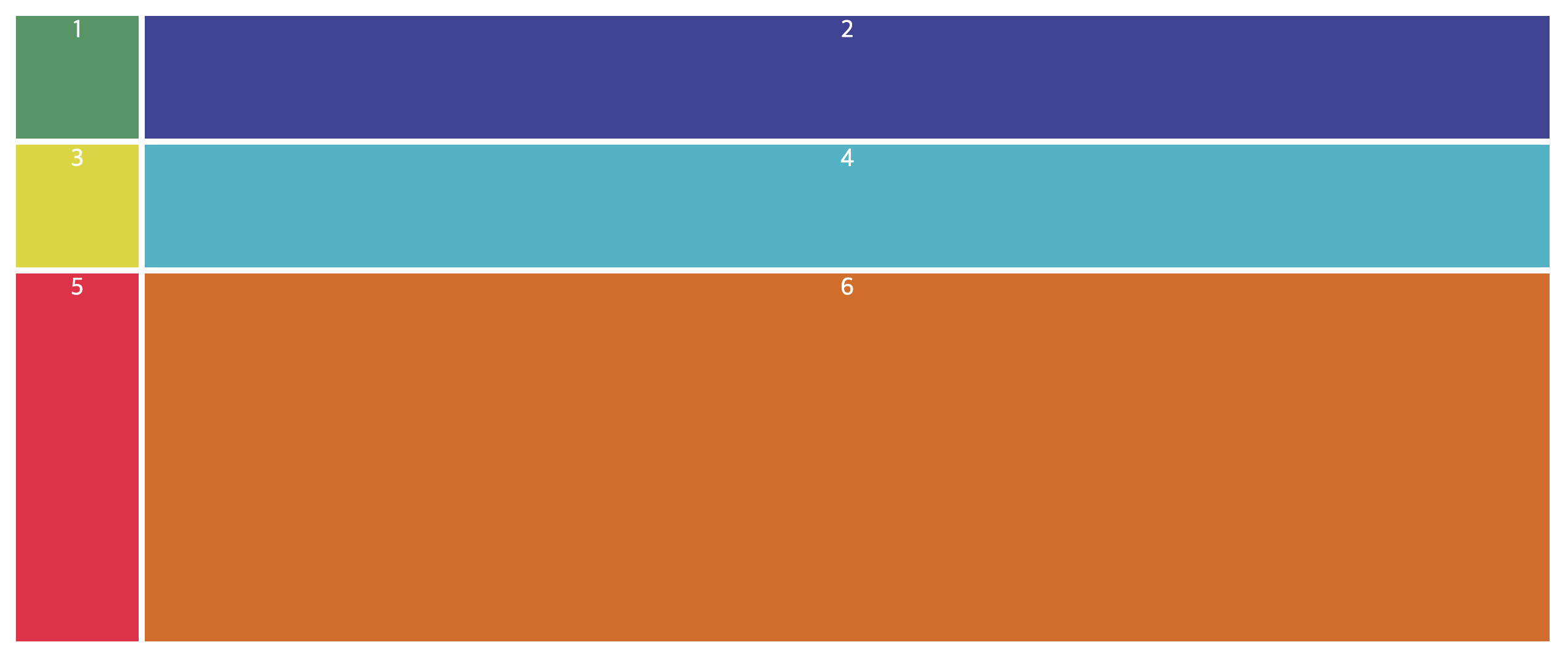
</body>CSS
body{padding: 50px;}

.container{
    display: grid;
    gap: 3px;
    /* grid-template-columns: 3fr 1fr 1fr; */
    /* grid-template-columns: repeat(3, 1fr); */
    /* grid-template-rows: 50px 50px; */
    /* grid-template-rows: repeat(2, 50px); */
    grid: repeat(2, 50px)/ repeat(3, 1fr);
}
.container div{color: #fff; font-size: 20px; text-align: center;}
.container div:nth-child(1){background: rgb(63, 151, 97);}
.container div:nth-child(2){background: rgb(63, 66, 151);}
.container div:nth-child(3){background: rgb(218, 214, 0);}
.container div:nth-child(4){background: rgb(29, 180, 199);}
.container div:nth-child(5){background: rgb(240, 13, 66);}
.container div:nth-child(6){background: rgb(224, 103, 16);}
- 여러 방법중에서 grid: repeat(2, 50px) 2줄 50px 높이 / repeat(3, 1fr); 3칸 1fr너비
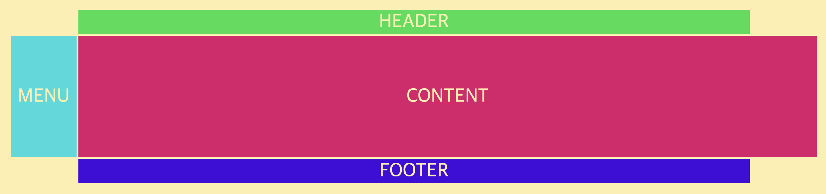
ex) Grid 반응형 레이아웃 1
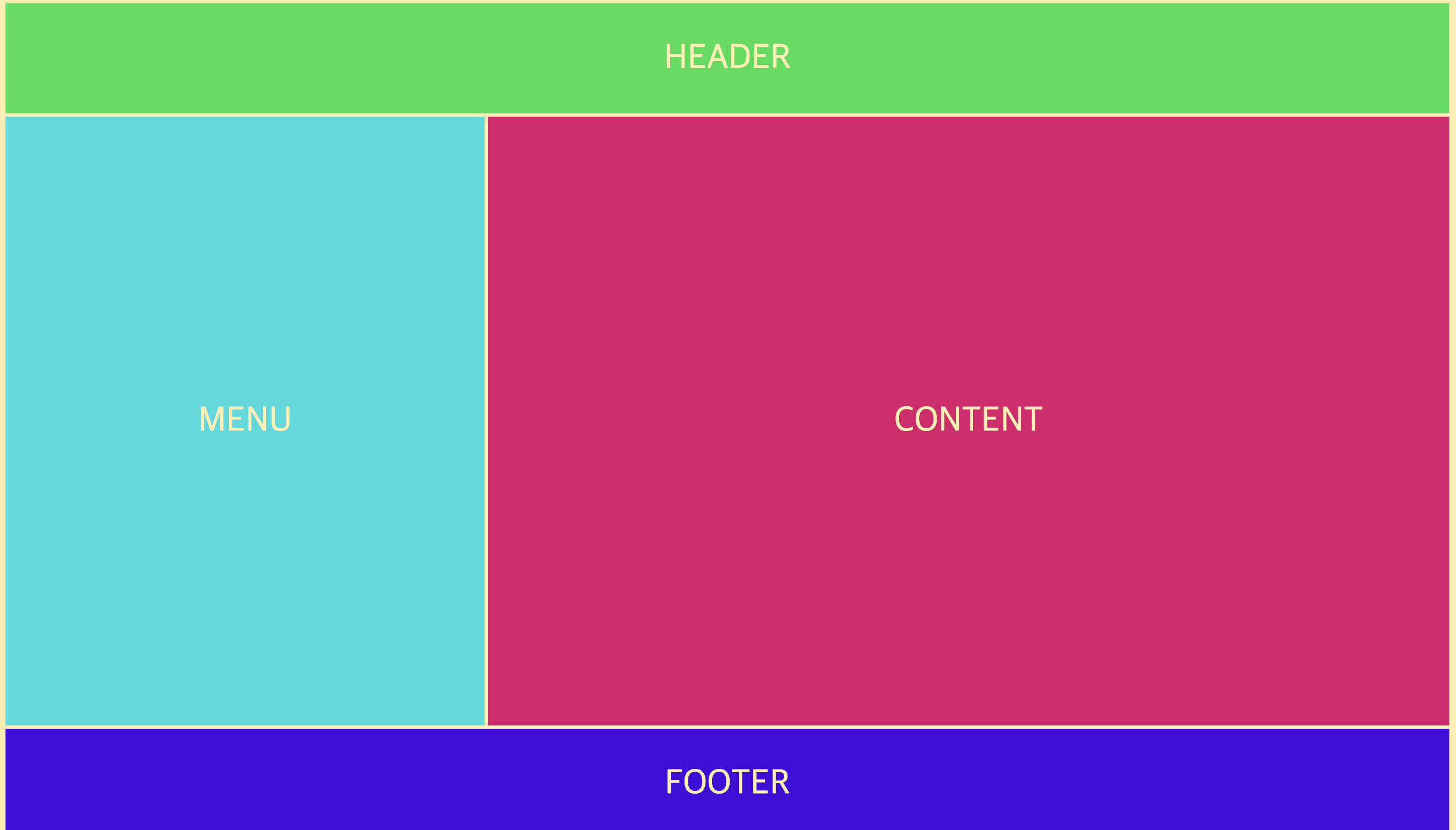
HTML
<body>
    <div class="container">
        <div class="header">HEADER</div>
        <div class="menu">MENU</div>
        <div class="content">CONTENT</div>
        <div class="footer">FOOTER</div>
    </div>
</body>
CSS
html,body{background: #ffeead; margin: 10px;}

.container{height: 100vh; display: grid; gap: 3px; grid-template-columns: repeat(12, 1fr); grid-template-rows: 100px auto 100px;}
.container > div{display: flex; justify-content: center; align-items: center; font-size: 2em; color: #ffeead;}
.container .header{background: rgb(11, 221, 77); grid-column: 1/-1;}
.container .menu{background: rgb(11, 218, 221); grid-column: 1/5;}
.container .content{background: rgb(221, 11, 106);grid-column: 5/-1;}
.container .footer{background: rgb(67, 11, 221); grid-column: 1/-1;}- 12칸을 만들고 넣어서 각자의 영역을 차지하는 부분을 병합시킨다.
ex) Grid 반응형 레이아웃 2
HTML
<body>
    <div class="container">
        <div class="header">HEADER</div>
        <div class="menu">MENU</div>
        <div class="content">CONTENT</div>
        <div class="footer">FOOTER</div>
    </div>
</body>
CSS
.container{
    display: grid;
    gap: 3px;
    grid-template-columns: repeat(12, 1fr);
    grid-template-rows: 40px 200px 40px;
    grid-template-areas:
        ". h h h h h h h h h h ."
        "m c c c c c c c c c c c"
        ". f f f f f f f f f f ."
    ;
}
.container > div{display: flex; justify-content: center; align-items: center; font-size: 2em; color: #ffeead;}
.container .header{background: rgb(11, 221, 77); grid-area: h;}
.container .menu{background: rgb(11, 218, 221); grid-area: m;}
.container .content{background: rgb(221, 11, 106); grid-area: c;}
.container .footer{background: rgb(67, 11, 221); grid-area: f;}
- 문자를 이용하여 병합가능
Auto-fit , Auto-fill
ex) auto-fit, auto-fill
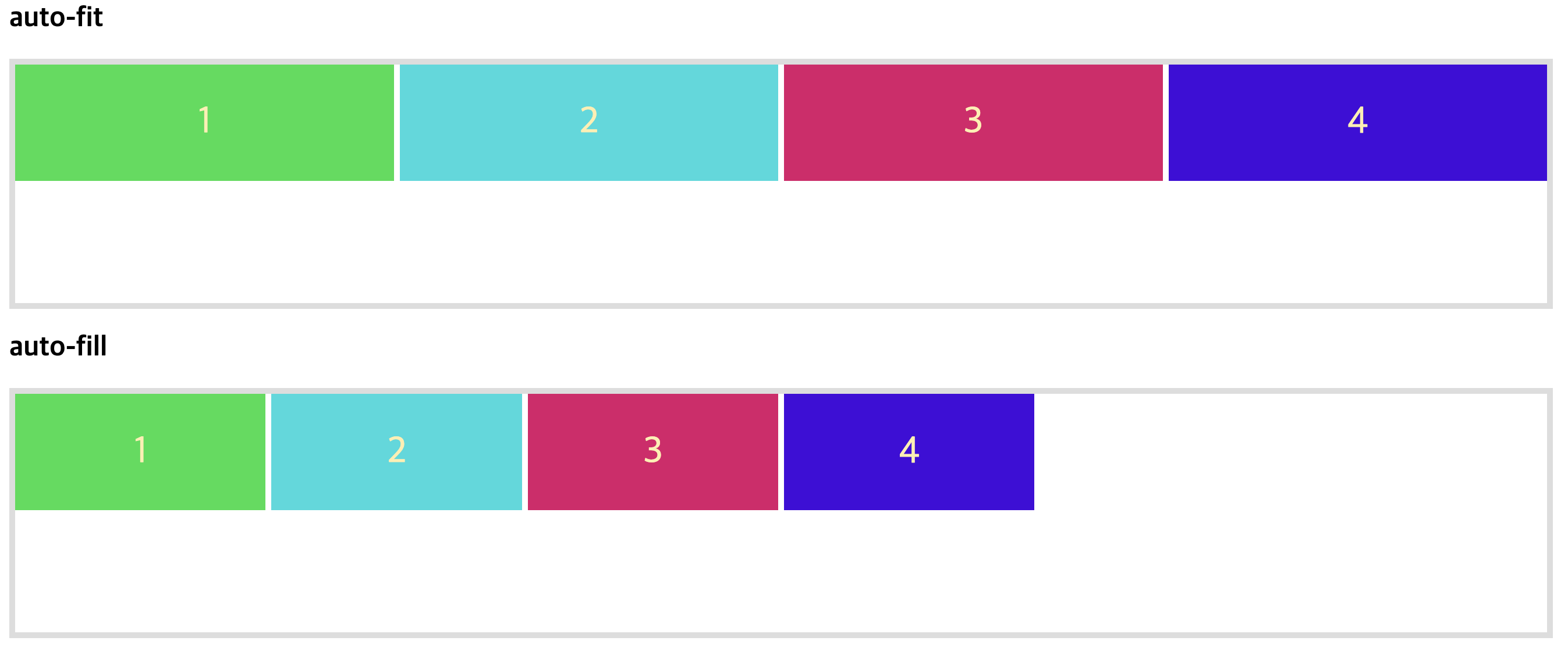
HTML
<body>
    <h2>auto-fit</h2>
    <div class="container1 container">
        <div>1</div>
        <div>2</div>
        <div>3</div>
        <div>4</div>
    </div>
    <h2>auto-fill</h2>
    <div class="container2 container">
        <div>1</div>
        <div>2</div>
        <div>3</div>
        <div>4</div>
    </div>
</body>
CSS
.container{
    display: grid;
    gap: 3px;
}
.container1{border: 5px solid #ddd; display: grid; gap: 5px; grid-template-columns: repeat(auto-fit, minmax(200px, 1fr)); grid-template-rows: repeat(2, 100px);}
.container2{border: 5px solid #ddd; display: grid; gap: 5px; grid-template-columns: repeat(auto-fill, minmax(200px, 1fr)); grid-template-rows: repeat(2, 100px);}

.container > div{display: flex; justify-content: center; align-items: center; font-size: 2em; color: #ffeead;}
.container div:nth-child(1){background: rgb(11, 221, 77); }
.container div:nth-child(2){background: rgb(11, 218, 221); }
.container div:nth-child(3){background: rgb(221, 11, 106); }
.container div:nth-child(4){background: rgb(67, 11, 221); }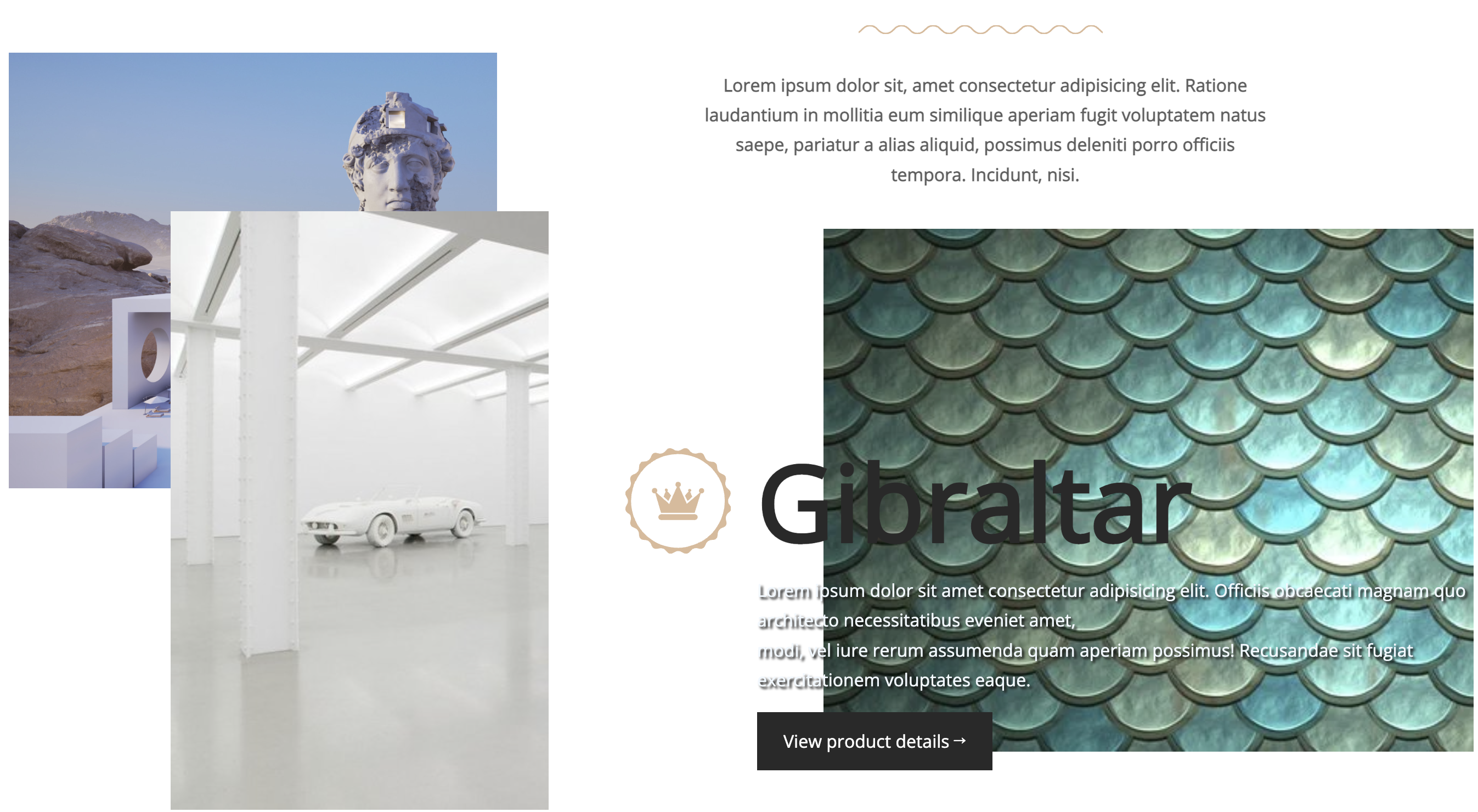
HTML
<body>
<section class="grid">
<div class="img1"></div>
<div class="img2"></div>
<div class="img3"></div>
<div class="strapline">
<blockquote>
Lorem ipsum dolor sit, amet consectetur adipisicing elit. Ratione laudantium in mollitia eum similique aperiam fugit voluptatem natus saepe, pariatur a alias aliquid, possimus deleniti porro officiis tempora. Incidunt, nisi.
</blockquote>
</div>
<div class="cta-wrapper">
<h1>Gibraltar</h1>
<p>Lorem ipsum dolor sit amet consectetur adipisicing elit. Officiis obcaecati magnam quo architecto necessitatibus eveniet amet,<br>modi, vel iure rerum assumenda quam aperiam possimus! Recusandae sit fugiat exercitationem voluptates eaque.</p>
<a href="#">View product details →</a>
</div>
</section>
</body>CSS
@import url('https://fonts.googleapis.com/css2?family=Open+Sans&display=swap');
body{color: #292929; font: 1em/1.7 'Open sans', sans-serif;}

.grid{
    height: 100vh;
    display: grid;
    grid-template-columns: 94fr 190fr 30fr 160fr 315fr 63fr; /* 852 */
    grid-template-rows: 39fr 82fr 9fr 134fr 28fr 108fr 30fr; /* 430 */
}
.img1{
    background: url(https://images.adsttc.com/media/images/62df/060e/cbe2/da01/6574/2d2e/large_jpg/daniel-arsham-and-andres-reisinger-among-acclaimed-designers-of-newly-launched-metaverse-real-estate-development_15.jpg?1658783304) no-repeat left top/cover;
    grid-column: 1/3;/* 1/span 2 */
    grid-row: 2/ span 3;
}
.img2{
    background: url(https://d5wt70d4gnm1t.cloudfront.net/media/a-s/articles/2830-380678369269/daniel-arsham-may-have-a-current-exhibition-at-perrotinbut-his-works-are-from-the-future-900x450-c.jpg) no-repeat left top/cover;
    grid-column: 2/ span 2;
    grid-row: 3/ span4;
}
.img3{
    background: url(https://cdn.pixabay.com/photo/2017/01/11/17/13/scales-1972344__340.jpg) no-repeat left top/cover;
    grid-column: 5/-1;
    grid-row: 4/ span 3;
}
.strapline{
    grid-column: 3/-1;
    grid-row: 2/3;
    text-align: center;
    padding: 0 16%;
    position: relative;
}
.strapline::before{
    content: '';
    width: 25%;
    position: absolute;
    height:  .5em;
    background: url(https://s3-us-west-2.amazonaws.com/s.cdpn.io/210284/wavy.svg) repeat-x center center/cover;
    top: -25px;
    left: 37%;
}
.strapline blockquote{
    color: rgb(95, 95, 95);
    font-weight: bold;
}
.cta-wrapper{
    grid-column: 4/-1;
    grid-row: 4/-1;
    padding: 200px 0 0 190px;
    box-sizing: border-box;
}
.cta-wrapper h1{font: bold 6em/1 'Open sans', sans-serif; margin: 0 0 20px; position: relative;}
.cta-wrapper h1::before{
    content: '';
    position: absolute;
    width: 1em;
    height: 1em;
    top: 0;
    left: -120px;
    background: url(https://s3-us-west-2.amazonaws.com/s.cdpn.io/210284/badge.svg) no-repeat center center/cover;
}
.cta-wrapper p{text-shadow: 2px 2px 2px rgb(21, 21, 21); color: aliceblue;}
.cta-wrapper a{
    background: #292929;
    color: #fff;
    text-decoration: none;
    display: inline-block;
    padding: .8em 1.5em;
}
Grid를 이용한 사진게시물 만들기
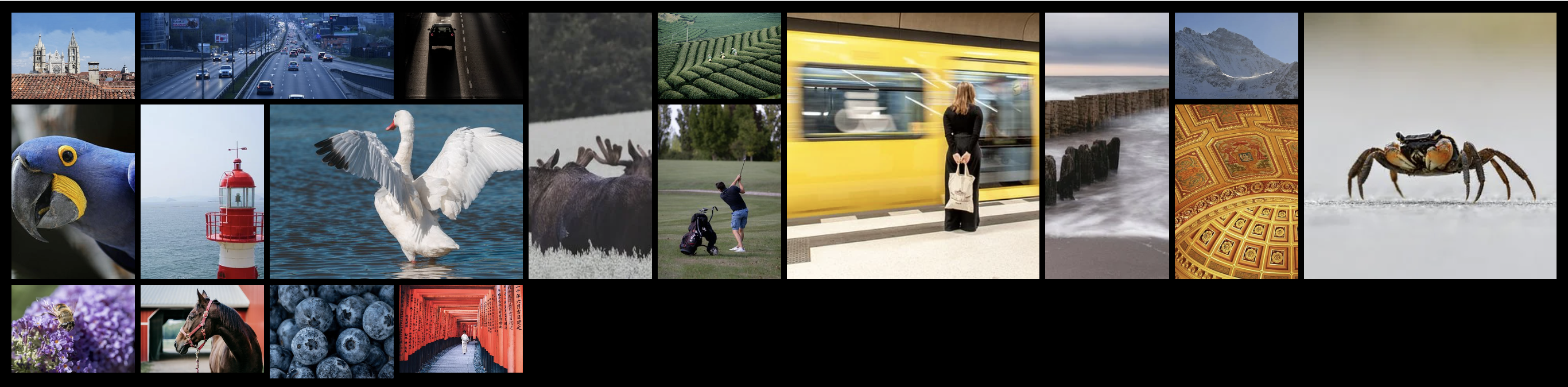
HTML
<body>
    <div class="container">
        <div><img src="https://cdn.pixabay.com/photo/2022/11/11/16/11/lion-cathedral-7585300__340.jpg" alt="사진"></div>
        <div class="horizontal"><img src="https://cdn.pixabay.com/photo/2022/05/22/11/10/highway-7213206__340.jpg" alt="사진"></div>
        <div><img src="https://cdn.pixabay.com/photo/2022/11/10/20/04/street-7583585__340.jpg" alt="사진"></div>
        <div class="vertical"><img src="https://cdn.pixabay.com/photo/2022/11/05/09/51/moose-7571491__340.jpg" alt="사진"></div>
        <div><img src="https://cdn.pixabay.com/photo/2021/09/18/02/27/vietnam-6634082__340.jpg" alt="사진"></div>
        <div class="big"><img src="https://cdn.pixabay.com/photo/2022/10/31/04/55/woman-7558886__340.jpg" alt="사진"></div>
        <div class="vertical"><img src="https://cdn.pixabay.com/photo/2022/10/30/11/43/baltic-sea-7557291__340.jpg" alt="사진"></div>
        <div><img src="https://cdn.pixabay.com/photo/2022/10/28/08/46/mountain-7552616__340.jpg" alt="사진"></div>
        <div class="big"><img src="https://cdn.pixabay.com/photo/2022/10/14/09/57/crab-7520956__340.jpg" alt="사진"></div>
        <div><img src="https://cdn.pixabay.com/photo/2022/10/05/20/43/hyacinth-macaw-7501470__340.jpg" alt="사진"></div>
        <div><img src="https://cdn.pixabay.com/photo/2022/09/29/01/26/lighthouse-7486290__340.jpg" alt="사진"></div>
        <div class="horizontal"><img src="https://cdn.pixabay.com/photo/2022/09/26/04/24/swan-7479623__340.jpg" alt="사진"></div>
        <div><img src="https://cdn.pixabay.com/photo/2022/09/19/10/27/golf-7465213__340.jpg" alt="사진"></div>
        <div><img src="https://cdn.pixabay.com/photo/2022/10/04/18/07/cathedral-7498794__340.jpg" alt="사진"></div>
        <div><img src="https://cdn.pixabay.com/photo/2022/09/11/14/52/bee-7446944__340.jpg" alt="사진"></div>
        <div><img src="https://cdn.pixabay.com/photo/2022/09/26/23/27/horse-7481726__340.jpg" alt="사진"></div>
        <div class="vertical"><img src="https://cdn.pixabay.com/photo/2022/09/20/20/22/blueberries-7468718__340.jpg" alt="사진"></div>
        <div><img src="https://cdn.pixabay.com/photo/2021/11/18/05/44/woman-6805531__340.jpg" alt="사진"></div>
    </div>
</body>
CSS
body{background: #000000; margin: 10px;}
.container{
display: grid;
gap: 5px;
grid-template-columns: repeat(auto-fit, minmax(100px, 1fr));
grid-template-rows: 75px;
grid-auto-flow: dense;
}
.container>div{}
.container>div>img{width: 100%; height: 100%; object-fit: cover;}
.horizontal{grid-column: span 2;}
.vertical{grid-row: span 2;}
.big{grid-column: span 2; grid-row: span 2;}