Front-end 국비지원 #040일
반응형 페이지 1-6

HTML
			<section id="movie" class="movie-box">
				<h2 class="ir_so">영상보기</h2>
				<div class="container">
					<div class="movie-phone">
						<video src="./movie/KakaoTalk_20221201_101837153.mp4" autoplay muted loop></video>
					</div>
					<div class="movie-text">
						<h3>동영상과 이미지를 <br>엮어서 스토리텔링 동영상을 <br><span>만드세요.</span></h3>
						<p>망고보드의 동영상 소스 혹은 이미지를 활용해서 <br>슬라이드들들을 만들면, 이를 엮은 하나의 동영상이 쉽게 <br>만들어집니다.</p>
						<p>카드뉴스도 클릭 며 번만 하면 자동으로 동영상이 <br>만들어집니다.</p>
					</div>
				</div>
			</section>
			<section id="muser" class="muser-box">
				<div class="container">
					<h2>SINCE OCT.2016 <span>사용자가 말하는 망고보드</span></h2>
					<ul class="userText">
						<li>“망고보드로 상세페이지를
							예쁘게 만들어 올리니 다들 제가
							디자인 전문가인 줄 알아요.”
							<span>쇼핑몰 마르공방 김상희 대표</span>
						</li>
						<li>“4시간 걸리던 작업을
							1시간만에 고퀄리티로 뽑을 수
							있게 되었어요! 감사요^^”
							<span>병원마케터(ID:han***)</span>
						</li>
						<li>“팀 과제물을 망고보드로
							만들었더니 교수님으로부터
							좋은 점수를 받아써요.”
							<span>대학원생 루재무님(ID:jmj***)</span>
						</li>
						<li>“3분카레를 데워서 요리를
							만들 듯이 제가 만들 수 없던
							멋있는 결과물을 뚝딱 만듭니다.”
							<span>1인기업 오씨아무마 오종현 대표</span>
						</li>
					</ul>
				</div>
			</section>
			<section id="reference" class="reference-box">
				<h2 class="ir_so">레퍼런스</h2>
				<div class="container">
					<img src="./images/reference1912.png" alt="">
				</div>
			</section>
			<section id="etc" class="etc-box">
				<div class="container">
					<h2 class="ir_so">기타</h2>
					<ul>
						<li><a href="#">사용자 메뉴얼</a></li>
						<li><a href="#">망고보드 소개서</a></li>
						<li><a href="#">저작권 규정</a></li>
						<li><a href="#">자주하는 질문</a></li>
						<li><a href="#">새로운소식</a></li>
					</ul>
				</div>
			</section>
CSS
#movie{width: 100%; height: 700px; background: #8c816e;}
#muser{width: 100%;}
#reference{width: 100%; height: 418px; background: #f7f7f7;}
#etc{width: 100%; height: 163px; background: #1e1e1e;}

/* movie-box */
.movie-box .container{display: flex; justify-content: space-between;}
.movie-box .movie-phone{position: relative; background: url(../images/main_mobile.png)no-repeat center bottom; flex: 1 1 50%; height: 700px; border-bottom: 5px solid #5b564e;}
.movie-box .movie-phone video{width: 405px; height: 407px; position: absolute; top: 239px; /* left: 89px;  */left: 50.23%; transform: translateX(-50%);}
.movie-box .movie-text{flex: 1 1 50%; padding: 60px 20px 20px;}
.movie-box .movie-text h3{font-size: 45px; font-weight: bold; color: #fff; letter-spacing: -3px; margin-bottom: 50px;}
.movie-box .movie-text h3 span{color: #ffe7bd; font-weight: 500;}
.movie-box .movie-text p{font-size: 23px; font-weight: 300; color: #ffe7bd; letter-spacing: -2px; font-weight:lighter; margin-bottom: 30px;}

/* muser-box */
.muser-box .container{padding: 60px 0; margin-bottom: 50px;}
.muser-box h2{text-align: center;  font-size: 52px; font-weight: 100; color: #1e1e1e; line-height: 120%; margin-bottom: 100px;}
.muser-box h2 span{display: block; font-size: 50px; font-weight: 700; color: #1e1e1e;}
.muser-box .userText{display: flex; justify-content: space-between;}
.muser-box .userText li{width: 227px; height: 77px; position: relative; flex-basis: 25%; padding: 0 30px; font-size: 18px; color: #777;}
.muser-box .userText li:first-child{color: #1e1e1e;}
.muser-box .userText li::before{position: absolute; content: ""; display: block; width: 1px; height: 100px; background: #e9e9e9; right: 2px;}
.muser-box .userText li:last-child:before{display: none;}
.muser-box .userText li span{display: block; text-align: center; margin-top: 20px;}

/* reference-box */
.reference-box{padding: 90px 0; /* box-sizing: border-box; */}
.reference-box img{width: 100%; vertical-align: middle;}

/* etc */
.etc-box{}
.etc-box ul{display: flex; justify-content: space-between; border-left: 1px solid rgba(255, 255, 225, .6);}
.etc-box ul li{border-right: 1px solid rgba(255, 255, 225, .6); height: 163px; flex-basis: 20%; text-align: center; padding-top: 100px;}
.etc-box ul li:nth-child(1){background: url(../images/MA_manual.png) no-repeat center 50px;}
.etc-box ul li:nth-child(2){background: url(../images/MA_introduction.png) no-repeat center 50px;}
.etc-box ul li:nth-child(3){background: url(../images/MA_license.png) no-repeat center 50px;}
.etc-box ul li:nth-child(4){background: url(../images/MA_qna.png) no-repeat center 50px;}
.etc-box ul li:nth-child(5){background: url(../images/MA_news.png) no-repeat center 50px;}
.etc-box ul li a{color: #f6f6f6;}

@media screen and (max-width: 1160px){
    .movie-box .movie-text h3{font-size: 40px;}
    .movie-box .movie-text p{font-size: 18px;}
}
@media screen and (max-width: 1100px){
	.muser-box .userText li::before{height: 165px;
    }
@media screen and (max-width: 950px){
    #movie{height: auto;}
    .movie-box .container{flex-wrap: wrap;}
    .movie-box .movie-phone{flex: 1 1 100%;}
    .movie-box .movie-text{flex: 1 1 100%; text-align: center;}
}
@media screen and (max-width: 880px){
    .muser-box .userText{flex-wrap: wrap;}
    .muser-box .userText li{flex: 1 1 50%; margin-bottom: 5px; height: 150px;}
    .muser-box .userText li:first-child{color: #1e1e1e;}
    .muser-box .userText li:nth-child(2n):before{display: none;}
    .muser-box .userText li::before{height: 120px;}

    #reference{display: none;}

    .etc-box ul{border-left: 1px solid rgba(255, 255, 225, 0);}
    .etc-box ul li:last-child{border-right: 1px solid rgba(255, 255, 225, 0);}
}
@media screen and (max-width: 720px){
	 .movie-box .movie-text h3{font-size: 32px; letter-spacing: 1px;}
    .movie-box .movie-text p{font-size: 16px; letter-spacing: 1px;}

    .muser-box .userText li{border-right: none; border-bottom: 1px solid #ddd;}
    }
@media screen and (max-width: 680px) {
    .muser-box h2{font-size: 40px;}
    .muser-box h2 span{font-size: 42px;}
    .muser-box .userText{flex-wrap: wrap;}
    .muser-box .userText li{flex: 1 1 100%; margin-top: 20px; margin-bottom: 5px; height: 150px;}
}
JavaScript
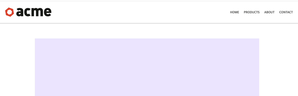
Nav bar 메뉴바 만들기
결과
HTML
 <header id="header">
        <nav>
            <img src="./images/logo.svg" alt="logo" id="logo">
            <ul>
                <li><a href="#">Home</a></li>
                <li><a href="#">Products</a></li>
                <li><a href="#">About</a></li>
                <li><a href="#">Contact</a></li>
            </ul>
        </nav>
    </header>
    <div class="container">
        <main>
            <p>Lorem ipsum dolor sit amet, consectetur adipisicing elit. Porro consectetur, nulla voluptate dicta architecto voluptatum enim magni, blanditiis commodi fuga nesciunt officiis eius odio assumenda ex sunt, non vero iure.</p>
            <p>Lorem ipsum dolor sit amet, consectetur adipisicing elit. Porro consectetur, nulla voluptate dicta architecto voluptatum enim magni, blanditiis commodi fuga nesciunt officiis eius odio assumenda ex sunt, non vero iure.</p>
            <p>Lorem ipsum dolor sit amet, consectetur adipisicing elit. Porro consectetur, nulla voluptate dicta architecto voluptatum enim magni, blanditiis commodi fuga nesciunt officiis eius odio assumenda ex sunt, non vero iure.</p>
        </main>
        <footer>
            <hr>
            <p><small><em>Porro consectetur, nulla voluptate dicta</em></small></p>
        </footer>
CSS
*{box-sizing: border-box;}
body{color: #333;}
hr{margin: 3em 0; background-color: #ccc; height: 1px; border: none;}
p{margin-bottom: 3em;}
a{text-decoration: none; color: #555; text-transform: uppercase; font-size: 85%; font-weight: bold;}
ul{list-style: none;}

header{width: 100%; height: 6em; position: fixed; top: 0; background: #fff; border-bottom: 2px solid #ccc; transition: .3s ease-in; padding: 0 2em;}
nav ul{float: right; margin: 0;}
nav ul li{display: inline; margin-left: 1em; line-height: 6em; transition: .3s ease-in;}
#logo{position: absolute; top: 50%; transform: translateY(-50%); opacity: 1; transition: .3s ease-in; visibility: visible;}
#logo.hide{visibility: hidden; opacity: 0; }

.container{margin: 10em auto 0; width: 75%; text-align: center;}
.container main{}
.container main p{height: 50em; line-height: 50em;}
.container main p:first-child{background: rgb(235, 229, 255);}
.container main p:nth-child(2){background: rgb(229, 253, 255);}
.container main p:nth-child(3){background: rgb(229, 255, 231);}

header.shrink{height: 4em; background: rgba(255, 255, 255, .6);}
.shrink nav ul li{line-height: 4em;}
Script
let $window=window;
let $header=document.getElementById('header');
let $logo=document.getElementById('logo');
let $defualtLogo='./images/logo.svg';
let $smallLogo='./images/logo-shrink.svg';
let $height=$header.offsetHeight;
console.log($height);

$window.addEventListener('scroll', function(){
    if(this.pageYOffset >$height){
        if(!$header.classList.contains('shrink')){
            $header.classList.add('shrink')
        switchImg($smallLogo)
        }

    }else{
        if($header.classList.contains('shrink')){//shrink 없으면 포함
        $header.classList.remove('shrink')
        switchImg($defualtLogo)}
    }
});
function switchImg(newImgPath){
    $logo.classList.add('hide');
    setTimeout(function(){
        $logo.setAttribute('src', newImgPath);
        $logo.classList.remove('hide');
    },300);
}
CSS에 javascript로 적용하기 위해 .shrink라는 클래스를 classList를 사용하기 위해 넣어 두었다.
header.shrink{height: 4em; background: rgba(255, 255, 255, .6);}
.shrink nav ul li{line-height: 4em;}
스크롤이 내려가면 로고가 바뀌어야 하므로 변수를 지정하고 변할 img 파일 경로를 넣어둔다.
let $defualtLogo='./images/logo.svg';
let $smallLogo='./images/logo-shrink.svg';
조건문을 만들어 scroll이 pageYOffset 값을 기준으로 클래스를 추가하게 한다.
$window.addEventListener('scroll', function(){
    if(this.pageYOffset >$height){
        if(!$header.classList.contains('shrink')){
            $header.classList.add('shrink')
        switchImg($smallLogo)
        }
    }else{
        if($header.classList.contains('shrink')){//shrink 없으면 포함
        $header.classList.remove('shrink')
        switchImg($defualtLogo)}
    }
});
function switchImg(newImgPath){
    $logo.classList.add('hide');
    setTimeout(function(){
        $logo.setAttribute('src', newImgPath);
        $logo.classList.remove('hide');
    },300);
}
JQuery
slide Up / slide Down
결과
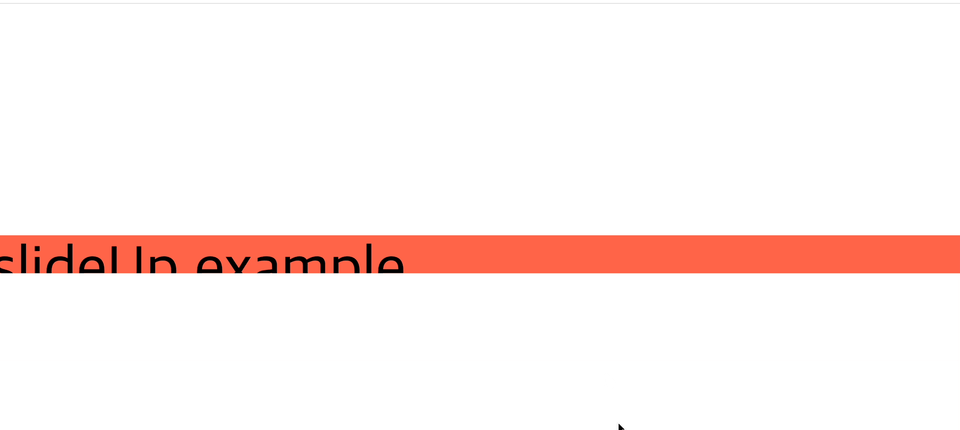
HTML
    <div class="container"><div class="slide" id="slideDown">slideDown example</div></div>
    <div class="container"><div class="slide" id="slideUp">slideUp example</div></div>
CSS
        body{font-size: 5em;}
        .container{height: 300px;}
        #slideDown{background: pink; display: none;}
        #slideUp{background: tomato; width: 100%; height: 100%;}
Script
$(function(){
    $('.container').hover(function(){
        $(this).find('.slide').stop().slideDown(300);
    },function(){
        $(this).find('.slide').stop().slideUp(300);
    })
});
'.container' 를 호버하면 자식요소인 '.slide'를 찾고 slideUp, sldeDown을 실행시킨다.
animate 애니메이션 1-1
결과
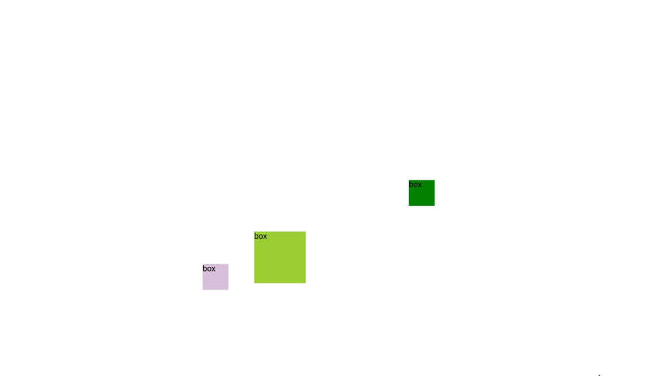
HTML
    <div id="box">box</div>
    <div id="box1">box</div>
    <div id="box2">box</div>
CSS
        #box{width: 100px; height: 100px; background: yellowgreen; position: absolute; top: 0; left: 0;}
        #box1{width: 50px; height: 50px; background: green; position: absolute; top: 100px; left: 100px;}
        #box2{width: 50px; height: 50px; background: thistle; position: absolute; bottom: 0; right: 0;}
Script
$(function(){
    $('#box').animate({left:'500px', top:'500px'},1000);
    $('#box1').delay(1000).animate({left:'800px'},2000).animate({top:'400px'},1000);
    $('#box2').animate({bottom:'800px'},1000).animate({left:'400px',bottom:'200px'},1000);
});
선택자를 선택하고 .delay().animate({위치:픽셀}),1000(1초); 를 넣어준다.
top과 left를 같이 쓰면 대각선으로 움직이게 된다.
animate 애니메이션 1-2
랜덤함수를 사용하여 당구 애니메이션 만들기
결과
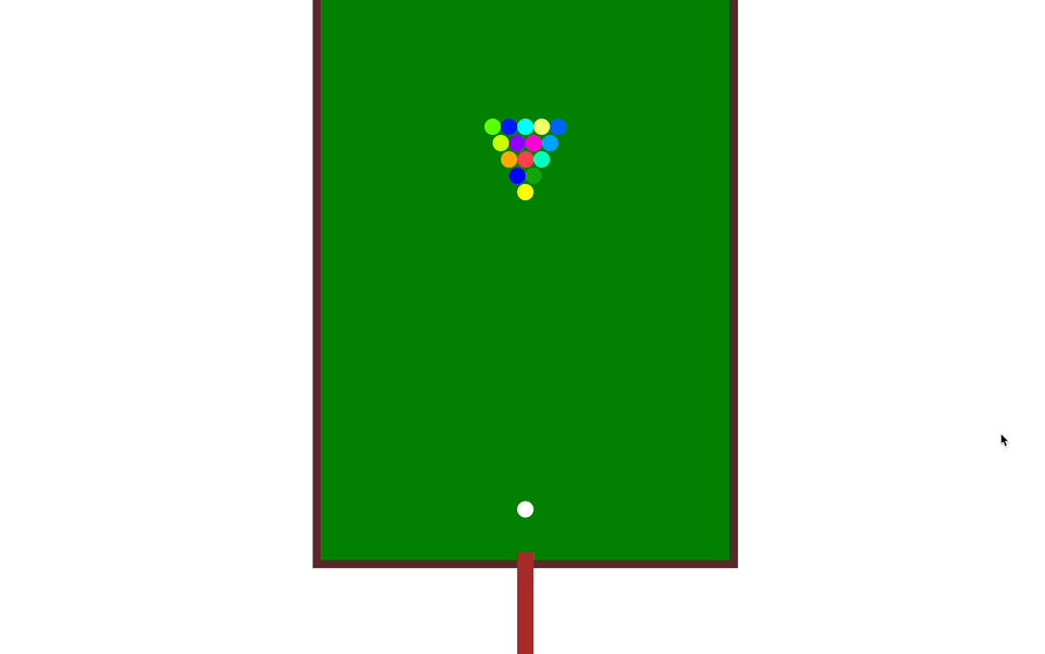
HTML
 <div id="ground">
        <div id="stick"></div>
        <div id="ball00" class="ball"></div>
        <div id="ball01" class="ball"></div>
        <div id="ball02" class="ball"></div>
        <div id="ball03" class="ball"></div>
        <div id="ball04" class="ball"></div>
        <div id="ball05" class="ball"></div>
        <div id="ball06" class="ball"></div>
        <div id="ball07" class="ball"></div>
        <div id="ball08" class="ball"></div>
        <div id="ball09" class="ball"></div>
        <div id="ball10" class="ball"></div>
        <div id="ball11" class="ball"></div>
        <div id="ball12" class="ball"></div>
        <div id="ball13" class="ball"></div>
        <div id="ball14" class="ball"></div>
        <div id="ball15" class="ball"></div>
    </div>
CSS
#ground{width: 500px; height: 700px; background: green; border: 10px solid rgb(90, 42, 42); margin: 30px auto; position: relative;}
#stick{
    width: 20px; height: 150px; left: 50%; transform: translateX(-50%); position: absolute; top: 700px; background: brown;
}
.ball{width: 20px; height: 20px; background: #fff; position: absolute; top: 620px; left: 240px; border-radius: 50%;}
#ball00{background: white; top: 628px; left: 240px;}
#ball01{background: yellow; top: 240px; left: 240px;}
#ball02{background: blue; top: 220px; left: 230px;}
#ball03{background: rgb(255, 170, 0); top: 200px; left: 220px}
#ball04{background: rgb(200, 255, 0); top: 180px; left: 210px;}
#ball05{background: rgb(85, 255, 0); top: 160px; left: 200px;}
#ball06{background: rgb(21, 163, 8); top: 220px; left: 250px;}
#ball07{background: rgb(0, 255, 191); top: 200px; left: 260px;}
#ball08{background: rgb(0, 162, 255); top: 180px; left: 270px;}
#ball09{background: rgb(0, 98, 255); top: 160px; left: 280px;}
#ball10{background: rgb(255, 63, 79); top: 200px; left: 240px;}
#ball11{background: rgb(255, 0, 212); top: 180px; left: 250px;}
#ball12{background: rgb(144, 0, 255); top: 180px; left: 230px;}
#ball13{background: rgb(237, 255, 104); top: 160px; left: 260px;}
#ball14{background: rgb(0, 255, 247); top: 160px; left: 240px;}
#ball15{background: rgb(0, 26, 255); top: 160px; left: 220px;}
Script
$(function(){
    $('#stick').animate({top:'650px'},90).animate({top:'650px'},300);
    $('#ball00').delay(50).animate({top:260},300).delay(300).animate({top:220, left:250},1000);

    function ran(min, max){
        min=Math.floor(min);
        max=Math.ceil(max);

    return Math.floor(Math.random()*(max - min))+ min;
    }
    $('#ball01').delay(340).animate({
        top: ran(250, 270),left: ran(310, 350)
    },300);
    $('#ball02').delay(340).animate({
        top: ran(250, 270),left: ran(310, 350)
    },300);
    $('#ball03').delay(340).animate({
        top: ran(7, 400),left: ran(8, 472)
    },300);
    $('#ball04').delay(340).animate({
        top: ran(7, 400),left: ran(8, 472)
    },300);
    $('#ball05').delay(340).animate({
        top: ran(7, 400),left: ran(8, 472)
    },300);
    $('#ball06').delay(340).animate({
        top: ran(7, 400),left: ran(8, 472)
    },300);
    $('#ball07').delay(340).animate({
        top: ran(7, 400),left: ran(8, 472)
    },300);
    $('#ball08').delay(340).animate({
        top: ran(7, 400),left: ran(8, 472)
    },300);
    $('#ball09').delay(340).animate({
        top: ran(7, 400),left: ran(8, 472)
    },300);
    $('#ball10').delay(340).animate({
        top: ran(7, 400),left: ran(8, 472)
    },300);
    $('#ball11').delay(340).animate({
        top: ran(7, 400),left: ran(8, 472)
    },300);
    $('#ball12').delay(340).animate({
        top: ran(7, 400),left: ran(8, 472)
    },300);
    $('#ball13').delay(340).animate({
        top: ran(7, 400),left: ran(8, 472)
    },300);
    $('#ball14').delay(340).animate({
        top: ran(7, 400),left: ran(8, 472)
    },300);
    $('#ball15').delay(340).animate({
        top: ran(7, 400),left: ran(8, 472)
    },300);

})
max 값과 min값을 정하여 랜덤으로 좌표를 나타나게 하여 공의 위치를 매번 다르게 구현한다.