반응형 디자인 2-3
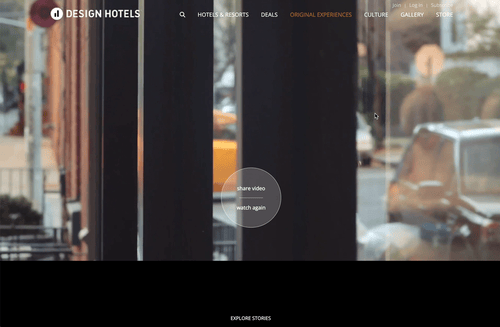
디자인호텔스
결과
HTML
<main id="main">
			<section id="section1">
				<div class="container">
					<div class="section1-video">
						<video id="mainVideo" autoplay muted poster="./img/GS-blog-historical-conversions.jpg">
							<source src="./video/main.mp4" type="video/mp4">
						</video>
					</div>
					<div class="section1-watch-again">
						<ul>
							<li><h2><a href="javascript:" class="sharevideoBt" title="share video">share video</a></h2></li>
							<li><i></i></li>
							<li><h3><a href="javascript:" class="watchagainBt" title="watch again">watch again</a></h3></li>
						</ul>
					</div>
					<div class="section1-next-section">
						<span><a href="javascript:" class="nextsectionBt">explore stories</a></span>
					</div>
					<div class="section1-icon-footer">
						<div class="section1-icon-footer-left">
							<ul>
								<li><span><a href="javascript:" class="videoIconBt addBg"><i class="fas fa-video"></i></a></span></li>
								<li><span><a href="javascript:" class="worldIconBt"><i class="fas fa-globe"></i></a></span></li>
							</ul>
						</div>
						<div class="section1-icon-footer-center">
							<ul>
								<li><span><a href="javascript:" class="nextIconBt"><i class="fas fa-chevron-down"></i></a></span></li>
							</ul>
						</div>
						<div class="section1-icon-footer-right">
							<ul>
								<li><span><a href="javascript:" class="playPuaseIconBt addBg"><img src="./img/icon-player-pause.png" alt="정지"></a></span></li>
								<li><span><a href="javascript:" class="mutedIconBt"><i class="fas fa-volume-off"></i></a></span></li>
								<!-- <i class="fas fa-volume-up"></i> -->
							</ul>
						</div>
					</div>
				</div>
			</section>
	   </main>
SCSS
#main{
width: 100%;
#section1{
width: 100%;
.container{
position: relative;
width: 100%;
background: #000;
.section1-video{
position: relative;
z-index: 1;
width: 100%;
height: 969px;
overflow: hidden;
video{
width: 100%;
height: auto;
margin-left: 0;
margin-top: -55.5px;
}
}
.section1-watch-again{
position: absolute;
top: 55%;
left: 50%;
z-index: 2;
width: 160px;
height: 160px;
border-radius: 50%;
border: 1px solid $white-opcity;
margin-left: -80px;
margin-top: -80px;
background: rgba(255, 255, 255, .2);
ul{
margin-top: 44px;
height: 160px;
width: 160px;
li{
display: flex;
flex-direction: column;
justify-content: center;
align-items: center;
h2{
font-size: 14px;
font-weight: bold;
a{
color: $white;
&:hover{
text-decoration: underline;
}
}
}
i{
width: 40%;
height: 1px;
background: $white-opcity;
margin: 15px 0;
}
h3{
font-size: 14px;
font-weight: bold;
a{
color: $white;
&:hover{
text-decoration: underline;
}
}
}
}
}
}
.section1-next-section{
position: absolute;
z-index: 2;
bottom: 100px;
width: 100%;
text-align: center;
transition: .3s;
span{
a{
color: $white;
text-transform: uppercase;
transition: .3s;
font-weight: bold;
&:hover{
color: $white-opcity;
}
}
}
&:hover{
bottom: 90px;
}
}
.section1-icon-footer{
position: absolute;
bottom: 0;
left: 0;
z-index: 2;
padding: 0 120px;
box-sizing: border-box;
width: 100%;
height: 60px;
background: rgba(61, 65, 66, .7);
display: flex;
justify-content: space-between;
align-items: center;
.section1-icon-footer-left{
width: 120px;
height: 60px;
ul{
display: flex;
width: 120px;
height: 60px;
li{
flex-basis: 50%;
height: 100%;
span{
display: block;
text-align: center;
height: 100%;
border-right: 1px solid rgba(255, 255, 255, .2);
a{
width: 100%;
height: 100%;
display: block;
background: rgba(255, 255, 255, 0);
color: $white-opcity;
i{
font-size: 24px;
padding: 18px 0;
}
&.addBg{
background: rgba(110, 116, 117, .7);
color: rgba(255, 255, 255, 1);
}
}
}
&:first-child span{
border-left: 1px solid rgba(255, 255, 255, .2);
}
}
}
}
.section1-icon-footer-center{
width: 60px;
height: 60px;
ul{
width: 100%;
height: 100%;
border-right: 1px solid rgba(255, 255, 255, .2);
border-left: 1px solid rgba(255, 255, 255, .2);
li{
width: 100%;
height: 100%;
span{
display: block;
text-align: center;
width: 100%;
height: 100%;
a{
width: 100%;
height: 100%;
display: block;
background: rgba(255, 255, 255, 0);
color: $white-opcity;
i{
font-size: 24px;
padding: 18px 0;
}
}
}
}
}
}
.section1-icon-footer-right{
width: 120px;
height: 60px;
ul{
display: flex;
width: 120px;
height: 60px;
li{
flex-basis: 50%;
height: 100%;
span{
display: block;
text-align: center;
height: 100%;
border-right: 1px solid rgba(255, 255, 255, .2);
a{
width: 100%;
height: 100%;
display: block;
background: rgba(255, 255, 255, 0);
color: $white-opcity;
i{
font-size: 24px;
padding: 18px 0;
}
img{
width: 18px;
padding: 18px 0;
margin-left: 3px;
}
}
}
&:first-child span{
border-left: 1px solid rgba(255, 255, 255, .2);
}
}
}
}
}
}
}
}video 태그는
<video src="./video/main.mp4"></video><video id="mainVideo"> <source src="./video/main.mp4" type="video/mp4"> </video>두가지 방식이 있다.
autoplay를 하려면muted까지 해야 실행이 된다.
Bootstrap (부트스트랩)

부트스트랩
트위터에서 시작된 오픈 소스 프론트엔드 프레임워크.
시작은 디자이너 한명과 트위터의 한 개발자였지만 지금은 트위터에서 주도적으로 개발하고 있지는 않다.
트위터에서 사용하는 각종 레이아웃, 버튼, 입력창 등의 디자인과 기능을 CSS와 JavaScript로 만들어 놓은 것이며,
초창기에는 웹 디자이너나 개발자 사이에서 웹 디자인의 혁명이라고 불릴 정도로 폭발적인 반응을 얻었던 프레임워크이다.
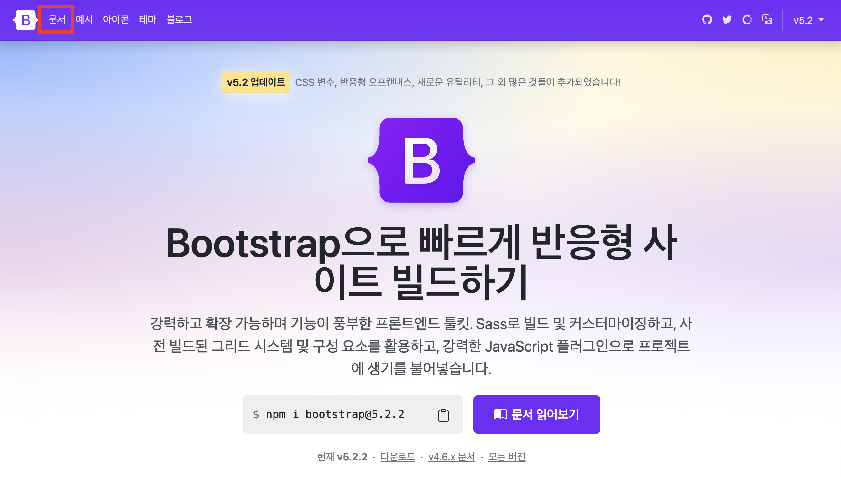
부트스트랩 사용방법
- 구글 검색창 'bootstrap' or '부트스트랩' 을 검색
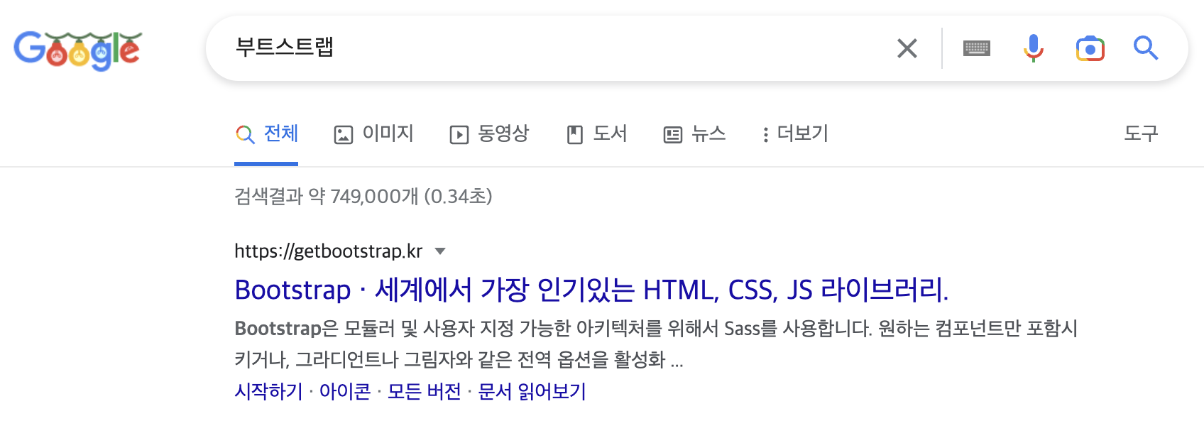
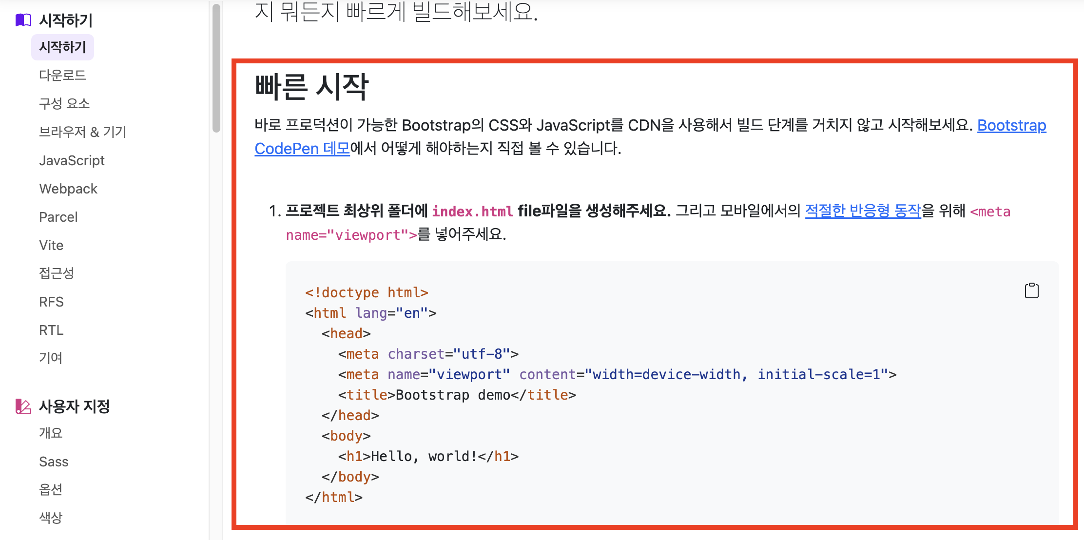
- '문서' > '시작하기' 를 찾는다.
- 빠른시작에서 html 을 복사하여 넣어준다.
- link css 와 script src도 복사하여 넣어준다.
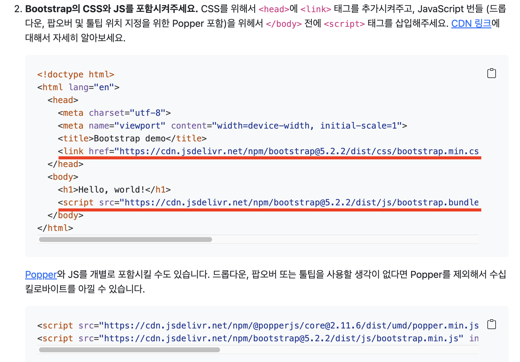
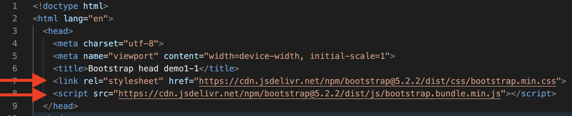
- 이렇게 CDN 방식으로 할 수도 있고 다운로드하여 직접 파일링크를 거는 방법도 있다.
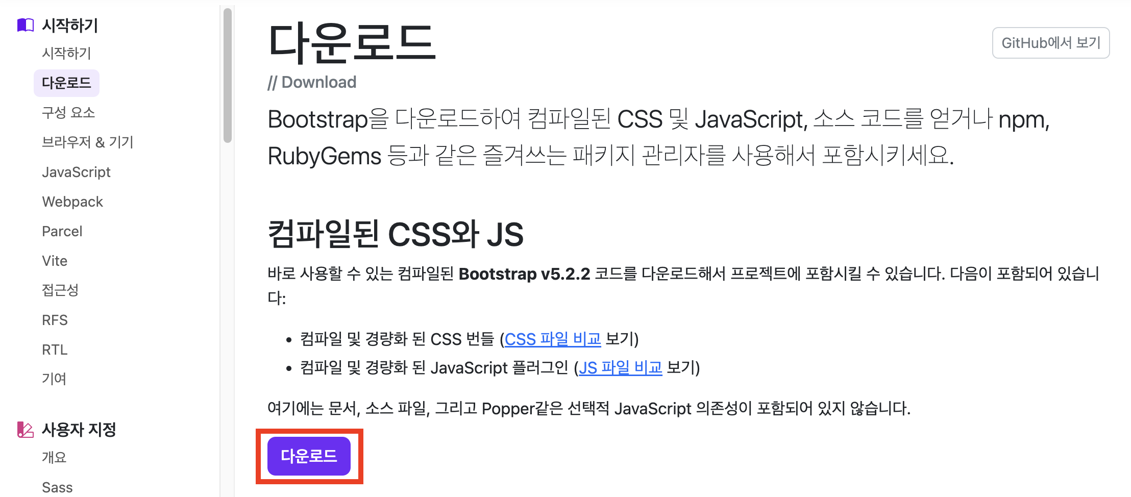
- 다운로드를 받게 되면
css와js파일이 있다. 넣어주면 된다.
- 메뉴에서 '예시'를 누르고 여러 예시 중 필요한 예시를 선택한다.
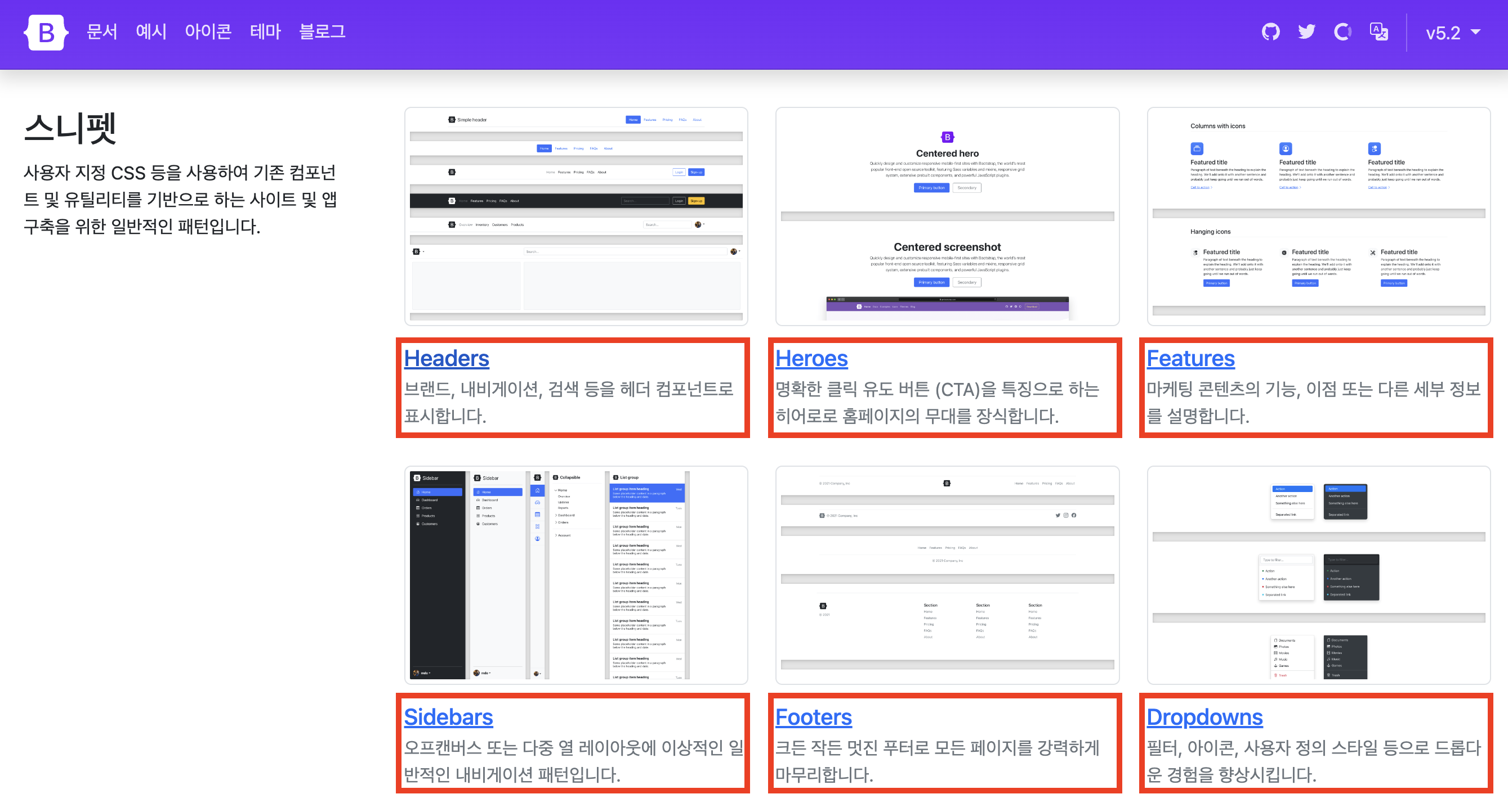
- headers 를 선택하여 본다.
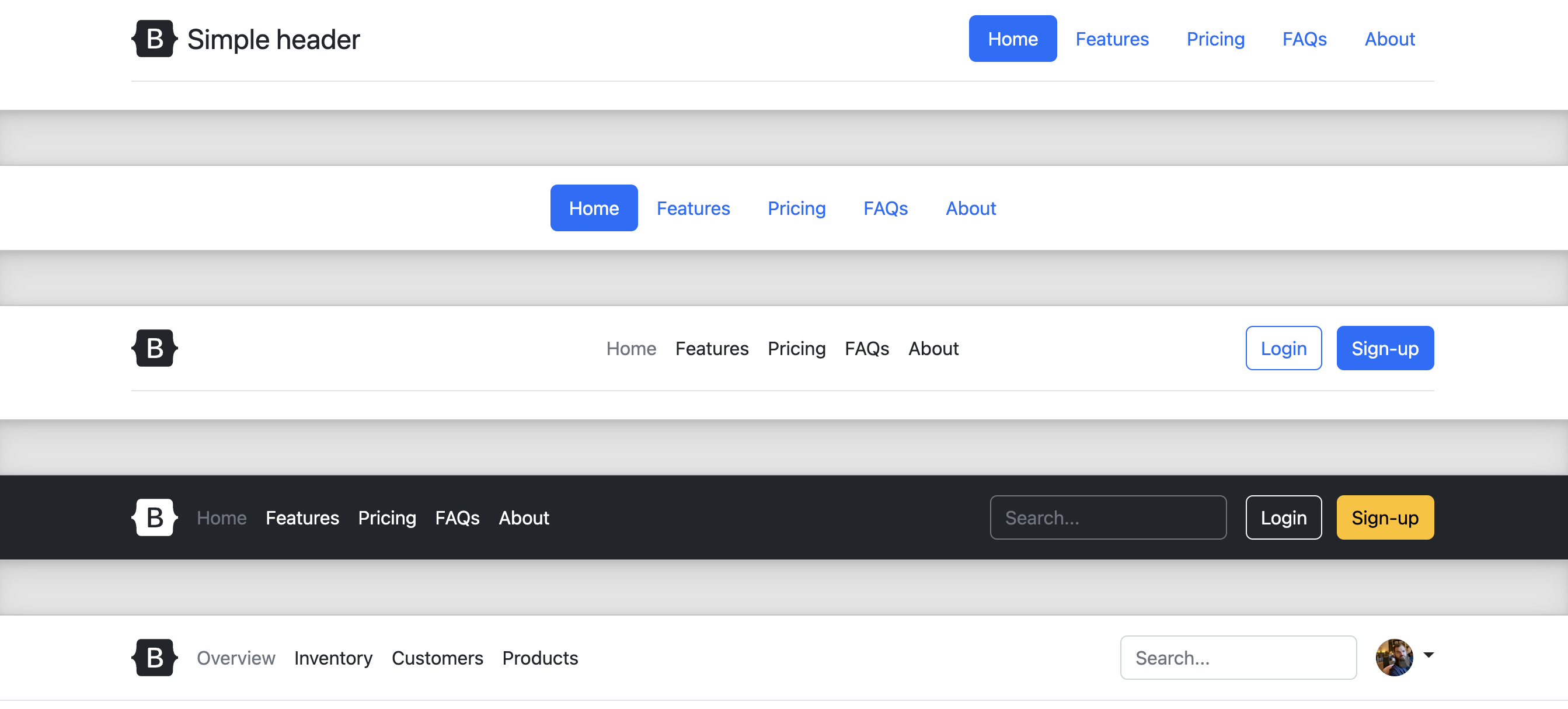
- 페이지 소스보기를 누른 후 필요한 부분을 복사하여 html에 넣어주면 적용이 된다.
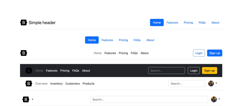
반응형도 적응되어 손쉽게 적용이 된다.
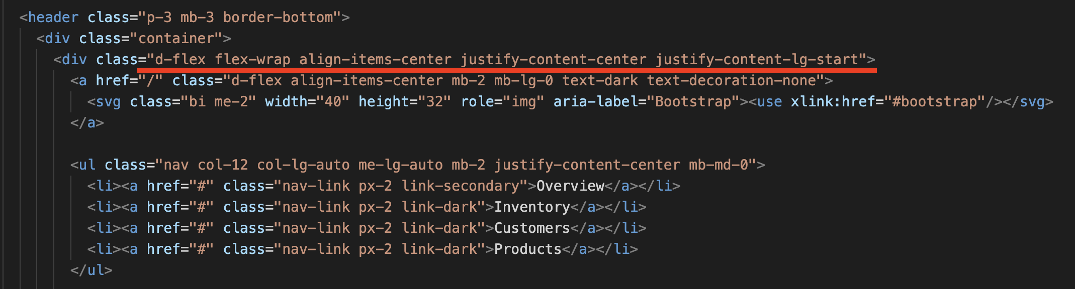
부트스트랩의 CSS
부트스트랩의 방식
부트스트랩의 방식은 엄청 많은 CSS들이 CSS 파일이나 CDN에class방식으로 적용 되어 있다.
ex) 클래스.mb-2는 css에.mb-2{margin-bottom: 8px;}이렇게 적용이 되어 있어서html에서 해당 요소에 클래스를 지정하여 부트스트랩의 CSS를 적용시키는 방식이다.
그러므로 부트스트랩을 가져와서 수정하여 사용하게 될 경우 적용된 클래스의 약자나 단어를 숙지하고 있어야 더욱더 쉽게 부트스트랩을 이용할 수 있다.
ex) d-flex , flex-wrap , align-items-center ... 예시