JQuery
JQuery animate
1. Hover Cross Effect
결과

hover를 하게되면 투명도가 있는 배경이 이미지에 십자가모양으로 이펙트를 주게된다.
HTML
<div class="box2">
        <div class="box banner01">
            <div class="hoverOpacity">
                <div class="top"></div>
                <div class="bottom"></div>
                <div class="right"></div>
                <div class="left"></div>
            </div>
        </div>
        <div class="box banner02">
            <div class="hoverOpacity">
                <div class="top"></div>
                <div class="bottom"></div>
                <div class="right"></div>
                <div class="left"></div>
            </div>
        </div>
    </div>
CSS
*{margin: 0; padding: 0;}
.box2{width: 100%; height: 450px; display: flex;}
.banner01{position: relative; width: 30%; height: 100%; background: url(../img/1.jpg) no-repeat center center/cover; margin-right: 10px;}
.banner02{position: relative; width: 70%; height: 100%; background: url(../img/2.jpg) no-repeat center center/cover;}
.top{width: 100%; height: 50%; position: absolute; top: 50%; left: 0; background: white;}
.bottom{width: 100%; height: 50%; position: absolute; bottom: 50%; left: 0; background: white;}
.right{width: 50%; height: 100%; position: absolute; top: 0; left: 50%; background: white;}
.left{width: 50%; height: 100%; position: absolute; top: 0; right: 50%; background: white;}
Class Top , Bottom 의 그림설명
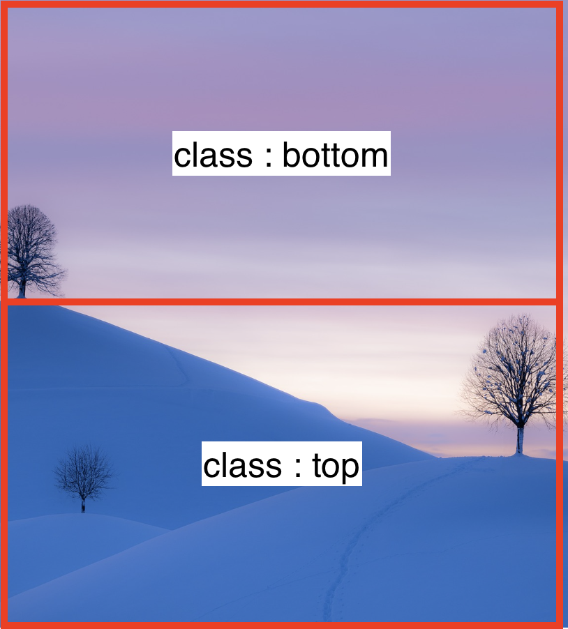
- top은 넓이가 100%를 차지한다 높이는 50% 영역을 차지하고 하단에 위치한다. (위치가 헷갈릴듯.. 양해바람)
- bottom은 넓이 100%를 차지하고 bottom에서 50%위에 위치하니 상단에 위치한다.
Class Right , Left 의 그림설명
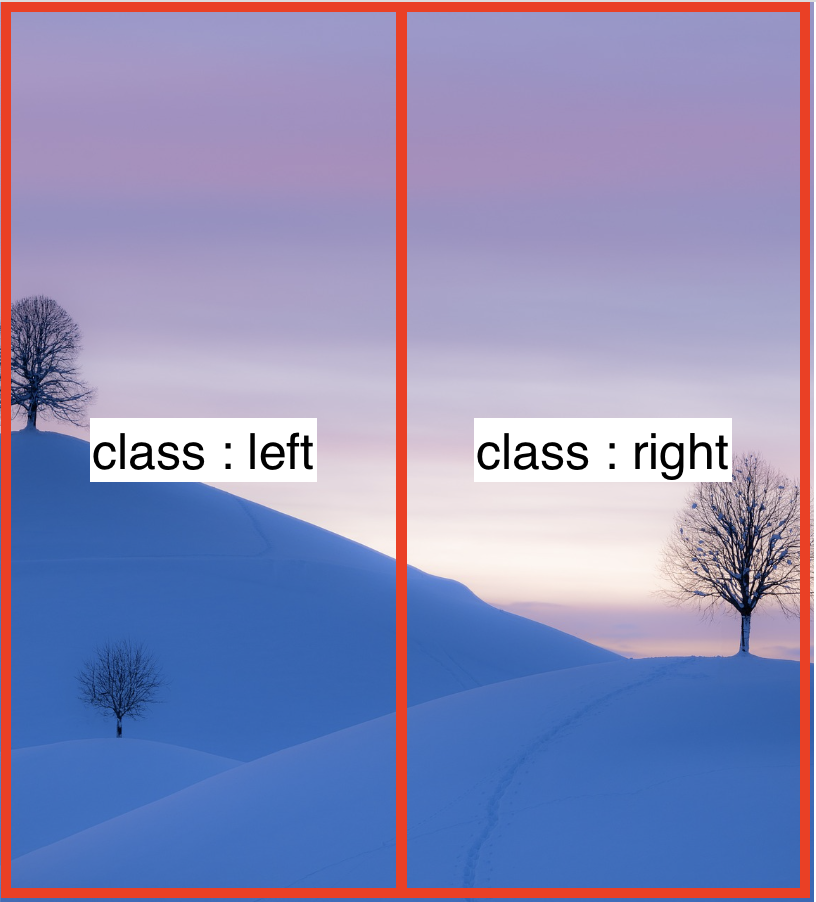
- right는 넓이 50% 높이 100% top은 0 left에서 50% 위치를 설정하고 오른쪽에 둔다.
- left는 넓이 50% 높이 100% top은 0 right에서 50% 위치를 설정하고 왼쪽에 둔다.
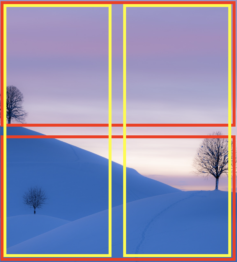
전체 모습
여기서 JQuery 스크립트에서 opacity 값을 0 를 주고 hover 를 하면 CSS가 변하는 값을 만든다.
script
$(function(){
    $('.hoverOpacity>div').css('opacity','0');
    $('.box').hover(function(){
        let th=$(this);
        th.find('.top').css('opacity','.2').stop().animate({height:0},500)
        th.find('.bottom').css('opacity','.2').stop().animate({height:0},500)
        th.find('.right').css('opacity','.2').stop().animate({width:0},500)
        th.find('.left').css('opacity','.2').stop().animate({width:0},500)
    },function(){
        let th=$(this);
        th.find('.top').animate({height:'50%',opacity:0},500)
        th.find('.bottom').animate({height:'50%',opacity:0},500)
        th.find('.right').animate({width:'50%',opacity:0},500)
        th.find('.left').animate({width:'50%',opacity:0},500)
    });
});
hoverOpacity > div 를 opacity를 '0' 으로 만들고 .box 를 호버하면 this 밑 find 메서드를 이용하여 (top,bottom,right,left) 클래스를 선택하여 animate의 너비와 높이 값을 조정하여 애니메이션을 준다.
1. Hover Cross Effect - 예제1
결과

HTML
<div id="wrap">
        <div class="left"></div>
        <div class="right"></div>
        <div class="text">하하하하하하하하하하하하하하하하하하</div>
    </div>
CSS
*{margin: 0; padding: 0;}
#wrap{
    width: 500px;
    height: 300px;
    position: relative;
    margin: 200px auto;
    background: url(../img/cat.png) no-repeat center center/cover;
    overflow: hidden;
}
.left{width: 50%; height: 100%; background: tomato; position: absolute; top: -100%; left: 0;}
.right{width: 50%; height: 100%; background: tomato; position: absolute; top: 100%; left: 50%;}
.text{position: absolute; top: 50%; left: 50%; color: #000; transform: translate(-50%,-50%); z-index: 3; font-size: 30px; display: none;}
left 와 right 두개의 영역을 만들어 하나는 위에서 아래로 하나는 아래에서 위로 움직이는 애니메이션이다. 따라서 첫번째와 달리 간단하게 left , right 두개로 만들어보았다. left의 넓이는 50% 이고 높이는 100% 이미지 영역밖으로 -100% 로 나갔다. (right는 반대)
script
$(function(){
    $('#wrap').hover(function(){
        $('.left').css('top','-100%').stop().animate({top:0},500);
        $('.right').css('top','100%').stop().animate({top:0},500);
        $('.text').css('display','block');

    },function(){
        $('.left').stop().animate({top:'-100%'},500);
        $('.right').stop().animate({top:'100%'},500);
        $('.text').css('display','none');
    });
});
2. Hover Slide Effect
결과

hover를 하게 되면 각자 영역을 밀어내고 100%를 차지하는 애니메이션을 만든다.
HTML
<div id="wrap">
        <div class="visual">
            <div class="sc section01">1</div>
            <div class="sc section02">2</div>
            <div class="sc section03">3</div>
            <div class="sc section04">4</div>
        </div>
    </div>
CSS
#wrap{width: 1000px; height: 500px; margin: 100px auto; overflow: hidden;
border: 5px solid #ddd;}
.visual{position: relative; width: 2000px;}
.sc{width: 200px; height: 400px; border: 1px solid #eee; box-sizing: border-box;
margin-top: 50px; margin-left: 40px; text-align: center; line-height: 400px;
font-size: 40px; color: #ddd; font-weight: bold; float: left;}
.section01{background: teal;}
.section02{background: tomato;}
.section03{background: navy;}
.section04{background: slateblue;}
script
$(function(){
    $('.section01').hover(function(){
        $(this).stop().animate({width:'920px'},500)
    },function(){
        $(this).stop().animate({width:'200px'},500)
    });
    $('.section02').hover(function(){
        $('.visual').stop().animate({left:'-240px'},500)
        $(this).stop().animate({width:'920px'},500)
    },function(){
        $('.visual').stop().animate({left:0},500)
        $(this).stop().animate({width:'200px'},500)
    });
    $('.section03').hover(function(){
        $('.visual').stop().animate({left:'-480px'},500)
        $(this).stop().animate({width:'920px'},500)
    },function(){
        $('.visual').stop().animate({left:0},500)
        $(this).stop().animate({width:'200px'},500)
    });
    $('.section04').hover(function(){
        $('.visual').stop().animate({left:'-720px'},500)
        $(this).stop().animate({width:'920px'},500)
    },function(){
        $('.visual').stop().animate({left:0},500)
        $(this).stop().animate({width:'200px'},500)
    });
});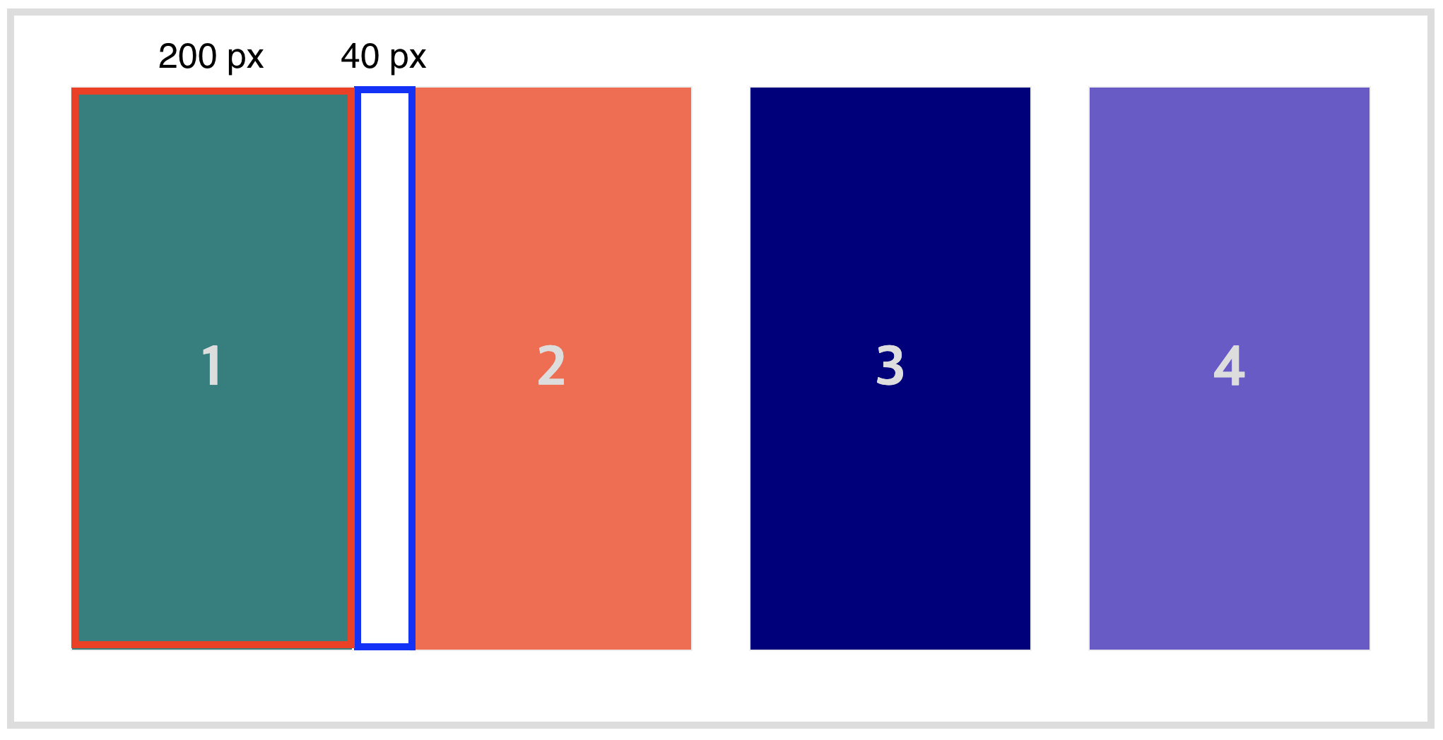
section01박스는 그자리 그대로에서 2,3,4번의 박스넓이(200px x 3) + (마진값:40 x 3) 인 920px 만큼 늘려준다.
section02박스는 그자리에 있으면 안되고section01박스의 영역 자리 즉 왼쪽 영역으로도 넓어져야한다. 그러므로section01~04를 감싸고 있는.visual영역을 줄이면서 영역도 넓혀야 밀어내는 효과가 나타난다..visual를left:'-240px'만큼 줄이면서width:'920px'를 늘려준다.
section03도section02와 마찬가지로.visual를 1번 2번의 영역을 합친left:'-480px'만큼 줄이고width:'920px'를 늘려준다.
section04는.visual가 3개의 박스넓이와 3개의 마진값을 합친left:'-720px'를 줄이고width:'920px'를 늘려준다.
*hover가 아닐 경우 마우스가 벗어난 경우 $(this).stop().animate({width:'200px'},500) 는 전부 동일하게 적용된다.
2. Hover Slide Effect #문제해결
처음에 직접 풀어본 결과
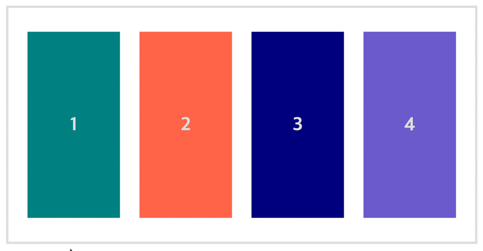
이렇게 2번 3번 4번은 넓이 920px만큼 늘어나지만 왼쪽박스 영역이 밀려 들어가는 모션이 없었다.
div에position:relative를 주고
$(function(){
    $('.section01').hover(function(){
        $(this).stop().animate({width:'920px'},500)
    },function(){
        $(this).stop().animate({width:'200px'},500)
    });
    $('.section02').hover(function(){
        $(this).stop().animate({left:'-240px' ,width:'920px'},500)
    },function(){
        $(this).stop().animate({left:0,width:'200px'},500)
    });
    $('.section03').hover(function(){
        $(this).stop().animate({left:'-480px',width:'920px'},500)
    },function(){
        $(this).stop().animate({left:0,width:'200px'},500)
    });
    $('.section04').hover(function(){
        $(this).stop().animate({left:'-720px',width:'920px'},500)
    },function(){
        $(this).stop().animate({left:0,width:'200px'},500)
    });
});
위와 같이
.visual를 생각하지 못했고, 해당 영역의left영역을 -값을 주면된다고 생각했기 때문이다. 역시나 왼쪽영역이 밀려서 확장되는 애니메이션이 아닌 위에서 덮어지는 효과가 나타났다.
3. Slide Scroll Button
결과
이미지 슬라이드를 스크롤로 제작한다.
HTML
<div id="wrap">
        <div class="content">
            <img src="./img/1.jpg" alt="">
            <img src="./img/2.jpg" alt="">
            <img src="./img/2.jpg" alt="">
            <img src="./img/2.jpg" alt="">
        </div>
        <div class="scrollBar">
            <div class="box"></div>
        </div>
    </div>
CSS
*{margin: 0; padding: 0;}
#wrap{width: 600px; margin: 100px auto; border: 1px solid #ddd; overflow: hidden; /* overflow: scroll; */}
.content{width: 2400px; height: 300px; position: relative;}
.content img{display: block; width: 600px; height: 100%; float: left;}
.scrollBar{width: 600px; height: 10px; background: #ddd;}
.box{width: 30px; height: 10px; background: tomato; margin-top: 5px;}
여기서 스크롤을 할 때 필요한
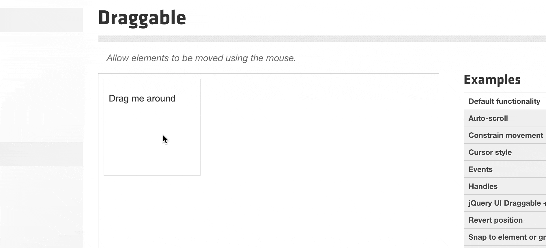
draggable가 있다.JQuery UI인데 먼저 알아보자.
JQuery Ui

JQuery Ui란?
JQuery-UI 는 자바스크립트와 css를 이용하여ㅛ 구현 할 수 있는 UI를 손쉽게 구현 할 수 있도록 제적된 라이브러리이다. 기존의 JQuery와 마찬가지로 사용할 함수의 값만 알고 있다면 복잡한 코딩 없이 각종 이펙트와 위젯, 피커등을 만들 수 있다.
JQuery Ui 사용방법
- 구글에 jquery ui 또는 https://jqueryui.com/ 로 들어간다.

- JQuery ui에 들어와서
ineractions에draggable에 들어간다.
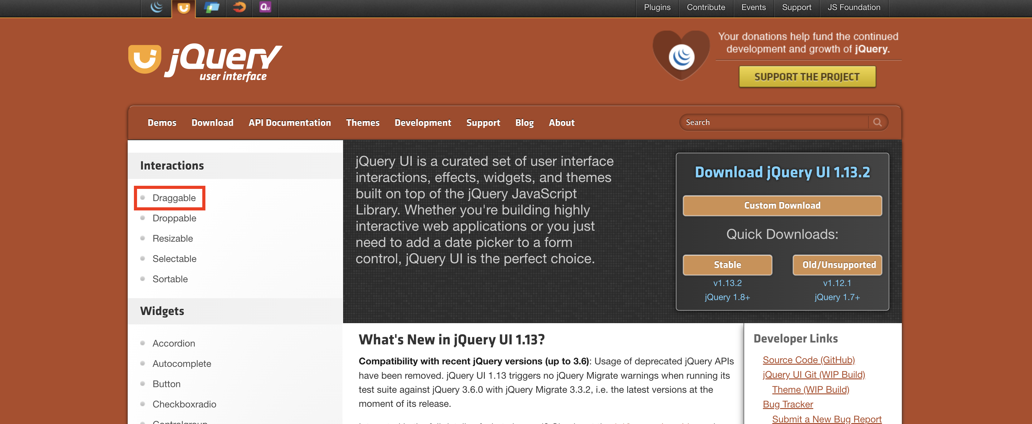
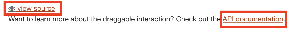
draggable의 예제를 알 수 있다.
- 하단에 vew source와 API documentation이 있다. 먼저 뷰소스를 눌러준다.
- cdn의 링크와 사용방법이 나와있다.
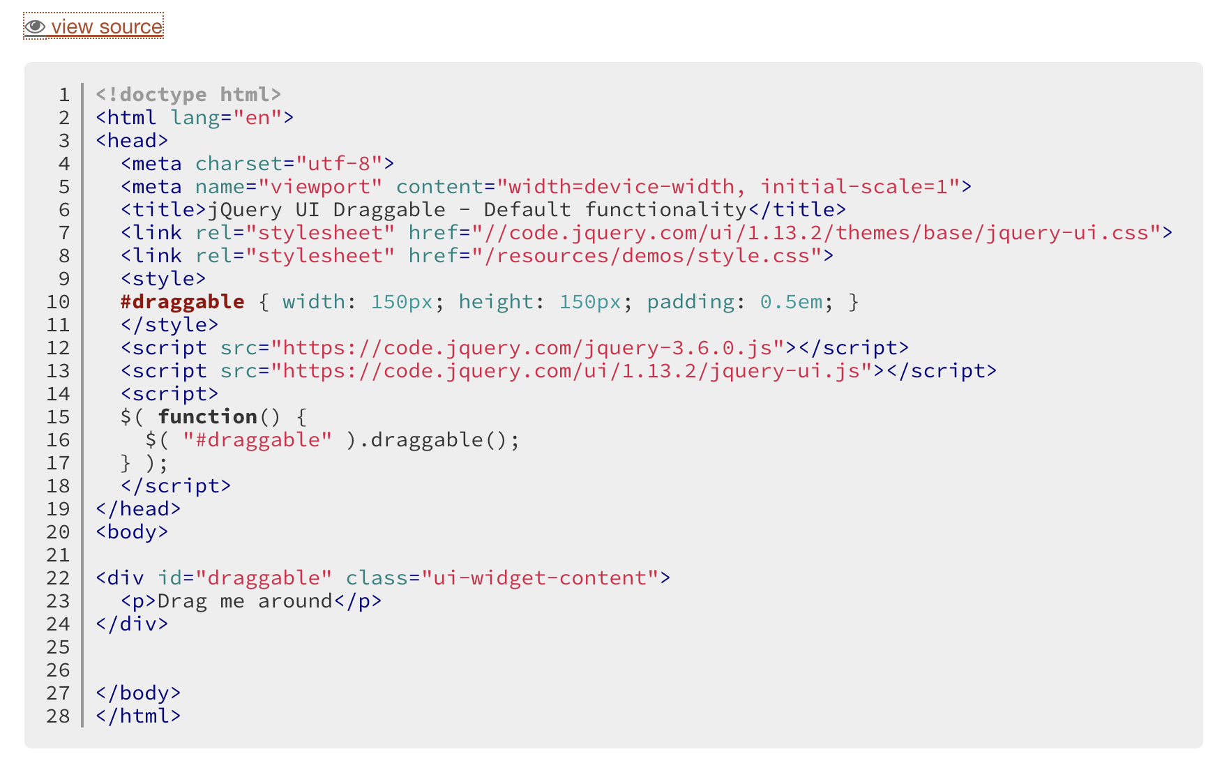
- cdn을 복사 붙여넣기 한다.
<script src="https://code.jquery.com/ui/1.13.1/jquery-ui.min.js"></script>
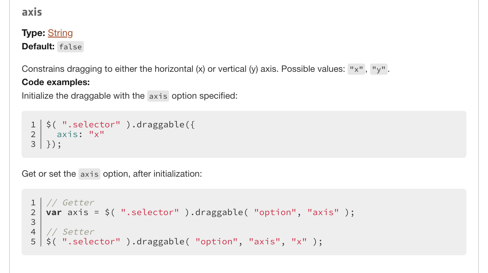
draggable의 X축으로 움직이기 위해API documentation에 들어간다.
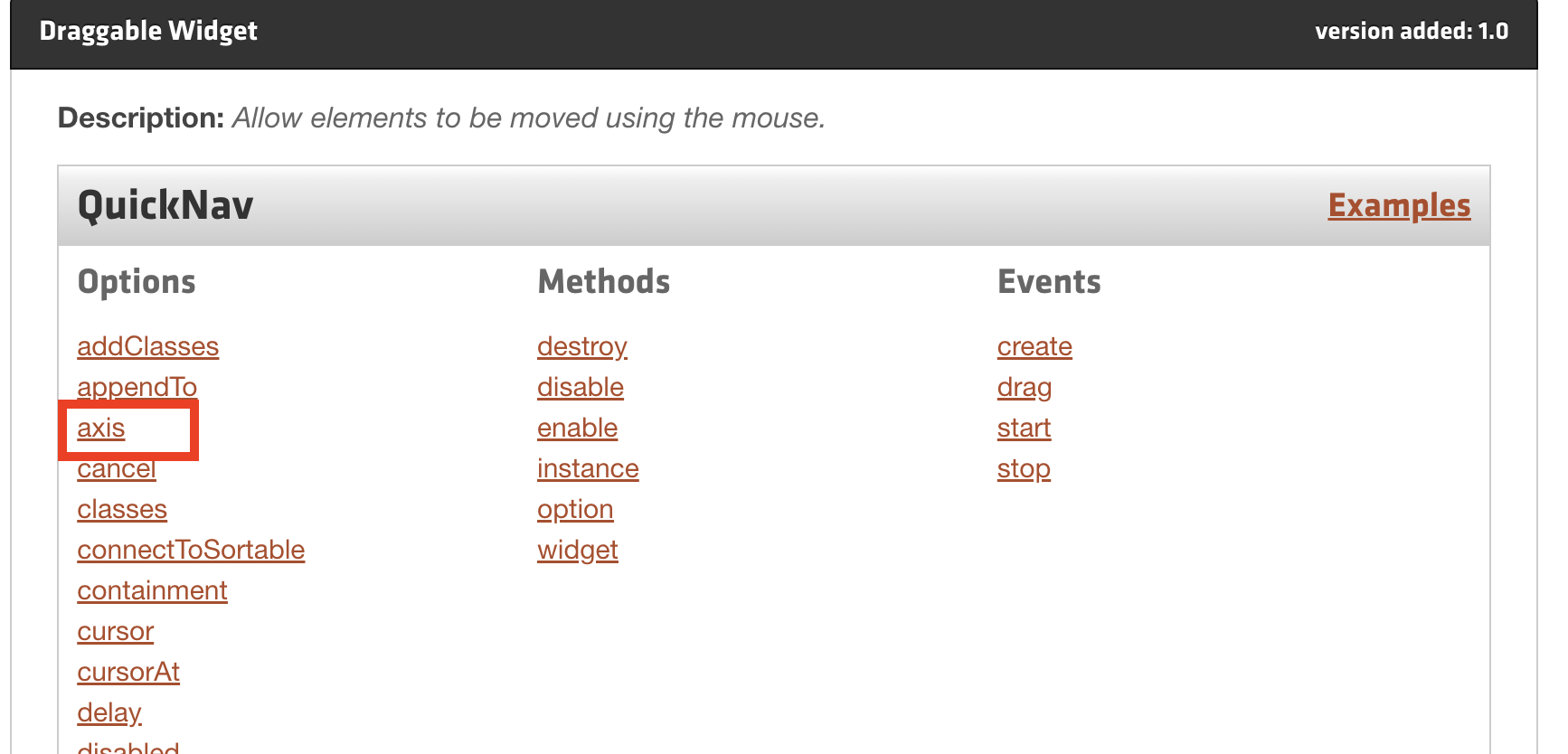
draggable안에axis: "x"를 써야하는걸 배웠다. 돌아가서 작성한다.
다시 3. Slide Scroll Button 으로 돌아와서 script를 작성해보자.
script
$(function(){
   $('.box').draggable({
    axis: "x",
    containment: "parent" // 이것을 써줘야 스크롤이 양쪽 밖의 영역으로 넘어가지 않는다.
    });
    $('.box').on('drag',function(){
        getPos();
    });

    let min=0;
    let max=-1800;

    function getPos(){
        let barLeft=$('.box').css('left');
        barLeft=parseInt(barLeft); //parseInt(문자를 숫자로 변환)
        console.log(barLeft);
        let pos=(barLeft * (max-min))/570 + min;
        $('.content').css('left',pos);
    }
});
$('.box').draggable밑에 만들어 두었던 스크롤바의 클래스 안에 박스 div가 있다. 이영역을 스크롤로 사용한다. axis는 x축으로 움직이고 박스를 드래그하면 getpos함수를 실행한다. getpos 함수는 barLeft의 숫자로 변환한 값을 min max값을 뺀 가로 스크롤 너비 이다. 총 600px중 스크롤막대 제외 570px이므로let pos=(barLeft * (max-min))/570 + min;값이 나온다. 이 값을 실행하면 스크롤이 움직이는 반대로contetnt는 왼쪽으로 움직이며 스크롤 효과가 나타난다.
결과는 다시한번 보자.
4. Image Effect
결과
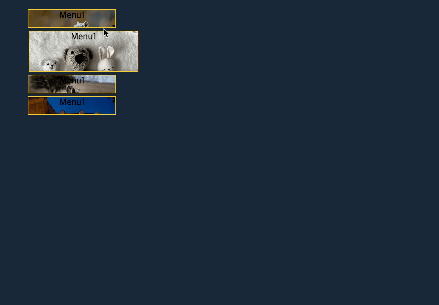
호버하게 되면 이미지의 영역이 커지면서 원래자리로 돌아간다.
HTML
     <ul id="navigation"> <!-- 사용자가 필요해서 만드는 data-img(지어줌)="img/1.jpg".. -->
        <li><a href="#" data-img="img/1.jpg">Menu1</a></li>
        <li><a href="#" data-img="img/2.jpg">Menu1</a></li>
        <li><a href="#" data-img="img/3.jpg">Menu1</a></li>
        <li><a href="#" data-img="img/4.jpg">Menu1</a></li>
    </ul>
CSS
body{width: 620px; padding: 0; margin: 20px auto; background: #192839;}
#navigation{list-style: none;}
#navigation a{display: block; width: 150px; height: 30px; /* background: red; */ margin-bottom: 5px; text-decoration: none; color: #000; border: 1px solid #fc0; text-align: center; background-repeat: no-repeat; background-size: cover;}
#navigation a:hover{color: #ff6;}
script
$(function(){
    $('li a').each(function(){
        let bgImg=$(this).attr("data-img");
        $(this).css("background-image","url("+bgImg+")")
    });
    $('li a').hover(function(){
        $(this).stop().animate({marginLeft:"15px",height:400, width:500},500);
    },function(){
        $(this).stop().animate({marginLeft:0,height:30, width:150},500);
    });
});
여기서 관건은
a태그에data-img="img/1.jpg"를 스크립트에서attr를 변경하는 것이다.let bgImg=$(this).attr("data-img"); 의 변수를 사용하여 $(this).css("background-image","url("+bgImg+")") CSS를 변경하는 것이다.