children 에 props 넘겨주기
요런식으로 컴포넌트로 감싸서 children 을 렌더링하는 구조를 사용할때가 있다.
이때 Modal 컴포넌트에서 children 에 props 을 넘겨주고 싶을때, 어떻게 구현할 수 있을까?
const App = () => {
  return (
     <Modal>
       <div>내용</div>
     </Modal>
   )
 }


 const Modal = (props) => {
  const {children, isOpen} = props;

  return (
     <ModalLayout>
       {children}
     </ModalLayout>
   )
 }
cloneElement 활용하기
cloneElement 는 React 에서 제공하는 함수이다.
주어진 React 요소를 복제하고 새로운 속성(props)을 추가 또는 재정의할 수 있도록 도와준다.
사용 방법
- element : 복제할 React 요소
- props (선택적): 추가하거나 변경할 속성
- children (선택적): 자식 요소
cloneElement(element, props, ...children)
예를들어 부모 컴포넌트가 자식 컴포넌트에게 새로운 속성을 전달하려면 다음과 같이 작성할 수 있다.
import React from 'react';

function ParentComponent() {
  return (
    <div>
      {React.cloneElement(<ChildComponent />, { newProp: 'value' })}
    </div>
  );
}
props 로 넘겨주는 방식과 뭐가 다르지?
이렇게 작성하고 나니 직접 ChildComponent 컴포넌트에 props 를 넘겨주면 되는거 아니야? 하는 생각이 든다.
물론 아래와 같이 작성해도 똑같이 동작한다.
import React from 'react';

function ParentComponent() {
  return (
    <div>
    	<ChildComponent value={value} />
    </div>
  );
}
그러나 차이점이 있다면, 직접 props 을 전달하면 자식 컴포넌트는 부모 컴포넌트와 결합을 가지게 된다. 즉, 의존성이 생겨 재사용성이 떨어지게 된다.
그러나 cloneElement를 사용하면 부모 컴포넌트가 자식 컴포넌트를 복제하는 것이므로 자식 컴포넌트는 완전히 독립적으로 유지된다.
따라서 재사용성을 높이고, 컴포넌트 간의 결합도를 낮추는 데 도움이 된다.
cloneElement 를 언제 어떻게 사용할 수 있을까?
이번에 프로젝트에서 공통으로 사용할 Input 컴포넌트를 만드는데 cloneElement 를 활용해봤다.
이처럼 공통 컴포넌트를 만들때는 재사용성을 높이는 것이 중요하므로 cloneElement 를 적절히 사용하면 도움이 될 것 같다.
cloneElement 활용해 Input 컴포넌트 만들기
먼저 그동안 input 를 어떻게 사용했는지를 떠올려 봤을때 아래와 같이 정리할 수 있었다.
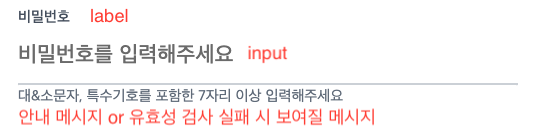
- label 과 input 을 함께 사용한다.
- 유효성 검사를 실행한다.
- 유효성 검사에 따른 안내 메시지가 보여진다.
화면으로 표현하자면 아래와 같다.
이런식으로 구현하기 위해서 아래와 같이 3개의 역할로 나누어서 진행하기로 했다.
- label
- input
- input 로직
이런식으로 Input 컴포넌트를 감싸주는 방식으로 구현해볼 것이다. 그리고 Input 의 기능은 useInput 훅으로 만들어 사용할 예정이다.
const [value, onChange] = useInput();

<Label>
  <Input />
</Label>
Label 컴포넌트
/components/common 폴더에 Label 파일을 만들었다.
const Label = ({ children, label, bottomText, ...props }: InputProps) => {
    const generatedId = useId();


    return (
        <Self {...props}>
            <Label htmlFor={id}>{label}</Label>
            {children} // input 자리
            {bottomText != null ? <Text isError={isError}>{bottomText}</Text> : null}
        </Self>
    );
};

export default Label;-
Label 컴포넌트는 label 과 에러 발생 시, 하단에 띄울 메시지를 보여주는 역할을 담당한다.
-
children 에는 input 값이 들어갈 자리이다.
-
이때 label 과 input 은 서로 htmlfor, id 값을 공유해야 한다. 그렇다면 어떻게 children 에 id 값을 넘겨줄 수 있을까? 하는 문제가 생겼다.
const Label = ({ children, label, bottomText, ...props }: InputProps) => {
    const child = Children.only(children);
    const generatedId = useId();
    const isError: boolean = child.props.hasError ?? false;

    return (
        <Self {...props}>
            <Label htmlFor={id}>{label}</Label>
            {cloneElement(child, {
                id,
                ...child.props,
            })}
            {bottomText != null ? <Text isError={isError}>{bottomText}</Text> : null}
        </Self>
    );
};

export default Label;-
Label 컴포넌트는 children을 1개만 받아오기 때문에 Children.only 함수를 사용하여 하나의 자식 요소만을 가져오도록 보장해준다.
-
받아온 children을 복제하고, id 값을 포함한 추가적인 props를 전달하기 위해 cloneElement 함수를 사용한다.
-
그럼 Label 과 Input 은 서로 같은 id 값을 공유하므로 Label 을 클릭해도 Input 에 포커스가 동작된다.
InputBase 컴포넌트
마찬가지로 /components/common 폴더에 InputBase 파일을 만들었다.
애플리케이션에서 사용되는 기본적인 input 스타일을 정의해줬다.
'use client';

import styled, { css } from 'styled-components';

const InputBase = styled.input<{ hasError?: boolean }>`
    width: 100%;
    color: ${(props) => props.theme.colors.grey800};
    padding: 0 0 8px;
    height: 40px;
    font-weight: 500;
    font-size: 22px;
    border-radius: 1px;
    caret-color: ${(props) => props.theme.colors.mainColorDk};
    outline: none;
    border: 0 none;
    border-bottom: 2px solid ${(props) => props.theme.colors.grey300};
    :focus {
        border-bottom-color: ${(props) => props.theme.colors.mainColorlg};
    }
    ${({ hasError }) => (hasError ? errorStyle : '')}
    transition: background-color 0.2s ease;
`;

const errorStyle = css`
    color: ${(props) => props.theme.colors.red500};
    border-bottom-color: ${(props) => props.theme.colors.red500};
    :focus {
        border-bottom-color: ${(props) => props.theme.colors.red500};
    }
`;

export default InputBase;
useInput 훅
useInput 훅은 입력값의 유효성을 검사하고 처리하는 로직을 추상화했다. 이 훅은 다양한 타입의 입력값에 대해 유효성 검사를 수행할 수 있는데, 현재는 문자열과 숫자에 대한 기본적인 검사만 작성했다.
나중에는 이메일, 비밀번호 등과 같은 더 복잡한 유효성 검사도 추가할 예정이다.
/hooks 폴더에 useInput 파일을 만들었다.
'use client';

import { useState, useRef } from 'react';
import { removeNonNumeric } from '@/utils/string';

interface Options {
    initialValue?: string;
    maxLength?: number;
    minLength?: number;
    type?: 'number' | 'string';
}

type returnType = [string, (e: React.ChangeEvent<HTMLInputElement>) => void, boolean];

/**
 * 간단한 유효성 검사 가능
 * type 에 따라 추가 로직 구현 가능
 */

const useInput = (options?: Options): returnType => {
    const { initialValue = '', maxLength, minLength = 0, type = 'string' } = options || {};
    const [value, setValue] = useState<string>(initialValue || '');
    const isValid = useRef<boolean>(true);

    const handleNumber = (receivedValue: string) => {
        let result: string = receivedValue;

        if (type === 'number') {
            result = removeNonNumeric(result);
        }

        if (maxLength && result.length > maxLength) {
            result = result.slice(0, maxLength);
        }

        isValid.current = result.length >= minLength;
        setValue(result);
    };

    const handleString = (receivedValue: string) => {
        let result: string = receivedValue;

        if (maxLength && result.length > maxLength) {
            result = result.slice(0, maxLength);
        }
        isValid.current = result.length >= minLength;
        setValue(result);
    };

    /** 첫번째로 실행되어 type에 따라 함수 호출 */
    const onChangeInput = (e: React.ChangeEvent<HTMLInputElement>) => {
        const targetValue: string = e.target.value || '';

        if (type === 'number') {
            handleNumber(removeNonNumeric(targetValue));
        } else {
            handleString(targetValue);
        }
    };

    return [value, onChangeInput, isValid.current];
};

export default useInput;
최종.jpg
input 을 구현하는데, label(Label), css(InputBase), 기능(hook) 으로 작게 모듈화 하고 합쳐서 사용한다.
서로 의존성을 최소화하여 변경이 생겨도 영향을 덜 받는 구조이자, 어떤 역할을 수행하는지 이해하기 쉽고, 따라서 문제가 생겼을때 빠르게 파악해 수정이 용이해진다.
const Login = () => {
    const [value, onChangeInput, isValid] = useInput({ minLength: 3, type: 'string' });

    return (
        <Self>
            <Label bottomText="대&소문자, 특수기호를 포함한 7자리 이상 입력해주세요" label="비밀번호">
                <InputBase hasError={!isValid} placeholder="비밀번호를 입력해주세요" onChange={onChangeInput} />
            </Label>
        </Self>
    );
};

export default Login;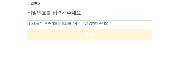
cloneElement 정리
리액트 공식 문서에는 cloneElement 를 사용하는 것은 흔하지 않으며, 불안정한 코드를 만들 수 있기 때문에 주의해서 사용해야 된다고 나와있다.
왜냐하면 자식 요소를 복제하는 것은 데이터가 어떻게 흘러가는지 파악하기 어렵기 때문인데, 그래서 친절히도 다른 방법도 제시해주고 있어서 비교해보고 더 나은 방법을 사용하면 좋을 것 같다.
이번에 cloneElement 를 새롭게 알게 되면서 children 을 복제해 가공해서 사용할 수 있다는 부분이 신선했고, 생각보다 간단하게 사용할 수 있다는 점이 좋았다.
물론 무분별하게 사용하면 경고한대로 불안정한 코드가 생겨날 수 있기 때문에 어떤 구조로 흘러가는지 제대로 공부할 필요가 있어 보인다.
https://ko.react.dev/reference/react/cloneElement#alternatives